Cockpit: "Forecast Comparison"
Compare multiple forecasts of the same target. Discover conditions that correlate with model superiority.
Pro This cockpit is only available in Visplore Professional.
Overview
The starting point for this cockpit is one reference time series, as well as several forecasts of this reference as forecast time series. Common usecases are model selection for trained predictors, or deciding which provider to buy a forecast from, for example in case of weather forecast providers.
The cockpit shows which forecast is superior to the others, based on their deviations from the reference time series. On the one hand, it compares how often each forecast is most accurate, and under which circumstances. On the other hand, forecasts are compared by error metrics like RMSE or MAPE, for different time periods and categories. The knowledge gained can be implemented in external forecasting tools, for example, as a script in order to use the models correctly.
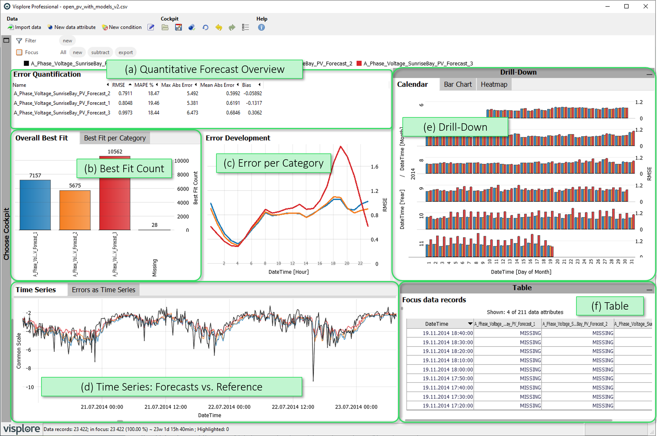
- Quantitative Forecast Overview: A list of error metrics for each forecast, considering all time stamps in Focus
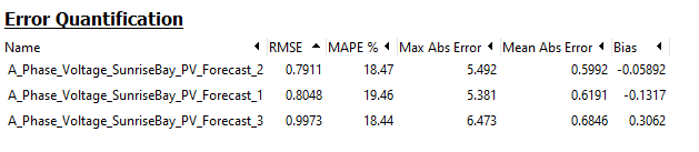
- Best Fit Count: How often does each forecast come closest to the reference time series? (Overall, and per category)
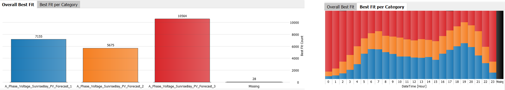
- Error per Category: A selected error metric is plotted for different categories, to discover systematical errors.
- Time Series / Errors as Time Series: Time series plot of forecasts vs. their reference over time (first tab), and of the error time series (second tab).
- Drill Down: One selected error metric plotted per day, per categories, or per combinations of categories, with the option of selecting time ranges and categories for a detailed view by clicking on them.
- Table: A table-like view of single values that can be shown on demand.
Starting the cockpit - assigning time series roles
The following roles can be given to data attibutes in this cockpit. Use the  icon in the toolbar to adjust them.
- Time axis: This role can be given to a data attribute defining a temporal ordering of the data records. Can be time stamps, or values. It will be used to define the temporal context for all variables, e.g. the times of measurement, consumption, production, etc. If the role is assigned to a data attribute of date/time type, periods like 'Month', 'Hour' etc. are extracted and available for defining filters, and categorical plots like bar charts.
- Reference: This role must be assigned to a time series which represents the desired condition, e.g., measurement values of actual consumption or production. Time series with the role 'Forecast' are validated against this 'Reference' time series. Thus, a reference may not have the role 'Forecast' at the same time.
- Forecast: This role must be assigned to at least one time series, which represents model values of some reference time series. The cockpit then allows to compare their deviations from the reference time series.
- Category: Some views aggregate values by categories (e.g. per day of week, per month, etc.). When this role is assigned to a categorical data attribute, its categories are available for such aggregations. Example: Assigning this role to a 'Holiday' variable with categories 'yes' and 'no' allows comparing values like energy production for holidays vs. non-holidays. The role can also be assigned to numerical data attributes, which results in one category per distinct value of that attribute (e.g. different states encoded as 0 or 1). If the role is given to a data attribute of date/time type, periods like 'Month', 'Hour' etc. are extracted and available for defining filters, and categorical plots like bar charts.
- Upper limit (Visplore Professional only): A variable with this role defines an upper limit for another numerical variable. It is shown along with the referenced variable in time series views.
- Lower limit (Visplore Professional only): analogous to Upper limit, but for lower limits.
- Setpoint (Visplore Professional only): analogous to Upper limit, but variables with this role represent a setpoint (=desired state) for the reference variable.
Quantitative Forecast Overview
In this list, the forecasts are compared by (global) error metrics. All records in focus are considered.
Sort the list by clicking the header of any error metric, and choose the set of displayed error metrics by clicking the view title, then "Choose displayed statistics" below.
Best Fit Count
This view counts which forecast came closest to the reference time series, overall (first tab) or per category (second tab). This means that the forecast with the smallest absolute distance from the reference time series is counted. The relative frequency of such "victories" is displayed for each forecast by the bar length. If several models have the (same) lowest forecast error at a time, this time stamp is counted as a separate category called "Ambiguous". The category "Missing" counts the number of time stamps where the value of the reference time series is missing.
- A selection or a bar in the "Overall Best Fit" view selects the data records where the selected forecast came closest to the reference.
- Please note that this absolute count does NOT convey by how far or how close a model has "won". It may even be, that the forecast with the most "wins" here performs badly regarding overall error metrics: when it wins often by a small amount, but the few times it loses, it loses by far.
- In the "Best fit per category" view, you can choose and order the used categories by clicking the x-axis label.
Error per Category
This view shows how one error measure for the forecasts depends on categories or time intervals (hours, days, months,...). The plot only considers the data records in focus.
In the images above, you can see for example that forecast 3 (red) has a particularly bad RMSE in evenings, and months after September. In mornings, on the other hand, it has the smallest RMSE.
Click the x-axis label to change the categories to compare the errors by. Click the y-axis on the right side of the view to change the used error metric.
Drill Down
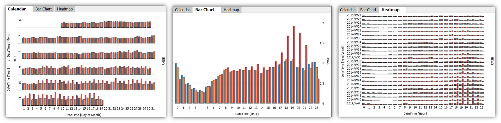
These views display one selected error metric per forecast using colored bars, for different (combinations) of categories. Each colored bar aggregates the deviations of one forecast's data that falls within the corresponding (combination of) categories.
- Calendar: is only available if a Date/Time-typed data column is present. It shows one bar per forecast per day.
- Bar Chart: one bar per forecast per (combination) of categories, as chosen via menu when clicking the axis labels.
- Heatmap: a grid-based, matrix display, built using combinations of categories on both the horizontal and the vertical axis. The categories used for building the chart can be selected via menu when clicking the axis labels.
The views can be used to perform selections of categories by clicking the category labels, which defines a focus for the other views. If a focus was already defined in other views, the Drill-Down views only consider the data records of the focus.
Using other error metrics than the RMSE: click the y-axis label on the right of the view.
Time Series
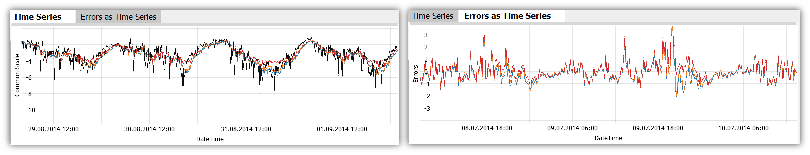
These plots show time series graphs of the forecasts and the reference. The "Time Series" view plots forecast and reference time series as such, while "Errors as time series" shows the residuals (i.e., the differences between forecast and reference) over time.
Key actions:
- Select time periods by dragging the left mouse button to put them into focus for the other views.
- Zooming: Drag a rectangle with the right mouse button to zoom in. Alternatively, use CTRL + mouse wheel to zoom in or out. Once zoomed in, there is a button in the bottom-left corner of the diagram with arrows pointing outwards. Click it to zoom out completely again.
The diagram offers several options when clicking the view title "Time Series". The most important ones are:
 Selection mode: changes the tool for selecting data records in the view. Availble alternatives to the 2D rectangle are 1D intervals, or a free-form Lasso selection.
  Automatic zooming: enabling this feature will let the time series zoom automatically to the focus, whenever a new focus is defined.
Table ('Focus data records')
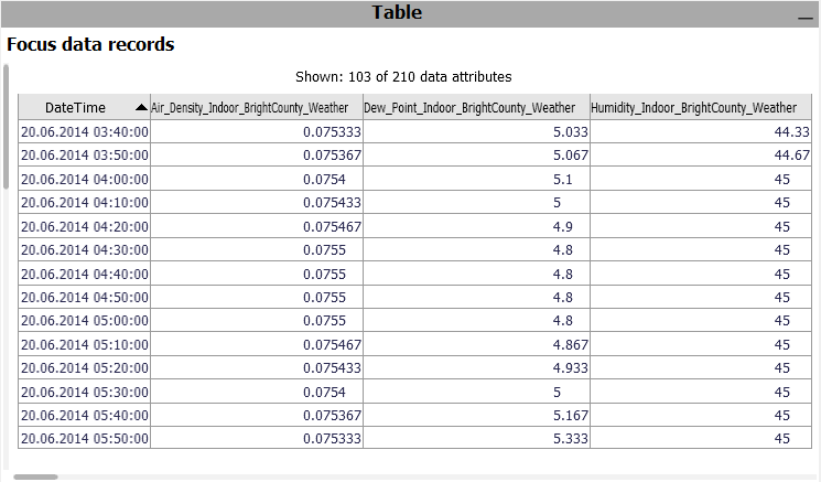
A table showing the single values. Only considers the data records in focus. Click the header of a column to sort the table by it. To change the set of displayed columns, click the header "Shown: 103 of 210 data attributes". Click single rows or drag a line with the left mouse button to select records, putting them into focus.
 Exporting: A key use case of the table is exporting a selected subset of the data. To export the current state of the table, click the view title "Focus data records", and then "Data export".
License Statement for the Photovoltaic and Weather dataset used for Screenshots:
"Contains public sector information licensed under the Open Government Licence v3.0."
Source of Dataset (in its original form): https://data.london.gov.uk/dataset/photovoltaic--pv--solar-panel-energy-generation-data
License: UK Open Government Licence OGL 3: http://www.nationalarchives.gov.uk/doc/open-government-licence/version/3/
Dataset was modified (e.g. columns renamed) for easier communication of Visplore USPs.