Cockpit: "Deviation Monitor"
Assess the match between time series, e.g., between forecasts and actual measurements. Discover and explain systematic deviations.
Pro This cockpit is only available in Visplore Professional.
Overview
This cockpit visualizes the match between target- and actual value time series, and reveals systematic deviation patterns. The most prominent example is the validation of forecast time series with respect to observed reference time series. Two typical use cases are (1) finding out which forecasts are not good enough for operational deployment and need to be improved, and (2) regular monitoring during operation, to find out which forecasts need to be recalibrated. Systematic error analysis provides ideas on how to improve the forecasts.
Note: For simplicity, the rest of this page refers to the particular use case of forecasting, referring to the target (or model) time series as forecasts and to the actual values as references. However, the cockpit is not limited to forecasting, but supports deviation analysis for any pairs of target-vs-actual time series.
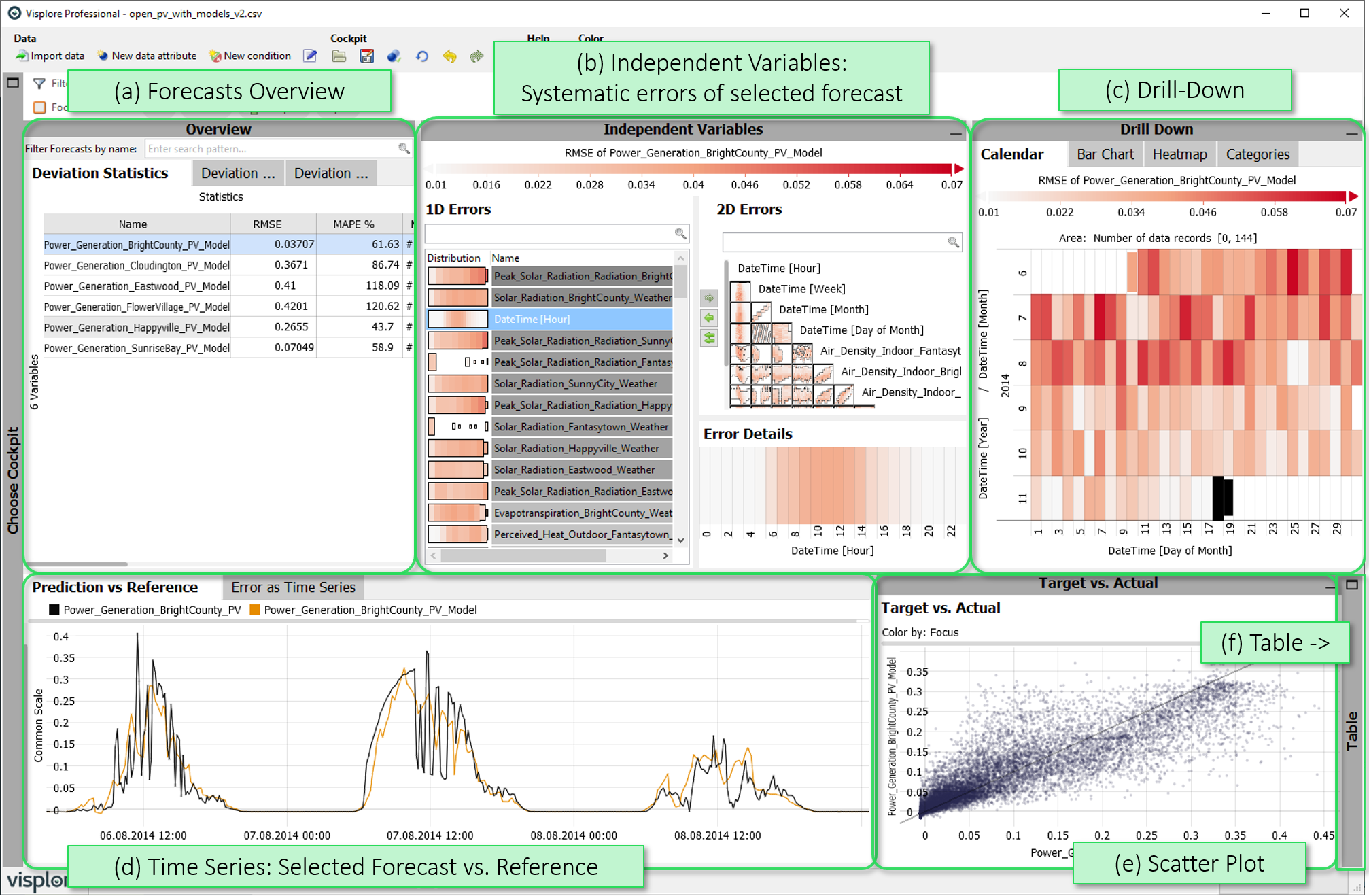
- Forecasts Overview: Various overviews summarizing deviations for all forecast time series, with the option of selecting one of them for detail analysis in the other views, as well as filter options through text input.
- Independent Variables: For one selected forecast, the effect of independent variables on the deviations is visualized, to reveal potential systematics. Patterns indicate a potential model improvement by accounting for these inputs better in the model definition.
- Drill Down: Deviations of the selected forecast aggregated according to time aspects or categories, with the option of selecting time ranges for a detailed view by clicking on them.
- Time Series: Time series plots of the selected forecast vs. its reference, with the possibility to select records, and to automatically zoom to selected time ranges.
- Scatter Plot (Target vs. Actual): Point-wise visualization of the match between forecast and reference, with the ability to select points, e.g., extreme over- or underestimations.
- Table: A table-like view of single values that can be shown on demand.
Starting the cockpit - assigning time series roles
- Time axis: This role can be given to a data attribute defining a temporal ordering of the data records. Can be time stamps, or values. It will be used to define the temporal context for all variables, e.g. the times of measurement, consumption, production, etc. If the role is assigned to a data attribute of date/time type, periods like 'Month', 'Hour' etc. are extracted and available for defining filters, and categorical plots like bar charts.
- Forecast: This role must be assigned to at least one time series, which represents model values of some reference time series. The deviation of the forecast time series to their references will be analyzed in the cockpit.
- Independent Variable: Time series with this role are influencing variables whose influence on the deviations is to be investigated. Example: Weather time series that could be relevant for the deviation of predicted renewable power production and the actually observed production. Any number of numerical or categorical time series can be assigned this role.
- Category: Some views aggregate values by categories (e.g. per day of week, per month, etc.). When this role is assigned to a categorical data attribute, its categories are available for such aggregations. Example: Assigning this role to a 'Holiday' variable with categories 'yes' and 'no' allows comparing values like energy production for holidays vs. non-holidays. The role can also be assigned to numerical data attributes, which results in one category per distinct value of that attribute (e.g. different states encoded as 0 or 1). If the role is given to a data attribute of date/time type, periods like 'Month', 'Hour' etc. are extracted and available for defining filters, and categorical plots like bar charts.
- Upper limit (Visplore Professional only): A variable with this role defines an upper limit for another numerical variable. It is shown along with the referenced variable in time series views.
- Lower limit (Visplore Professional only): analogous to Upper limit, but for lower limits.
- Setpoint (Visplore Professional only): analogous to Upper limit, but variables with this role represent a setpoint (=desired state) for the reference variable.
Forecasts Overview
Various overviews summarizing deviations for all forecast time series, with the option of selecting one of them for detail analysis in the other views, as well as filter options through text input.
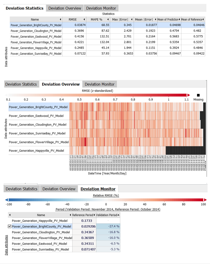 |
Deviation Statistics: Various statistical summaries of the deviation between each forecast and its reference. Click on the name of the forecast to select it for detail analysis in the rest of the cockpit. Sort the forecasts by any error metric by clicking a column header. Export the statistics by clicking the diagram title, and selecting the export options. Deviation Overview: A temporal overview of the deviations of each forecast by color-coding an error measure over time. Click on the name of the forecast to select it for detail analysis in the rest of the cockpit. Click one or more cells to put the represented periods into focus, and to immediately zoom in to that period in the time series view. Choose the error metric used for color coding via the dropdown field in the top of the cockpit toolbar. Error metrics are normalized by the reference values by default, such that extreme deviations pop out regardless of the scale of the underlying values. Normalization can be turned off or exchanged via a dropdown that appears when clicking the label of the color legend. By default, the rows are ordered such that those with similar error patterns end up together. The ordering can be changed by clicking near the left y-axis label "Variables". With the x-axis label, the aggregation raster can be exchanged. Deviation Monitor: Provides an overview, which forecast deviations have changed a lot from one time period to another. Specifically, an error metric (e.g. RMSE) is computed for a 'validation' period, and compared to the same metric for a 'reference' period. This comparison is done for every forecast. You can sort the list by the validation period to identify forecasts whose deviation changed most. The choice of the reference and validation periods can be changed, by clicking the gearwheel-symbol near the labels in the top of the view. Click on the name of the forecast to select it for detail analysis in the rest of the cockpit. |
Independent Variables
For one selected forecast, the plots viusalize how the deviations depend on the independent variables, to reveal potential systematics. Patterns indicate potential model improvement by accounting for these inputs better in the model definition.
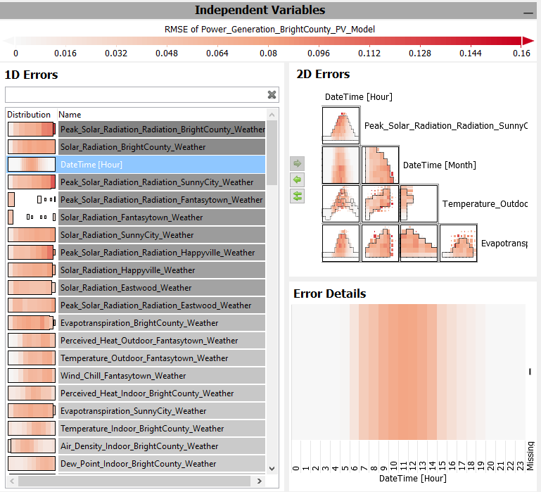 |
1D Errors: List of independent variables, with color-based visualizations of how the currently chosen error metric depends on the the variable. Ordered by the systematicness of the error pattern. View the error pattern in detail by clicking an independent variable. 2D Errors: Matrix of independent variable pairs, with color-based visualizations of how the currently chosen error metric depends on the the combination of variables. Ordered by the systematicness of the error pattern. View the error pattern in detail by clicking a cell of an independent variable pair. Select, which variables are shown in the matrix, by selecting them in the 1D Errors, and clicking the green arrow buttons between the 1D and 2D Errors views. Error details: Magnified visualization of the error pattern for the selected independent variable(s). Select any cells (=put them into focus) by dragging the left mouse button, to investigate the remaining variance within the selection in other views. |
Drill Down
These diagrams display one selected error metric for the one selected forecast per category, using colors. Each colored cell (or bar) aggregates the deviations of the data that falls within the corresponding (combination of) categories.
- Calendar: is only available if a Date/Time-typed data attribute is present. It shows one cell per day.
- Pivot Table: shows multiple statistics per (combinations) of categories. The categories can be selected via dropdown-menu when hovering the axis label.
- Bar Chart: a bar chart based on (combinations) of categories. The bar length encodes the number of data records per category. The categories for the bars can be selected via dropdown-menu when hovering the axis label.
- Heatmap: a grid-based, matrix display, built using (combinations of) categories on both the horizontal and the vertical axis. The size of cells encodes the number of data records per category combination. The categories used for building the chart can be selected via dropdown-menu when hovering the axis labels.
- Categories: Similar to 'Heatmap', for up to four categorical attributes at once.
The views can be used to perform selections of categories by clicking the category labels, which defines a focus for the other views. If a focus was already defined in other views, the Drill-Down views only consider the data records of the focus.
Using other error metrics than the RMSE for coloring: use the dropdown field in the top of the cockpit toolbar.
Time Series
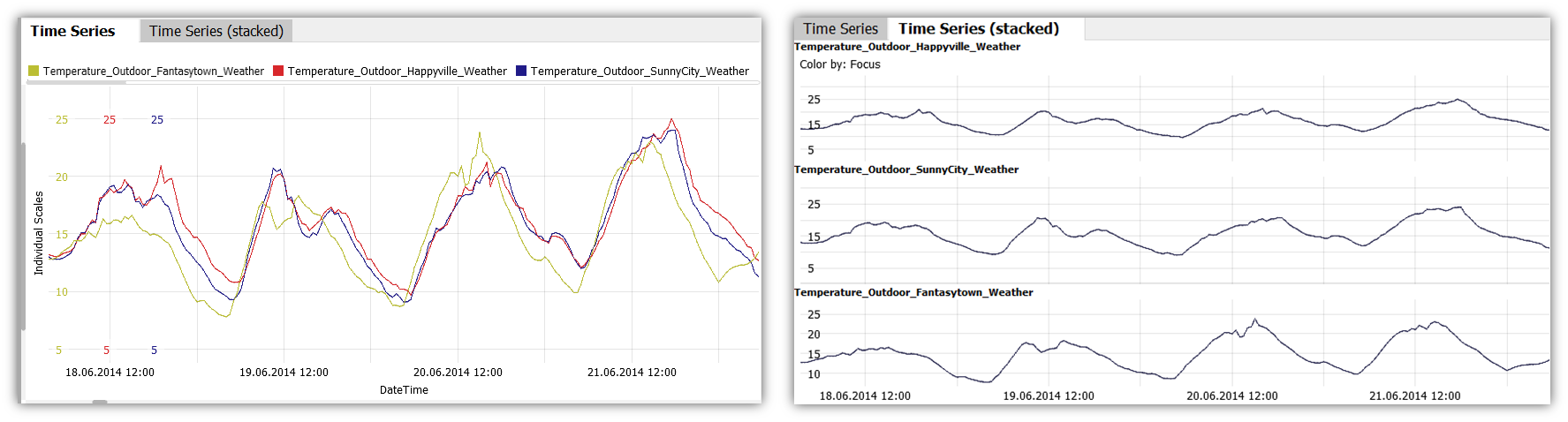
These plots show variables over time. If the time axis has a regular raster, the timeline is connected as line graph. If more than one variable is shown, there are two ways of distinguishing them:
- The tab Time Series plots them in the same graph, and distinguishes them by colors. Instead of displaying individual scales for each variable, you can select a common scale, or normalize the values for display, by clicking the y-axis label, and selecting a different option in the drop-down.
- The tab Time Series (stacked) shows them side by side (limited to 5 variables at a time).
Key actions:
- Zooming: Drag a rectangle with the right mouse button to zoom in. Alternatively, use CTRL + mouse wheel to zoom in or out. Once zoomed in, there is a button in the bottom-left corner of the diagram with arrows pointing outwards. Click it to zoom out completely again.
- Select time periods by dragging the left mouse button to put them into focus for the other views.
- Adjust axis range by clicking the top/bottom label of the axis. Note: if you want to adjust multiple axes, adjust them from left to right.
The diagram offers several options when clicking the view title "Time Series". The most important ones are:
 Selection mode: changes the tool for selecting data records in the view. Availble alternatives to the 2D rectangle are 1D intervals, or a free-form Lasso selection.
  Trend overlays: In addition to the displayed time series, a smoothed version of the time series can be displayed to analyze long-term trends. This is done by calculating a moving average over adjacent time points.
 Automatic zooming: enabling this feature will let the time series zoom automatically to the focus, whenever a new focus is defined.
Scatter Plot (Target vs. Actual)
This view shows the currently selected forecast and its reference values as a detailed two-dimensional scatterplot. The 45 degrees line is shown to indicate the ideal fit.
It is possible to select points (data rows) in the diagram by dragging the left mouse button. Selected points are brought into focus, unselected points fall into the context and are shaded in gray. The selection affects the remaining diagrams. For example, the "Deviation Overview" diagram now uses the currently selected entries as a basis for calculating the error metrics - as do all other views.
The diagram offers several options when clicking the diagram title 'Scatter Plot'. The most important ones are:
- Selection mode: Availble alternatives to the 2D rectangle are 1D intervals, a straight line selecting all points on one side of it, or a free-form Lasso selection.
- Automatic zooming: enabling this feature will let the view zoom automatically to the focus, whenever a new focus is defined.
Table ('Focus data records')
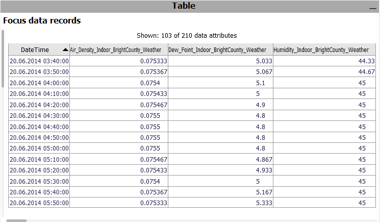
A table showing the single values. Only considers the data records in focus. Click the header of a column to sort the table by it. To change the set of displayed columns, click the header "Shown: 103 of 210 data attributes". Click single rows or drag a line with the left mouse button to select records, putting them into focus.
 Exporting: A key use case of the table is exporting a selected subset of the data. To export the current state of the table, click the view title "Focus data records", and then "Data export".
License Statement for the Photovoltaic and Weather dataset used for Screenshots:
"Contains public sector information licensed under the Open Government Licence v3.0."
Source of Dataset (in its original form): https://data.london.gov.uk/dataset/photovoltaic--pv--solar-panel-energy-generation-data
License: UK Open Government Licence OGL 3: http://www.nationalarchives.gov.uk/doc/open-government-licence/version/3/
Dataset was modified (e.g. columns renamed) for easier communication of Visplore USPs.