Cockpit: "Pattern Search and Comparison"
Extract and compare recurring patterns in time series data (e.g., days, machine cycles, or batches). Cluster the extracted patterns by their similarity and analyze user-defined features.
Pro This cockpit is only available in Visplore Professional.
Overview
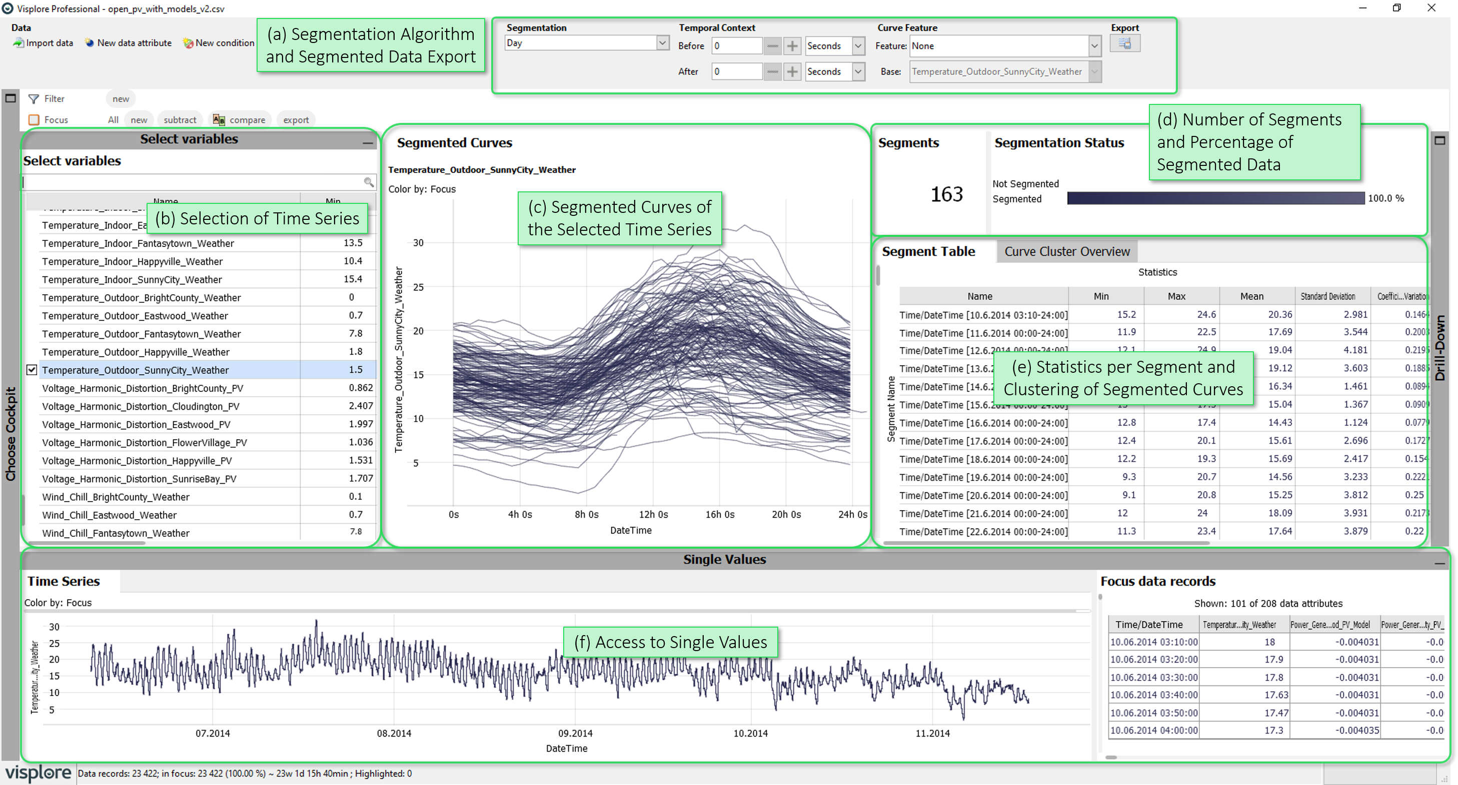
- Segmentation Algorithm and Segmented Data Export: Select how time series data is segmented into curves (=the segmentation algorithm). Define a temporal context for the displayed curves. Choose a curve "feature" (= a statistic) that is shown in the "Segment Table". Export the segmented data for further analysis.
- Selection of Time Series: Select time series you would like to see segmented, and displayed in detail in other views of the cockpit.
- Segmented Curves of the Selected Time Series: This diagram displays all segmented curves of selected timeseries on top of each other. This allows to compare individual segments and validate the current segmentation.
- Number of Segments and Percentage of Segmented Data: Number of segments and the percentage of data which was segmented by the selected algorithm.
- Statistics per Segment and Clustering of Segmented Curves: The "Segment Table" shows statistics of the selected time series for each segment, while the "Curve Cluster Overview" clusters the curves by their (dis-)similarity.
- Access to Single Values: The "Time Series" shows the timeline of selected time series, while the "Table" shows their exact values.
Getting Started: Extract and Analyze Day Curves
Import the demo dataset "Solar Power" after starting Visplore, and start the "Pattern Search and Comparison" cockpit.
Segment by Day Curves by selecting the segmentation algorithm "Days" n the top area of the Cockpit:
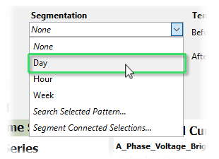
The cockpit creates a segment for each day in the data set. This has the following effects on the views:
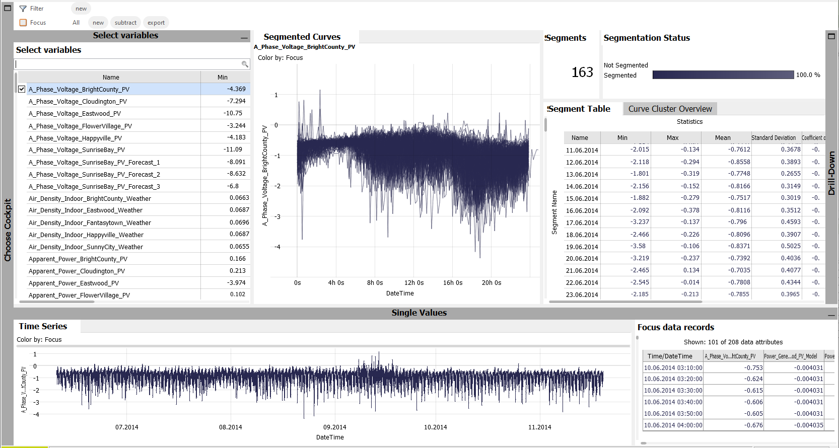
- The "Segmented Curves" view shows a curve for each day of the selected time series.
- The number of segments is shown in the top-right area of the cockpit, as well as the percentage of segmented data (in this case 100 %, as each data record is part of a day. We have no unsegmented parts).
- The "Segment Table" shows statistics of the selected time series for each day.
- The "Curve Cluster Overview" clusters the curves of the selected time series.
Selecting multiple time series shows the segmented curves for each selected time series (up to 5).
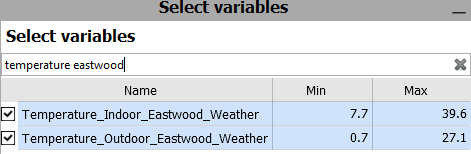
Filter the "Select Time Series" list by "Temperature Eastwood" and select both remaining time series:
As a result, Visplore looks like this:
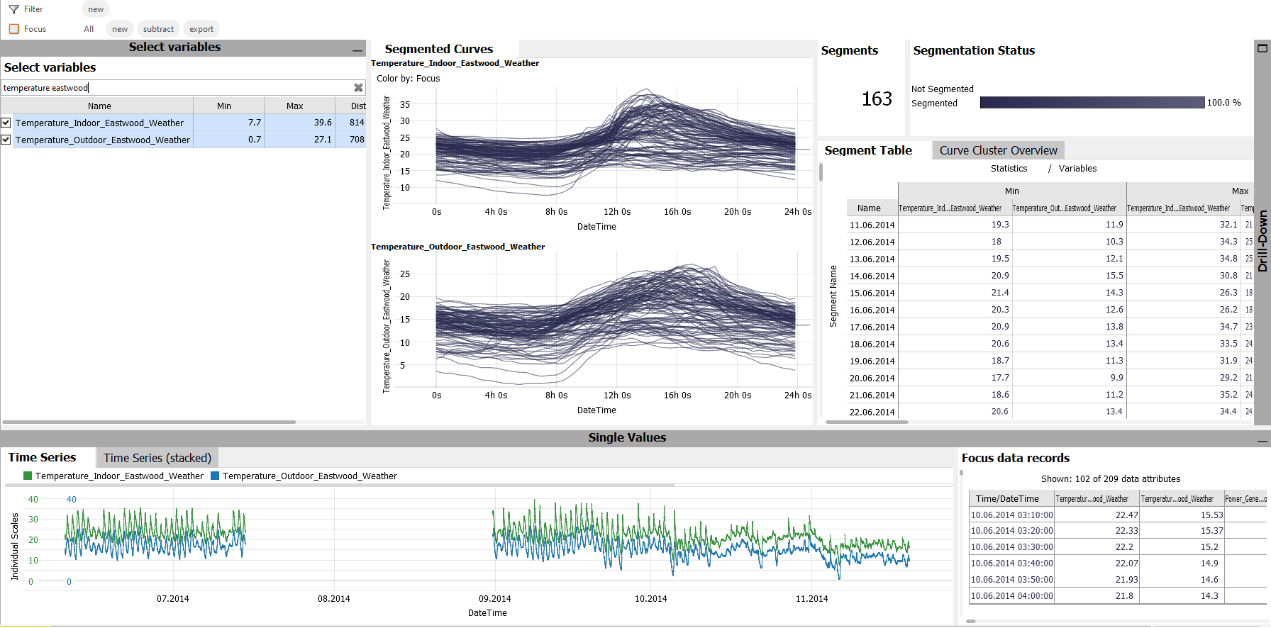
This allows to compare the daily curves / segments of multiple time series in several ways:
- The "Segmented Curves" now shows the curves for both selected time series.
- The "Time Series" shows both time series with different colors, while a newly appearing diagram "Time Series (stacked)" shows them one above the other.
- The "Segment Table" shows the statistics per segment for each of the selected time series.
Getting Started: Search and Analyze Selected Patterns
If not already done, import the demo dataset "Solar Power" after starting Visplore. Then start the "Pattern Search and Comparison" cockpit.
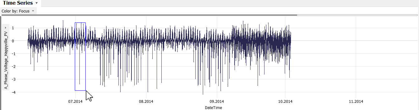
As an example, we would like to search for an anomalous pattern in the time series "A_Phase_Voltage_Happyville_PV".
Select the time series "A_Phase_Voltage_Happyville_PV" in the "Select Time Series" diagram.
The selected time series is then shown in the "Time Series" diagram in the bottom part of Visplore. As you can notice, this time series seems to have some anomalous troughs.
Zoom into one of the troughs by dragging the right mouse button, drawing a blue rectangle around the trough:
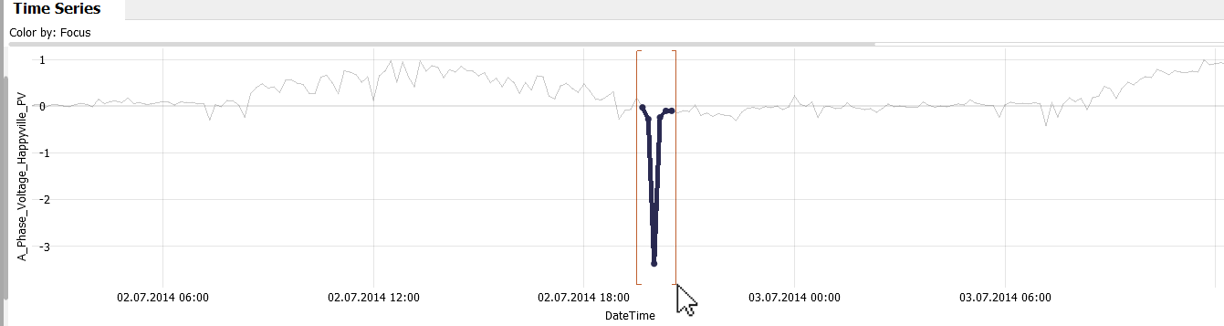
We would like to find multiple, similar patterns and analyze them in more detail.
Select the anomalous pattern by dragging the left mouse button around the pattern:
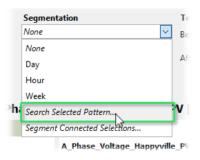
Choose to segment the time series by "Search Selected Pattern...":
After typing a pattern name, the selected pattern is searched for in the current time series. A dialog is shown to configure the search:
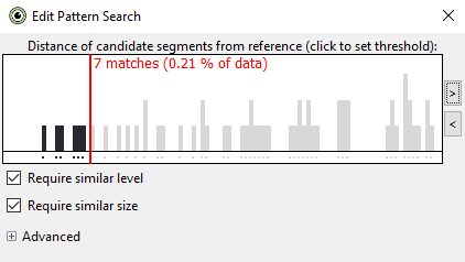
- The red line shows the current threshold, what is still considered similar enough to the search pattern.
- In the background, a histogram shows possible matches you get when choosing different thresholds.
- Clicking into the histogram changes the current threshold.
- Clicking the arrow buttons on the right of the histogram to zoom, and allow larger thresholds.
- When choosing different thresholds, the currently segmented curves are updated in the "Curves" diagram of the cockpit, as well as highlighted in the "Time Series" diagram:
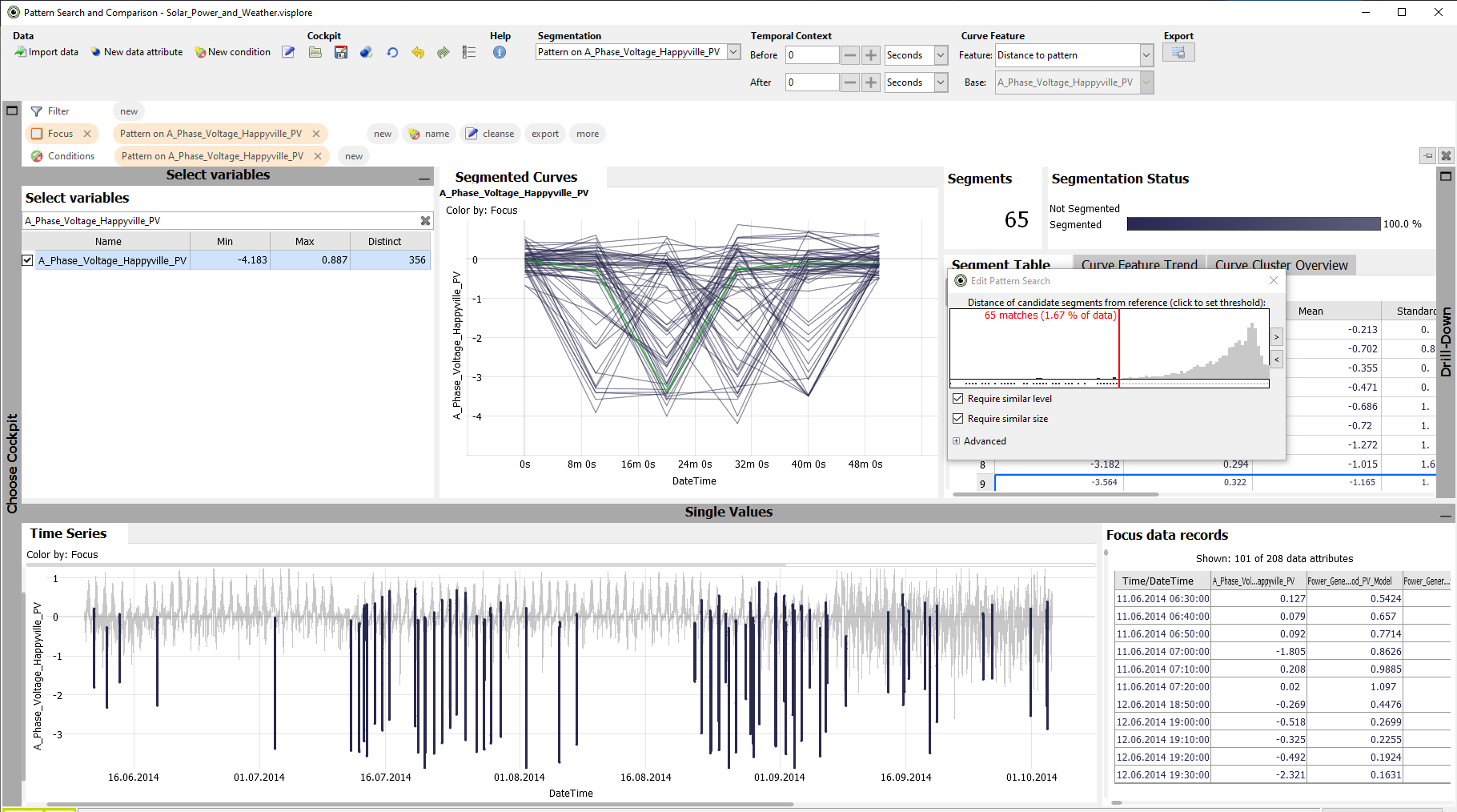
Choose a threshold so that all anomalous troughs are segmented (as in the image) and close the dialog.
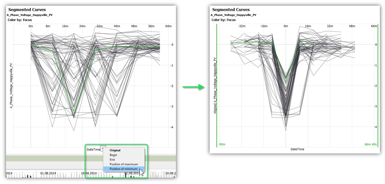
Align the segmented curves by the position of their minimum:
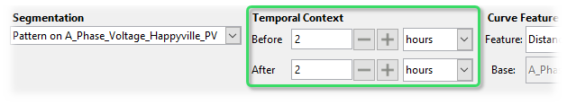
The context of the segmented patterns can be investigated by adding a temporal context using the controls in the top area of the Cockpit:
License Statement for the Photovoltaic and Weather dataset used for Screenshots:
"Contains public sector information licensed under the Open Government Licence v3.0."
Source of Dataset (in its original form): https://data.london.gov.uk/dataset/photovoltaic--pv--solar-panel-energy-generation-data
License: UK Open Government Licence OGL 3: http://www.nationalarchives.gov.uk/doc/open-government-licence/version/3/
Dataset was modified (e.g. columns renamed) for easier communication of Visplore USPs.