Analyzing correlations
This tutorial describes the basics of correlation analysis for time series data in Visplore. Here, correlation means a statistical correlation metric computed for any two signals, such as the Pearson correlation.
Any two time series that are represented as two columns of the Visplore data table can be correlated (on a per data record basis). See Example 1 of the import description for a table structure that suits the analysis of this tutorial directly, e.g. to correlate temperature and pressure in the example you see there. In case your dataset has additional categorical columns to define what the different time series are (e.g. assets as categories, in addition to sensors as data columns), you may need to use filters to correlate sensors of one asset at a time (see the filtering lesson).
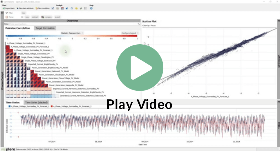
The easiest way to get acquainted with the "Correlations" cockpit is to watch the video tutorial in our Video Academy.
Start analyzing correlations
Visplore offers more cockpits than "Trends and Distributions". Each cockpit is a ready-to-use tool for a particular type of information, or particular task. You can change cockpits at any time. Any currently defined focus, filters, and all other objects you made are kept and are available in the other cockpits as well.
If not the case yet, please load the Solar Power demo dataset, as described in the beginning of lesson 1. Start exploring time series data.
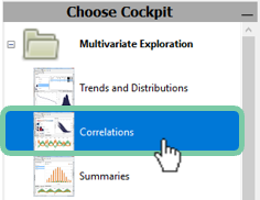
If it is not shown already, click on the gray vertical "Choose cockpit" bar on the left edge of Visplore to open the list of available cockpits. Depending on your version of Visplore, there may be more cockpits:
Double-click on the cockpit "Correlations". In case a dialog "Correlations - Role assignment" is shown, just press OK.
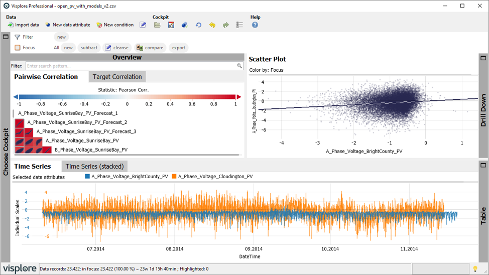
The cockpit opens and looks like the following image (with "Drill Down" panel minimized). If you just switched over from another cockpit, and you have a focus or filter defined, clear them for now (press the small "x" symbols next to the words "Filter" and "Focus" in the top of Visplore 
 )
)
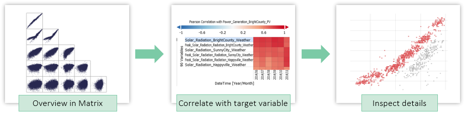
The "Correlations" cockpit is about finding correlating pairs of time series, as well as finding time series that correlate most with a specific target variable of interest. See the "Cockpits" section of the documentation to learn all details about this cockpit. Here, you learn some basic interactions.
Finding correlating pairs of variables
The "Overview" section in this cockpit initially shows a matrix of "Pairwise Correlation". Here, the first 25 time series are correlated with each other. Each pair of two time series is shown as a small plot in the matrix. Per cell, the names of the paired time series are stated above the cell, and in the right of the cell. The background color of a pair shows the correlation between the two time series: red means positive correlation, blue means negative (=inverse) correlation, white means they are independent. ">P" means that a pair does not pass a significance test, see the cockpit's detailed description.
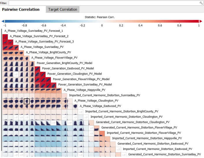
Hover some of the cells to get a detailed description of that pair as a tooltip window.
Click on cells to see the scatter plot of the clicked pair enlarged in the "Scatter Plot" view in the upper right.
Filter the matrix of displayed time series to temperature time series only, by typing "temp" in the field next to "Filter:" above the matrix.
Then, click the pair "Temperature_Outdoor_BrightCounty_Weather" and "Temperature_Indoor_BrightCounty_Weather". Visplore then looks like this:
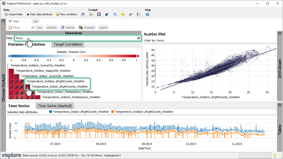
The "Scatter Plot" shows that this indoor and outdoor temperature sensor at the location BrightCounty are highly correlated, which is not surprising. However, there are several points in the middle of the visualization, that do not lie on the generally correlated point cloud. Let's inspect them in detail.
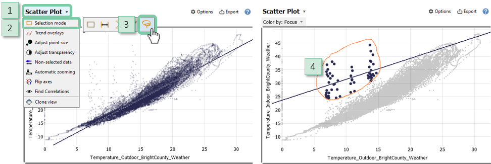
To select them properly, switch selection mode by clicking the view title "Scatter Plot", then "Selection mode", and then select the Lasso option (rightmost orange symbol).
With the Lasso tool, circle the anomalous points by dragging the left mouse button, approximately like this:
As a result of selecting these records, the correlation matrix immediately updates to consider only the points in focus. More importantly in this case, the "Time Series" visualization highlights the selected points as well using colors, which helps us to localize them in a temporal context.
Zoom in to the first two occurrences in 09.2014 by dragging a rectangle around them with the right mouse button:
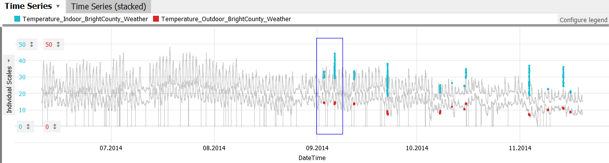
This view is interesting: the indoor temperature sensor seems to have some kind of oscillation, while the outdoor sensor recorded values regularly.
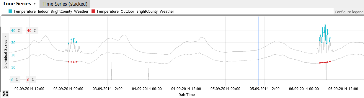
Zoom out again by clicking the button in the lower left corner of the "Time Series" view (see image above). Then, zoom in to another occurrence, to discover that the same pattern occurs several times.
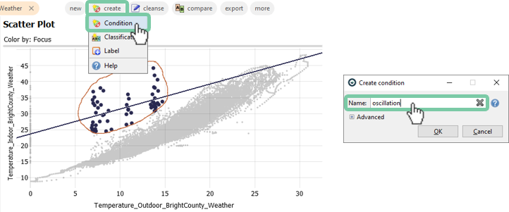
To mark this finding for later, we can label the currently selected data records as a named condition, which we can use later on, even when switching to other cockpits.
Make sure your Lasso selection is still in place as your focus, then press the "name" button in the focus bar (see image below). Choose "Condition", type the name "Oscillation" for the condition, and press OK to label it.
Labeling data by creating named conditions is an important use case of Visplore. You can use the labels for further analysis in Visplore, or export them for downstream tasks in other tools, like Excel or Python.
Hover the mouse over the named condition "Oscillation" to highlight these records in all views.
You can also click the orange "Oscillation" area in the "Conditions" bar, to do many other things with this condition. For example, you can try "Add as variable" to make the condition available as a 1/0 column that can be analyzed like any other numerical data attribute - e.g. for visualization.
Analyzing correlation with a target variable
In many cases you have a particular target variable and are interested which variables correlate with that target. For example we could ask which weather sensors correlate most with the power generation of a particular region. For such questions the target correlation functionality is helpful.
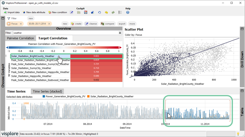
Click the "Target Correlation" tab in the "Overview" section.
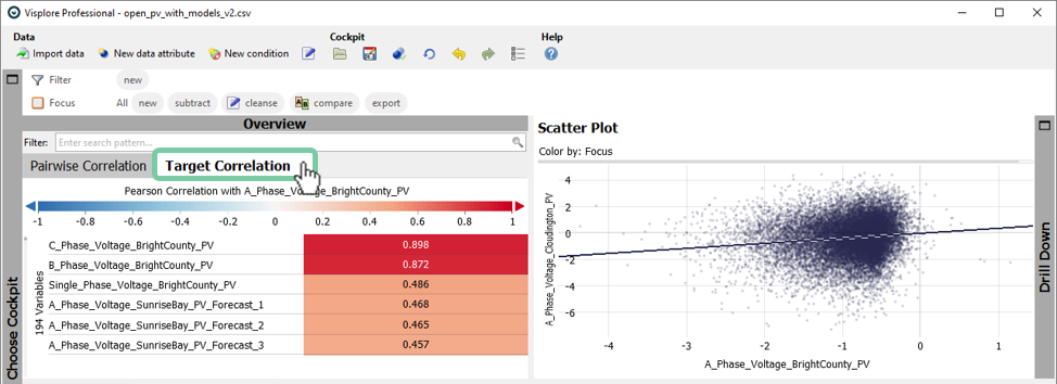
First let's specify the target variable. The target variable can be found just above the color legend. In this example we select the photovoltaic power generation of bright county.
Select the target variable by clicking on the title above the color legend. Select "Power_Generation_BrightCounty_PV"
Enter the filter "weather" to display weather related sensors only.
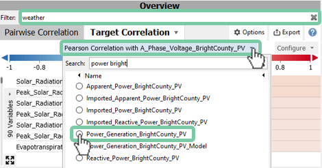
As you might have expected, the solar irradiation of bright county shows the highest correlation with the photovoltaic power generation.
Similar to other cockpits, you will find that the correlations are updated when you make a selection. For example, you can select a time period of interest in the time series view such as October and November. You will see the correlations update. The scatter plot draws the non-selected time periods in the background.
Click on "Solar_Radiation_BrightCounty_Weather" to display the correlation.
Select a time period by drawing a box in the "Time Series" view.
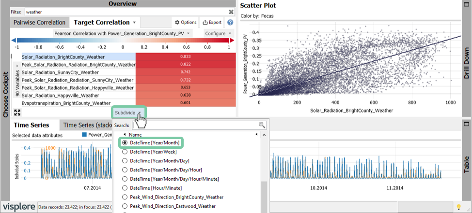
In many cases the correlation between variables is different for various parts of the data. This can be for example the season, the time of day or other characteristics may have an impact. Visplore allows you to break down those correlations easily. Let's break down the correlations adding a subdivision.
First remove your previous selection by clicking on the "x" in your focus (top left) or press the "Del" key on your keyboard.
Add a subdivision to break down your target correlation by clicking on "Subdivide" and select Year/Month.
This shows that some sensors have a varying correlation for different months. This may arouse suspicion if the correlation is real and not just occurred locally by chance. In the same manner you can compare correlations for other types of data categories such as different operating modes of industrial machines.
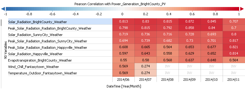
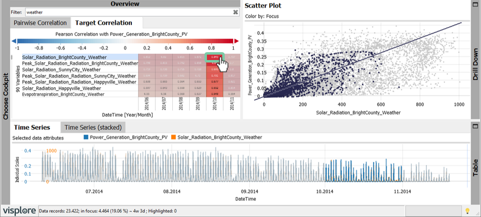
Click on subdivided correlation (e.g. October) to see the scatter plot for that particular month.
Well done! You have mastered the concept of effectively analyzing correlations in detail!
>> Continue with Next lesson: Interactive data selection
License Statement for the Photovoltaic and Weather dataset used for Screenshots:
"Contains public sector information licensed under the Open Government Licence v3.0."
Source of Dataset (in its original form): https://data.london.gov.uk/dataset/photovoltaic--pv--solar-panel-energy-generation-data
License: UK Open Government Licence OGL 3: http://www.nationalarchives.gov.uk/doc/open-government-licence/version/3/
Dataset was modified (e.g. columns renamed) for easier communication of Visplore USPs.