Interactive data selection
Visplore supports you to dynamically work with your data rather than just looking at it. Interactive data selection is a key feature for multiple reasons:
- It is a powerful tool for answering ad-hoc questions rapidly, such as "what is this clusters?" or "what happened at this point in time?". Selecting data allows you to tell Visplore what you are interested in. That's why the selection is called "Focus" in Visplore.
- It is an intuitive user interface for defining queries and filters on your data. You see immediately, what you selected and you can express complex queries within seconds and without coding.
- It is an intuitive tool for editing data manually, for example for cleansing outliers or labeling data.
- It is the basis for workflows such as correlating data across visualizations and comparing time periods.
This chapter explains the basics of selecting data in visualizations, and then focuses on practical usage patterns of interactive data selection.
IMPORTANT! A word of caution: The current selection (= the "Focus") has a big impact on the information displayed by the views! Some views treat the selection as a filter. This enables very efficient workflows, but it must be considered when interpreting and exporting results in order to avoid misinterpretations.
Whenever interpreting or exporting plots or other results such as statistics, consider the current focus and the filter!
When things "look strange" or when visualizations unexpectedly show no data at all, it often helps to reset the selection.
Selecting data visually
Most visualizations of Visplore support to select data interactively. To select data, click the left mouse button within the visualization and drag it to define the selection. The type of selection depends on the visualization. For example:
- Histograms let you specify and interval on the shown variable along the X axis.
- Bar Charts let you select one or more data categories which are represented by the bars.
- It is an intuitive tool for editing data manually, for example for cleansing outliers or labeling data.
- Heatmaps select combinations of data categories mapped to their axes.
Try selecting high values of a variable in the histogram of the cockpit "Trends and Distributions" by dragging an interval.
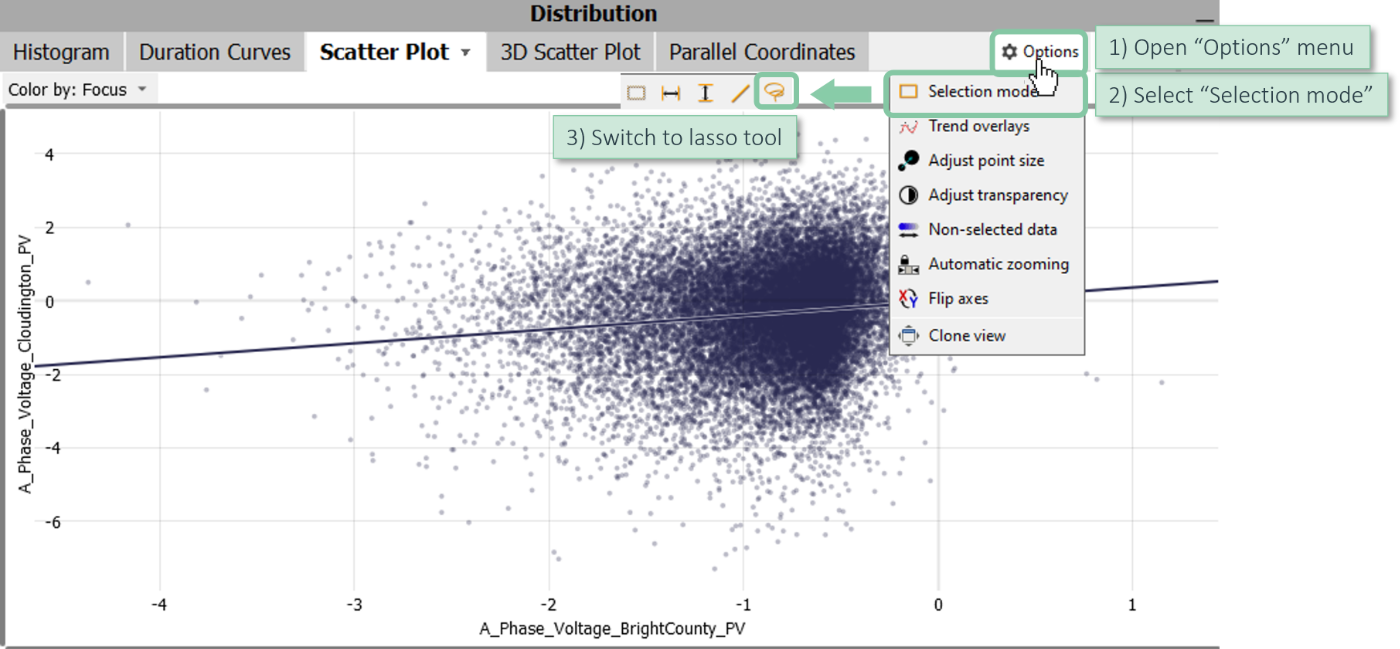
Some visualizations offer multiple selection types. For example, 2D Scatterplots offer:
- A rectangle selection. The selected data is the intesection of all samples within the intervals on the X and the Y axes.
- An interval selection on the variable mapped to the X axis.
- A straight line that selects all data on one side of the corresponding linear equation.
- A lasso selection that supports to select clusters in a free-form style
For visualizations supporting multiple selection types, the current selection mode can be set in the options menu of the view.
Open the "Options" menu and change the selection mode.
Time series plots offer the same selection types as 2D scatter plots. For example, it makes sense to switch to X intervals if you intend to select time periods without constraining the Y axis.
To interact with the orange selection handles drag the borders and move it around as a whole. Hover a selection handle to display a toolbar that offers much functionality.
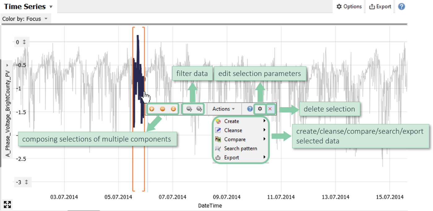
Note: A selection is more than a temporary way to highlight or filter data! Rather, it is an explicit query on the data. This query is shown in the line called "Focus" at the top of the main window of Visplore.
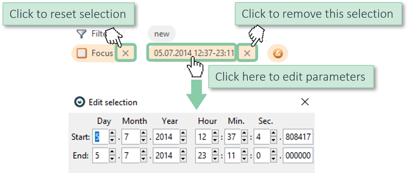
Clicking on a component of the query opens a dialog for editing its parameters, if supported by the selection type. This is not the case for complex types such as lasso selections. Furthermore, you can remove individual selection components or reset the selection entirely. A quick way to reset the selection is also by pressing the Delete key on your keyboard.
Using selection to filter data
A common motivation for selecting data is to filter it. For example:
- You can exclude outliers or anomalous periods for your analysis.
- You can select the five largest categories in a bar chart and filter away everything else.
The advantage of specifying filters interactively is to see what you are filtering and that you can more easily specify complex filters.
Click on one of the two gray icons in the selection toolbar to choose either "Filter: Exclude selected data" or "Filter: Keep only selected data".
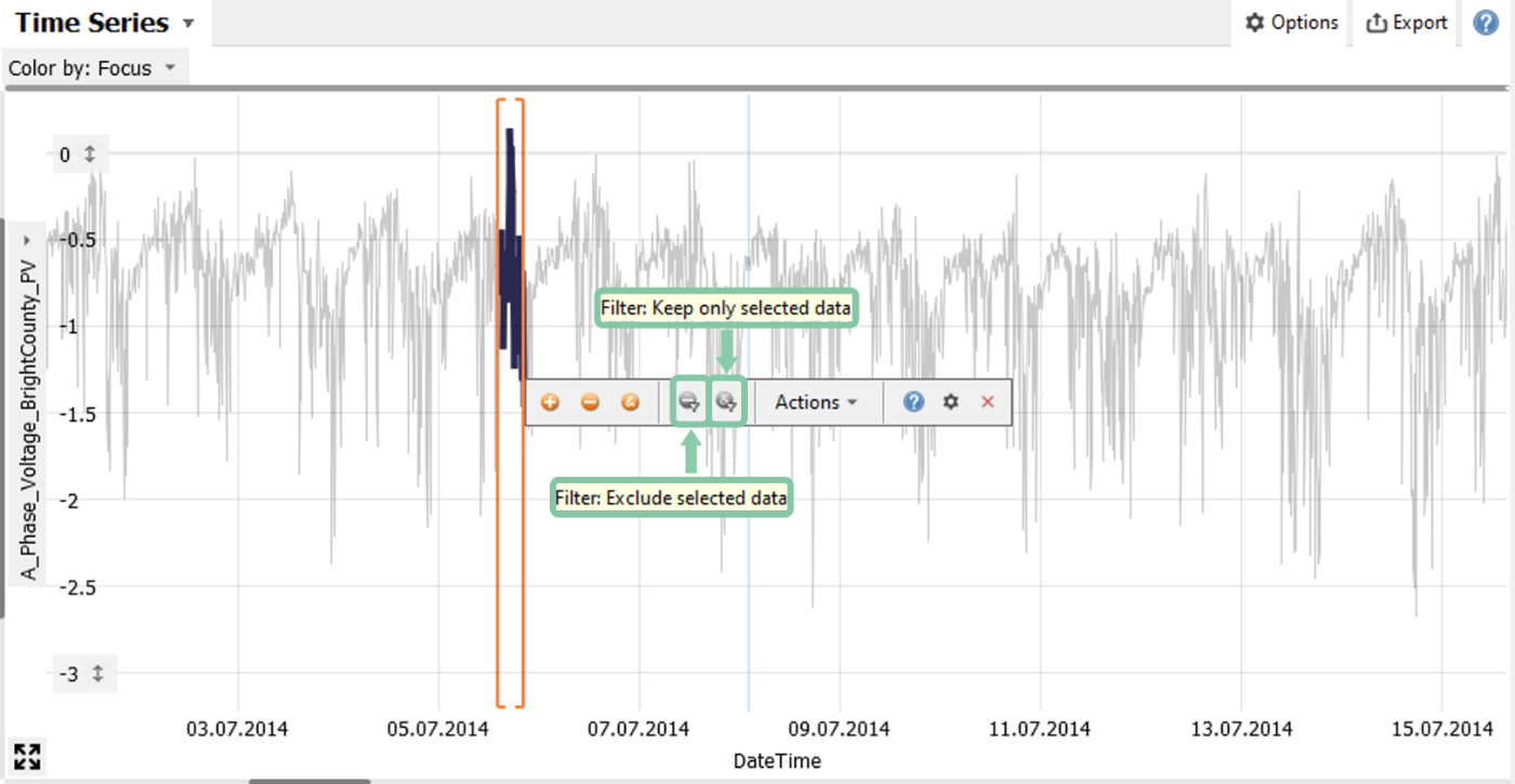
The left icon excludes the selected data, the right icon keeps the selected data and excludes everything else.
-> Try it: select some data and click on the left filter icon to exclude this data.
Alternatively, you can turn the selection to a filter by clicking on the button "new" in the filter line.
Note: Selections and filters always apply to entire data records! When you select or filter a multivariate data sample in one variable, that sample is always selected or filtered in all of its data attributes.
This behavior is fundamental for linking multiple views on the data. Some views in Visplore update automatically upon data selection and always show the selected data only, for example pivot tables. For persistently filtering data in all views, you can turn any data selection into a filter that is part of the filter line at the top of the window.
If you really intend to remove values such as outliers only in some variables while keeping the data of the same data records for other variables, consider editing the values (e.g., setting them missing) rather than filtering the data.
See the Chapter on cleansing outliers and gaps.
Analyzing selected data across views
Data selection is an important tool to make multiple views on the data work together. This enables you to correlate different types of information that would not be possible to represent in a single visualization.
Let's look at some frequent examples and try to reproduce them on your own:
Looking up the raw data:
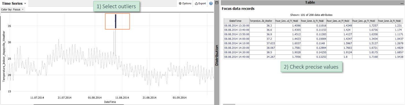
Assume you have a time series with some outliers and want to see additional information for these outliers such as the precise values.
Select the outliers in the time series plot and inspect their details in the data table at the bottom right of each cockpit.
Of course, you can also use other views to select outliers and clusters, for example 2D scatter plots, histograms, parallel coordinate plots, and some more.
When you hover over the rows of the data table, the corresponding items in the other view are highlighted (typically in blue). So you can easily match the information in both directions.
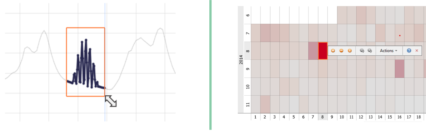
Inspecting time periods:
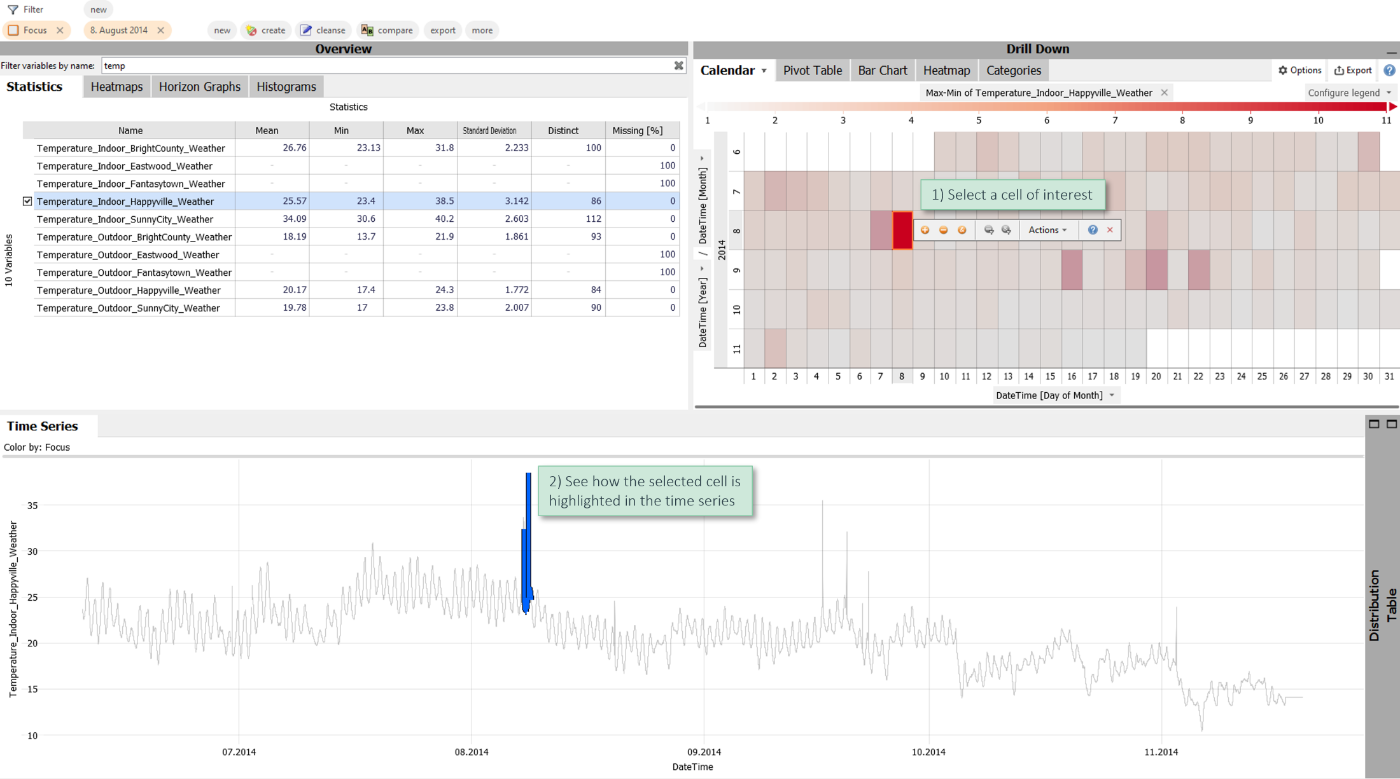
Assume you have long time series data. An effective way to find relevant periods is to look at an aggregated view of the data. In the example below, the calendar shows the difference between the maximum and minimum per day via color (red means high difference). Some days visually stand out.
Click on one of the cells/days in order to highlight them in the time series below.
There are two features to make this interplay even smoother:
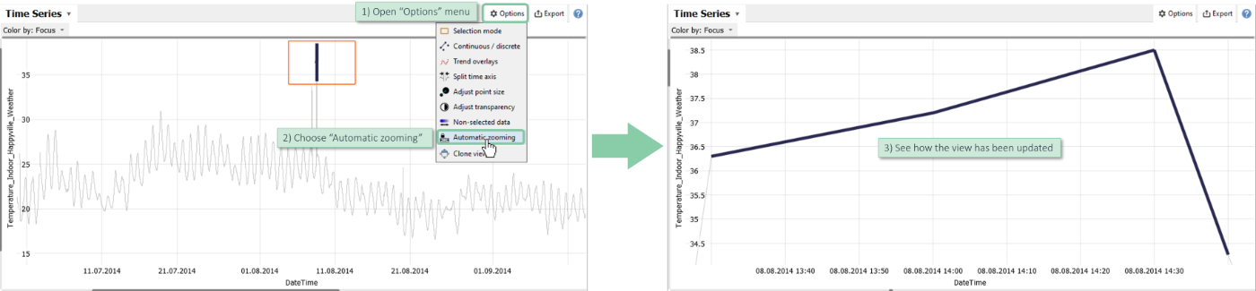
Open the view options menu and choose the option "Automatic zooming" (available in time series plots and 2D scatter plots). When enabled, the views automatically zoom to the selected part of the plot.
Open the view options menu and choose the option "Non-selected data" (available in time series plots, 2D scatter plots and histograms) to hide non selected data entirely.
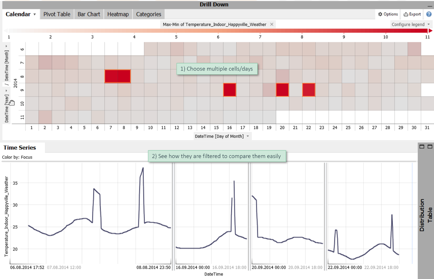
In this case, selecting data in one view (such as the calendar) filters the visualized data in the time series (or scatter plots or histograms). This way, you can easily compare some days simply by a multi-selection.
Note: The calendar is just one option of aggregating time data. Other options are bar charts by subdividing the X axis and heatmaps by subdividing either axis. Furthermore, especially powerful methods of getting an overview of many time series are heatmaps of variables and horizon graphs which allow for selecting the time period as well as the display variables by simply dragging a rectangle.
Analyzing data categories
The linked views show you how a category is distributed over time and how the variables of a categories are distributed.
Look at the example below (try to reproduce this using the shipped demo data "Manufacturing"): The bar chart at the top right shows order IDs.
Select the order ID with most produced pieces (i.e., the longest bar) and look after the details of this order ID in the three other views.
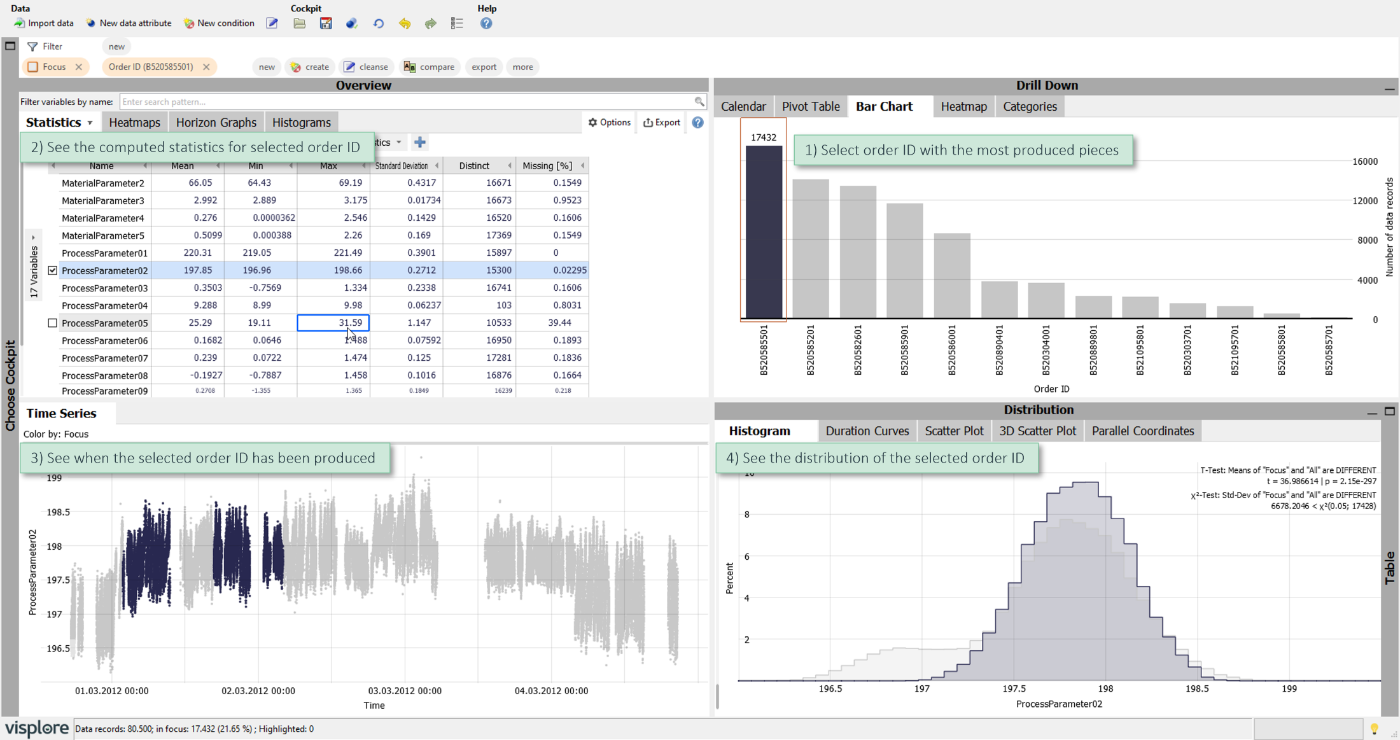
- The statistics table computes its results only for the selected order ID.
- The time series view shows, when the order ID has been produced. In this case, there was some time in between when other order IDs have been produced. It also shows the distribution of the values of ProcessParameter02 for the selected order ID.
- The histogram also shows the distribution of the selected order ID (dark gray). The light gray histogram is the distribution of the entire data including the selected order ID.
You can select categories in many other types of visualizations, such as pivot tables and heatmaps. To relate the various aspects even faster, just hovering categories with the mouse cursor highlights their data in other views (typically in blue).
Characterizing time periods and ranges:
In the latter example, you selected categories to look up details. Data selection also works in the reverse direction: You can select ranges on your variables to characterize them in other views. This allows for answering questions such as:
- When did a certain situation occur?
- How long did it occur?
- What did other variables look like during this situation?
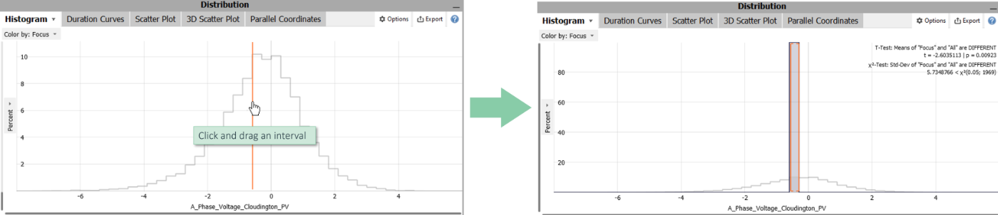
Let's look at this example: There is a selection on temperature values ranging from 43 to 50. The pivot table above (top right) lists the eight days where this situation occurred. It also shows their maximal temperatures and the number of data records, for this data corresponding to intervals of 10 minutes. The statistics per variable shows the maximal temperatures during the selected periods for each of the other temperature variables.

Note: Visplore offers even more powerful features for comparing the selected peaks of this example. Comparing data and selected events is covered in a later chapter.
Outlook
Selections are the basis for many other use cases that are described in other chapters:
- Interactive data labeling
- Cleansing outliers and gaps
- Computing new data attributes and conditions
- Comparing data categories and time periods
>> Continue with Next lesson: Interactive data labeling
License Statement for the Photovoltaic and Weather dataset used for Screenshots:
"Contains public sector information licensed under the Open Government Licence v3.0."
Source of Dataset (in its original form): https://data.london.gov.uk/dataset/photovoltaic--pv--solar-panel-energy-generation-data
License: UK Open Government Licence OGL 3: http://www.nationalarchives.gov.uk/doc/open-government-licence/version/3/
Dataset was modified (e.g. columns renamed) for easier communication of Visplore USPs.