Step by Step Guide
This guide introduces you to Visplore. It provides a step-by-step tutorial based on a demo dataset, to get familiar with the most important concepts and features.
The guide consists of a number of "lessons" that you can follow, ideally in ascending order. In the end of every lesson, you find a button to proceed to the next one. In the navigation menu on the left, you have a list of available lessons to directly continue at the point you left off.
Lession 1: Start exploring time series data
Assuming Visplore was installed by an installer, you can start Visplore via Desktop icon or via start menu shortcut. A third option available in any deployment is double-clicking visplore.exe in the directory you installed it to.
Upon startup you are greeted by a welcome dialog. The first action is loading some data from one of many sources (CSV, database, Python etc.). All sources are described in the Data Import section. Alternatively, you can load one of several demo datasets shipped with Visplore - this is what we do for this step by step guide.
Click "Solar Power" to load a timeseries dataset shipped with Visplore:
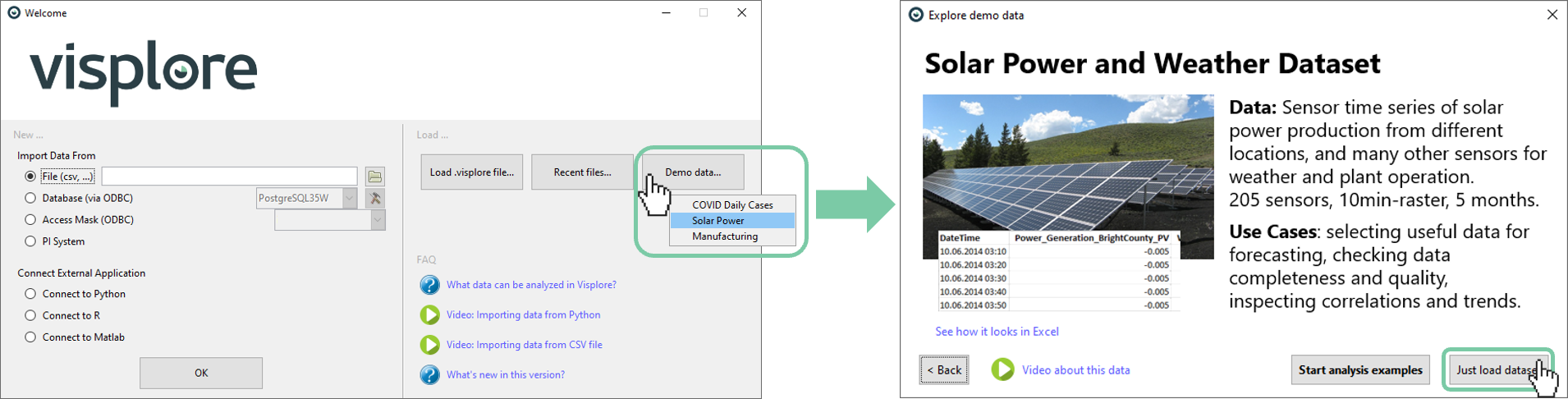
The dataset is a csv file containing about 200 time series from solar power plants and weather measurements from several locations. It is a real, anonymized dataset (credits see bottom of page). If you are interested in the file, you find it in the Data subfolder of your Visplore installation.
A first look at the data with the "Trends and Distributions" cockpit
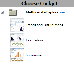
Visplore offers several starting points, hereafter called analysis cockpits to address different analyses directly without setup effort. For this demo data, the first cockpit "Trends and Distributions" is immediately started.
Once you load data from your own source, like Python, you may need to start a cockpit manually by double-clicking one of the cockpit icons in the "Choose Cockpit" bar on the left.
After a few seconds, the cockpit presents itself as follows:

The analysis cockpit is divided into several areas, some of which are closed at the beginning (these are described below). The open areas have the following functions:
- The Overview area provides the big picture for all time series. Initially, in the form of statistical summaries. Here, you select which time series are shown in the other views, as described below.
- The time series view shows the selected time series as line graph.
- The lower right view shows the value distirbutions of the selected time series in other representation, such as a value histogram, and others.
All analysis cockpits are arranged in a way that the visualized information becomes more detailed from top left to bottom right.
Selecting the displayed time series
You can display a time series in the other views by clicking its name in the overview area.
Please click on the second time series, "A_Phase_Voltage_Cloudington_PV".
Now, this time series is shown in the "Time Series" graph, as well as its "Histogram".
Sorting the list of time series
By clicking on a column header in the "Statistics" overview, you sort the time series according to that criterion. For example, it might be interesting to identify time series with particularly many missing values.
Click the column header "Missing [%]". Then, select the time series with most missing values by a click on its name ("Peak_Solar_Radiation...").
Then Visplore should look like this, indicating that this variable has no values most of the time:
|
As the example dataset contains much more time series than can be displayed at a time, you can scroll them in the Statistics overview. Either by using the mouse wheel, or using a scrollbar on the left side. Click the gray scrollbar near the left border of the Statistics overview. A bigger scrollbar appears, where you can drag the dark gray area with the left mouse button to scroll. |
|
Filtering the list of time series by name
For many analyses, it is helpful to filter the time series displayed in the Overview section. Suppose you want to limit the overview to temperature time series.
To do this, please enter "Temp" in the text box next to "Filter variables by name":
This limits the Statistics overview to those time series that contain "Temp" in their name. You can also use "BrightCounty" to restrict the list to all of that location, or "Temp Bright" to those that have both parts in the name. The statistics table reveals that the time series "Temperature_Outdoor_BrightCounty_Weather" obviously has a minimum of exactly zero.
Please select this time series (Temperature_Outdoor_BrightCounty_Weather).
Zooming and Adjusting Scales
The time series view shows that this time series drops to zero quite often. To view such periods in detail, you can zoom into the timeline.
Drag a blue rectangle around the area of interest using the right (!) mouse button.
zeige: blaues rechteck-pfeil-zoom
If you accidentally used the left mouse button, and received an orange rectangle instead of zooming, you can undo this action by using the UNDO button in the toolbar on top of Visplore  (or CTRL+Z on the keyboard).
Zooming is with the right mouse button. The left mouse button is explained in a minute.
Once the view has zoomed, you have several options for navigating in it:
Move the mouse wheel to move the display horizontally (i.e. along the time axis).
Hold down the control key ("CTRL") and move the mouse wheel to zoom in or out - at the position of the mouse cursor.
Press the button in the lower left corner to zoom out again:
Additionally, you can adjust each scale in Visplore with a control element.
Move the mouse cursor to the bottom of the "Time Series" view, and click the thin gray bar.
The appearing control element allows you to set the displayed area interactively:

Drag the left white arrow to the right, then drag the right white arrow to the left, and then move the area by dragging the gray area in between.
Open a dialog by clicking on "Configure" gearwheel on the far right and set the displayed time range manually, e.g., to 1.7.2014 to 1.8.2014.
The control element to modify scales is used in many places. It therefore pays to practice its use a few times.
Move the mouse to the left edge of the "Time Series" view, where the same control appears vertically, to adjust the scaling of the Y-axis.
You can zoom in other views as well.
In the "Histogram", drag an interval around zero with the right (!) mouse button. Then, experiment a bit with the control elements for scaling that appear along the left and lower border.
The histogram automatically adjusts the discretization of the value range and also adapts the y-axis accordingly. To fix scales, use the lock symbol on the control element. This prevents the diagram from automatically adapting the scale when you select another time series.
Additional view: Calendar
The analysis cockpit offers many additional visualizations.
Click the gray vertical bar labeled "Drill-Down" at the upper right border of Visplore.
Then, Visplore should look like this:
The newly opened "Drill-Down" block aggregates the (one) selected time series by categories. The first view is a calendar, where rows are months/years, and columns are days of the month. The color (and number label, if space permits) initially shows the Mean (=average) value of that day. According to the color scheme, days with a high average temperature are dark red, and cooler days are white-ish. You can adjust the color scheme.
Click "Configure legend" on the right, above the color legend, and select the option "Change colors".
In the dialog you can select one of many pre-defined color schemes, for example, Blue-White-Red:
Now, in the Statistics overview, select the time series "Power_Generation_BrightCounty_PV". The text filter may help you.
You see how all visualizations, including the calendar, adapt immediately. For power generation, daily sums may be more interesting than daily means.
Click the name of the color legend "Mean of Power_Generation_BrightCounty_PV", and select Sum as aggregation.
The calendar then shows daily sums. By the way, clicking "Configure Legend" and choosing "Adjust range.." lets you adjust the value range of the color scheme using the same control element you used for adjusting the scaling of (time) axes.
Lesson 2: Select and view data subsets
A central feature of Visplore is the ability to focus the analysis on a specific subset of the data at any time. This can be a certain period of time, a category (e.g. all weekends), a cluster, or certain outlier values. To keep the specification of this Focus as intuitive as possible, and to use insights from the visualization in doing so, data can be marked directly in the views - using interactions known from drawing programs.
Selecting time periods in the calendar
In the previous example, the calendar showed significant differences in daily sums.
Click on July 3rd with the left mouse button.
This day should then be marked by an orange rectangle, while all other days should be grayed out, to distinguish Focus from context.
More importantly, the other views have changed as well:
- The "Statistics" overview has updated to show only the statistics for that day.
- In the "Time Series", this day is shown in full intensity while the rest is grayed out.
- The "Histogram" shows the value distribution of that day in full intensity, vs. the histogram of the entire data population.
- The statusbar at the lower border of Visplore shows - next to the overall number of data records - the number of data records "in Focus". Moreover, the amount of time corresponding to these records in Focus is shown, assuming a regular raster.
The focus always describes a subset of data records (= whole rows of the imported dataset), regardless of which variable was used to define it.
This means, that selecting a different time series in the "Statistics" overview doesn't have an effect on the selected subset of data records - the records will still be highlighted.
As discussed in the last section, you can zoom in on areas of interest, e.g., by dragging a rectangle with the right mouse button. This shows that July 3rd had no extreme maximum, but an continously high production. You can also make the Time Series view zoom in automatically when defining a new focus:
Click the title "Time Series" of the view, and select the option "Automatic zooming".
With this, defining a new focus will make the "Time Series" view zoom in to it.
Click the label "7" in the calendar on the left of the matrix row representing July. This selects the whole of July, zooming accordingly:
View records in focus as table
You can always see the raw data values in Visplore on demand.
Click the vertical gray bar "Table" at the lower right border of Visplore.
This opens a data table view, showing the data records that are currently in focus. Specifically, when you have not specified a Focus, all rows are in Focus, and thus shown in the table. Use the scrollbars to navigate in the table, or use the mouse wheel for vertical scrolling.
Clear Selection
In the upper area of Visplore, the current selection of data records (i.e., the focus) is described in a textual form. The area is referred to as "Focus bar". Among many other actions, you can clear the selection (if it is not already empty):
Click the small "x" in the orange "Focus" blob in the top left. Alternatively, you can press the DELETE key on the keyboard ("Entf" on German keyboards).
Once cleared, all records are in focus again and shown in fully intensity, like when you started the cockpit in the beginning.
Selecting and Changing Intervals
You can also select data in other views.
Click with the left mouse button in the middle of the "Histogram" view, and drag an interval towards the right.
This selects all records, where the value of the displayed time series belongs to the drawn interval (here: "Power_Generation_BrightCounty_PV"). You can adjust the interval at any time:
Try dragging the left orange border, then the right one, changing the size of the interval. Then, drag the space between the interval borders to the left or right to move it.
Often, you need precise borders. Click the gearwheel icon next to the orange interval. (If you don't find it, hover the mouse over the interval first).
This allows typing the interval border values by hand. Alternatively, you find this dialog by clicking the orange description of the interval in the focus bar.
Free selection of records in the Time Series view
Similar to the interval, you can select records in the "Time Series" view.
Clear the Focus (e.g. by pressing the DELETE key), then drag a rectangle with the left mouse button in the "Time Series" view, e.g., around some spikes.
The handling is analogous to intervals in the "Histogram".
Move the rectangle, and drag its borders. Then press the gearwheel icon to type its border values manually. Here, need to specify whether you change the border values regarding the time (x-axis) or value (y-axis) part of the rectangle. For example, try to select those times during the two days in July, that have significantly lower power generation than the rest, but are above zero:
Sometimes you don't want to use a 2D rectangle to select, but only select along one dimension. For these, various other selection tools exist.
Click the view title "Time Series", then "Selection mode". Then, click on the horizontal interval icon (second from left):
Now the selection only affects the time axis. In the same manner, the third from left selection mode only selects in the vertical value dimension.
Comparing time series
Up to now, only one time series was considered at a time. Often, you need to compare multiple time series to relate patterns or events like structual breaks.
Let's consider temperature time series. Type "Temp indoor" in the "Filter variables by name" field of the Overviews. Then, select "Temperature_Indoor_Happyville_Weather".
Select a second time series
Click on the checkbox next to the time series "Temperature_Indoor_SunnyCity_Weather".
Now both time series are selected. Instead of the checkboxes, you can also hold the CTRL key while clicking the name of the second time series. Or, you can also drag a vertical line across two time series names to select two at once.
After selecting a second time series, Visplore should look like this:
Time Series view with multiple time series
Both selected time series are distinguished in the "Time Series" view by different colors. The coloring is arbitrary at first.
Click on the colored square next to one of the time series names to change its color in a dialog:
Depending on the value ranges of the two time series, the scales shown in color on the left are aligned like in this example, or not. To enforce a common scale, or normalize the time series, click on "Individual Scales" to find options for these. When you use individual scales, clicking one of the colored range borders allows you to adjust the scaling using the familiar control element.
As an alternative to the superimposed "Time Series", it is also possible to display the time series below each other in the diagram "Time Series (stacked)".
Switch to the tab "Time Series (stacked)".
Here, patterns in the individual time series can be seen more clearly, such as spikes or gaps. The time axes of the plots are linked.
Zoom in on of the spikes by dragging a rectangle with the right mouse button in one of the plots.
The timeaxis of the second plot zooms in accordingly. The vertical axes can be adjusted individually.
2D Scatterplot
Another common visualization of two time series is the "Scatter Plot".
Show the "Scatter Plot" diagram by clicking the corresponding tab in the group:
This diagram orthogonally plots the values of the two time series against each other. Each point is a data record. The temporal order is not shown, but correlations and correlating subsets can thus be seen much more effectively than in the "Time Series" view. Like all views, the "Scatter Plot" is linked with the other visualizations:
Move the mouse pointer across days in the calendar.
The data of the corresponding days is highlighted in the "Scatter Plot" (as well as in other views like the "Time Series"). This way, a relationship between a time period and a value distribution can be seen very rapidly.
The "Scatter Plot" also shows a linear regression line between the two variables, indicating a possible linear relationship.
Hover the mouse pointer over the regression line, to see the equation of the regression line in a yellow tooltip window.
In the view menu (click the view title "Scatter Plot"), you can configure the visualization like flipping the axes, or changing the degree of the regression polynomial to see nonlinear relations.
Visualize a quadratic regression polynomial (see image).
Several points in the "Scatter Plot" seem to lie exactly on one line. To examine this effect, you can select data records in this view as well, for example, using a selection rectangle similar to the "Time Series" view. However, for pattern of a shape like this, a free-form selection is more handy.
|
Click the view title "Scatter Plot", then "Selection mode". From the options, choose the one shaped like a lasso (see image). With the Lasso tool, drag a shape with the left mouse button that contains the points in the line pattern. Maybe you need one or two attempts at first to get the shape right. Remember that you can use the UNDO function, or clear the selection (DELETE key) to start over. |
|
Once the line patterns are selected, the other views provide interesting information on these records. It is 51 records (see statusbar at the bottom). Their temporal distribution is evident from the calendar, as well as from the "Time Series (stacked)" views. It seems to be the spikes from the "Temperature_Indoor_Happyville_Weather" time series. The table in the lower right shows that the value for the two time series seems to be identical at these 51 points. This is confirmed by the statistics for the two time series in the overview (top left). Apparently, this seems to be a data artifact.
This rapid interplay of visualizations is a key feature of Visplore. Discover a pattern - select it - and immediately investigate it in other views.
Lesson 3: Overviews of many time series
So far, we used the "Statistics" overview to look at many time series. There are several other, more graphical overviews. For example, looking at the temporal distribution of missing values, or trends in the data. For this, see the overview "Heatmaps".
Heatmaps - an aggregated temporal or categorical overview
Please clear the time series name filter in the field "Filter variables by name" to see all time series gagain. Also, clear the "Focus" if you have any (e.g. DELETE key or x-symbol near "Focus") to see all records in full intensity again.
Then, click the second overview tab "Heatmaps".
In this view, each row is a time series. Each column corresponds to one day (initial aggregation level may be different for other datasets). The color indicates whether the mean (=average) value of a day is above the mean value of the entire time series (red), similar to the overall average (white) or below the overall average (blue). In other words: in blue periods the time series is low on average, in red periods it is high on average. Black cells indicate days without valid values (100% missing values).
The list of time series is automatically ordered such that strongly correlating time series are
next to each other. This reveals, for example, that certain days are high/low in several
time series at the same time, hinting at a possible correlation.
Scroll the scrollbar left of the view up and down a bit. Then, try filtering the time series list by typing "Temp" in the field "Filter variables by name".
Now, we only look at temperature time series with roughly the same value range. It may make sense to view them in their original scaling.
Click the label of the color legend "Mean (z-standardized)", then choose "not normalized", to switch from the normalized color scale to the original one in degrees celsius.
This reveals that the temperature time series have two distinct value ranges.
Like in the "Statistics" overview, you can select one or multiple time series in the "Heatmaps" to inspect them in other views.
Select a few time series and compare details in the "Time Series" view. You may need to zoom in (drag rectangle with right mouse button).
|
Moreoever, the partitioning of the x-axis can be changed. For example, average day patterns may be interesting for the temperature time series. Click the lower label of x-axis "DateTime [Year/Month/Day], then "Switch category". From the list of data attributes, select "DateTime [Hour]" to partition the axis by the 24 hours of the day. (You may need to scroll down a bit to find "DateTime [Hour]", or use the text filter to search for "hour" in the dialog.). |
|
Note: a shortcut for switching the category, is pressing the small downwards arrow icon right next to the axis label. This opens the same dialog as pressing the name of the axis label, then "Switch category", but needs one click less.
Now switch the normalization for the color legend back on, by clicking the color legend label, then selecting "Normalization / z-standardized".
Apparently, almost all temperature sensors have a distinct daily pattern, but not all of them have their maximum at the same time.
You can also subdivide the axis by multiple data attributes. Hours may be too coarse, for example.
|
Move the cursor to the lower area of the view, then click the "plus" symbol that appears on the right side of the x-axis label "DateTime [Hour]". Then, select "DateTime [Minute]" from the list. Then, the x-axis is partitioned more finely, but still cyclic. |
|
Remove one of the two "partitioners" of the axis, by clicking their axis label, then "Remove". The other one, please switch to "DateTime [Year/Month/Day/Hour]".
This may take some time, as the whole time range is now subdivided linearly, down to hours of every day.
To focus on a particular, shorter time range, select a time period in the "Time Series" view below (left mouse button).
You can use filtering (details see a later chapter) by using a symbol that appears in the "Heatmaps" view, when computing the visualization takes longer (see image below). Afterwards, all visualizations in Visplore only consider the data that pass the filter, which speeds up the computation and shows that period in detail in the "Heatmaps".
|
To remove the filtering again, press the small "x" next to the word "Filter" in the filter bar in the top of Visplore (see image). |
|
You just learned several very important control elements for aggregated visualizations in Visplore. Identical elements and workflows can be found in the "Drill-Down" views in the upper right part of Visplore, once opened. In particular, the views "Bar Chart", "Heatmap", and "Categories". Try these out as well, and experiment with the partitioning a bit, to get an idea of the pivot table/aggregation functionalites of Visplore.
Horizon graphs - a non-aggregated overview of many time series
This view provides a chronological overview of many time series that preserves extreme values and time series patterns better than aggregated views. Also, relationships and effects that appear with a certain delay in other time series become evident as well. This makes the view particularly useful for root-cause-analysis and explaining errors in continuous processes.
To understand the overall idea of the view quickly, open it on some familiar part of the data. Filter the list of time series by typing "Temp" in the field "Filter variables by name". Then, use the left mouse button to select a time interval in the "Time Series" view. Note how the Horizon graphs automatically zoom in, to show the selected records close-up. Zoom in to the selected part in the "Time Series" view, so you can relate the familiar "Time Series" view to the "Horizon graph":
Now let's interpret the visualization:
- Similar to the "Heatmaps" view, red color means high values (above average), blue means low values (below average), white is average. Black means missing values.
- The value of the time series (y-axis) is colored step-wise in intervals. The intervals are drawn stacked on top of each other. This allows to encode everything from extremely low to extremely high on a very small space - which is ideal for an overview.
Order the list of time series by similarity, by pressing the "Variables" button on the left, then "Order by / similarity". As a result, time series with similar patterns are arranged next to each other. This reveals groups of similar time series.
The most important interactions with the view are:
- Click the name of a time series to display it in other views. Use the checkmarks for multi-selection
- Zoom in by dragging an area with the right mouse button. Scroll sideways using the control element at the lower edge of the view. Zoom out with the button in the lower left corner of the view.
- Change the color scale by pressing "Configure legend" in the top-right corner.
- Switch the normalization of the time series off when you have similarly scaled time series, by clicking the color legend label "Horizon graphs (z-standardized"), then "Normalization / no normalization".
- Rearrange the order of the time series manually by Drag-and-Drop of the small squares between the name of a time series and the visualization upwards or downwards.
- Select a time period in the visualization by dragging a rectangle with the left mouse button.
- Finding correlations with a specific pattern of one time series: Select a time period of one time series by dragging a line with the left mouse button in the visualization of one time series (important to stay within the one row and not touch others with the line). Then, press "Find Correlations" that appears next to the orange selection rectangle. This orders all time series by their correlation to the selected pattern in the selected time period. This is particularly useful for finding possible explanations:
Histograms - an overview of (differences in) value distributions
Another helpful overview can be found in the "Histograms" tab. Here, the distributions of the time series are shown using small histograms.
Most importantly, when a focus is defined, the list of time series is automatically ordered by how much the distribution of the focus differs from the rest of the data. This is useful for finding possible reasons for certain patterns that you select.
Remove the text filter of time series names, and select the months October and November. For example, by using the calendar: drag a line with the left mouse button that spans the month labels 10 and 11 on the calendar's y-axis.
As a result, the "Histograms" of those time series are ranked top, that have extraordinary value distributions in October and November. Here, these are certain temperature and humidity time series.
Note that you can also compare more than two categories or time periods by colors in the histograms. For example, to find which time series have changed most after something in the process was changed. See the chapter on "Comparing time series" for details.
Lesson 4: Data filtering
Data filters allow you to selectively hide parts of the data from all visualizations and calculations in the cockpit. In contrast to the data selection (focus), where entries which are not selected are still displayed as gray context, filtered entries no longer appear in the visualizations.
Filtering unwanted parts of the data out
One usecase of filtering is to exclude unwanted parts, like selected outliers via the filter to have the full display resolution available for plausible data.Select the time series "Temperature_Indoor_Happyville_Weather" in an overview (left click on the name in an overview like "Statistics"). Clear the focus (DELETE key), if any, and make sure the "Time Series" view is zoomed out (button in lower left corner).Then, select a spike in the "Time Series" view by dragging a rectangle with the left mouse button. (Remember, the selection tool can be selected by clicking on the view title "Time Series", then "Selection mode").
Now press the small gray icon of the filter with the minus symbol, appearing next to the selection rectangle to filter these records out:
You can repeat this selecting / filtering for any other spikes and outliers you would like to remove. After filtering all the spikes out, it should look like this:
Filtering always removes entire data records (= table rows) from the data table. This means that removing those spikes has also removed possibly useful values from the other time series at these points in time. See the chapter on "Data cleansing" to learn about removing values of just the affected time series while keeping the other time series intact.
Let's clear the filter again. Press the small "x" symbol next to the word "Filter" in the filter bar at the top of Visplore, and the records with the temperature spikes are back.
Filter to limit the analysis to a relevant subset of the data
Another important usecase of filtering is limiting the analysis to a subset of the data records, like some categories, or time periods. There are multiple ways to achieve this:
Specify filters by hand, like in Excel
One option to define a filter is choosing categories, time periods, or value intervals to keep.
Press the "new" button of the filter bar on top of Visplore, then type "date" to filter the list, and select the data attribute "DateTime [Month]". Press ok. Next, mark the checkboxes of the months 7 and 8, to keep just July and August. You immediately see the effect on the whole cockpit. Press OK to confirm.
Now modify the filter by clicking on its orange representation "July-August" in the filter bar. There, select September as an additional month and close the dialog by pressing the red X.
Use the "new" button in the filter bar, to refine the filter further. Choose the time series "Temperature_Outdoor_BrightCounty_Weather", then specify the interval 10 to 20 (degrees) to keep. Select the time series "Temperature_Outdoor_BrightCounty_Weather" in an overview, to look at it. Now only times are analyzed, where the temperature sensor was in that interval, between July and September.
Specify filters by interactive data selection
Alternatively, any current definition of the focus can be used to refine the filter.
Drag a rectangle with the left mouse button in the "Time Series" view to select some of the records. Then, click the "Focus" button in the focus bar, then choose "Reduce to focus":
This has added the focus as an additional part to the filter bar, reducing the kept data records further. Any of these filter parts can be modified in retrospect by clicking on their orange representation, or removed by pressing the small "x" on their right.
Remove the middle part, e.g., the temperature interval by pressing its small "x":
Lesson 5: Switching cockpits (Example: Correlations)
Visplore offers more cockpits than "Trends and Distributions". Each cockpit is a ready-to-use tool for a particular type of information, or particular task.
You can change cockpits at any time. Any currently defined focus, filters, and all other objects you made are kept and are available in the other cockpits as well.
If it is not shown already, click on the gray vertical "Choose cockpit" bar on the left edge of Visplore to open the list of available cockpits. Depending on your version of Visplore, this may contain other cockpits as well:
Double-click on the cockpit "Correlations". In case a dialog "Correlations - Role assignment" is shown, just press OK.
The cockpit opens and looks like the following image. If you just switched over from another cockpit, and you have a focus or filter defined, clear them for now (press the small "x" symbols next to the words "Filter" and "Focus" in the top of Visplore.)

The "Correlations" cockpit is about finding correlating pairs of time series, as well as finding time series that correlate most with a specific target variable of interest. See the "Cockpits" section of the documentation to learn all details about this cockpit. Here, you learn some basic interactions, and using the cockpit in combination with other cockpits.
The "Overview" section in this cockpit initially shows a matrix of "Pairwise Correlation". Here, the first 25 time series are correlated with each other. Each pair of two time series is shown as a small plot in the matrix. Per cell, the names of the paired time series are stated above the cell, and in the right of the cell. The background color of a pair shows the correlation between the two time series: red means positive correlation, blue means negative (=inverse) correlation, white means they are independent. ">P" means that a pair does not pass a significance test, see the cockpit's detailed description
.
Hover some of the cells to get a detailed description of that pair as a tooltip window.
Click on cells to see the scatter plot of the clicked pair enlarged in the "Scatter Plot" view in the upper right.
Filter the matrix of displayed time series to temperature time series only, by typing "temp" in the field next to "Filter:" above the matrix. Then click, the pair "Temperature_Outdoor_BrightCounty_Weather" and "Temperature_Indoor_BrightCounty_Weather". Visplore then looks like this:
Basically, this indoor and outdoor temperature sensor at the same location are highly correlated, which is not surprising. However, there are several points in the middle of the visualization, that do not lie on the generally correlated point cloud. Let's inspect them in detail.
To select them properly, switch selection mode by clicking the view title "Scatter Plot", then "Selection mode", and then select the Lasso option (rightmost orange symbol).
With the Lasso tool, circle the anomalous points by dragging the left mouse button, approximately like this:
As a result of selecting these records, the correlation matrix immediately updates to consider only the points in focus. More importantly in this case, the "Time Series" visualization highlights the selected points as well using colors, which helps us to localize them in a temporal context.
Zoom in to the first two occurrences in 09.2014 by dragging a rectangle around them with the right mouse button:
This view is interesting: the indoor temperature sensor seems to have some kind of oscillation, while the outdoor sensor recorded values regularly.
Zoom out again by clicking the button in the lower left corner of the "Time Series" view. Then, zoom in to another occurrence, to discover that the same pattern occurs several times.
To mark this finding for later, we can label the currently selected data records as a named condition, which we can use later on, even when switching to other cockpits.
Make sure your Lasso selection is still in place as your focus, then press the "name" button in the focus bar (see image below). Type the name "Oscillation" for the condition, and press OK to label it.
Labeling data by creating named conditions is an important use case of Visplore. You can use the labels for analysis in Visplore, or export them for downstream tasks in other tools, like Excel or Python.
Hover the mouse over the named condition "Oscillation" to highlight these records in all views.
You can also click the orange "Oscillation" area in the "Conditions" bar, to do many other things with this condition. For example, the option "Create Classification" makes it available as a categorical data attribute, which you can use for coloring views by, or for partitioning data in aggregated views.
Switching back to another cockpit
Now let's switch back to the "Trends and Distributions" cockpit, to investigate further if other sensors from the location "Bright County" have similar anomalies.
Click the vertical gray bar "Choose Cockpit" at the left border of Visplore. Then, double-click the cockpit "Trends and Distributions". If a dialog named "Trends and Distributions - Role assignment" appears, just press OK.
The cockpit opens, possibly looking the same way as you left it before. But this time, note that we have taken along the named conditions, and possibly also a focus and filter from the Correlations cockpit.
Now clear any focus and filter that you may have (press "x" near Focus and Filter, if any).
Click the "Horizon graph" view in the "Overview of variables" section, and type "Bright county weather" in the "Filter variables by name" field to see only time series of the Bright County location. Visplore should look like this:
To see if oscillation events happens in more sensors at once, we need to zoom in a bit.
Click the "Oscillation" condition, then choose "Put in focus" to focus on the records of the condition.
Make sure, the time series "Temperature_Indoor_BrightCounty_Weather" with the oscillations is selected, so that it's shown in the "Time Series" view, and the oscillations are highlighted.
Zoom in to the first bigger oscillation spike by dragging a rectangle with the right mouse button:
Now we want to select the period around this oscillation event. Click the view title "Time Series", then "Selection mode", then select the horizontal interval tool (2nd from left).
Drag a line from left to right with the left mouse button, making sure to have some time before and after the oscillation in focus as well (you may need to zoom out a bit first to achieve this, using CTRL + mousewheel). Note, how the horizon graph shows all bright county weather time series of your selected period immediately:
The image shows that the indoor sensor of Bright County is the only one showing oscillation at that exact time. Note how the series "Evapotranspiration_Bright_County_Weather" also seems to oscillate, however at a slightly later time.
Switching cockpits at any time allows to effectively combine the interaction and visualization tools, as was described in this example.
Lesson 6: Exporting images and data
Visplore supports multiple ways of exporting information. The most important ones are exporting images, and exporting data tables.Export Diagrams as Image
It is possible to export each diagram in Visplore as an image. Let's export a Scatter Plot, as found in the cockpit "Trends and Distributions", or "Correlations".
Ensure the Scatter Plot is visible, by selecting two time series, and clicking the view tab "Scatter Plot". Then, click the view title "Scatter Plot", and click the last option "Image export".
The dialog allows to change parameters of the image export:
- Choose the target of the export. This can either be "Clipboard" (default) or "File".
- Preview of the image to be exported in the full resolution.
- Overview of the image, can be used to navigate in the full resolution preview.
- Change parameters such as the resulting image size, visibility of parts of the diagram (e.g. the color legend), or other appearance aspects (e.g. the used font).
Confirm the export by clicking "OK" in the dialog.
By default, this results in the image being copied to the clipboard. The image can then be pasted into other applications, such as Microsoft Word or Excel, by using Ctrl + V.
Export Data of Diagrams
Visplore offers numerous options for exporting selected raw data as well as aggregated values.
Export the data of the displayed "Statistics" table to the clipboard and paste the resulting table into another application of your choice (e.g. Microsoft Excel):
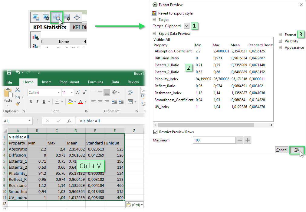
Similar to the image export dialog, the data export dialog allows to change some parameters of the export:
- Choose the target of the export. This can either be "Clipboard" (default) or "File".
- Preview of the data table to be exported.
- Change parameters of the export such as the format (e.g. the column separators), visibility of parts of the table (e.g. the diagram title), or other appearance aspects.
Export Selected Data Subset
The currently selected data subset (i.e. the data in "focus") can be exported by pressing the "export" button in the focus bar, either to the clipboard, or to a file.
Export selected data to clipboard: By pressing the button in the title bar, the data records in focus are copied to the clipboard, in one of three ways. Then they can be inserted directly into tools such as Excel.
- as indicator variable (0/1): This exports a single, new time series as a column that is as long as the entire table, but has a "1" value in those rows that are in focus (i.e. have been selected). For non-selected records, the indicator time series has a value of "0". This column can be inserted directly in tools such as Excel next to the original table, for example, to process the selection information further using formulas.
- as indicator variable (0/1) with time stamp and user-defined data attributes: In addition to the indicator time series, the respective time stamp (date/time) is written into a second column. Additionally, any user-defined data attributes such as named conditions, classifications, and predictions of trained regression models are exported.
- Data records in focus (all data attributes, including user-defined): The actual values of the selected times are exported in tabular form. Rows of the table are only the records in focus, columns are all data attributes that are available in the cockpit (i.e. variables, categories). Additionally, any user-defined data attributes such as named conditions, classifications, and predictions of trained regression models are exported.
Export selected data as CSV: Exports records in focus to a csv-file. After selecting the export format and specifying a file name, the actual values of the selected records are exported in table form. This also includes user-defined data attributes such as predictions of trained regression models. Rows of the table are only all times in the focus, columns in this case are all imported time series (that is, independent of role assignment).
Using the "export" action in the focus bar is a simple way of making the results of data labeling and data editing available for other tools.
Exporting data table and view tables to Python, R, Matlab
See the API documentations of these connectors for examples, how to retrieve Visplore data from these environments
Lesson 7: Saving and Loading Cockpit Sessions
In addition to exporting data and images of diagrams in a Visplore cockpit, the state of the current analysis session can also be saved as a whole - and can be restored at a later time.
Click on the button for saving a cockpit session, which opens the save dialog:
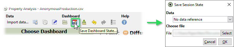
The dialog allows to choose whether and how the underlying data should be referenced, as well as the location and name of the stored session file.
Choose "Include data reference" in the "Data" box, select where the file should be stored and confirm by clicking "OK".
Saving a cockpit with an included data reference means that the currently loaded data is not stored in the saved session, but only a reference to its location. In the case of the imported CSV file, the absolute path to the file is stored in the session, and imported again when loading the session at a later time.
Close the current Visplore instance and start it again.
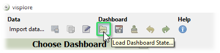
Load the previously stored cockpit session via the corresponding button in the Visplore toolbar:
When loading the cockpit session again, notice that the referenced data is automatically imported before starting the cockpit. Visplore supports following ways to handle data references:
- Include data reference: The original location of the imported dataset is stored as reference in the saved session and imported when loading the session at a later time (as in the previous example).
- Embed data: The imported data is embedded into the cockpit session.
- No data reference: No reference to the imported data is saved. In this case, a cockpit session can be loaded if the currently imported data has the same data attributes as when saving the session. This allows you to save a cockpit session as a "template": if the imported data attributes match, the saved cockpit configuration can also be restored for a different set of data records.
Note that Visplore sessions can also be started by a double click in the file explorer, if Visplore was installed by an installer.
License Statement for the Photovoltaic and Weather dataset used for Screenshots:
"Contains public sector information licensed under the Open Government Licence v3.0."
Source of Dataset (in its original form): https://data.london.gov.uk/dataset/photovoltaic--pv--solar-panel-energy-generation-data
License: UK Open Government Licence OGL 3: http://www.nationalarchives.gov.uk/doc/open-government-licence/version/3/
Dataset was modified (e.g. columns renamed) for easier communication of Visplore USPs.