Analyzing many events or batches with curve-typed data
Pro Analyzing curve-typed data is only available in Visplore Professional.
In addition to numerical and categorical data analysis, it is possible to analyze curve-typed data in Visplore. The curves can be visualized in Visplore Professional and correlated with other information. For this purpose, Visplore supports a unique discrete data model, as shown in the image above: each event or object has numeric KPIs (see y-axis of Timeline) and categorical properties (see color), as well as curves corresponding to it (see right part of the image). Example use cases of this data model are:
- Analyzing batches together with meta-information per batch. Each row of the data table refers to one manufactured batch. For each batch, KPIs (like quality) or other meta info (like product type) are represented as numerical/categorical columns. In addition, one or multiple time series per batch are represented as curves (e.g. pressure, temperature, or a chemical element’s amount over time). A use case can be relating properties of the curve with numeric KPIs, e.g. for predictive quality.
- Analysis (or labeling) of machine operations, such as press strokes, shot curves, milling operations, bolt tightenings, etc. Each table row is one operation with meta information columns, and time series as curves per operation – such as force over time (see example image above).
- A large number of experiments in R&D. Each experiment is a row with numeric/categorical input/control parameters and result measurements. In addition, curves can hold measured time series or a spectrum for each experiment.
- Simulation results of a multi-run simulation / DoE. One simulation run per row with numerical and categorical input parameters that can be related to numerical or curve-typed simulation results (e.g. torque or acceleration as a function of angle or time).
Importing curve-typed data
Curve-typed data can be imported into Visplore directly from Python, Matlab, or CSV files. The data format requirements and the import process for the different data sources are detailed in the "Importing many batches / curves" chapter.
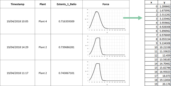
The data model supporting curves looks as shown in the image below. Each table row represents one event / batch / machine operation… In the example below, each row is an item manufactured at a certain time (Timestamp), in a certain plant (e.g. Plant 4), with some quality (e.g. Extents_1_Ratio of 0.716). Additionally, curve-typed columns (like „Force“) hold an entire curve (=value vector) in each table cell. Curves are value vector pairs of an axis and values (shown as x and y) below.
Note: Importing data already given in this model, curves can also be interactively extracted from raw time series using the Pattern Search feature. Use the Export button  in the "Pattern Search and Comparison" cockpit to export the curves in the aforementioned data model, as multiple CSV files. The main exported CSV file can then be loaded again in Visplore, which will load the curves along with it (see section "Importing curve-typed data from multiple CSV files").
Visualizing curves
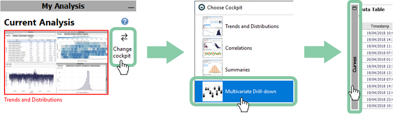
To visualize the curves after the import process, you can use the "Multivariate Drill-down" cockpit in Visplore Professional. In the "Curves" view of this cockpit, you can look at one curve-typed column at a time.
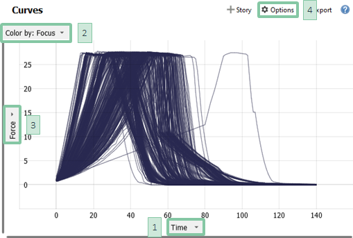
Details of the "Curves" view:
- At location [1] you can adjust the horizontal alignment of the curves, and at location [2] you can choose an attribute for coloring the curves as described "here".
- Zooming works similarly as in the time series view. Draw a blue rectangle with the right mouse button around the area of interest to zoom in, and press the button in the lower left corner to zoom out completely.
- If your dataset has multiple curve-typed attributes:
- select which to show by clicking on the label of the y-axis [3] on the left, then choose "Change assignment".
- show more than one attribute at once, by clicking on "Options" [4] -> "Choose and Reorder Visible Views", then select a second plot here. Optionally exchange which attribute is shown or change the order of the selected attributes.
- To visualize aggregate curves, click on "Options" [4] and select "Show aggregated curves". If you have chosen an attribute for coloring, you can visualize seperate aggregated curves for each color category.
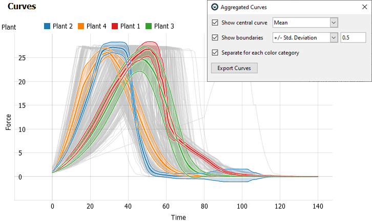
Note: aggregated curves only consider the data records in Focus (so make sure that the Focus bar is empty or it only includes the desired selections before interpreting the curves).
Note: you can also export these aggregate curves by clicking on "Options" [4] -> "Show aggregated curves" and selecting "Export Curves". Together with filtering outlier curves, you can use this to interactively define and export a golden batch.
Relating curves and other attributes
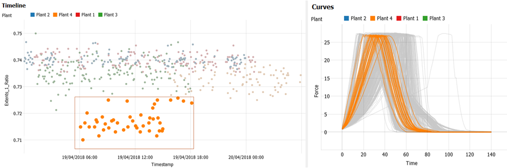
With the selection of the curves (e.g. outliers, clusters), you can see in other views (scatter plots, heatmap, table view, etc.) the distribution of other parameters.
In the "Curves" view, you can use the line selection, i.e. draw a line with the left mouse button, and all the curves intersecting that line are selected. While selecting, hold CTRL to select multiple clusters, or SHIFT to refine a selection (=multiple lines a curve must pass through).
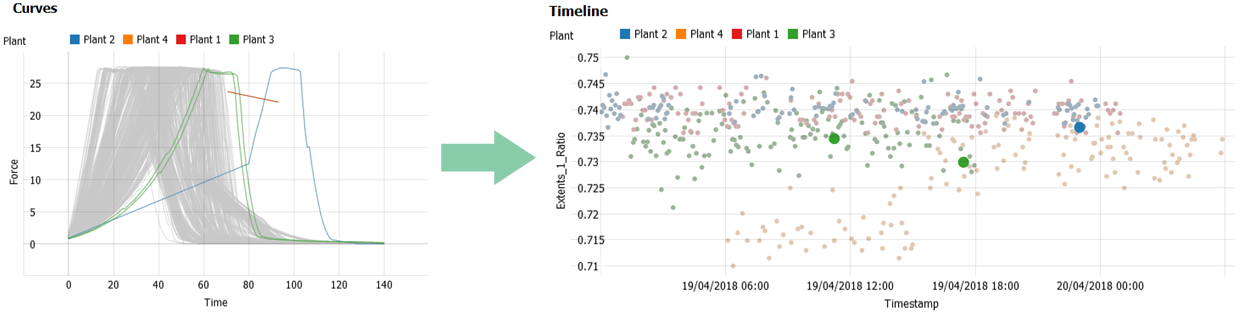
You can also make the selection in other views (e.g. quality or input parameters) and see what the corresponding curves look like (see the image at the top of this chapter, where a cluster is selected in the timeline, highlighting the corresponding curves).
Note: in addition to visually relating the aspects, it's possible to extract KPIs from the curves (e.g. area under the curve) and compute correlation coefficients with other variables (see the last section of this chapter).
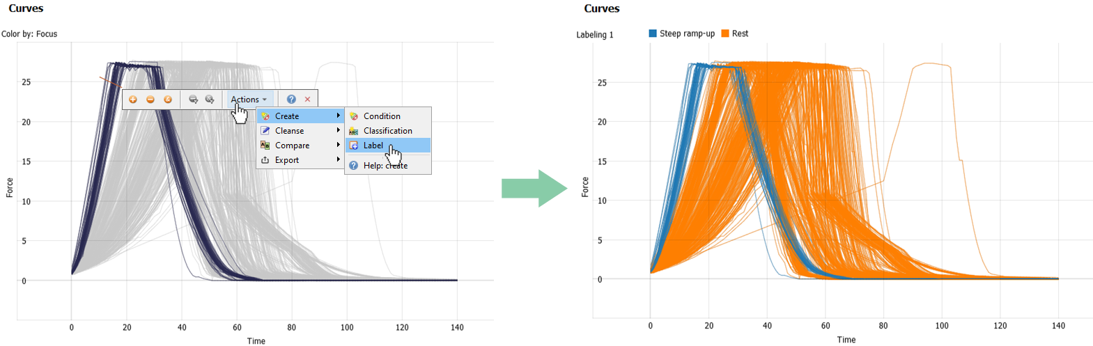
Labeling curves
Similar to other data records, curves can be labeled after the selection to obtain training data for an AI project, e.g. to train a classifier.
To see the entire workflow of labeling curves in action, from data import, through labeling and finally export, please watch this video:

Extracting curve KPIs and correlating with other variables
In addition to the visual correlation of curves and KPIs as described before, it is possible to compute numerical KPIs from the curves themselves (e.g. the area under the curve, a duration above a threshold, etc.). These „curve properties“ can then be correlated with other, imported numerical KPIs per event. A typical example is computing a correlation between an imported quality KPI and extracted features of the curves.
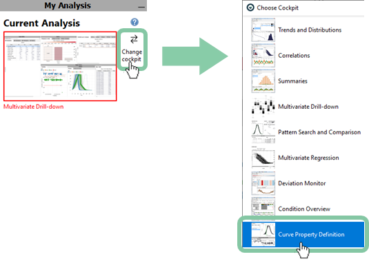
To extract KPIs, switch to the "Curve Porperty Definition" cockpit.
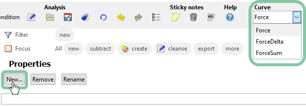
If you have multiple curve attributes, make sure you have the right one selected for extracting a KPI. Start to create a new property by clicking on the "New..." button in the "Properties" diagram. In the appeared dialog choose "Duration above threshold" and confirm with "OK".
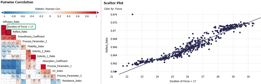
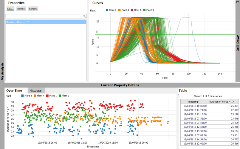
The cockpit now shows a timeline ("Over Time") of the property, as well as a horizontal green line in the "Curves" diagram representing the editable parameter of the newly created KPI. With the adjustment of the green line, you can measure the duration above a certain Force for each curve. The exact values of the KPI can be seen in the "Table" view and are plotted in the timeline. In the "Over Time" view (see image below), it is visible that the Force is longest above the threshold for Plant 1 (red).
Drag the horizontal green line in the "Curves" diagram to other positions and notice the changes in the timeline "Over Time".
After creating properties, they can be analyzed in other cockpits.
Switch to the "Correlations" cockpit and make sure the created properties are checked for the role "Variable" in the role-assignment dialog.
In the "Pairwise Correlation" and "Scatter Plot" views, you can see how the extracted curve KPIs are correlated with other measurements, such as quality.