Custom Analysis for Live Data
Use story pages to perform routine data analysis, like monitoring and reporting by using live data from your process. A process engineer could use this to monitor for the stability of a process and the quality of manufactured product. When the stability or quality is starting to deviate from expected values, this usually needs to be solved under time pressure. Use preconfigured cockpits on live data to accelerate generating insights and getting the process back to your expectation.
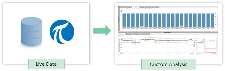
The idea is to make custom views accessible for quick inspection of live data by subject matter experts without them having to learn how to use all of Visplore. Use this functionality to answer questions such as: How was the production quality in the last hours? Why did it get worse? How did today's batches perform compared to a reference batch? Was the process stable or unexpectedly different?
Pro This functionality is only available in Visplore Professional.
Overview: How to Set Up Views on Live Data
Follow the following general steps to setup analysis on live data:
1. Setup data connection to live source
Import data from e.g. a database with an access mask to make it user friendly. Also use a relative time filter such as e.g. last 7 days. See chapter Database (ODBC) and OSISoft PI for details.
2. Setup the dashboard / report to your needs
Configure filters, views, conditions, calculations and more according to your need. Add selected views to your report as slides using the "+ Story" button (for single elements) or "Add a new story page" (for all elements). As a page can contain multiple views, use this to e.g. click through time series/categories and see its details.
3. Save / share with users
Save your analysis as .visplore file. Keep the "Keep link to data source" option selected, so that Visplore knows where to load the data from (specific database in this case). Optionally share this .visplore file with your subjact matter experts (note: they also need to have access to the same database / access mask / PI system).
4. Use the configured story pages regularly
Start the .visplore file with a double-click (or through the Visplore welcome dialog). The user has to simply go through the pages like in a Powerpoint slide while still being able to interact with the data (zoom in, adjust filter, select data, and more).
Example: Monitoring Production Quality from Database
The following specific example guides you through setting up a monitoring on data from discrete manufacturing. Here each manufactured part has process parameters and a quality indicator such as "OK" or one of two reasons for exclusion.
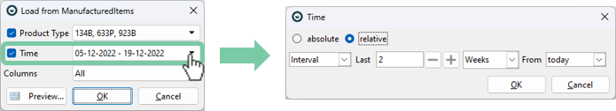
1. Import data using an access mask with a relative time filter.
Visplore offers the possibility to set up a filter dialog for end users for a table/view (a so-called Access Mask). By using a relative time filter, one does not have to manually select a time span. The access mask configuration is also made available for each one who wants to monitor the production quality.
2. Setup the dashboard / report to your needs.
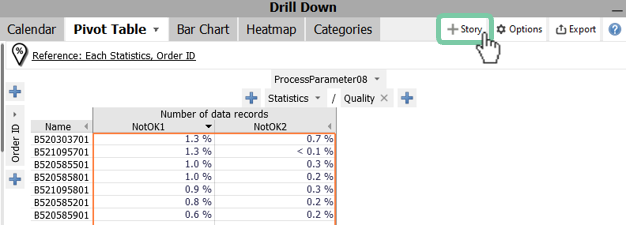
Create the pages that the user can go through. The following shows two ways to create story pages:
Click on "+ Story" to add a single element to your view. You can give a name (and adjust what is visible) to your page in the dialog that follows.
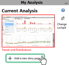
Click on "+ Add a new story page" to all the elements that are currently visible in your current analysis. Again, you can give a name (and adjust what is visible) to your page in the dialog that follows.
Now you created two story pages that can be consumed with live data.
3. Save / share with users.
Finally, save your analysis as a .visplore file by clicking save  . Keep the option "Keep link to data source" checked.
4. Use the configured story pages regularly.
At this point, the end user opens the .visplore file and perhaps adjusts the import access mask to suit his current needs. Now the user can interactively click on an order to see each not-ok part. In addition, he can visualize other relevant KPIs over time to detect trends. This way, you not only detect the goods scrap but also can analyze this scrap in detail. The underlying raw data is accessible for maximum transparency.
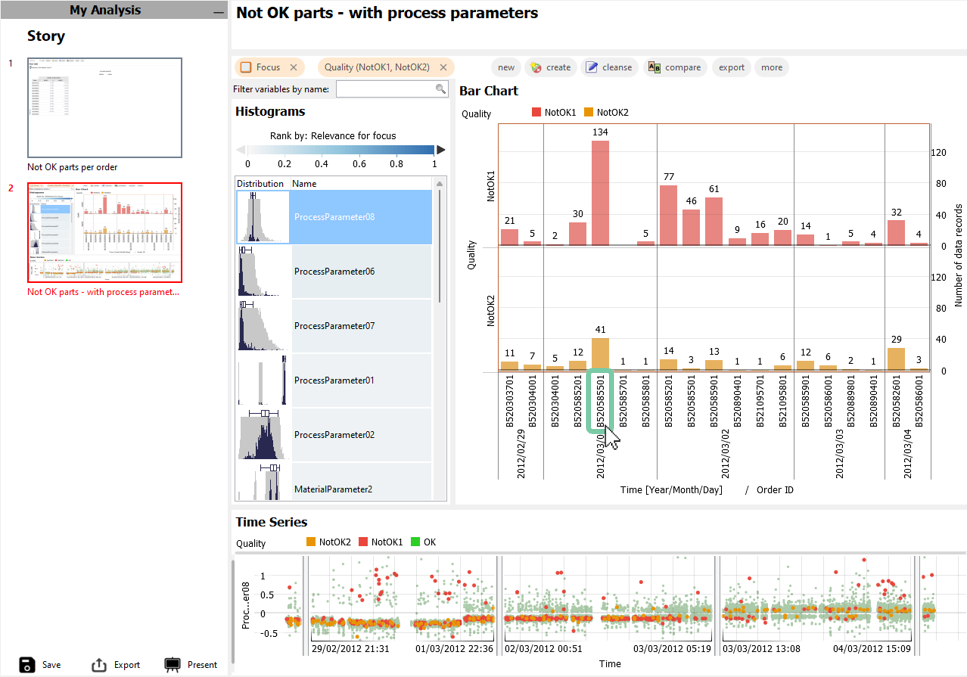
Tip: So that the user really only has the story pages to click through on the left, and cannot permanently change any pages, you can switch on the "Story consumption mode" in the preferences before saving. This simplifies the GUI even more, as you can see in the picture before.
Example: Live Report of Process Stability from OSIsoft PI
The following specific example guides you to setup a live report from a continuous production process (e.g. pulp and paper) with data from the OSIsoft PI System. The PI System not only holds the historical data but also setpoints and tolerance limits. In this example various products are manufactured, that need to be monitored for process stability and complying with product tolerances. Should there be any violations, they need to be analyzed to find the root cause quickly.
1. Import data using our integrated PI connector
Retrieve the relevant tags by name ("tag search" or through the PI Asset Framework including setpoints and tolerance limits. To see the latest data, you may want to use a relative time interval (e.g. "last 24 hours" or "last 7 days"). See chapter OSISoft PI for details.
Note: When sharing a live report with other users, they need to have the PI System configured in Visplore, too.
2. Setup the dashboard / report to your needs
Create the pages that the user can go through. The following shows two ways to create story pages:
Click on "+ Story" to add a single element to your view. You can give a name (and adjust what is visible) to your page in the dialog that follows.
Click on "+ Add a new story page" to all the elements that are currently visible in your current analysis. Again, you can give a name (and adjust what is visible) to your page in the dialog that follows.
Now you created two story pages that can be consumed with live data.
3. Save / share with users.
Finally, save your analysis as a .visplore file by clicking save . Keep the option "Keep link to data source" checked.
4. Use the configured story pages regularly.
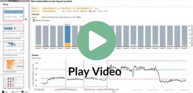
At this point, the process engineer opens the .visplore file and perhaps adjusts PI import to suit his current needs. Now the process engineer can interactively click on a product to see and explain tolerance violations. See the following video how such as live report can be used by the process engineer!
Tip: So that the user really only has the story pages to click through on the left, and cannot permanently change any pages, you can switch on the "Story consumption mode" in the preferences before saving. This simplifies the GUI even more, as you can see in the picture before.
Great, now you can use Visplore to setup custom views that are accessible for quick inspection of live data by subject matter experts! This helps to answer questions such as: How was the production quality in the last hours? Why did it get worse? How did today's batches perform compared to a reference batch? Was the process stable or unexpectedly different?