Visplore: New Features of Version 2.0
Introducing self-service automation of any Visplore analysis and a new, most-user friendly workflow for process and asset diagnostics make this version a gamechanger that warrants the title “2.0”. And as always, there are dozens of other new features and improvements to your everyday work with Visplore!
Automation and collaboration
Self-service automation enables engineers to schedule any Visplore analysis for automatic execution without coding – directly from your familiar Visplore interface. This enables multiple use cases:
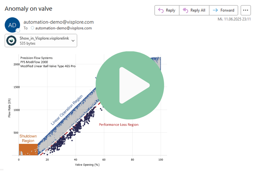
- Reporting (as PDFs, e-mails, images in website): Turn every Visplore chart and every computation into a live report that is automatically delivered, for example on a daily or weekly basis. The setup is as easy as writing an e-mail to colleagues and takes less than a minute. Visplore graphics can be directly embedded in the mail, and an optional backlink instantly gets you from the inbox back to Visplore for deeper diagnostics. This way, everyone keeps track of what’s going on even without having time to start the analytics or learning Visplore! For example, what about starting to monitor transients such as start-ups, changeovers, or other advanced patterns? Done within minutes in Visplore 2.0.
- Advanced condition monitoring: Never miss anything critical again! What’s “critical” can easily be defined by the user within a few clicks. Set up automated alerts upon the occurrence of advanced patterns, trends, drifts, anomalous sensor correlations, and other indications that deserve attention but go far beyond monitoring by simple thresholding. Alerts can, for example, be configured as e-mails which already provide insights by embedded graphics and KPIs without even opening Visplore.
- Custom automated Python actions: Your automated Visplore alerts should trigger a call to a custom API, or write information to a specific data source? All this is possible via custom actions in Python that can be integrated in your automated Visplore analytics.
- Sharing analyses with an Active Directory group: You created great analyses that your colleagues should use too? Upon saving analyses centrally on the Visplore server, easily share them with an entire Active Directory group. Your colleagues see analyses which are shared with them when starting Visplore, and can easily start them without worrying about files.
- AVEVA PI: Writing back computed variables as PI tags: Users of the AVEVA PI system can easily write any computed variables, model predictions, automatically generated labels, and much more back to their PI System as tags. This also works across multiple assets.
Please note: Most features for automation and sharing require a new service component called “Visplore Server” which is to be hosted on a Windows server on premise at the customer. All other new and previous features only require the Windows client application, as for previous versions. Furthermore, reports and alerts can also be set up without Visplore Server, and need to be triggered manually then similar to macros.
Introducing self-service automation for engineers
Advanced analytics
Visplore 2.0 offers new advanced analytics for supporting trouble shooting and diagnostics. So that Visplore searches for the needle in the haystack, instead of you.
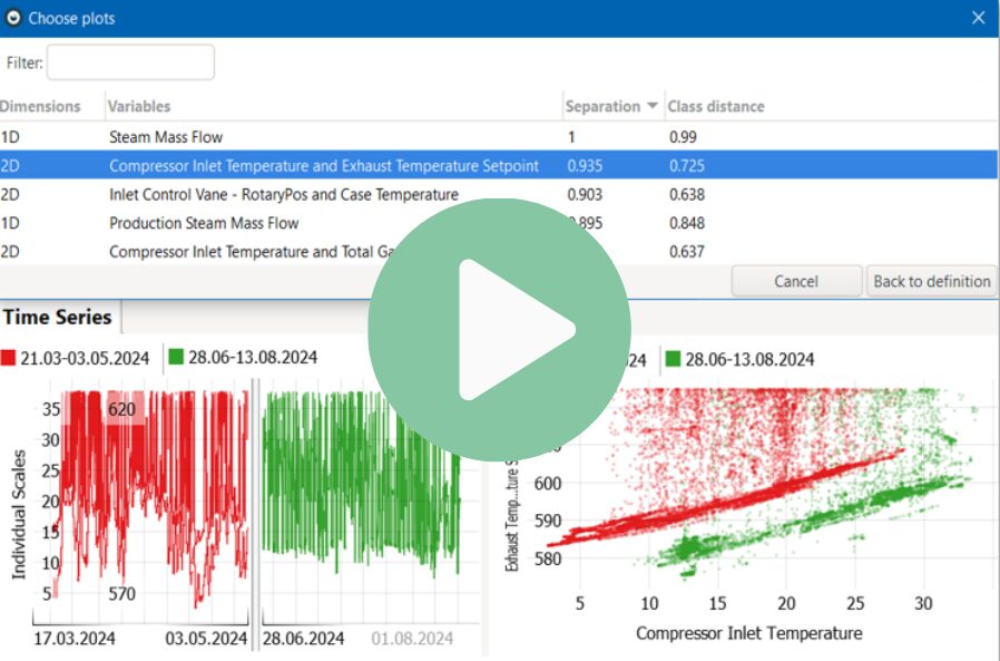
- Suggest plots: When comparing classes of data such as time periods, assets, process conditions, or anything else, Visplore provides you with an automatic list of 1D and 2D plots to look at. The plots are sorted by how well they show differences between the compared classes. These differences may include patterns in 2D, such as drifts in correlations and dependencies between variables. The user can easily browse the list and interpret the discoveries in an easy-to-understand way. For example, let Visplore find out which process conditions have changed between good and bad phases of operation, explaining the different performance. And don’t miss anything even for hundreds of process variables.
- Suggest rules: What did times have in common before the process needed to be stopped due to a specific problem? This new feature mines for rules that characterize these situations, revealing potential root causes or other patterns that can be used for early warnings. It builds on decision trees to present interpretable rules, so that subject-matter experts can easily validate them.
- “Trend” function: This new function detects drifts over time, and also supports for expressing them in terms of physical units (for example: increase of one degree Celsius every 3 days). One application is for automated condition monitoring, e.g. to monitor if a trend will exceed a threshold within the next 10 days from now.
- Regression models support boundaries: Regression models support boundaries: Some predictions have physical limits, for example at zero or some maximal production capacity. Regression models now support to optionally specify such limits in order to clamp predicted values to a physically possible range.
Process- and asset diagnostics in 4 clicks
Working with data patterns / batches
The “Pattern Search” cockpit features several improvements:
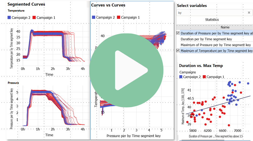
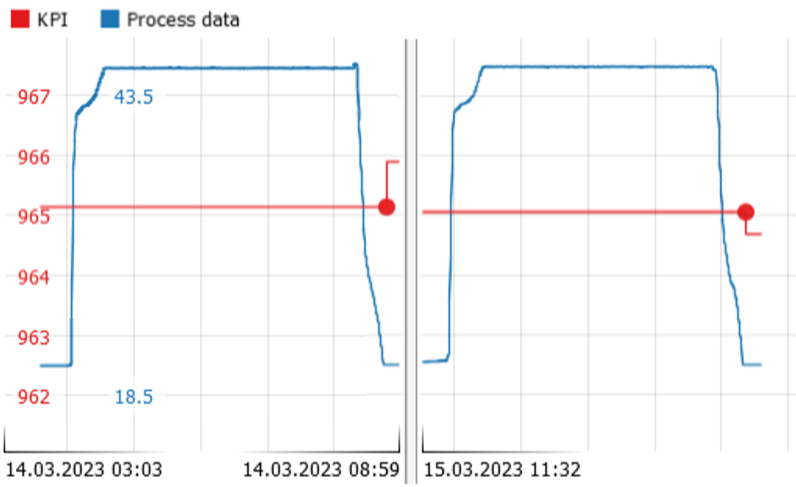
- New Curves vs. Curves Plot: Plotting two variables against each other can reveal insights also in case of patterns such as batch phases or transient operations. The new plot displays 2D differences between operation profiles much more explicitly than by plotting two variables over time in a side-by-side manner. As another advantage, this plot makes operations with different durations more easily comparable than standard
curve plots, because time is shown only implicitly by connecting sequential samples. The benefit is an easier identification of golden profiles as well as outlying operations. - Defining multiple Curve KPIs: Many analyses of patterns require the aggregation of the profiles as KPIs such as maximum, duration, or the value at 2h after start. The new version facilitates the graphical definition of any number of such curve KPIs in a way that they are equivalent to any other derived variable. For example, they are available in other cockpits such as the correlation cockpit.
New curve-vs-curve plots and curve KPI extraction
Conditions
- Expand/shift event periods: Oftentimes, the periods you want to analyze around events are different than the events themselves. When analyzing process states, for example, you may want to exclude the first few minutes in order to ignore transient effects. Or if the event refers to an alert, you may want to extend the period to include the hour before. Conditions now let you easily modify the analyzed event periods by expanding, shifting, or contracting them.
- Display custom channels upon selection: Inspecting a condition may benefit from looking at certain variables which are semantically related to the condition. For example, inspecting mismatches of a model may require looking at the actual values and the model inputs. Therefore, conditions now support to specify a custom set of variables which get automatically displayed when the condition is selected (= put into Focus). This feature is also helpful for automated reporting, in order to automatically show all relevant variables if a certain condition fires.
- More flexible filter: The new version enables to specify which parts of the filter line should be adopted by the condition rather than using the entire filter. For example, in order to apply a condition to new data, it is necessary to remove those parts of the filter that refer to constant time periods, which now happens by default.
Extending or shrinking periods fulfilling a condition
Selections
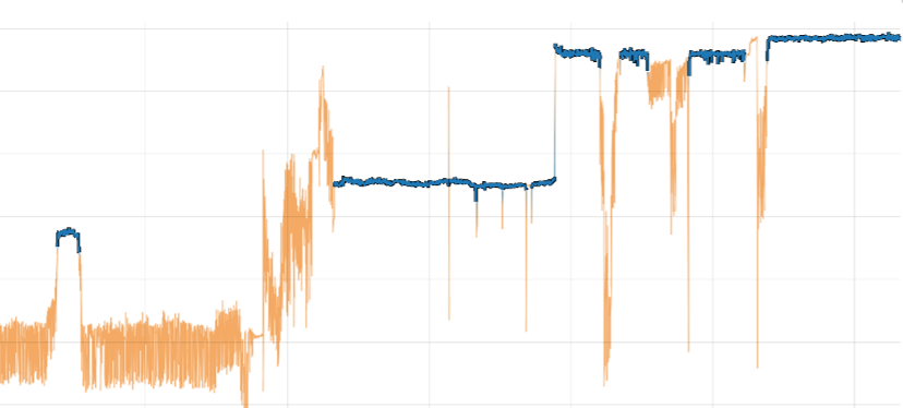
- Steady Period Selection: For many analyses, it helps to separate steady states from transient processes. A new selection component makes the selection of steady periods particularly simple and transparent.
- Improved lasso selection: The lasso selection now supports to set the vertices of the polyline more precisely via point and click.
- Regression model anomalies: Regression models can be effectively used for anomaly detection by detecting periods of distinct mismatch between the model prediction and the actuals. Turning a regression model into a condition for anomaly detection is now very easy and explicitly supported by the work flow.
- Simplified refinement with multiple selections: Consider the following example: You first selected a specific category (such as an order ID, or an asset), and within this category, you want to select two or more clusters. Selections like this have become easier to specify and also show up correctly in the Focus bar using brackets.
- Invert: You can now more easily invert selections, also if they consist of multiple clauses. For setting up an anomaly detection, for example, it can be easier to mark up regions that define the normal state, and then invert the selection for the anomaly condition, than to define the anomalous regions directly.
Selecting steady operation periods based on change per period
Data sources
- Reload button: A new button allows for triggering a manual reload of data from data sources. If the imported time span is relative to now (for example, the most recent week), then this operation will also fetch the latest data.
- Filling values backwards in time: Assume you want to correlate quality data of a production process with process data. Typically, the quality measurements are done after the production steps. In order to correlate the two different types of data, it is necessary to compensate for the different timings. Now, it is easy to fill values – in this example the quality values – backwards in time based on their time stamps. This enables a direct correlation of quality and process values.
- IBA HD Server connector: As for other data sources, there is a plug-in available now that fetches data directly from the IBA HD Server. The plugin is available upon request.
Backward filling to correlate quality samples with earlier process data.
Usability
- Export/import category selection to clipboard: In many places of Visplore, you can select a custom subset of categories, for example in filters. If the number of categories is high, defining the intended subset can be cumbersome. Now, it is possible to export a selection to the clipboard, and also to restore it from there. This also allows for saving and sharing selections (for example as text files).
- Enforce readable size for cells: In some visualization types such as bar charts, heat maps, and box plots, the labels of the cells can sometimes get dropped if the number of categories used to subdivide the axis gets too large. While this can be intended if you want to preserve an overview, many use cases require each cell to be labeled. Now, it is possible to enforce that cells remain a minimal height / width so that all labels remain legible.
- Define image file type for PDF reports: You can now choose whether images embedded in PDF reports should be JPG or PNG. Previously, all images were embedded as PNG which could cause reports having quite large file sizes.
As you see, Visplore 2.0 is packed with improvements, ranging from long-expected usability features to game-changing possibilities such as self-service automation. We are delighted to tell you more about the new features and how they support your specific use cases, and are of course gladly offering live demos.
