Visualization Features
Seeing is understanding. Discover the unique visualization features of Visplore to gain important insights from complex data.
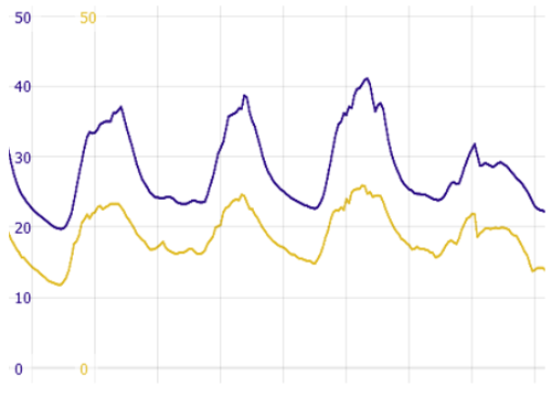
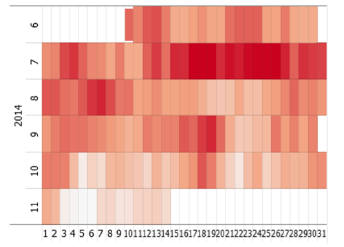
In Visplore, the classic time series plot offers many innovative features such as collapsing time spans, scaling time series individually, and much more.
Time plots also visualize discrete data, convey the density of the data, show additional data by color, and highlight trends via moving averages.
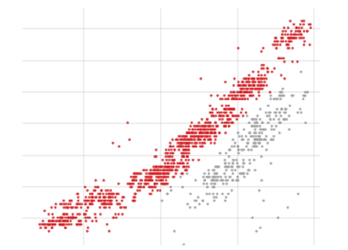
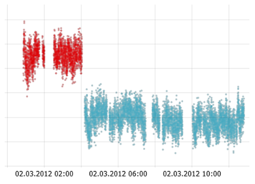
2D scatter plots in Visplore provide multiple selection tools such as lasso, flexible coloring options, and support overlaying regression functions.
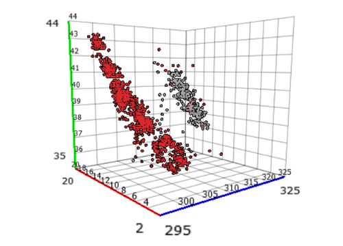
3D scatter plots support intuitive rotation, panning, and zooming. They also display additional data via color.
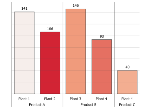
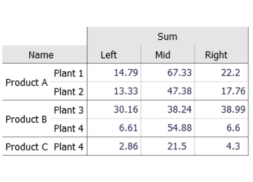
Summarize your data by the dimensions and statistics that matter to you. Compare data by percentages or differences between cells.
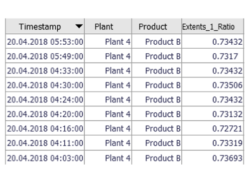
Inspect, edit, and export raw data values any time via a flexible spreadsheet view.
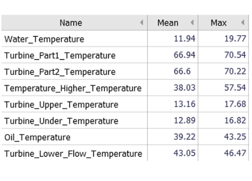
Summarizes the data by statistics of all numerical variables and supports sorting the variables by their statistics.
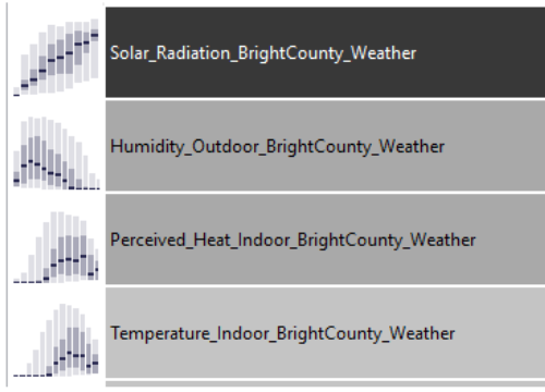
A comprehensive overview of all numerical variables for discovering gaps, trends, jumps, cycles, or many other aspects. Sorting the variables guides you to insights.
Gain rapid insights about the distributions of all numerical variables and let the view guide you to those variables with explanatory power for anomalies or other aspects.
See dozens of time series without clutter and still be able to discover any type of pattern. This innovative overview of process data is your compass to discoveries.
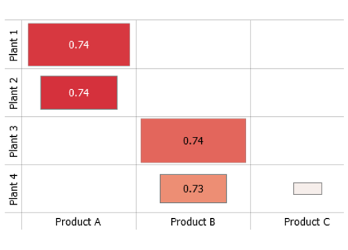
Discover two-dimensional patterns, clusters and outliers at a glance for dozens of variables. Color indicates correlations.
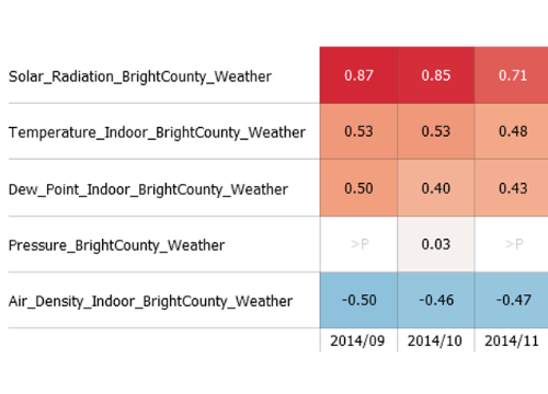
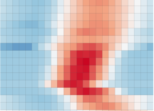
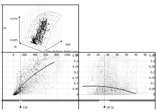
Get the complete picture of all correlations with the target variable that matters to you. Flexible drill-down features let you deal with multi-modal data at ease.
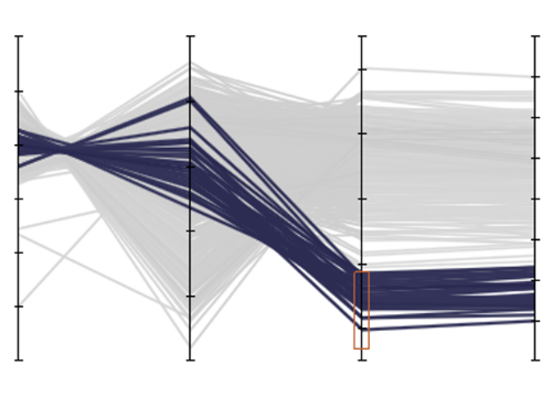
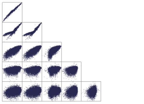
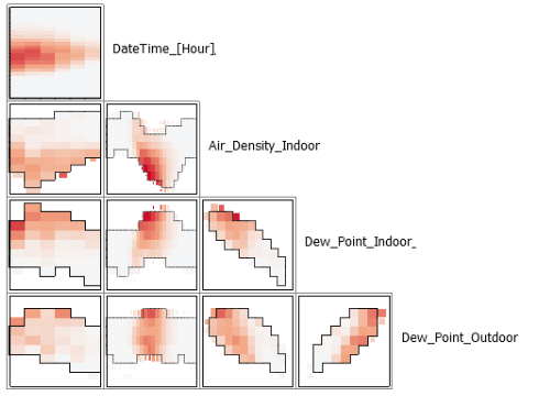
Relate numerous variables for discovering multivariate clusters and for specifying multivariate queries on the data.
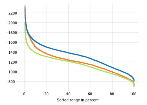
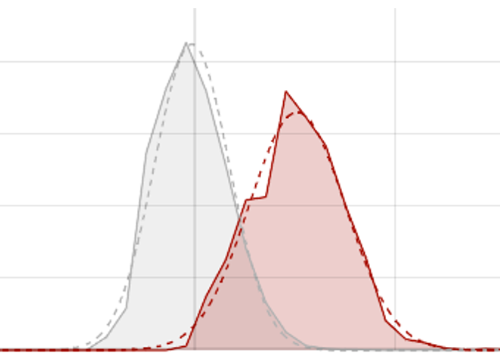
Duration curves are an interesting method for visualizing and comparing distributions of numeric variables.
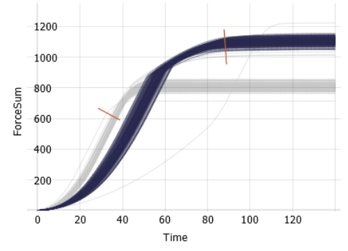
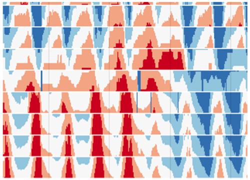
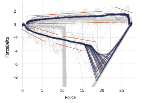
Analyze hundreds of curves or more, for example daily cycles, machine operations, or spectra. Intuitive tools let you select and emphasize the curves that matter to you.
Visualize pairs of curves such as movement trajectories for hundreds of entities and intuitively select interesting ones.
Analyze regression functions with 3, 4, 5 or more independent variables. Understand sensitivities and conduct what-if analyses in seconds.
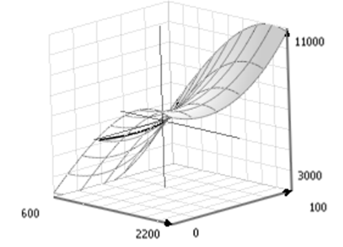
Visualize regression functions as 3D response surfaces that you can flexibly rotate and zoom. Explore response surfaces even for higher dimensional models.
This view is an efficient guide to discover correlations between variables of any structure, including non-linear ones.
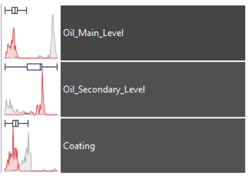
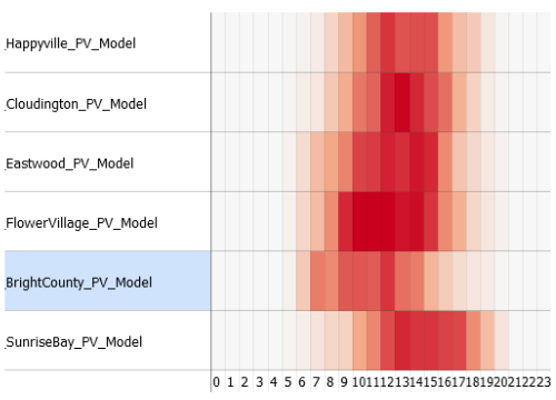
This visualization shows the data distribution for many pairs of numeric and categoric variables. It also guides you to pairs with a potential impact on a target variable.
The ideal tool for detailed performance analytics of a large number of predictive models. Visualize the development of the RMSE and other measures over time or over relevant data categories.
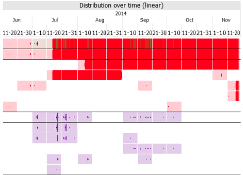
Gain a scalable overview, when and where gaps, outliers, anomalies, nonconformities or custom conditions occur in a large number of time series.
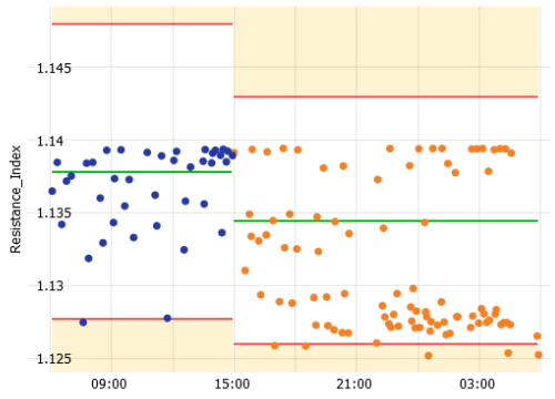
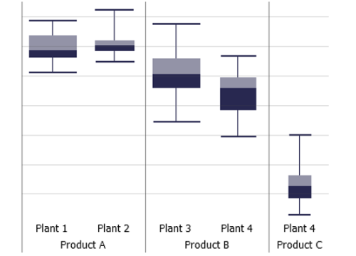
Display setpoints and specification limits – also variable ones – in time series plots, histograms, and box plots. Select non-conformities with a click.