List of Visualizations
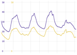
Time series plot
Plots one or more variables over time. Alternatively, the X axis may also be defined by another data attribute which represents a chronologic order, for example an ID. Visplore supports line charts for continuous time series and data points for discrete samples. Additonal features include collapsing time spans, overlaying moving averages, and much more.
Click for more information
How to get this visualization
Time series plots are available in all cockpits, typically in the lower half of the cockpit. Time series plots will only be offered if the "Time axis" role has been defined for the cockpit. The visualized time series are selected outside of the time series view in one of the overviews of all variables. In some cockpits, pairs of time series will be selected, for example when analyzing correlations ("Correlations" cockpit).
Configuration
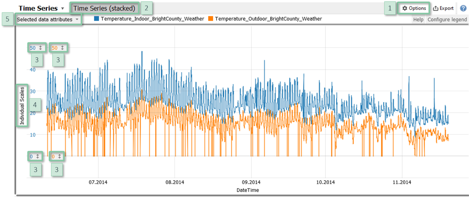
- Discrete/continuous: Switch between discrete (= unconnected data points) and continuous (= connected data points) visualization, available in the view options menu [1] item "Continuous / discrete".
- Plotting multiple time series: In case multiple (at least two) time series are selected, you can choose between plotting them in one chart, or stacking plots (up to eight) on top of each other via the tab "Time Series (stacked)" [2].
- Vertical scaling: Adjust the vertical scaling by zooming or by clicking on the vertical ticks [3].
- Scaling multiple time series: Switch the scaling mode by clicking on the vertical label [4] on the left-hand side. This enables to enforce a common scaling for all time series, and to normalize time series for visualization.
- Color: Click on the gray area [5] in the top left corner to use color, e.g., for visualizing additional data.
- Trend overlays: The view options menu [1] item "Trend overlays" lets you overlay moving averages with an adjustable window size.
- Collapsing empty periods: Time periods without data can be collapsed. Such gaps may have also be created by the current filter.
- Non-selected data: It can be desirable to show only data corresponding to the selection in another view rather than the entire data. This can be configured in the view options menu [1] item "Non-selected data".
- The view options menu [1] item "Automatic zooming" lets you zoom automatically to highlight data which is selected in another view.
Note
Time series plots provide multiple selection modes, such as rectangle, X interval, Y interval, and lasso. However, if multiple time series are shown with individual scalings, the only selection option is "X interval".
Further information
about parameterization and zooming.
Histogram
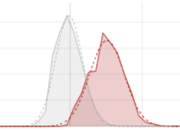
Visualizes the distribution of a quantitative variable and allows for comparing the distributions of multiple classes, for example the categories of a categorical data attribute.
Click for more information
How to get this visualization
The histogram is available in the cockpits "Trends and Distributions", "Multivariate drill-down" (Visplore Professional), and "Curve Property Definition" (Visplore Professional). The visualized variable is selected outside of the histogram in one of the overviews of the variables.
Configuration
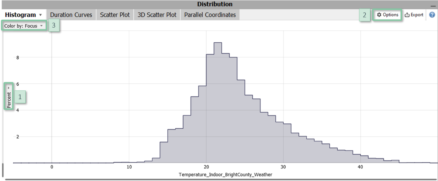
- Relative / absolute distribution: The histogram offers two vertical scaling modes to show absolute frequency counts, or to show the percentages per class. The latter mode (default) facilitates to compare distributions of classes of different magnitude. Click on the vertical gray label [1] on the left hand side (by default titled "Percent") to switch between the modes.
- Bin sizes: You can define an approximate number of intervals for defining the bars of the histogram, also called "bins", or you can directly specify the bin size in the view options menu [2] item "Histogram configuration". Remark: "approximate number of bins" means that Visplore tries to make the borders of bins align with nice values.
- Compare classes by color: Click on the gray area in the top left corner [3] to select a categorical data attribute in order to compare the distribution of its categories. Alternatively, the selected data (i.e., the "Focus") is compared to the entire data (excluding filtered data). You can also configure the histogram to show only the selected data in the view options menu [2] item "Histogram configuration" by checking "Hide non-selected data".
- Statistical tests: Histograms offer a T-test of the means and a Chi-Square test of the standard deviations of two classes. The classes depend on the use of color. Option 1 (default): for fast ad-hoc comparison, the distribution of the selected data ("Focus") is compared to the entire data. Option 2: compare two classes of the categorical data attribute assigned to color. If there are more than two data categories, use other views to select the two classes to be compared. The statistical tests can be disabled in the view options menu [2] item "Statistical tests".
- Bars / lines visualization: You can manually enforce the appearance to be bars or lines in the view options menu [2] item "Histogram configuration".
- Normal distribution: For reference and easier visual comparison, the view options menu [2] item "Overlay normal distribution" displays a normal distribution per class having the same mean and standard deviation.
Further information
about parameterization and zooming.
2D Scatter Plot
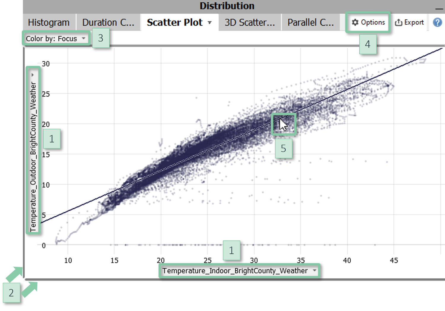
Study correlations and clusters for two variables. The points correspond to the imported data samples. 2D scatter plots in Visplore provide multiple selection tools such as lasso, flexible coloring options, and support overlaying regression functions.
Click for more information
How to get this visualization
The 2D Scatter plot is available in several cockpits, for example "Trends and Distributions", "Correlations", and "Multivariate drill-down" (Visplore Professional). The visualized variables are selected outside of the scatter plot in overview visualizations of the variables. 2D Scatter plots are also part of some other cockpits, for example as "Predicted vs. Observed" plots in the cockpits "Deviation Monitor" and "Multivariate Regression".
|
Configuration
|
Further information
Bar Chart / Stacked Bar Chart
Common visualization technique to compare classes. The length of the bars may represent, for example, the magnitude of each class. Bar charts in Visplore let you nest multiple categorical data attributes, support various options for sorting the bars, and display additional quantities via the color of the bars. They can also be configured as stacked bar charts.
Click for more information
How to get this visualization
Bar charts are available in most cockpits, provided that the data contains at least one categorical data attribute and/or time stamp. In many cockpits, bar charts are contained in the top right part of the cockpit. For example, the cockpits "Trends and Distributions", "Correlations", "Summaries", and several other cockpits of Visplore Professional contain a tab group titled "Drill down" which contains bar charts.
Configuration
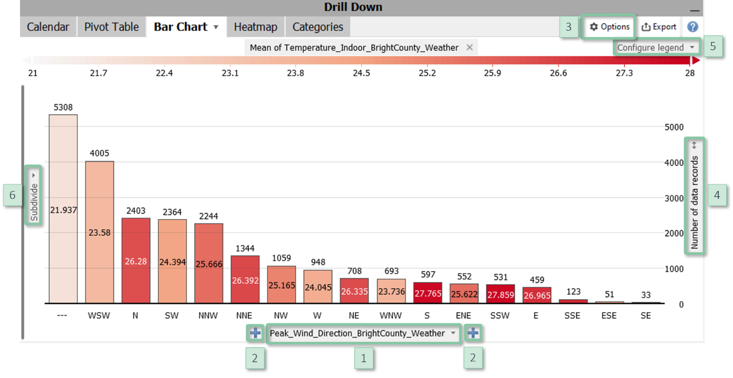
- Define bars: Clicking the centred label at the bottom [1] allows for switching the categories used to define the classes. You can nest multiple data attributes using the "+" signs [2] and change their order using drag and drop.
- Bar length: In most plots, the item "Configure view" in the view options menu [3] allows for configuring the information represented by the bar lengths. Common examples are the number of data records per bar as well as statistics per class such as mean, sum, maximum, etc. of a variable. In some plots, the options are more limited and can be accessed by clicking the vertical label [4] next to the right border. The scaling of the bars can be adjusted next to the right border as well.
- Bar color: The color can be configured or removed by clicking the label of the color legend [5] or via the item "Configure view" in the view options menu [3]. It may show quantitative information or it may subdivide the bars by categorical data. This enables to define stacked bar charts. In some bar charts, however, color is used to distinguish variables, for example the tab "Bars" in the Summaries cockpit.
- Sorting and hiding bars: Clicking the centred label at the bottom [1] offers multiple options for sorting the bars, for example alphabetically, by their size, or any custom order. In the dialogue for custom ordering, it is also possible to hide categories and to display sub-totals (check the option "Combined").
- Y axis subdivision: Clicking the vertical label "Subdivide" [6] allows for subdividing the Y axis by additional categorical data attributes.
- Labels: The item "Cell labels" in the view options menu [3] configures labels to display precise values of the information shown by bar length and color.
- Percentual results: The item "Absolute / relative results" in the view options menu [3] switches between absolute values and relative values, for example the percentage of data per bar. References can be specified in the dialog shown when enabling relative results.
Further information
about visualizing categorical data.
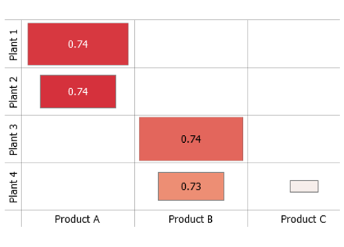
Heatmap
Visualization technique to show information of two dimensions. In Visplore, both dimensions (i.e. axes) are defined by categorical data attributes which may also be nested. Cell color and cell area display information such as the magnitude of the category combination or a statistical measure of another quantitative variable. Common use cases of heatmaps include cross-tabulations of categorical data attributes and visualizations of data categories over time. In the latter case, one axis is defined by temporal data categories such as calender months.
Click for more information
How to get this visualization
Heatmaps are available in most cockpits, provided that the data contains at least one categorical data attribute and/or time stamp. In many cockpits, heatmaps are contained in the top right part of the cockpit. For example, the cockpits "Trends and Distributions", "Correlations", "Summaries", and several other cockpits of Visplore Professional contain a tab group titled "Drill down" which contains heatmaps.
Configuration
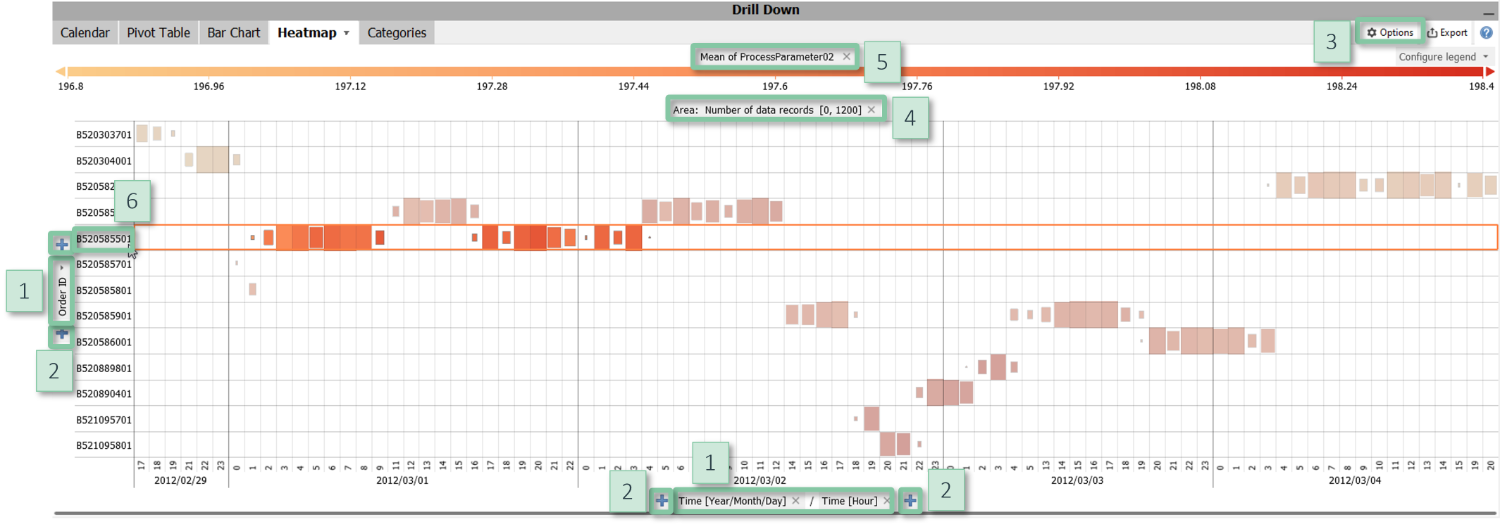
- Axes: [1] Clicking the centred label at the bottom or the left-hand side, respectively, allows for switching the categories used to define the axes. [2] You can nest multiple data attributes using the "+" signs and change their order using drag and drop.
- Area: The item "Configure view" in the view options [3] menu allows for configuring the information represented by the area, or to disable using the area. The default is the magnitude as given by the number of data records. The scaling can be adjusted by clicking on the centred label "Area" [4] above the visualization.
- Color: [5] The color can be configured or removed by clicking the label of the color legend or via the item "Configure view" in the view options menu. It may show quantitative information such as statistical measures of a quantitative variable or it may subdivide the rectangles by categorical data. In some cockpits, the information shown by color is defined by the cockpit, for example the Pearson correlation coefficient in the Correlations cockpit.
- Sorting and hiding rows or columns: Clicking the centred axis labels [1] offers options for sorting the rows and columns, for example alphabetically, by their size, or any custom order. In the dialogue for custom ordering, it is also possible to hide categories and to display sub-totals (check the option "Combined"). Alternatively, the item "Hide insignificant categories" in the view options menu may be used to hide results for cells with too few data points.
- Labels: The item "Cell labels" in the view options menu configures labels to display precise values of the information shown by color.
- Percentual results: The item "Absolute / relative results" in the view options menu switches between absolute values and relative values, for example the percentage of data per cell. References can be specified in the dialog shown when enabling relative results.
Interaction
Clicking on a row or column label (i.e. the name of a category) [6] selects that category to be highlighted or filtered in other views. You can also click on cells to select combinations of categories and drag a rectangle to select multiple categories.
Further information
about visualizing categorical data.
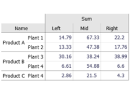
Pivot Table
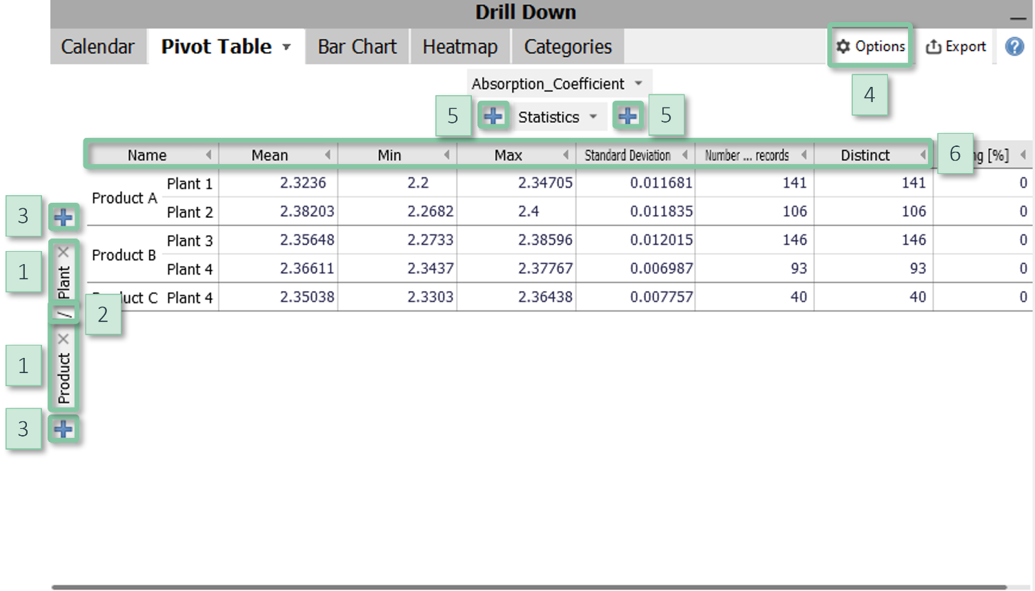
Common technique to summarize quantitative data, e.g. for reporting. Visplore lets you define rows and columns by categorical data attributes which may also be nested, and offers numerous statistics for summarization. Pivot tables may also show percentages and differences for comparing rows or columns. Besides reporting, a common use case is to prepare data for export.
Click for more information
How to get this visualization
Pivot tables are available in most cockpits, provided that the data contains at least one categorical data attribute and/or time stamp. In many cockpits, pivot tables are contained in the top right part of the cockpit. For example, the cockpits "Trends and Distributions", "Correlations", "Summaries", and several other cockpits of Visplore Professional contain a tab group titled "Drill down" which contains pivot tables.
|
Configuration
|
Further information
about visualizing categorical data.
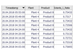
Spreadsheet Table
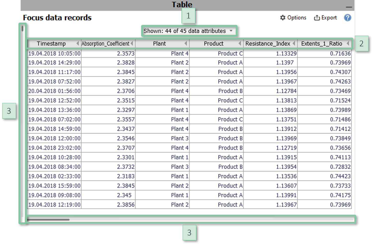
A table showing non-aggregated data records. The table automatically filters to the selected data (i.e., the "Focus") for displaying details of user-selected data records such as outliers. Other common use cases are data editing and data export.
Click for more information
How to get this visualization
Spreadsheet tables are available in all cockpits in the bottom right area of each cockpit. In some cockpits, it may be necessary to explicitly expand them by clicking on the vertical gray area titled "Table".
|
Configuration
|
Interaction
- You can select data rows by clicking or dragging a line.
- While data is just being edited, the views displays additional controls to edit the values or categories of single cells or all selected cells of a column.
Further information
- about selecting data.
- about editing data.
Statistics Overview
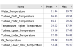
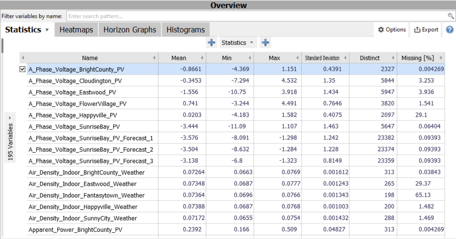
Lists all numerical variables and summarizes them by their statistics. The main use case is to select variables for visualization in other views. Additonal use cases are to order variables by information such as the percentage of missing values and to export the table.
Click for more information
How to get this visualization
Statistics overviews are available in the cockpits "Trends and Distributions" and "Multivariate drill-down" (Visplore Professional). Some other cockpits also offer similar tables of variables. The displayed variables can be filtered by their names in the text edit field above of the view.
Configuration
The configuration is similar to Pivot tables. As the main difference, the rows of the Statistics overview correspond to the variables of the data.
Interaction
Click on the name of a variable to select (only) that variable for visualization in other views. Use the check boxes next to the variables (or alternatively the Control or Shift keys) to select multiple variables.
Further information
- about Pivot tables.
- about parameterization.
Heatmap of variables
Powerful method to visualize dozens of variables without clutter. It can, for example, be used as an overview for anomaly detection, trend analysis, correlation analysis, and it is suitable to trace patterns across sensors over time.
Click for more information
Interpretation
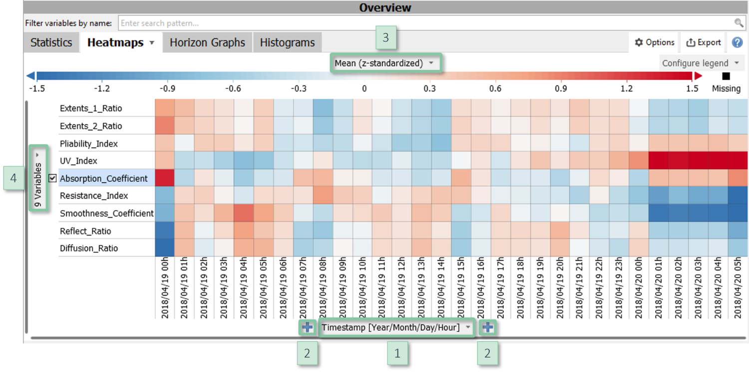
The rows of this heatmap correspond to the variables. The columns (i.e., the X axis) can be defined by the user. By default, the columns are temporal units such as calendar days, and can be switched to display any other categorical data attribute such as grades, order IDs, etc. The color displays statistics, for example the mean per cell (default), the standard deviation, and the percentage of missing values. Reading rows from left to right thus conveys how variables change over time (in case that columns are temporal units), or how they differ between categories such as order IDs. Cells with particularly high or low statistics stand out.
Reading the plot vertically allows for comparing variables. To support this, the heatmap standardizes the variables by default so that the visualization becomes independent of their scales. Furthermore, variables can (and are by default) ordered in a way so that similar variables are adjacent. This emphasizes patterns that occur across several variables.
How to get this visualization
Heatmaps of basic statistics are available in the cockpits "Trends and Distributions" and "Multivariate drill-down" (Visplore Professional). The displayed variables can be filtered by their names in the text edit field above of the view.
Other cockpits also offer heatmaps of variables, and display cockpit-specific statistics by color such as the Pearson correlation (cockpit "Correlation") and goodness-of-fit measures (cockpit "Deviation Monitor" in Visplore Professional).
Configuration
- Columns: Clicking the centred label at the bottom of the view [1] allows for switching the categories used to define the columns. You can nest multiple data attributes using the "+" signs [2] and order the categories as needed.
- Shown statistic: Clicking the centred label above the color legend [3] lets you choose the statistic to be displayed by color. There you can also enable or disable the standardization of the variables.
- Sorting the variables: The expressiveness of the heatmap largely depends on the order of the variables. Clicking the vertically centred label at the left border [4] lets you sort the variables. Common order strategies are by similarity (placing similar variables close to each other), by the shown statistic, and by the variance of the statistic across the columns. A custom order may be useful for example if the variables have a natural sequence, e.g., sensors along a physical process.
Further configuration options (e.g., percentual comparisons between columns) are similar to other visualizations of categorical data.
Interaction
Dragging a rectangle within the visualization with the left mouse button selects the variables of the touched rows as well as the categories of the touched columns. This becomes most effective in combination with the Time series plot below: The heatmap serves as an overview of the data, and the time series shows details of the selected part (hint: enabling "Automatic zooming" in the time series makes this interplay even smoother).
Further information
Histogram overview
Visualizes small histograms for all variables as a quick preview for exploring their univariate distributions. This tool is particularly useful for comparing data subsets.
Click for more information
Interpretation
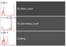
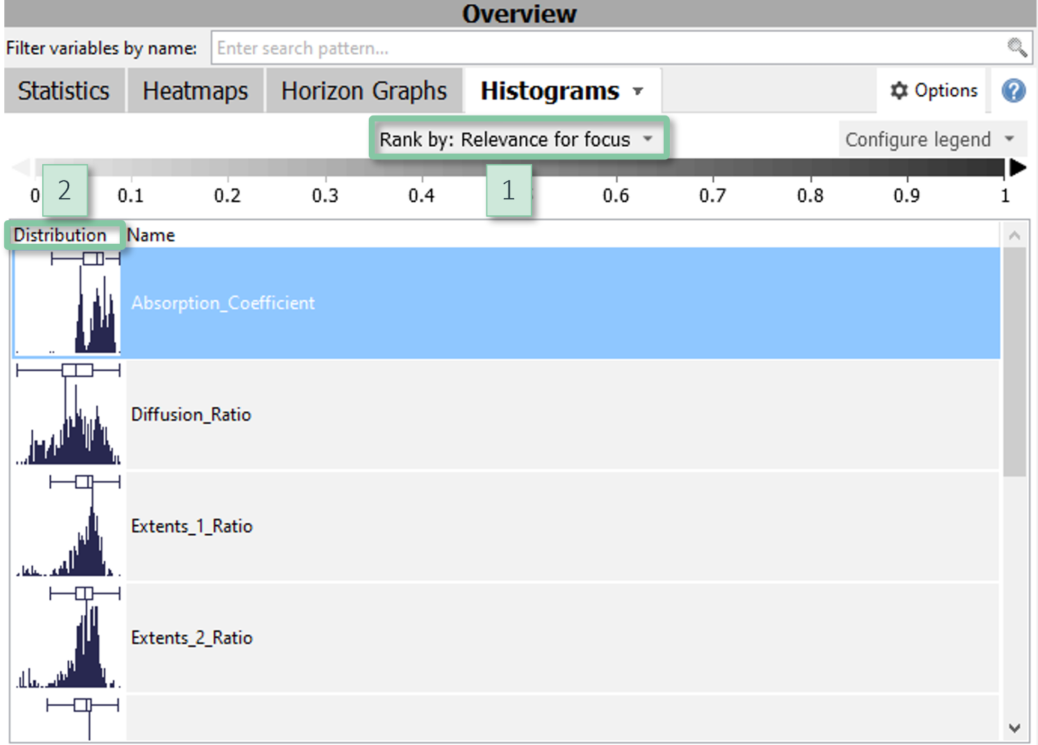
The variables are ordered by their mutual information with the data selection (the "Focus"). For example, assume you selected a certain time period. The histogram overview will not only highlight the data distributions of that period for all variables, but will also bring those variables on top where the selected period is distributed most differently than the rest of the data. This facilitates to find variables characterizing the selection. The mutual information is conveyed by the intensity of the gray background.
Likewise, the histograms can be used to compare data categories by color (e.g., via the "Compare" features). Also in this case, the histograms will be ordered so that top-ranking variables show the biggest difference in the distribution of the categories. This can help answering questions such as "which variables show a different behavior for A than for B?", where A and B can be, for example, order IDs, user-defined time periods, clusters, and much more.
How to get this visualization
Histogram overviews are available in the cockpits "Trends and Distributions" and "Multivariate drill-down" (Visplore Professional). The displayed variables can be filtered by their names in the text edit field above of the view.
|
Configuration
|
Interaction
Clicking on a variable selects that variable for visualization in the other views. For selection multiple variables, press the "Control" key on your keyboard while clicking the variables.
Further information
about visualizing many numerical variables.
Parallel Coordinates
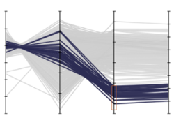
Parallel coordinates are a visualization technique to display multiple variables. The strength is to rapidly see how clusters and outliers are distributed across over ten variables. Another use case is to specify multidimensional filters.
Click for more information
Interpretation
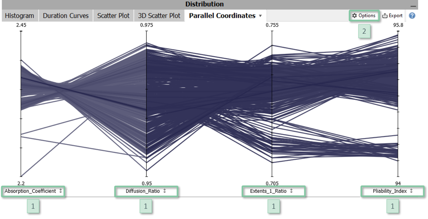
Each variable is represented by a vertical axis which draws the minimum of the respective variable at the bottom and the maximum at the top. Each data sample is drawn as a line strip that intersects all axes at the positions corresponding to its values. In case you know radar charts: Parallel Coordinates are closely related to radar charts, but the axes are aligned in parallel to each other rather than meeting at the same center point.
Parallel Coordinates work best if the number of data samples is rather small (e.g., up to a few hundreds) or if the data has multiple distinctive clusters. In this case, the intensity of the color reflects the density of the data. For larger data sets, Parallel coordinates can be helpful in combination with data selection, because Parallel coordinates convey the distribution of selected data quite well. Furthermore, a common use case is to define and tune selections on multiple variables, for example for optimization problems with multiple criteria. In this case, the criteria correspond to the axes.
How to get this visualization
The Parallel Coordinates are available in the cockpits "Trends and Distributions" and "Multivariate drill-down" (Visplore Professional). The visualized variables are selected outside in one of the overviews of the variables.
Configuration
- Order of axes: Reorder an axis by clicking on its name [1] and dragging it to the left or right.
- Axis scaling: Click on an axis name [1] to open the slider for adjusting its scaling. In the view options menu [2], you can enable that all axes share a common scaling.
- Adjust contrast: You can adjust the contrast in the view options menu [2] to (de-)emphasize the visualization of data density.
- Overlay box plots: As a reference for assessing the "outlyingness" of samples, it can be helpful to display box plots in the view options menu [2].
Interaction
Select data by dragging (with the left mouse) vertically along an axis. This specifies an interval on that variable. Selections on multiple axes can be defined, for example, via the orange "&" symbol in the toolbar next to the selection.
Further information
Duration Curve
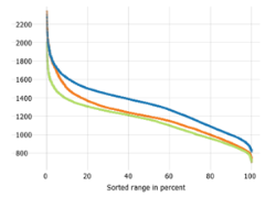
Duration curves visualize the distribution of one or more variables. Their strength is that they precisely convey the percentage of data below / above each value level and also work well for multi-modal distributions.
Click for more information
Interpretation
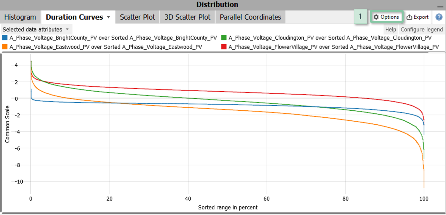
The Y axis represents the scale of the variable(s). The X axis is always scaled from 0 to 100 and represents the percentage of data. For example, a line intersecting the X value of 20 at an Y value of 1000 means that 20% of the data of that variable (ignoring potential missing values) are larger than 1000 while, conversely, 80% of the data are smaller than 1000. Broad horizontal sections thus correspond to ranges with many samples while steep slopes correspond to ranges with few data samples.
How to get this visualization
The Duration Curve technique is available in the cockpit "Trends and Distributions". The visualized variables are selected outside in one of the overviews of the variables.
Configuration
Disable connection: If the data has non-connected clusters, it can make sense to disable the connection in the view options menu [1].
Further information
3D Scatter Plot
Study correlations and clusters for three variables. The points correspond to the imported data samples.
Click for more information
How to get this visualization
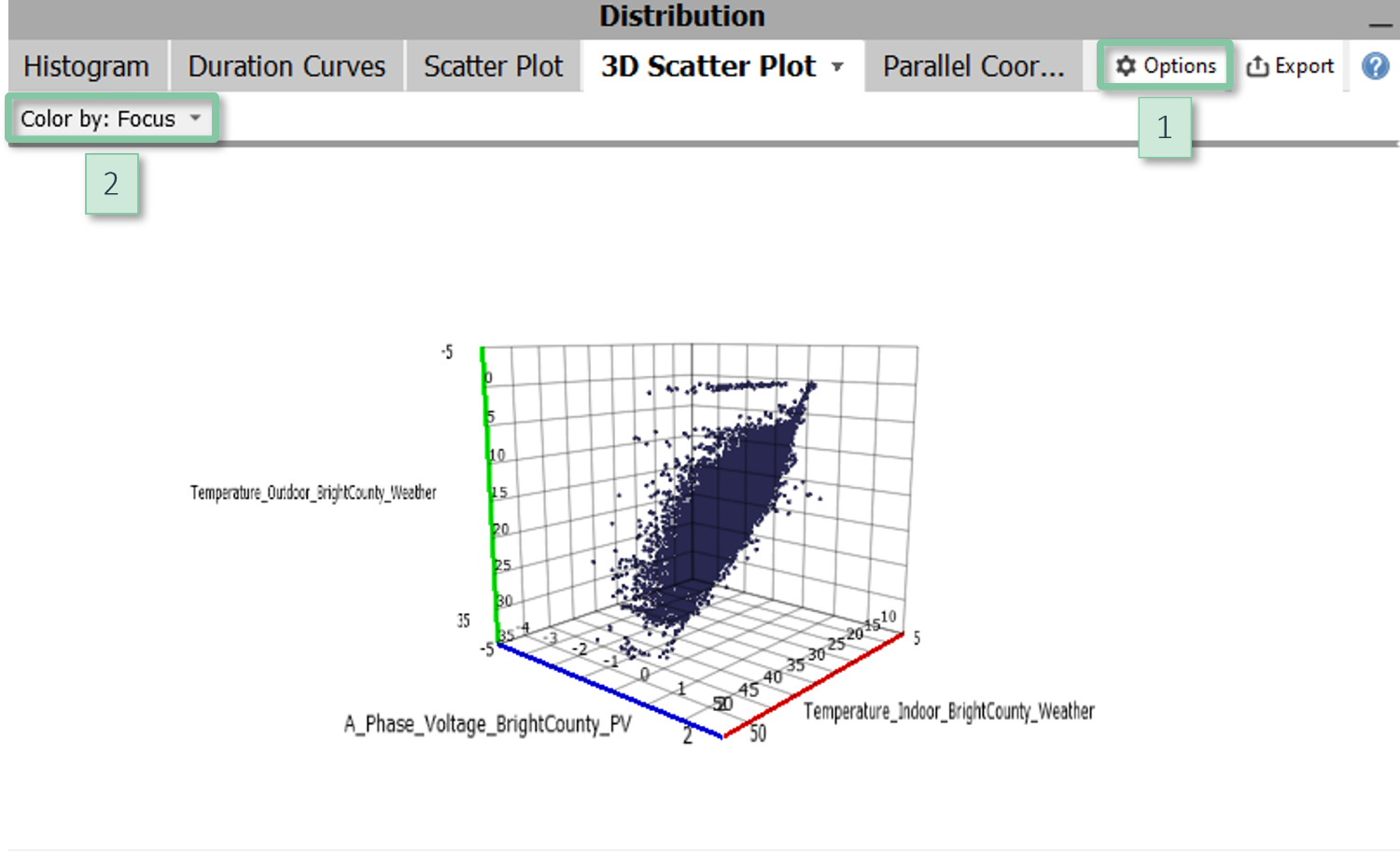
The 3D scatter plot is available in the cockpits "Trends and Distributions" and "Multivariate drill-down" (Visplore Professional). The visualized variables are selected outside of the 3D scatter plot in one of the overviews of all variables. If you select more than three variables, the first three selected variables will be shown.
|
Configuration
|
Navigationn
- Rotate: Drag while pressing the left mouse button
- Pan: Drag while pressing the right mouse button
- Zoom: Use the mouse wheel to zoom in and out
Further information
Stacked Categories
Visualizes up to four categorical data attributes (and possibly more by nesting them) as stacked uni-dimensional heatmaps. The two main use cases are (1) to select categories and combinations of categories in multiple data attributes and (2) to characterize data selections in other views.
Click for more information
How to get this visualization
Stacked category views are available in most cockpits, provided that the data contains categorical data attributes and/or a time stamp. In many cockpits, this view is contained in the top right part of the cockpit. For example, the cockpits "Trends and Distributions", "Correlations", "Summaries", and several other cockpits of Visplore Professional contain a tab group titled "Drill down" which contains this view titled as "Categories".
Configuration
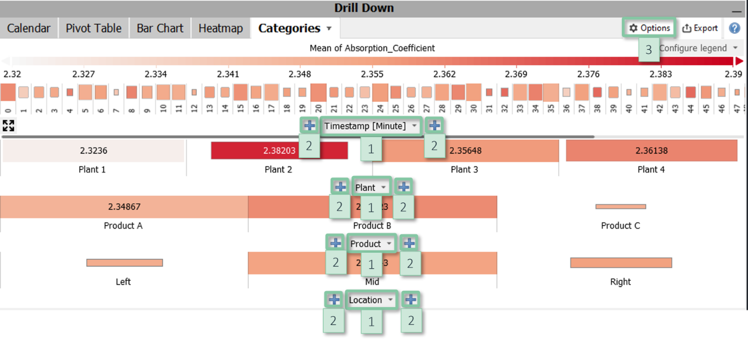
- Axes: Clicking the centred labels [1] at the bottom of each heatmap allows for switching the shown category. You can nest multiple data attributes using the "+" signs [2] and change their order using drag and drop.
- Color: The color can be configured or disabled via the item "Configure view" in the view options menu [3]. It may show statistical measures of the variable currently selected in the cockpit. In some cockpits, the information shown by color is defined by the cockpit, for example the Pearson correlation coefficient in the Correlations cockpit.
- Area: The area displays the number of data records. It can be switched off by the item "Configure view" in the view options menu [3].
- Sorting and hiding categories: Clicking the centred axis labels [1] offers options for sorting the categories, for example alphabetically, by their size with respect to the current data selection, or any custom order. Alternatively, the item "Hide insignificant categories" in the view options menu [3] may be used to hide results for cells with too few data points.
- Labels: The item "Cell labels" in the view options menu [3] configures labels to display precise values of the information shown by color.
Interaction
Clicking on a category in one of the heatmaps selects it just as in other views of categorical data. The other heatmaps automatically filter to that category. Clicking on a category in another heatmap can then be used to easily specify composite selections, such as Status = Error and Month = June and Time of Day = 10 to 12 AM.
Passively, selecting data in other views (for example a certain time period or a cluster in a scatter plot) filters the stacked categories so that it is immediately visible, which categories the selection corresponds to. For this use case, it can be helpful to sort the categories by their size.
Further information
- about visualizing categorical data.
- about data selection.
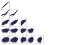
Correlation Matrix
Visualizes two-dimensional patterns and clusters for up to dozens of variables. Color indicates correlations between variables. The main strength is to discover correlations and groups of correlated variables.
Click for more information
Interpretation
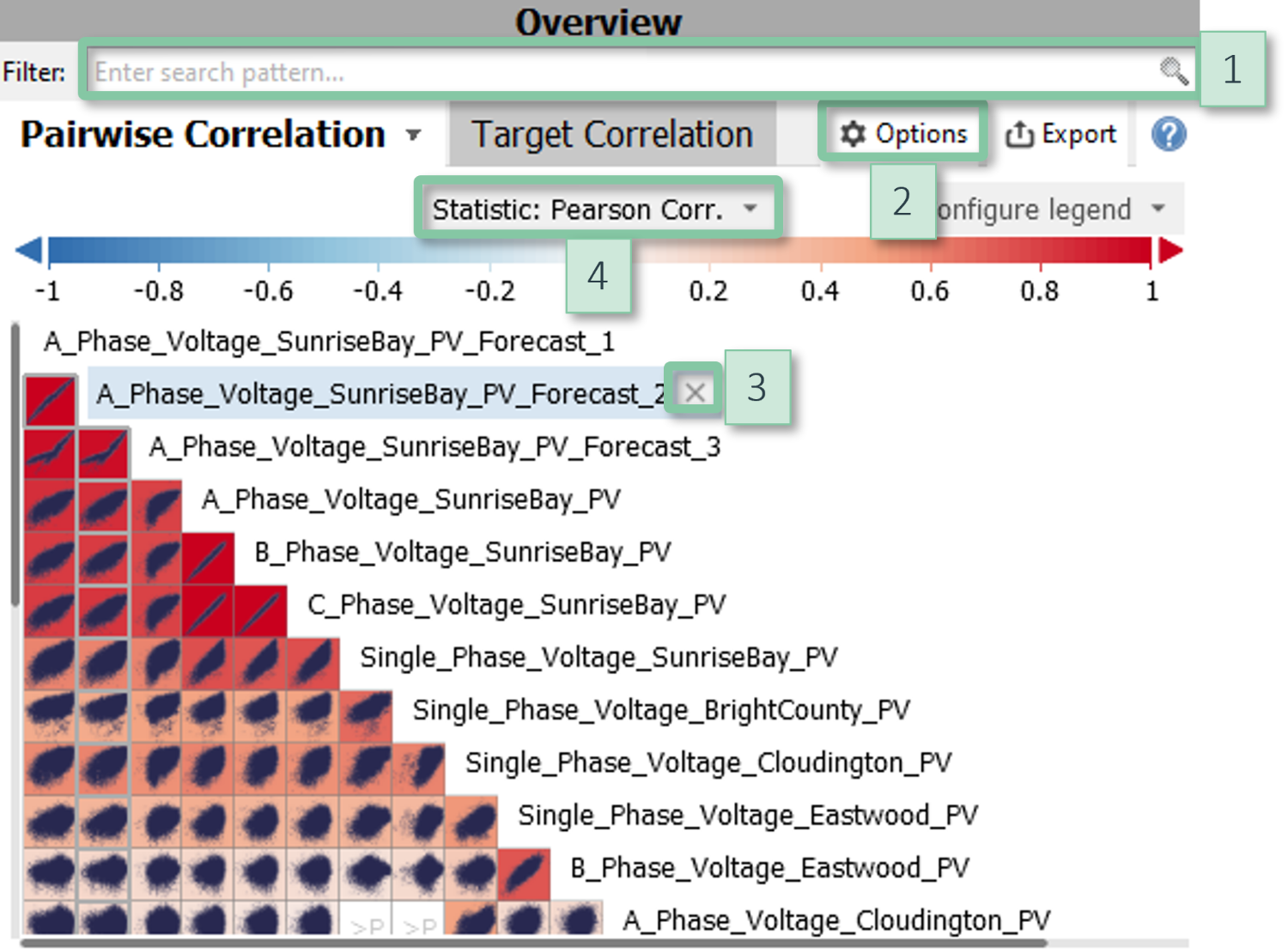
The variables define columns and rows of a half-diagonal matrix. Each cell of the matrix corresponds to a pair of variables and (typically) shows a small scatter plot. The color of a cell conveys the degree of correlation between the two variables, by default as the Pearson correlation. Positive correlations are shown in red tones, negative ones in blue (the color mapping can be configured). By default, cells are drawn white where the correlation is not statistically significant according to the p-Value or when no correlation can be computed, e.g., because all values of a variable are identical. Precise values for the correlation coefficient and the p-value can be read from the tooltip that appears when hovering a cell, or by exporting the matrix as a data table.
Please note:
- If the number of variables is large, not all variables are displayed for performance reasons. The set of displayed variables can be adjusted (see below).
- The correlations refer to the data in Focus (i.e., the selected part of the data, if any). Changing the Focus updates the matrix.
How to get this visualization
The scatter plot matrix is available in the cockpits "Correlations" and "Property Correlation" (Visplore Professional). The displayed variables can be filtered by their names in the text edit field above of the view.
|
Configuration
|
Interaction
Clicking a cell shows the corresponding two variables in the other views of the cockpit. For large matrices, please use the gray scroll bars at the left and at the bottom.
Further information
about analyzing correlations.
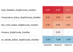
Target Correlation Heatmap
Visualizes the correlations between many variables and one target variable. The strengths are the scalability for up to hundreds of variables, and the possibility to break down the correlations, for example by different data modalities.
Click for more information
Interpretation
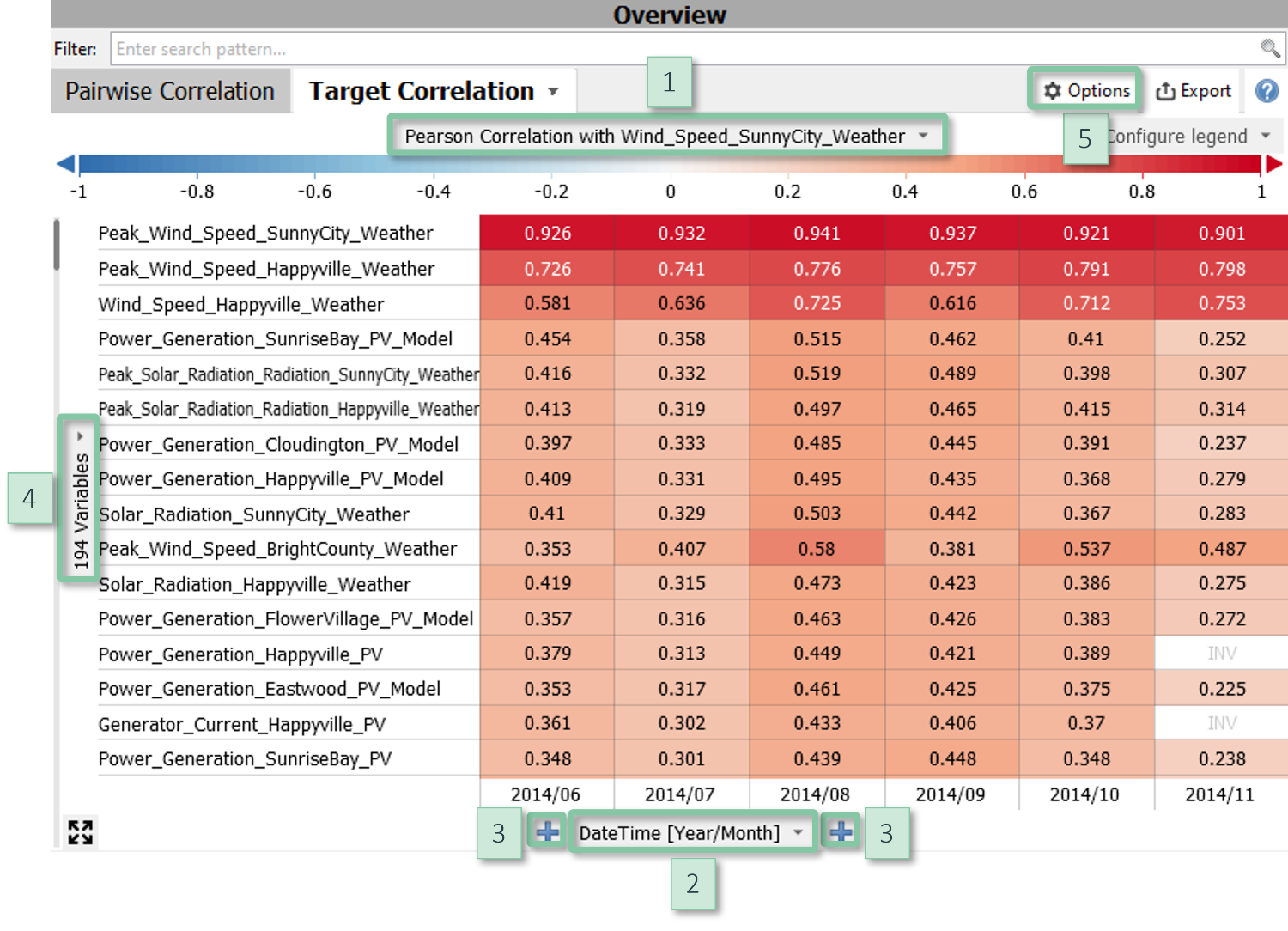
Each row corresponds to a variable. Color indicates the Pearson correlation with a target variable. Positive correlations are shown in red tones, negative ones in blue (the color mapping can be configured). The columns (i.e., the X axis) can be defined by the user. They can, for example, be temporal units such as calendar weeks in order to assess the stability of correlations over time, or other data categories in order to compute the correlations separately for structurally different parts of the data.
How to get this visualization
The target correlation heatmap is available in the cockpits "Correlations" and "Property Correlation" (Visplore Professional). The displayed variables can be filtered by their names in the text edit field above of the view.
|
Configuration
|
Interaction
Clicking on a cell selects the two variables for visualization in the other views.
Further information
- about analyzing correlations.
- about heatmaps of variables.
- about visualizing categorical data.
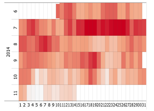
Calendar
Displays a heatmap in a pre-configured calendar layout. Rows correspond to calendar months and the cells represent calendar days. The information represented by color and area can be defined by the user.
Click for more information
How to get this visualization
The calendar is available in many cockpits, provided that the data contains a time stamp. In many cockpits, the calendar can be found in the top right part of the cockpit. For example, the cockpits "Trends and Distributions", "Correlations", "Summaries", and several other cockpits of Visplore Professional contain a tab group titled "Drill down" which contains a calendar.
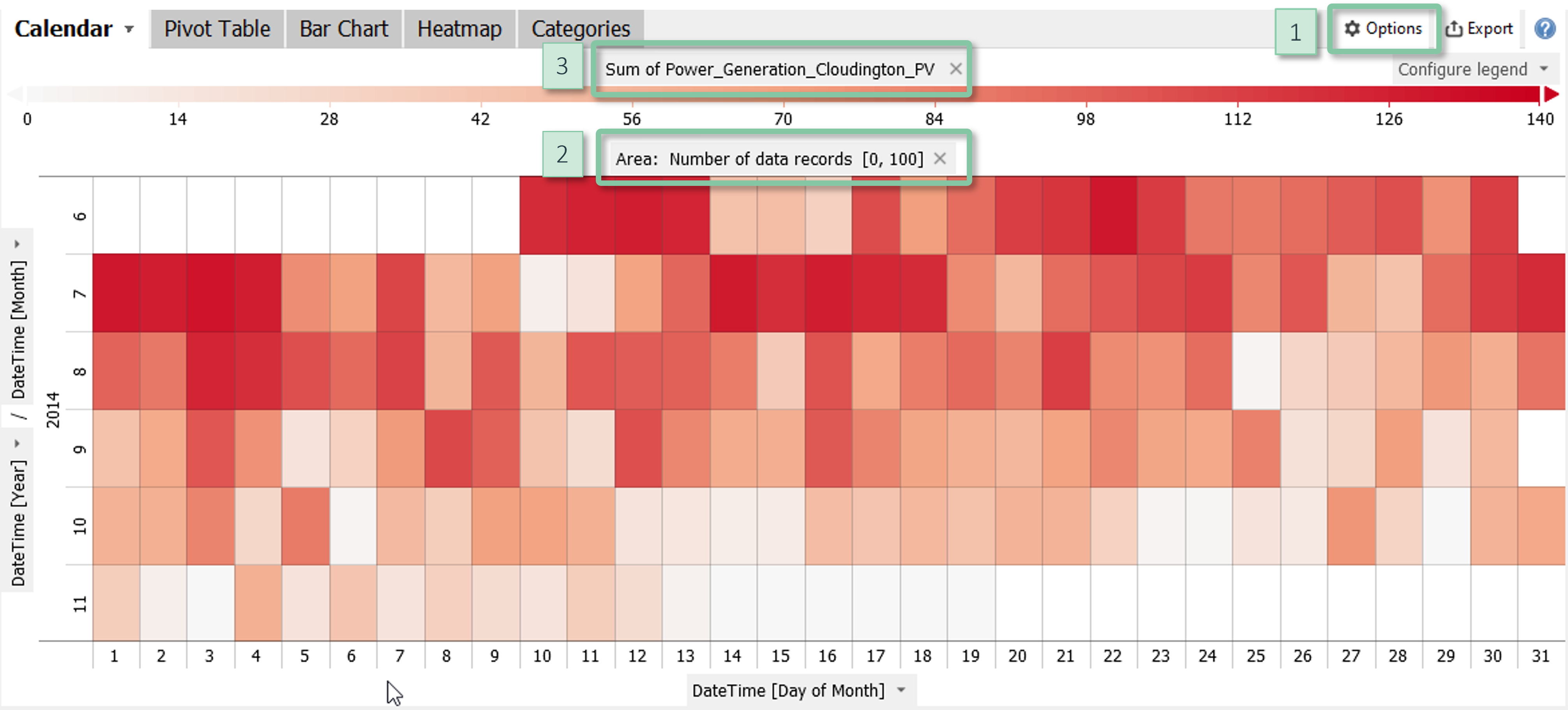
Configuration
- Area: The item "Configure view" in the view options menu [1] allows for configuring the information represented by the area, or to disable using the area. The default is the magnitude as given by the number of data records. The scaling can be adjusted by clicking on the centred label "Area" [2] above the visualization.
- Color: The color can be configured or removed by clicking the label of the color legend [3] or via the item "Configure view" in the view options menu [1]. It may show quantitative information such as statistical measures of a quantitative variable or it may subdivide the rectangles by categorical data. In some cockpits, the information shown by color is defined by the cockpit, for example the Pearson correlation coefficient in the Correlations cockpit.
- Labels: The item "Cell labels" in the view options menu configures labels to display precise values of the information shown by color.
Interaction
Clicking on a row label selects the corresponding year / month to be highlighted or filtered in other views. You can also click on cells to select individual days.
Further information
- about visualizing categorical data.
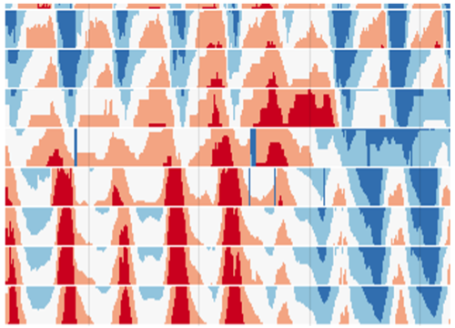
Horizon graphs
An innovative visualization method to display dozens of time series without clutter while preserving details like spikes and oscillations. Use cases include (1) fast plausibility checking of sensor data, (2) detailed comparison of time periods, e.g. for root-cause analysis, (3) searching patterns across time series, (4) tracing events and patterns along sensors of a continuous process.
Click for more information
Interpretation
Each row corresponds to a time series (i.e., a variable). For each time series, its range is subdivided in equally-sized levels which are overlaid for visualization, as shown by the following illustration:
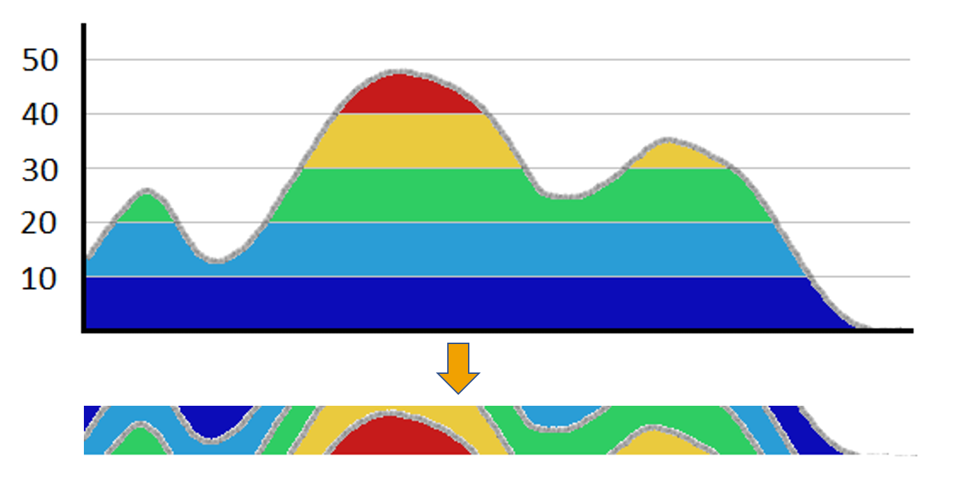
The color indicates the level (e.g., high, medium, low) while the shape of the time series is shown by the border between levels.
Reading rows from left to right conveys the change of variables over time. Reading multiple rows vertically tells, when events such as spikes or drops occurred in time relative to other time series. By default, the horizon graph plot in Visplore normalizes each variable so that the visualization becomes independent of their scales.
The strength of horizon graphs is their ability to visualize many time series while preserving their details. Because color is a strong visual cue, they support a rapid perception of patterns very well - much better and much more scalable than by stacking normal time series plots on top of each other.
The vertical order of the rows can also be used for advantage: Clusters of similar time series are well-perceived if they correspond to adjacent rows - Visplore supports sorting the variables by their similarity. Another good practice is to order the rows manually so that they reflect the order of the sensors along a continuous process. This is a very effective visualization of a process history.
Hint:
To familiarize with horizon graphs, it's helpful to compare patterns with the usual time series plot below in the same cockpit. When hovering the horizon graphs, the time below the mouse cursor is highlighted in the time series plot below, which may facilitate this matching.
How to get this visualization
The horizon graph plot is available in the cockpit "Trends and Distributions". The displayed variables can be filtered by their names in the text edit field above the view.

Configuration
- Order of variables: The variables (i.e., the rows) can be ordered automatically or manually. Options for ordering are available by clicking on the word "Variables" [1]. For manual ordering, drag-and-drop rows in the space between its name and the left end of the visualization [2]. Moreover, when selecting a pattern in a single row, you can order all variables by their correlation to that pattern using the button "Find correlations" in the selection toolbar.
- Color: Click on "Configure legend" in the top right corner [4] of the view and the "Change colors" to change the number of color levels as well as the used color map.
- Row height: Drag the horizontal line between the variable names [5] to adjust the row height.
- Zooming: You zoom by dragging a rectangle using the right mouse button. The degree-of-detail of the plot updates automatically. Alternatively, you can drag the gray slider located at the bottom of the visualization [6].
- Hiding empty periods: Periods without data are collapsed by default. To configure or deactivate this, click on the gray slider at the bottom [6] and then on the button at the very right ("Options").
Interaction
- Click on a row to select it for visualization in other views. You can also (de-)select multiple rows using the check boxes or clicking the Control or Shift key.
- Select a time period by dragging a rectangle with the left mouse button in the visualization. If the rectangle spans multiple rows, the corresponding time series are selected.
- If a selection rectangle spans a single row, you can sort all time series by the similarity to the selected pattern using the button "Find correlations" in the toolbar appearing next to the selection.
Further information
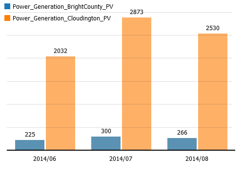
Multi-variable bars
Bar chart for comparing multiple variables which are distinguished by color. The axes can be subdivided by categorical data attributes.
Click for more information
How to get this visualization
Multi-variable bars are available in the cockpits "Summaries" and "Multivariate drill-down" (Visplore Professional). The variables are selected outside the view in one of the overviews of all variables.
Note: This view is very similar to usual bar charts, except that color is reserved to distinguish the variables and can not be defined by the user.
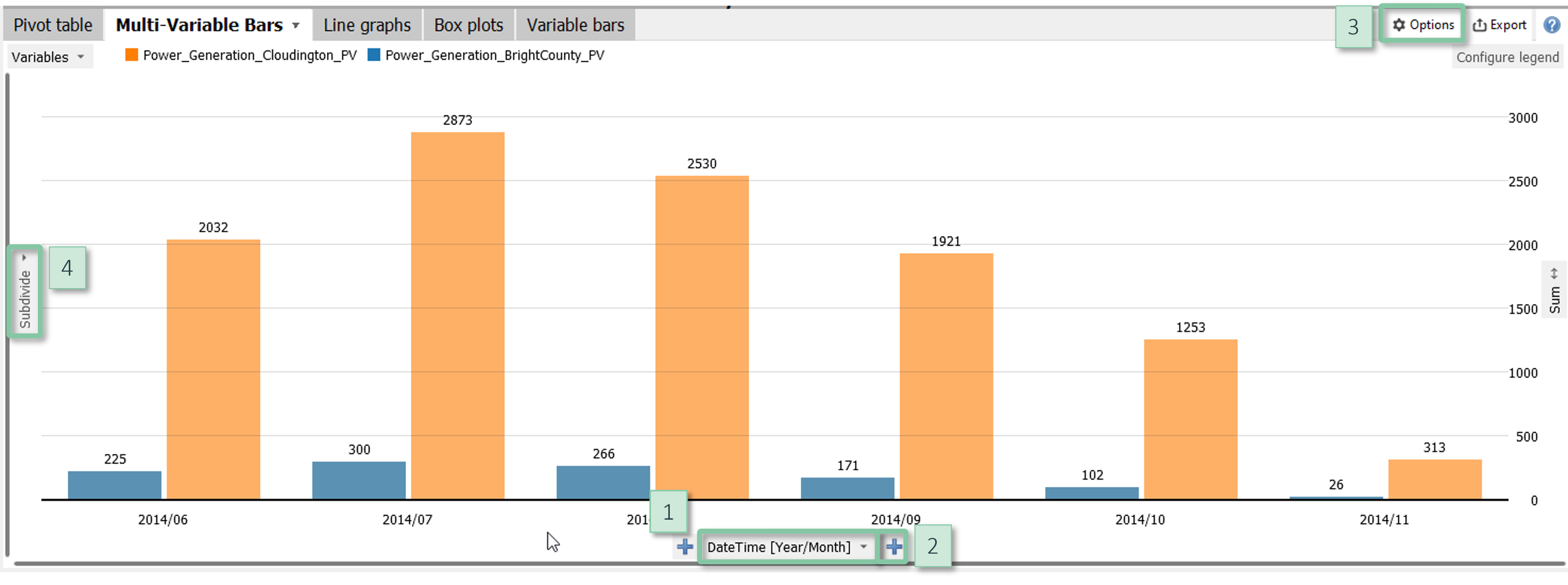
Configuration
- Define bars: Clicking the centred label at the bottom [1] allows for switching the categories used to define the classes. You can nest multiple data attributes using the "+" signs [2] and change their order using drag and drop.
- Bar length: The item "Configure view" in the view options menu [3] allows for configuring the information represented by the bar lengths.
- Sorting and hiding bars: Clicking the centred label at the bottom [1] offers multiple options for sorting the bars. In the dialogue for custom ordering, it is also possible to hide categories and to display sub-totals (check the option "Combined").
- Y axis subdivision: Clicking the vertical label "Subdivide" [4] allows for subdividing the Y axis by additional categorical data attributes.
- Labels: The item "Cell labels" in the view options menu [3] configures labels to display precise values of the information shown by bar length and color.
Further information
- about visualizing categorical data.
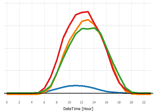
Aggregated line graphs
A line graph visualizing aggregated values of one or more variables, for example for trends or average daily profiles. You can subdivide the axes by categorical data attributes.
Click for more information
How to get this visualization
Aggregated line graphs are available in the cockpit "Summaries". The displayed variables are selected outside the view.
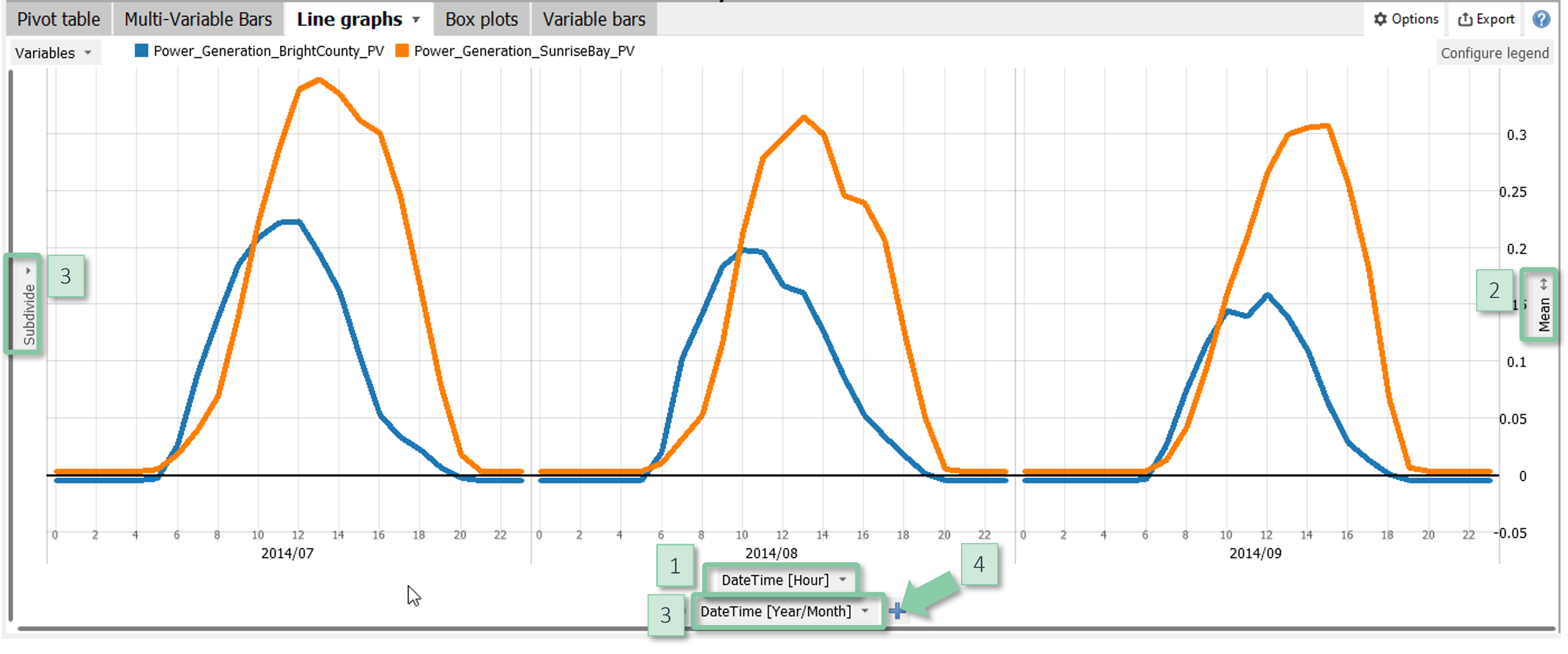
Configuration
- X axis of graph: Clicking the centred label at the bottom [1] selects the categories to define the graph. Often, the categories are temporal such as calender months or hours of the day.
- Y axis of the graph: The information shown by the graph is a statistic as displayed to the right [2]. Clicking on the statistic allows for switching to a different statistic and for scaling the Y axis.
- Subdivision: You can subdivide the X- and Y-axes by clicking on the centered gray "Subdivide" buttons [3]. You can nest multiple data attributes using the "+" signs [4] and change their order using drag and drop.
Note: Color is used to distinguish variables.
Further information
- about visualizing categorical data.
Box plots
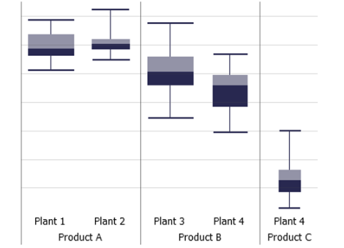
Summarize the distribution of a variable by its median, its inter-quartile range and the range containing 95% of the data. A common use case is to compare categories by their distributions. You can subdivide both axes of the view by additional categorical data attributes.
Click for more information
Interpretation
Box plots are a common statistical chart type for summarizing uni-modal distributions, for example normally distributed data. The inner, filled box indicates the range containing 50% of the data, i.e., the lower end is the 25% percentile and the upper end is the 75% percentile. The border between the dark and light gray areas is the median. The outer "whiskers" show the range containing 95% of the data. The lower end is the 2.5% percentile and the upper end is the 97.5% percentile.
How to get this visualization
Box plots are available in the cockpits "Summaries" and "Multivariate drill-down" (Visplore Professional). The displayed variables are selected outside the view.
Configuration
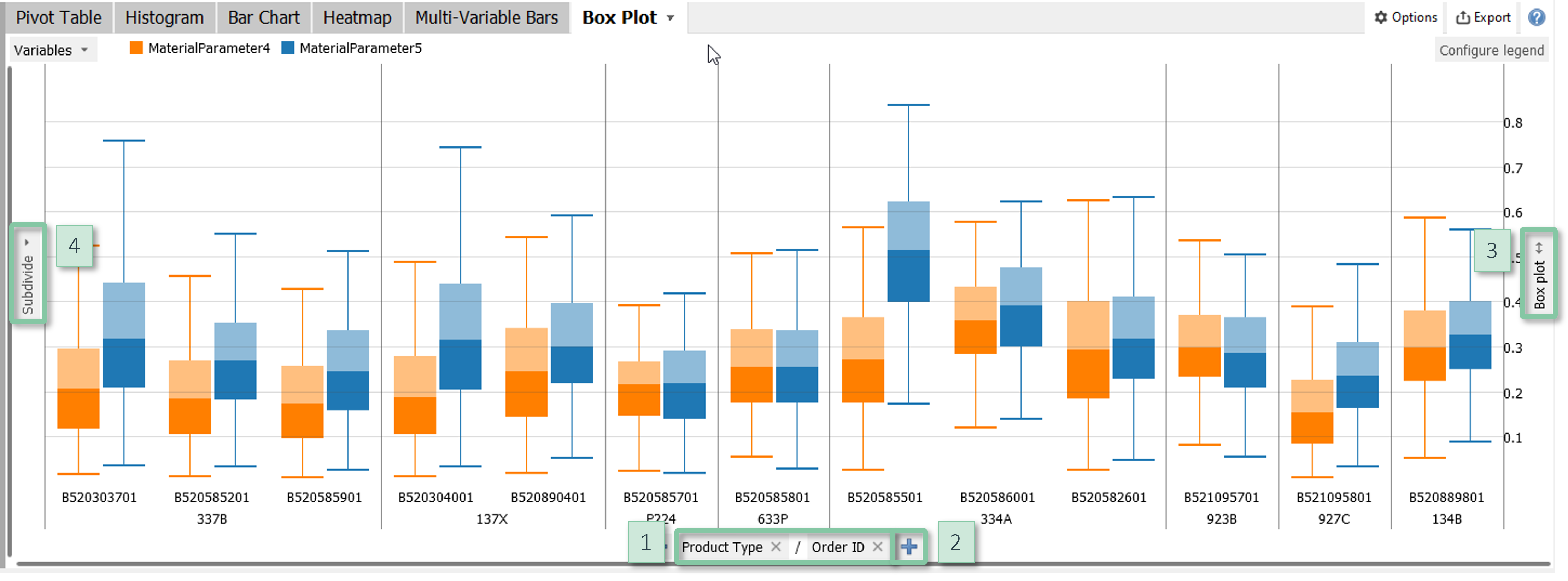
- X axis: Clicking the centred label at the bottom [1] switches the categories of the box plots. You can nest multiple data attributes using the "+" signs [2] and change their order using drag and drop.
- Sorting and hiding categories: Clicking the centred label at the bottom [1] offers multiple options for sorting the categories, for example alphabetically, by their size, or any custom order. In the dialogue for custom ordering, it is also possible to hide categories.
- Y-scaling: The box plots can be scaled by clicking on the label next to the right border [3].
- Y axis subdivision: Clicking the vertical label "Subdivide" [4] allows for subdividing the Y axis by additional categorical data attributes.
Note: Color is used to distinguish variables.
Further information
- about visualizing categorical data.
Curves
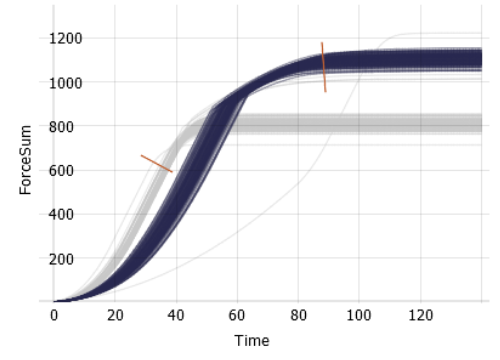
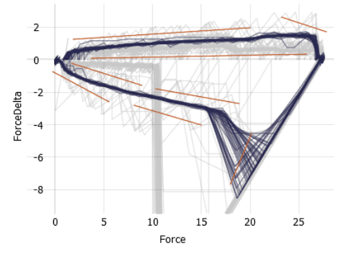
Visualizes a large number of curves. Examples of curves include daily profiles of an energy load, signatures of many machine operations, batches in batch production, spectral data, and much more. All curves share the axes where X typically represents the time since the beginning of each operation. Key features of this view are interactive tools for selecting curves and aggregated visualizations of curve clusters.
Note: this visualization is only available in visplore professional.
Click for more information
How to get this visualization
There are two different ways to visualize curves:
- Extract the curves from (long) time series data by using the cockpit "Pattern Search and Comparison". This cockpit offers multiple options for extracting curves, including temporal cycles such as days and weeks, patterns found by pattern search, and any contiguous time periods which are selected by the user.
- Load data with curve-typed data attributes. Such data attributes may come from separate CSV files being indexed from a "main" CSV file, or they can be imported via the APIs to Python and Matlab. For curve-typed data, the cockpit "Multivariate drill-down" offers a curve view that is collapsed by default as a vertical gray area titled "Curves" in the lower right part of the cockpit. The cockpit "Curve Property Definition" also has a curve view and allows for defining features on the curves.
Configuration
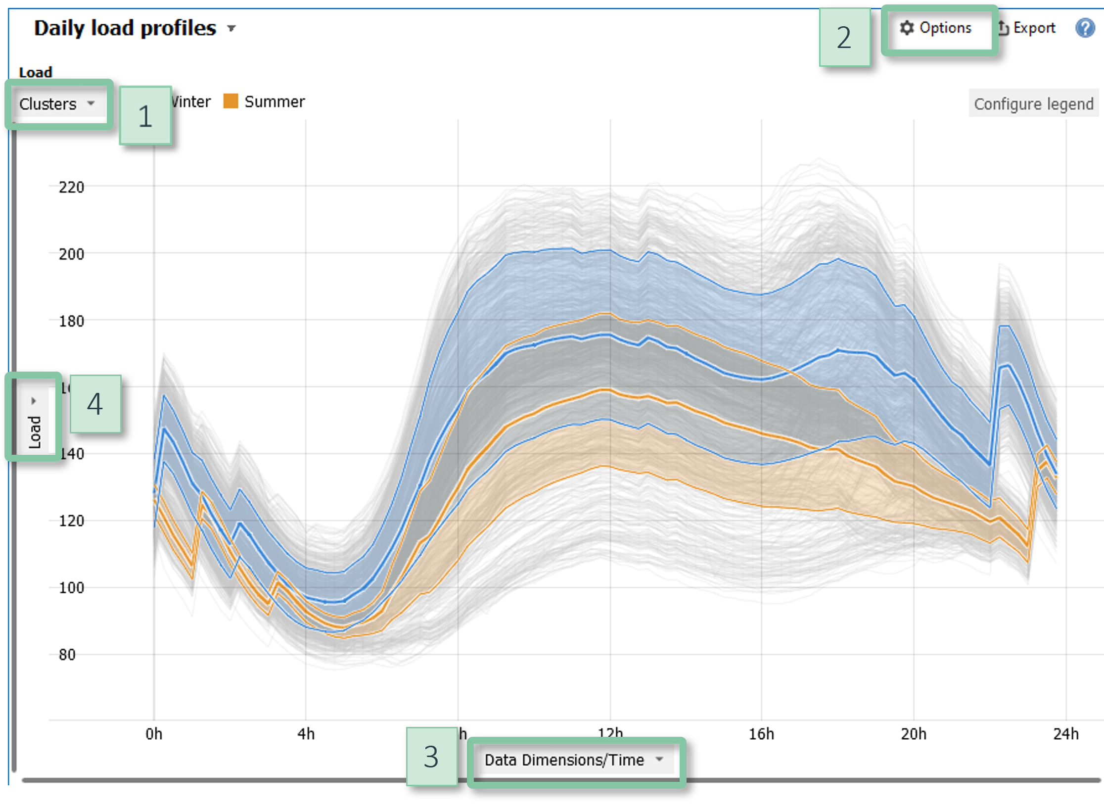
- Color: Click on the gray area in the top left corner [1] to display additional information by color. A common use case is to discriminate different classes of curves via categorical data attributes.
- Aggregation: The item "Show aggregated curves" in the view options menu [2] optionally overlays average curve profiles and bands showing the dispersion. If a categorical data attribute is displayed by color, this can be used to visualize multiple clusters in the curves. You can also export the data of the computed average curve profiles, for example when identifying optimal profiles.
- X Alignment: Click on the label of the X axis [3] to adjust the horizontal aligment of the curves. By default, the curves are aligned by their starting position, but you can alternatively align them by their maximum or minimum value, for example.
- Y Normalization: Click on the label of the Y axis [4] to optionally normalize each curve. This enables to compare patterns for curves with different vertical scales.
- Transparency: In the view options menu [2], you can tune the transparency to convey the data density.
Interaction
You can select curves using the following two selection tools. The active tool can be chosen in the view options menu [2].
- Line selection: Selects all curves that intersect the user-defined line. This is quite versatile: For example, a horizontal line selects all curves exceeding a certain threshold while a vertical line selects curves that are within a certain range at a specific X position.
- Similarity selection: Allows for drawing a polygon and selects all curves that are within a certain tolerance range around the polygon.
Further information
- about the cockpit "Pattern Search and Comparison".
- about the cockpit "Multivariate drill-down".
- about the cockpit "Curve Property Definition".
Curves vs. Curves
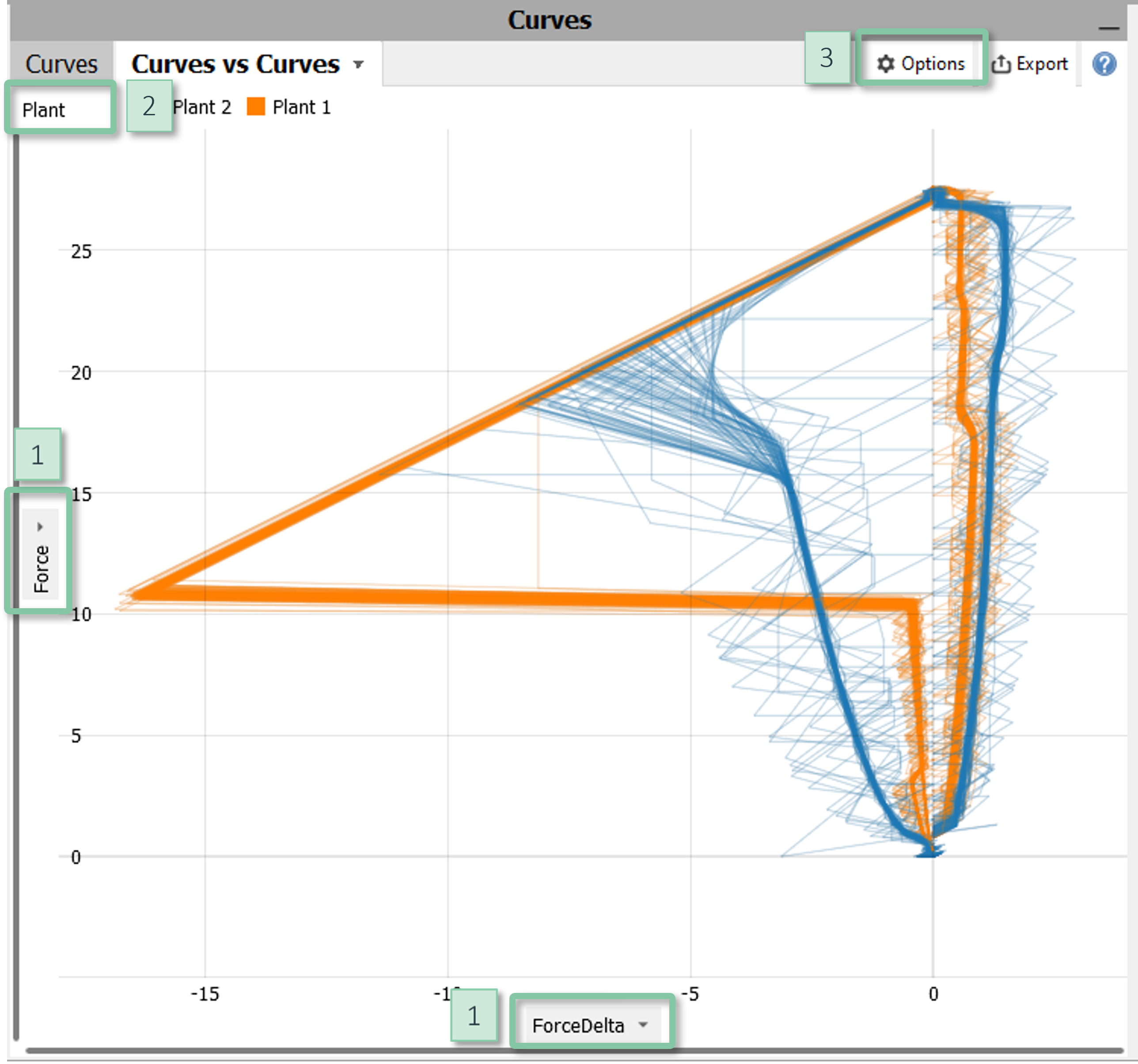
Plots two curve-typed data attributes against each other. A typical use case is the visualization of large numbers of (planar) movements and trajectories where the X- and Y- components of the movements are given as curves.
Note: this visualization is only available in visplore professional.
Click for more information
How to get this visualization
The visualization is available in the cockpit "Multivariate drill-down" (Visplore Professional) if the data contains two or more curve-typed data attributes. Such data attributes may come from separate CSV files being indexed from a "main" CSV file, or they can be imported via the APIs to Python and Matlab. In the cockpit "Multivariate drill-down", expand the vertical gray area titled "Curves" in the lower right part.
Configuration
- Axes: Click on the labels of either axis [1] to choose the displayed curve-typed data attribute.
- Color: Click on the gray area in the top left corner [2] to display additional information by color.
- Normalization: Click on the labels of either axis [1] to optionally normalize the curves.
- Transparency: In the view options menu [3], you can tune the transparency to convey the data density.
Interaction
You can select curves using a line tool which selects all curves that intersect the user-defined line.
Further information
about the cockpit "Multivariate drill-down".
Sensitivity analysis and response surface tool
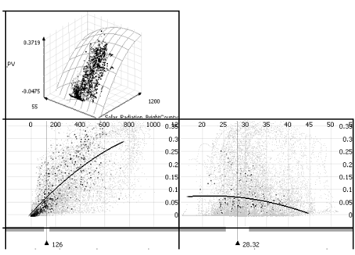
This is an interactive tool for visualizing multivariate regression models. The most common use cases include sensitivity analysis, "what if" analysis, and model validation. The main purpose is to visualize the expected impact of changes in independent variables on a quantitative target variable as predicted by a regression model. These dependencies can be visualized as explicit and implicit function graphs as well as 3D response surfaces.
Note: this visualization is only available in visplore professional.
Click for more information
Interpretation
Assume you have a regression model of a target variable y as a function of three independent variables x1, x2, x3, i.e., y = f(x1, x2, x3). This tool then visualizes how changes of x1, x2, and x3 affect y. The main idea is to visualize this information by breaking it down to multiple lower-dimensional plots, namely function plots, iso-contour plots, and 3D surface plots. All these plots are essentially slices through the four-dimensional cube (x1, x2, x3, y), as shown by this illustration:
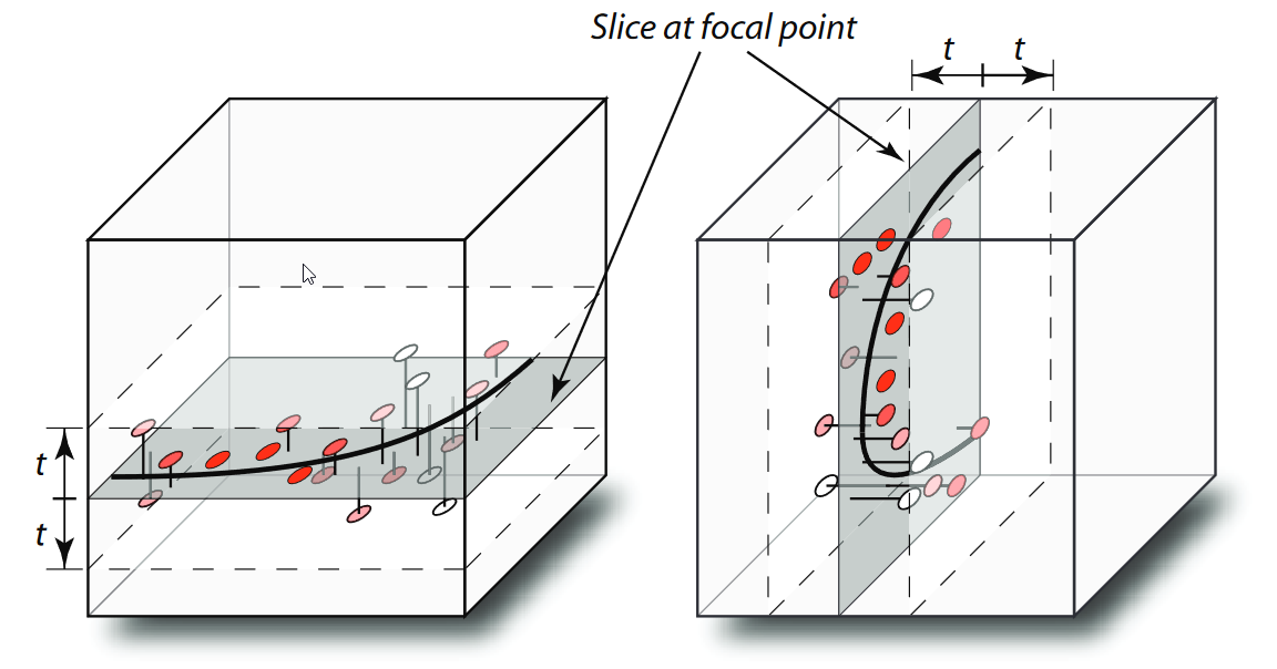
To visualize the function graph y = f(x1), for example, the parameters x2 and x3 must be held constant. Likewise, for plotting y = f(x2), x1 and x3 must be held constant, and so on. The principle is thus to specify a user-defined vector (the "focal point") that provides values for all parameters which are not directly visualized in a plot. This vector is graphically represented as sliders that can be dragged by the user to navigate within x1, x2, and x3. The following example shows how a plot can change by altering another parameter outside the plot.
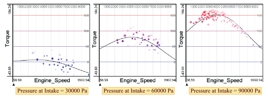
The basic layout is a row of line plots, i.e., y = f(x1), y = f(x2), y = f(x3). Dragging the slider in one plot affects the function graphs in all other plots. Note that parameters can also be categorical. In this case, the predicted value for each category is visualized.
Optionally, the tool also visualizes parameter combinations as additional plots: Implicit function plots show the interaction of two parameters on the target y as iso-contours, while 3D function plots show the combined effect of two parameters on y as a (response) surface in 3D.
In addition to the regression function, the tool also displays the data samples of the loaded data set around the function. This can be used for a qualitative model assessment and also conveys, if the prediction for certain parameter combinations are backed by data at all.
More details are described in this paper:
H. Piringer, W. Berger, and J. Krasser. "Hypermoval: Interactive visual validation of regression models for real-time simulation." In Computer Graphics Forum, vol. 29, no. 3, pp. 983-992, 2010.
How to get this visualization
This tool can be found in the cockpit "Multivariate Regression". It is available once a model has been created.
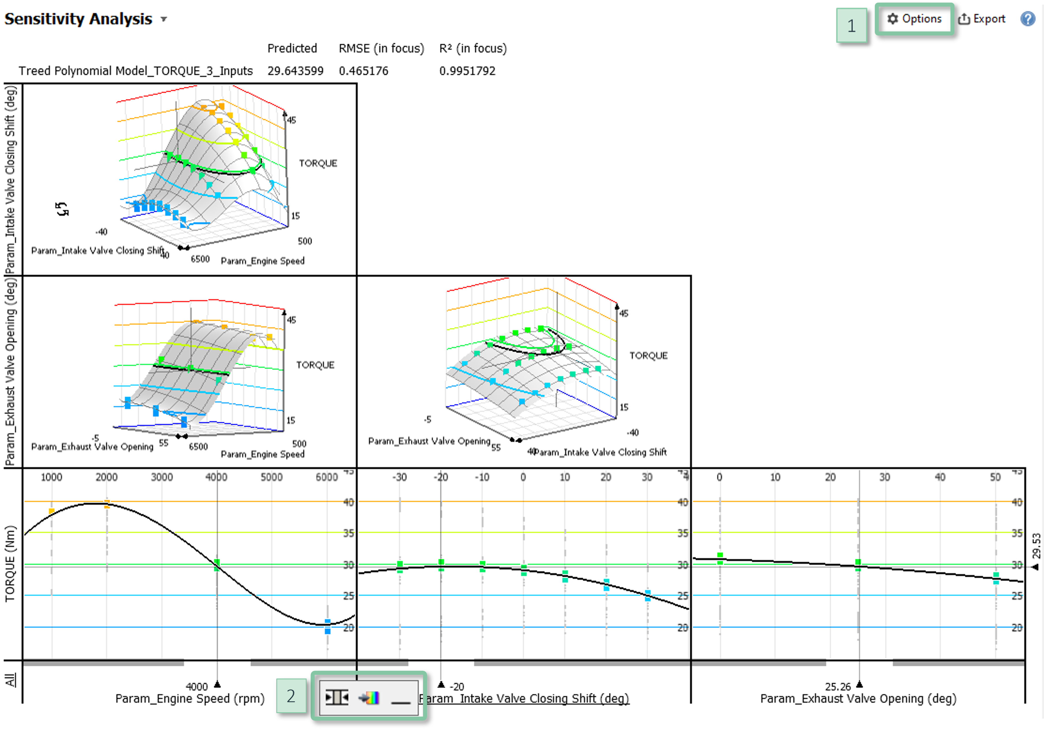
Configuration
- Showing data points: In the view options menu [1], the item "Data point options" lets you toggle the visibility of the data points and adjust their size.
- Fading options: By default, data points are faded with increasing distance from the focal point. Function plots are faded out if no data samples are nearby, in order to avoid misleading extrapolations. This behavior can be adjusted in the item "Fade options" of the view options menu [1].
- Parameter combination plots: In addition to the row of univariate dependencies, additional cells may show dependencies of parameter combinations as iso-contours or 3D surfaces. These plots can be enabled by the item "Switch visualization mode" of the view options menu [1].
- Hiding parameters: If the regression model has many inputs, it can be reasonable not to visualize all of them. When hovering a parameter name, additional controls appear [2]. The right symbol "_" hides the parameter.
- Parameter variation: The additional controls [2] also support to visualize variations of one parameter by color. In the image above, variations of the dependent variable are color-coded.
Interaction
The main interaction is to drag the sliders that define the focal point. This allows for answering questions such as, "what would happen to the target, if the parameters changed in a certain way?".
Further information
about the cockpit "Multivariate Regression".
License Statement for the Photovoltaic and Weather dataset used for Screenshots:
"Contains public sector information licensed under the Open Government Licence v3.0."
Source of Dataset (in its original form): https://data.london.gov.uk/dataset/photovoltaic--pv--solar-panel-energy-generation-data
License: UK Open Government Licence OGL 3: http://www.nationalarchives.gov.uk/doc/open-government-licence/version/3/
Dataset was modified (e.g. columns renamed) for easier communication of Visplore USPs.
