How is Visplore different from Tableau or Power BI?

Author: Harald Piringer – July 7, 2021

In the past decade, business intelligence software has gained widespread popularity for data visualization. Tools such as Tableau, Power BI and several others are widely known. Therefore we are often asked to explain the difference between Visplore and those tools.

This blog tries to answer that question. In a nutshell, Visplore is optimized for checking, exploring and labeling large sensor data as well as for a digging deep into process issues whereas business intelligence tools such as Tableau and Power BI are designed for building custom dashboards to support standardized analysis and reporting of business data.

Before diving into details, I want to emphasize one conclusion right away: As the importance of data is rising sharply, there is no “one size fits all”. Using data effectively requires you to know when to apply which tool. This blog provides some guidance here and explains, when Tableau, Power BI, etc. are good choices – and when they are not.
Data Exploration vs. Reporting

Data visualization can fulfil multiple purposes. Let’s illustrate this by a scenario.

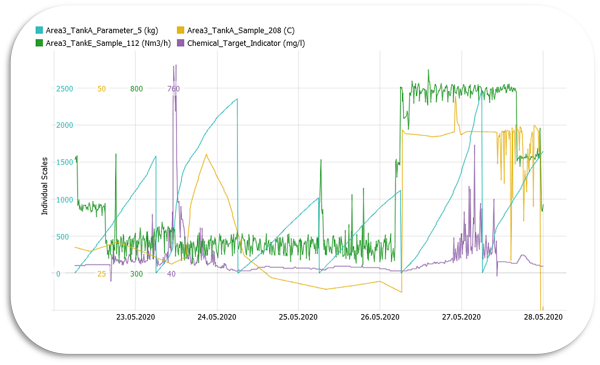
Think about a consultant who just received massive high-resolution machine sensor data from a customer for a new project (say: a manufacturing company wants to predict failures). As an important early project milestone, the consultant needs to understand the data basis really well and be aware of potential issues regarding completeness and plausibility of the data. All further steps and the outcome of the project depend on this knowledge. Understanding new data is a typical setting for data exploration. Visualization is great for data exploration, because it largely avoids assumptions about the data and allows for discovering also unexpected patterns.

Now, assume that the project has made progress. For presenting results to the customer, the consultant prepares charts that compare a few selected KPIs. This is a typical setting for reporting. Showing the most relevant information graphically makes it easy to get the message across. In a broad sense, monitoring can also be seen as a way of reporting from the process to the human. In our scenario, for example, a project result could be a live dashboard that displays whether some process KPIs are inside their expected ranges. It is a kind of reporting because it is typically standardized what information to present so that abnormal situations are easy and fast to detect.

So – what’s the difference now?

Using visualization for reporting and monitoring is in general much more familiar to most people than data exploration. And that’s what business intelligence tools such as Tableau or Power BI are optimized for: Building custom dashboards for standardized analysis and reporting.

These tools are essentially construction kits. You can build cool dashboards – if you know very well what to build, how to build it and if you have the time to perform the large number of steps needed for building something that is more complex than a standard chart. This is ok, if you build it once and use it repeatedly, which is the typically the case for standardized reporting and monitoring.

But what about data exploration?

The following table compares typical requirements of reporting on one hand, and visual data exploration on the other hand.

Table 1: Difference in requirements between reporting and visual data exploration
ReportingExploration
ProcessWidely standardized process either by a sequence (e.g. a “story”) or by some well-defined options for drill down and filter.Many ad-hoc decisions about where to go next during the analysis, depending on discoveries made in the data.
Number of variablesTypically, the number of variables is intentionally kept low in the visualization to focus the attention on a few well-known KPIs.It is often necessary to understand hundreds of variables where it is not known before, which ones will ultimately turn out to be relevant.
Level of aggregationNot only the number of variables, but the complexity of the visualization itself is usually minimized by showing highly aggregated information, such as sums per month and product group. Therefore, the number of visually represented values is typically rather small.It is often necessary to look at data which is hardly aggregated or even the raw data. For example, finding short spikes and outlying patterns in high-frequency machine data might require plotting millions of individual values. The number of visually represented values is often very large.
Data quality and preparationDashboards for presentation, monitoring, and controlling often assume that data quality issues have been dealt with before, for example by automated pre-processing steps. Cleansing the data within the dashboard is typically out of scope.Most data quality issues are discovered during the exploration – this is actually one of its outcomes! This means that many data challenges such as gaps, outliers, useless periods (e.g. machine standing still), etc. need to be handled when they are discovered before proceeding the exploration. Ad-hoc data preparation and data exploration thus go hand in hand.
Performance and interactivityInteraction with the data can be important, but typically for rather discrete interactions (e.g., one click to do a drill down) and on data that has been aggregated before.Fast interaction is crucial in order to avoid interrupting the flow of thoughts and often involves continuous interactions, for example panning and zooming a detailed graph with millions of non-aggregated data points.
Use of analyticsThe use of analytics is typically standardized as part of the data processing pipeline, for example evaluating the same forecast model on new data.The use of analytics is widely spontaneous. For example, to use statistics for comparing and describing clusters that have just been discovered.

The requirements for effective visual data exploration thus differ significantly from those of building custom reporting dashboards. This is where Visplore comes into play: Visplore has been designed and optimized for interactive data exploration and data preparation.

When does this difference matter?

Apart from the scenario described above, there are numerous situations that require exploring massive data. To name just a few:

  1. A researcher or engineer has collected new data from experiments and needs to check its plausibility as well as develop ideas and hypotheses based on the data.
  2. A company in plant engineering or mechanical engineering has put a new asset into operation and uses the initial data to ensure that everything is working properly.
  3. An industrial company experiences problems with one of their assets which are hard to explain. They thus need to dig deep into the sensor data to find and understand hidden root causes.

In all of these (and many other) settings, the analysis has a strong exploratory component because it either refers to data from a new source and/or requires finding out new aspects about the data. The path to these findings is not known before. That’s why the key to success is agility and fast discoveries rather than fine-tuning custom dashboards for each new thought of the exploration.

Why does Visplore shine with data exploration then?

Visplore is structured very differently than business intelligence programs such as Tableau or Power BI. All aspects of Visplore are optimized for rapid exploration of massive measured data:

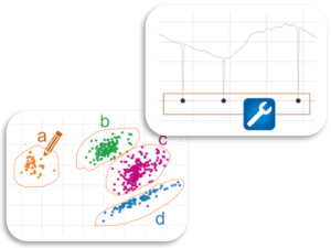
Ready-to-use cockpits: In Visplore, you don’t need to build charts and dashboards from scratch. Instead, Visplore provides pre-configured cockpits for analyses such as trending, correlation, pattern search and comparison, regression, and much more. The cockpits already comprise multiple visualization types. You don’t have to create these views – they are ready to be utilized! The cockpits enable an optimal workflow by having all these views working together. So, Visplore gets you started with a deep look at your data (literally within seconds), and not with myriads of options to define your first chart of one or two variables. You directly benefit from best practices in data visualization and dashboard design. This not only makes exploration much faster, but also way easier.

Ready-to-use cockpits

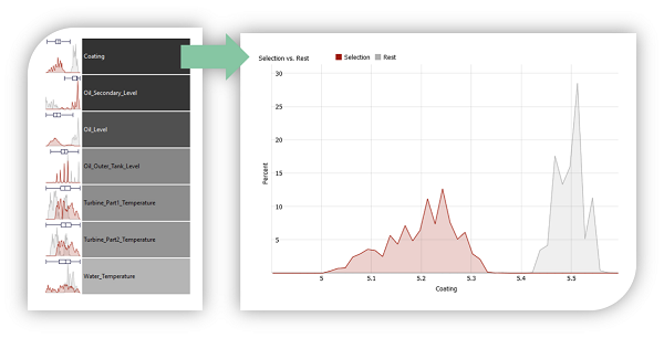
Guided exploration of many variables: In data exploration, you often don’t know which variables are worth looking at. Visplore addresses this challenge twofold: first, it provides visualization types that convey patterns and relationships effectively even for multiple dozens of variables or sensors. Second: Visplore employs built-in analytics to guide the user. For example, by grouping similar variables or sorting them by some aspect of the data. Together, these features provide a truly global perspective on the data and make you look at relevant variables / sensors you might have missed otherwise – for surprising discoveries.

Fig. 2: Guided exploration of many variables

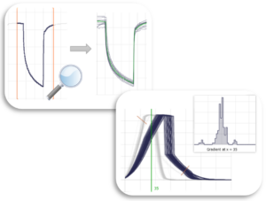
Fast visualization of non-aggregated data: Data exploration has to be smooth in order to become really effective. Performance makes all the difference between a creative workflow and an annoying interrupted trial-and-error search. That’s why Visplore is highly optimized to enable a smooth experience without delay even when analyzing and visualizing millions of raw, non-aggregated data values.

Fig. 3: Fast visualization of non-aggregated data

Built-in data preparation: Cleaning data can be very time-consuming. That’s why Visplore integrates data exploration and data preparation. A good visualization can be the most intuitive user interface to deal with your data. That’s why you can select, filter, replace, modify, segment, … data directly within the visualization where you discovered the feature. This speeds up the preparation by magnitudes, perfectly aligns with the exploration rather than interrupting it, and makes it easy to get validated results you can trust.

Built-in data preparation

Advanced analytics for process data: Visplore offers functionality for data from machine sensors and industrial processes that go far beyond the scope of BI tools. For example, searching pattern profiles, extracting time-dependent outliers, compensating for lags between sensors, and much more. Moving averages can be overlaid with a single click rather than by advanced formula computations and complex chart configuration. So when a domain expert asks questions such as “what’s that cluster?”, “how often does this pattern occur?”, “how did the process change at that event?”, “which variables does the temperature correlate with?” and many more, it’s possible to answer that instantly, within seconds. Compare this to the traditional workflow of taking notes, doing tedious “home work” to prepare some results and waiting for the next meeting two weeks later to discuss the results only to end up with new questions.

Advanced analytics for process data

I still don’t get it…

For illustrating the difference between Visplore and Tableau (Tableau Desktop version 2020.3), let’s have a look at an example use case. Assume we need to understand process data from a hydropower plant. It contains 21 sensors (which is not much for process data) with one value per minute over 4 years – approximately 2 million values per sensor. In both tools, the data can be imported within a few seconds. Afterwards, however, the process is very different. Note: we chose Tableau here, but the distinction is very similar for other business intelligence programs such as Power BI.

Step 1: A first view on the data

The usual way to start exploring new data is by looking at some basic statistics and plots.

Visplore

Starting the first cockpit (“Trends and Distributions”) takes 2 clicks and a few seconds on an average laptop. Without any pre-configuration for that specific data, you get a list of statistics for each of the 21 sensors, a time series visualization, and a histogram.

These views (and many more such as a calendar, duration curves, bar charts, etc.) are already linked. For example, a click in the statistics table shows the time series and histogram of that sensor within one second. Zooming into any part of the data is animated and updates the visualization immediately. Selecting a time period shows the histogram and statistics of this period. All of that without any configuration or coding.

Tableau

In order to see anything of the data, it’s necessary to specify a visualization from scratch. Even if we know which variable to look at, it still takes multiple drag and drop interactions to generate an initial time series visualization. For inspecting another variable, further drag and drop interactions are necessary to modify the visualization accordingly. Looking at the data in full resolution, Tableau already makes you wait a long time just to get a first glimpse at time series plots from three of the 21 variables due to delays for updating the visualization after each modification. At the same slow pace, it is possible to zoom into the view – waiting long for each update.

At that point, we still have not seen much of the data – no idea about basic statistics (which variables contain meaningful data at all?), distributions, or any other information about the data. Just adding a histogram requires to first create it and then to configure a dashboard that contains both views. More configuration is necessary for making the views filter each other. And even more advanced features such as dashboard parameters are needed for switching the shown variable in both views simultaneously. After a few minutes at the latest, the focus is not on exploring the data any more, but on building dashboards.

Step 2: Correlation analysis

Correlations are a key aspect of exploratory data analysis. In this use case, it’s relevant to identify groups of highly correlated sensors and periods that differ from usual correlation behavior.

Visplore

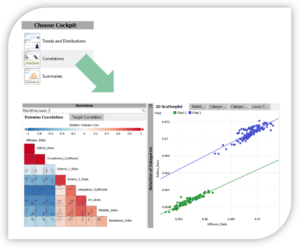
Switching to the Correlations cockpit takes three clicks. In less than 20 seconds, we see a correlation matrix of all variables. This provides the big picture and allows for discovering also unknown correlations.

Everything is pre-configured for drill down: a single click on any cell of the matrix shows a detailed scatter plot of those two variables and the corresponding time series visualization. The update time is less than 1 second. Also in this cockpit, the views are already linked by default. Selecting any pattern or time period updates all views. For example, we can filter the correlation analysis on periods of really useful, homogeneous data. This is a matter of less than ten seconds and advances the flow of thoughts, rather than interrupting it..

Tableau

Specifying a scatter plot with a trend line is easy. Going beyond that is not. For example, you can create a correlation matrix, but it involves multiple advanced steps such as setting up self-joins, creating calculated fields, and seven steps for building the view (https://kb.tableau.com/articles/howto/creating-a-correlation-value-matrix). Even then, this view is still not configured for showing details upon clicking a pair of variables. This can also be accomplished one way or the other. But again, the attention is on building dashboards, not on exploring and understanding the data.

Step 3: Comparing time periods

Correlations may change over time – and that’s typically relevant information. In this use case, for example, it can be meaningful to compare periods of normal process behavior, without the spikes caused by start-up and shut-down procedures.

Visplore

Visplore makes comparing time periods easy. Selecting three meaningful periods takes less than ten seconds. Comparing them is a click on a button. This automatically configures all views for the comparison, distinguishing them by color, trend lines, correlation coefficients, and many more. The user does not need to worry about how to do this. The focus stays on the interpretation of the results for many new insights in very short time.

Tableau

You can filter and compare subsets of your data – but it requires many manual steps such as defining sets and manually re-configuring the views of the dashboard. Working on millions of data records causes long delays for updates. It’s thus likely to take several minutes even for a power user just to compare two time periods by some statistics. This is far from answering ad-hoc questions instantly.

In a nutshell

In Visplore, this entire workflow takes less than 30 clicks and can easily be accomplished within 5 minutes even for a novice user. The steps match a typical data exploration use case: looking at various variables separately and in combination, filtering uninteresting data, inspecting trends, understanding correlations. Getting the pre-configured visualizations is essentially instant even without any training or background in data analytics.

Doing data exploration in Tableau, Power BI and most other business intelligence tools is not impossible. However, it takes much longer especially for large data and non-aggregated visualizations, requires a much deeper expertise in using the tool, and is not designed for quick ad-hoc analytics. You typically have to know which variables you want to look at rather than relying on the tool to guide you. Beyond simple charting, the attention soon shifts from exploring the data to configuring visualizations and dashboards.

So, is Visplore always the better choice?

No. The previous section illustrated a typical data exploration use case on sensor data. The story is different for building an operational report of a few selected business KPIs. For this use case, the numerous options to fine-tune details of the views and the flexibility in building and deploying custom dashboards makes Tableau or Power BI (or some other business intelligence tools) great choices!

And that’s the point: In today’s data-driven world, there is no “one size fits all”. Data is becoming way too business-critical for all enterprises so that using the wrong tool for the wrong task and/or wrong data would work in the long run. It can be tempting to keep using familiar tools or trying to minimize the overall number of tools. That’s why much data analysis is still done in Excel, even when it does not fit the capabilities of Excel at all. However, using tools for purposes which they have not been designed for is simply not efficient!

  • For standardized interactive reporting of business KPIs, the best choice might be Tableau, Power BI or some other business intelligence tools.
  • For operational predictive / AI models, this might be Python or R in conjunction with the numerous toolkits available for data processing and modelling.
  • For advanced scientific or engineering programming, this might be Matlab.
  • For building and deploying data processing pipelines visually, this might be Alteryx, KNIME, RapidMiner, or Orange.

… and this could be continued.

For that reason, Visplore offers integrations to Python, Matlab, and R – enabling users to work in a side by side manner and to use each tool for what it does best.

And for checking, exploring and labeling large sensor data as well as for digging deep into process issues – that’s Visplore.

Additional Information

These videos give you a first impression in less than 3 minutes for applications from the energy sector as well as industry.

For a more detailed look at data exploration in Visplore, please have a look at this video or others of our video academy.

This blog explains data exploration in more depth.

Have fun visploring your data!

About Harald Piringer

Harald Piringer studied informatics at the Vienna University of Technology and finished his PhD in 2011. For more than 10 years, Harald Piringer was the head of the Visual Analytics group at the VRVis research center in Vienna / Austria, where he did applied research in close collaboration with partners from industry, energy, healthcare, and other sectors. Harald Piringer (co-)authored more than 30 international publications in the fields of data visualization and visual analytics. In 2020, he co-founded the Visplore GmbH as its CEO.

Newsletter

Stay up to date on new developments about Visplore. Subscribe to never miss new blog posts!