Step by Step Guide
This guide introduces you to Visplore. It provides a step-by-step tutorial based on a demo dataset, to get familiar with the most important concepts and features.
There are several "lessons" you can follow, either one by one, or by jumping directly to the most interesting ones in the navigation on the left.
Basic analysis of numerical time series
After installing Visplore, you can start it via Desktop icon or via start menu shortcut.
Upon startup you are greeted by a welcome dialog. The first action is loading some data from one of many sources (CSV, database, Python etc.). All sources are described in the Data Import section. Alternatively, you can load one of several demo datasets shipped with Visplore - this is what we do for this step by step guide.
Click "Solar Power" to load a time series dataset shipped with Visplore.

The dataset is a csv file containing about 200 time series from solar power plants and weather measurements from several locations. It is a real, anonymized dataset (credits see bottom of page). If you are interested in the file, you find it in the Data subfolder of your Visplore installation.
To start following this guide, expand the headline below with a click ('A first look at the data ...').
A first look at the data with the "Trends and Distributions" cockpit
Visplore offers several starting points, called cockpits to address different analyses directly without setup effort. For this demo data, the first cockpit "Trends and Distributions" is automatically started.
Once you load data from your own source, like Python, you may need to start a cockpit manually by double-clicking one of the cockpit icons in the "Choose Cockpit" bar on the left. In case you get a dialog for "Role assignment" before the cockpit starts, just press OK for now.
After a few seconds, the cockpit presents itself as shown in the following image. It is divided into several areas, some of which are not yet visible in the beginning (these will be described below). The visible areas have the following functions:
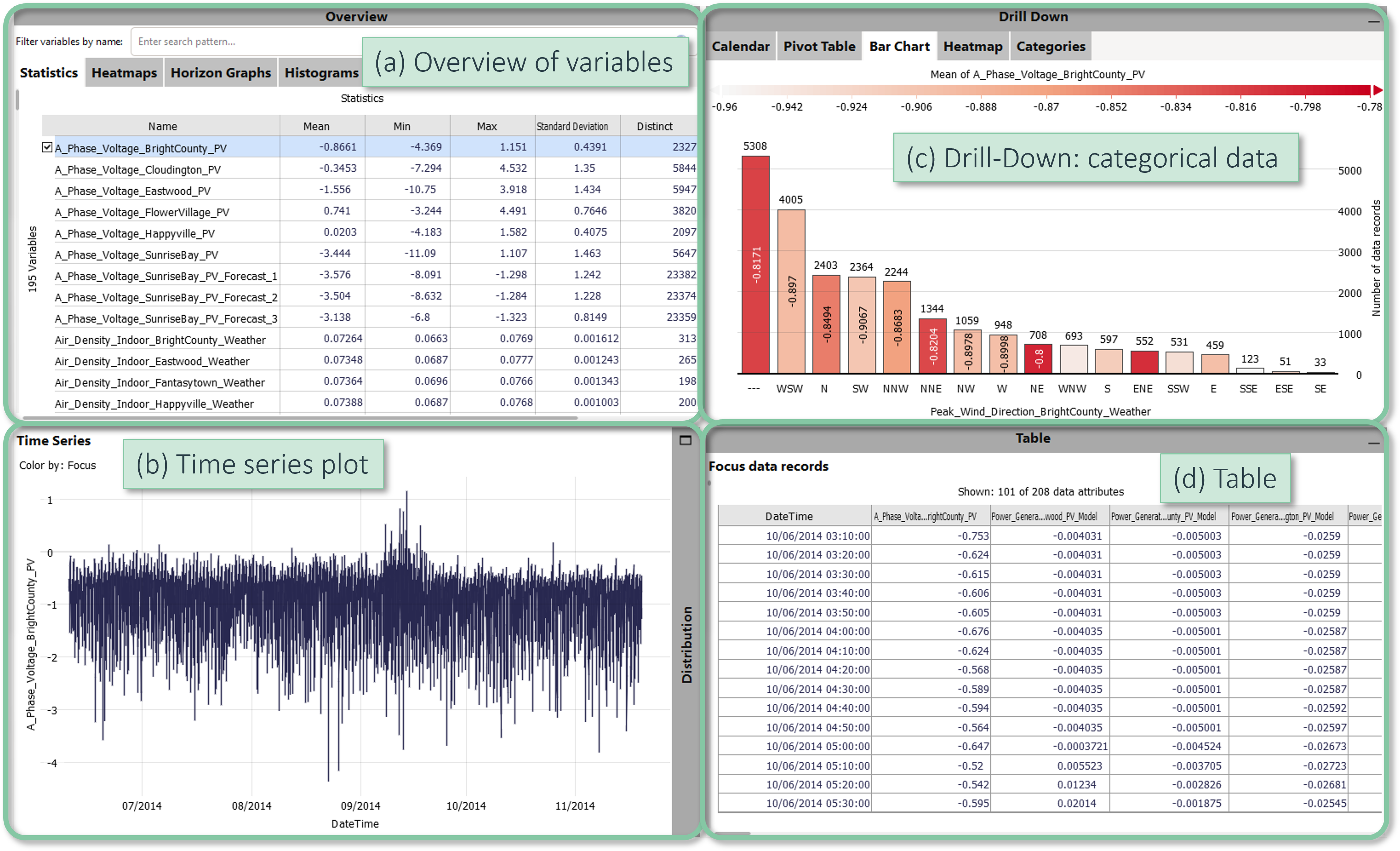
- The Overview of variables area provides the big picture of all time series. Initially, time series are summarized by statistics. Here, you select which time series are shown in the other views, as described below.
- The time series plot shows the selected time series as line graph.
- The drill-down area shows categorical data attributes, and summarizes . This area is only opened initially, if you have categorical data.
- The lower right view shows the data records that are in the focus.
Selecting the displayed time series
You can display a time series in the other views by clicking its name in the overview area.
Please click the name of the second time series, "A_Phase_Voltage_Cloudington_PV".
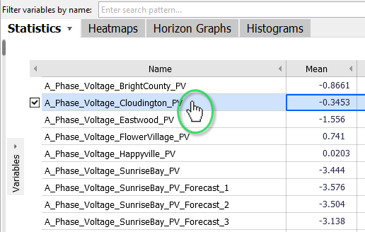
Now, this time series is shown in the "Time Series" graph, as well as its "Histogram", which view can be displayed by opening the "Distribution" bar.

Note: even though there are checkmarks next to the names of the time series, you can just click their name to select a different time series.
Sorting the list of time series
By clicking a column header in the "Statistics" overview, you sort the time series according by that criterion. For example, it might be interesting to identify time series with particularly many missing values.
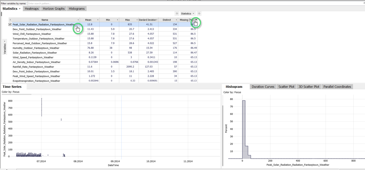
Click the column header "Missing [%]". Then, select the time series with most missing values by a click on its name ("Peak_Solar_Radiation...").
Then Visplore should look like the following image. The "Time Series" view shows that this variable really has no values most of the time:
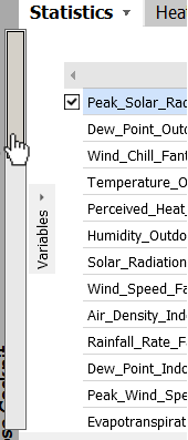
As the example dataset contains much more time series than can be displayed at a time, you can scroll them in the Statistics overview. Either by using the mouse wheel, or using a scrollbar on the left side.
|
Click the gray scrollbar near the left border of the Statistics overview. A bigger scrollbar appears, where you can drag the dark gray area with the left mouse button to scroll. |
 |
Filtering the list of time series by name
For many analyses, it is helpful to filter the time series displayed in the Overview section. Suppose you want to limit the overview to temperature time series.
To do this, please enter "Temp" in the input field next to "Filter variables by name":
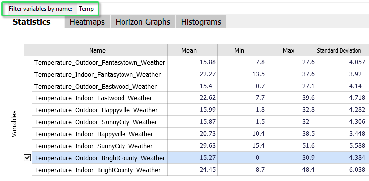
This limits the Statistics overview to those time series that contain "Temp" in their name. You can also type "BrightCounty" to restrict the list to all of that location, or "Temp Bright" to those that have both parts in the name. The statistics table reveals that the time series "Temperature_Outdoor_BrightCounty_Weather" obviously has a minimum of exactly zero (see image above).
Please select this time series "Temperature_Outdoor_BrightCounty_Weather" with a click on its name (see image above).
Zooming and Adjusting Scales
The time series view shows that the time series we just selected drops to zero quite often. To view such periods in detail, you can zoom into the timeline.
Draw a blue rectangle around the area of interest using the right (!) mouse button.
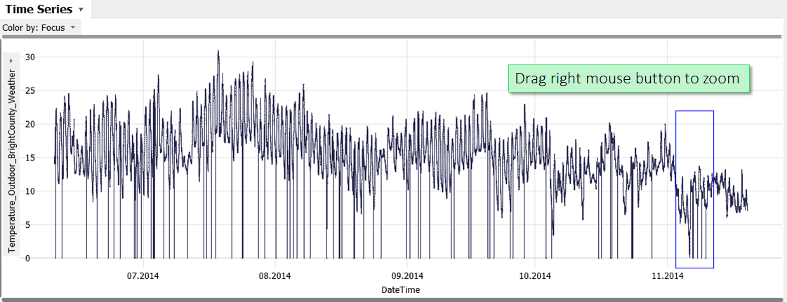
If you accidentally used the left mouse button, and received an orange rectangle instead of zooming, you can undo this action by using the UNDO button in the toolbar on top of Visplore  (or CTRL+Z on the keyboard).
Zooming is with the right mouse button. The left mouse button selects data, which is explained in a later lesson.
Once the view has zoomed, you have several options for navigating in it:
Move the mouse wheel to move the display horizontally (i.e. along the time axis).
Hold down the control key ("CTRL") and move the mouse wheel to zoom in or out - at the position of the mouse cursor.
Press the button in the lower left corner to zoom out completely:
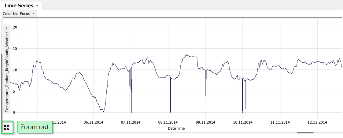
You can zoom in other views as well. Additionally, you can use range slider controls by clicking scrollbars of a view, to have fine-grained control over zooming and scrolling.
In the "Histogram", drag a blue interval around zero with the right (!) mouse button. Then, experiment a bit with the control elements for scaling that appear along the left and lower border.
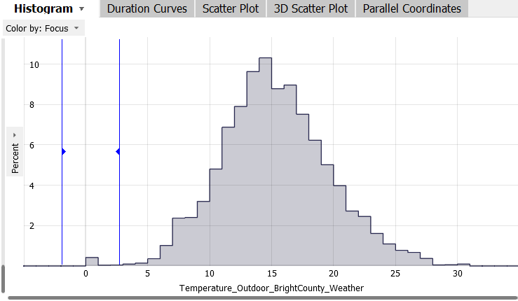
Also here, you find the Zoom out button in the lower left corner of the histogram, once zoomed in.
Additional view: Calendar
The analysis cockpit offers many additional visualizations.
In the upper right corner, switch from the 'Bar Chart' visualization to the first tab, called 'Calendar'.
Note: in case you didn't see a bar chart, click on the dark-gray vertical bar labeled "Drill-Down" at the upper right border of Visplore.
Once you open the "Calendar", Visplore should look like this:
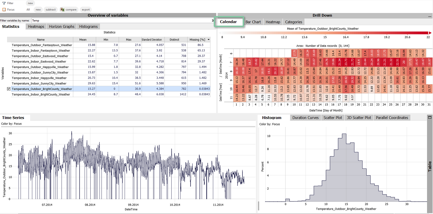
The newly opened "Drill-Down" block aggregates the (one) selected time series by categories. The initially shown view is a calendar, where rows are months/years, and columns are days of the month. The color (and number label, if space permits) initially shows the Mean (=average) value of that day. According to the color scheme, days with a high average temperature are dark red, and cooler days are white-ish.
Now, in the Statistics overview, select the time series "Power_Generation_BrightCounty_PV". The text filter may help you.
Note how all visualizations, including the calendar, adapt immediately when another time series is selected.
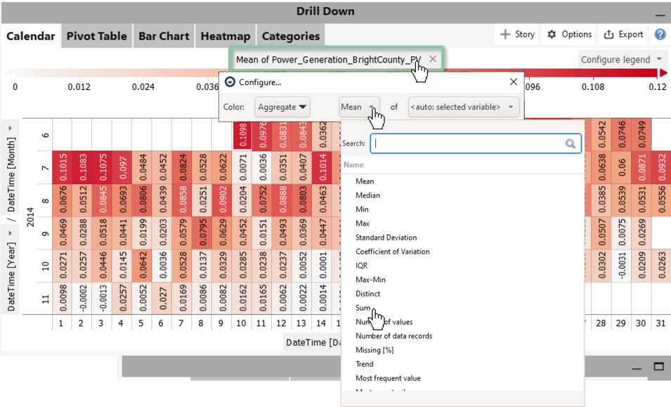
For power generation, daily sums may be more interesting than daily means.
Click the label of the color legend "Mean of Power_Generation_BrightCounty_PV", and select Sum as aggregation:
Well done! You have mastered taking your first look at time series data in Visplore! :) All these visualizations come ready to use in 1 minute to explore your own data, without coding or setting them up first.
>> Continue with Next lesson: Categorical data and pivot tables
License Statement for the Photovoltaic and Weather dataset used for Screenshots:
"Contains public sector information licensed under the Open Government Licence v3.0."
Source of Dataset (in its original form): https://data.london.gov.uk/dataset/photovoltaic--pv--solar-panel-energy-generation-data
License: UK Open Government Licence OGL 3: http://www.nationalarchives.gov.uk/doc/open-government-licence/version/3/
Dataset was modified (e.g. columns renamed) for easier communication of Visplore USPs.
