Forecast monitoring and validation in Visplore Professional – USE CASE TUTORIAL
This tutorial describes how to operate your systems better through forecast monitoring in Visplore. This can be monitoring of forecasts and improving them, or monitoring of a system through forecasts. In both cases we are interested in analyzing deviations between forecasts and actual values, and generating insights.

Pro For this tutorial, we use the cockpit "Deviation Monitor". Please note that this cockpit is only included in Visplore Professional.
The tutorial refers to electric energy consumption data as well as production data from a PV plant. Both data sets contain forecast values that originate from autoregressive models such as ARIMA or multivariate linear regression. However, all described methods are applicable to any model type, as Visplore operates on the forecast- and actual values. The methods presented can be applied to a wide range of topics such as analyzing forecasts of producers, predicting consumer behavior, predicting price trends, and monitoring sensor data - as long as there is an expected or target value, and actual values.
Note: the data shown in this tutorial is not the demo dataset shipped with Visplore. Please apply the shown concepts to a dataset of your own, that fits the data model described in the "Preparation: Loading data" section.
Preparation: Loading data
As a first step, we describe the structure of our dataset – helping you to understand if preparations are necessary in your case.
Data model
For forecast monitoring, Visplore expects data in the form of one data table. Rows correspond to timestamps. Any step size of the timestamps (hours in this example) is fine, and it can even be non-regular. Actual data and forecasts are represented as data columns. The data may include any number of data columns for actual data and forecasts, and it may also contain additional data columns, for example meteorological time series.
Please note that the analysis is based on model predictions, not on the forecast models themselves. As a consequence, it is possible to monitor and validate forecasts from any type of model. In particular, forecasts may also come from forecast service providers.
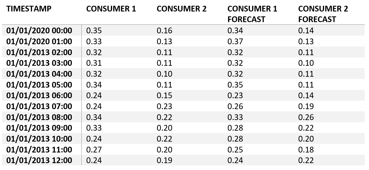
Loading data
Visplore allows you to load your data from various sources. In this tutorial, we load data from a CSV file, structured like the table shown above. Loading data from databases or other operational sources is also possible, and makes sense for monitoring the performance of models or systems on a regular basis. Please refer to the documentation "Data import" if you are interested in details of loading data.
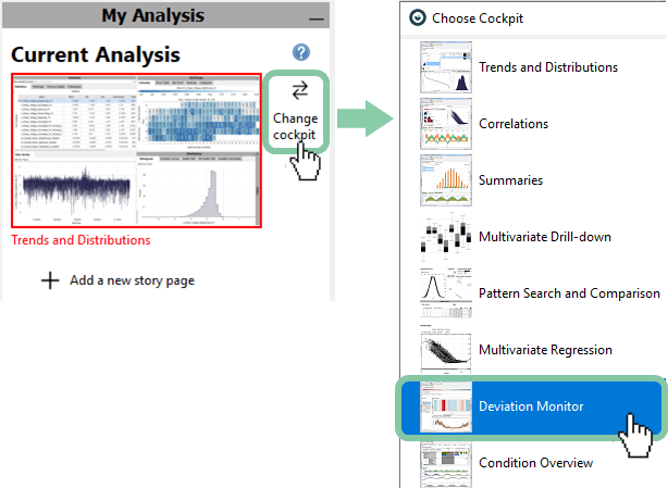
Start the "Deviation Monitor" with a double click.
Assigning roles
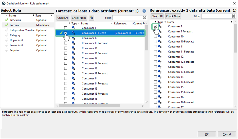
When first starting the Deviation Monitor cockpit, you are asked to specify which data columns represent forecasts and to which actual measurements these forecasts refer to.
Click the item "Forecast" in the leftmost list named "Select Role"
Then, select a data column containing a forecast (here: "Consumer 1 Forecast") in the middle list. Finally, click the variable "Customer 1 Forecast" refers to (typically the actual values). Here, this is "Consumer 1".
The checkmark next to "Consumer 1 Forecast" should have become green, as this is assigned correctly.
In some cases (not here), multiple forecasts may share the same data column as reference. This is typically the case when the goal is to compare different forecasts.
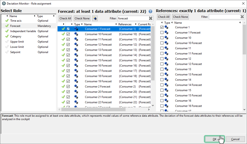
Typically, you have not just one forecast, but many, as in our example. You can repeat the procedure as described before, which may take some time. Note that the assignment is saved automatically and re-applied upon future starts of the Deviation Monitor (provided that the names of the data columns do not change).
Advanced: An optional naming convention significantly facilitates the specification of reference data columns. If the name of a forecast starts with the name of its reference, the reference is assigned automatically. For example, "Consumer 1 Forecast" fully contains the name of the data attribute "Consumer 1", which is accordingly recognized as reference data. Also use the filter in combination with "Check All" and "Check None" as a powerful way to speed up the assignment.
Once at least one forecast is assigned the role "Forecast", the red cross next to the role turns into a green check sign as seen in the figure below. This is also a good time to check if the total number of forecasts correspond to your expectation.
Optionally, this dialog also allows to specify other variables as "Independent Variables", such as influencing temperatures, operating conditions, or external conditions. In this example, we have a categorical independent variable called "Holiday" (with 1 = holiday, 0 = no holiday). Independent variables can help to explain systematic deviations of forecasts (such as higher errors during holidays).
If your dataset has independent variables, select "Independent Variable" in the leftmost list ("Select Role"), then check all such variables in the list on the right side.
Once all roles are assigned correctly, click "OK" to start the Deviation Monitor cockpit.
A first look at the Deviation Monitor
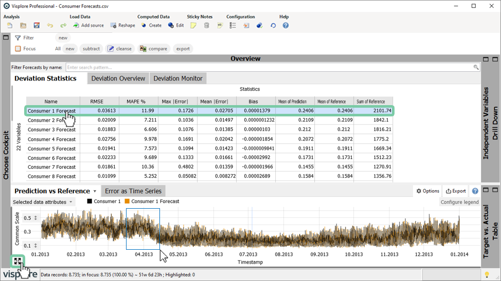
Initially, the Deviation Monitor cockpit appears as shown in figure below. A table on top provides an overview of all forecasts based on various statistic metrics per forecast, for example the Root Mean Square Error (RMSE), the Mean Absolute Percentage Error (MAPE), and several others.
Click on a row in the table to select the corresponding forecast for detailed analysis.
For example, the selected forecast (in orange) and the corresponding reference (in black) are displayed in the line plot titled "Prediction vs Reference" as highlighted in the figure below. As you may know from other cockpits, you can use the right mouse button to zoom into the graph, and click on an arrow symbol (see figure below, if it is not visible hover your mouse over the "Prediction vs Reference" plot) in the bottom left corner of the timeseries plot to zoom out again.
How to calculate error metrics
The statistics table calculates various error metrics per consumer. This table can be sorted as required. By clicking again you will change the descending order to ascending.
Sort the models by an error metric by clicking on the column header, for example MAPE.

It can be seen that the forecast for consumer 11 has the highest MAPE with 14,31% and (by scrolling or with ascending order) that consumer 22 has the lowest MAPE with 2,68%.
Often, it is necessary to analyze how the forecast error is affected by other information such as holidays / non-holidays. Currently it displays the statistics for the whole time period. Let’s subdivide this information by "Holiday"
Click on the plus symbol on the right of the word "Statistics" as highlighted in the figure below. Now you will see that each error metric is shown for holidays (1) and for non-holidays (0) next to each other.
Alternatively, you could have clicked the plus symbol on the left of the word "Statistics". In this case, all error metrics would be displayed next to each other for holidays, followed by all error-metrics for non-holidays.

It can be seen in the figure below that the error (RMSE and MAPE) is generally higher on holidays for each consumer, but to a varying degree. Also the "Bias" (= average of the errors per timestamp) is slightly more pronounced during holidays (category "1" in the plot) compared to when there is no holiday (category "0").
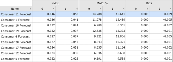
You can export this table to the clipboard or a file.
If you put some part of the data "in focus" by selecting it in other diagrams, the Deviation Statistics will only consider and summarize the data records in focus. Click the X next to the word Focus to have the entire dataset summarized again by the Deviation statistics.

How to analyze the long-term behavior of forecast quality
The visualization of a heat map allows to quickly grasp the error distribution over a long period including trends and outliers. It also allows you to compare the performance of models with respect to each other.
Open the tab "Deviation Overview" to see the error trends of all forecasts as heatmap over time.
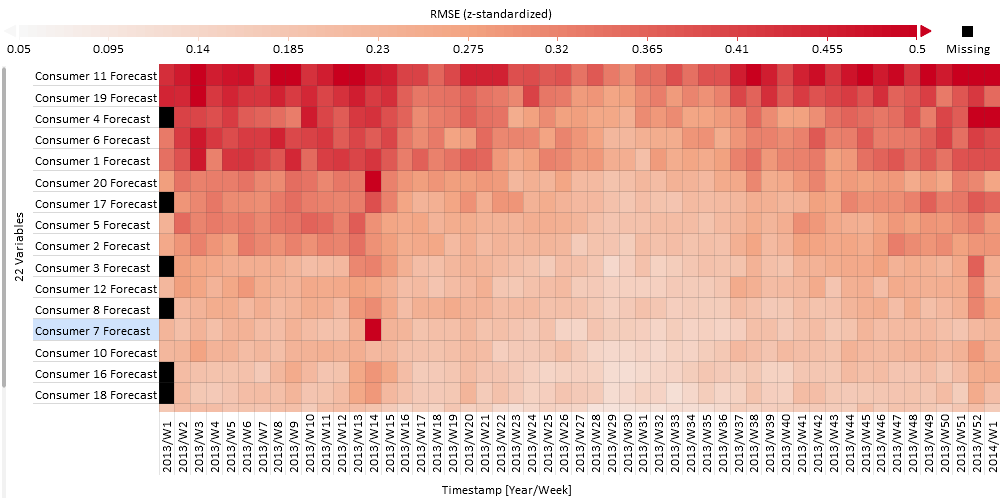
A heatmap is a very condensed view that allows you to grasp a lot of information at once. It is basically a statistics table as seen before but the values are color coded. Also, the rows are not global summaries but broken down to some time periods by default.
The figure above shows you a color representation of the RMSE for each forecast over each week. Above the heatmap you see the value that each color stands for (legend). Black means that there is no data available ("Missing"). By clicking on "Configure legend" you can choose a different color palette and adjust the range of values if you want to. On the very top (see image below) you have the option to change the "Color" from the default error metric RMSE to a different one such as MAPE or Bias.

The error metric is normalized by default with z-standardization to allow for a visual comparison across differently scaled variables. This can be adjusted by clicking on "RMSE (z-standardized)" and choosing between z-standardized, minmax normalized and not normalized. Z-standardization is suitable in most cases as it honors the distribution of values whereas minmax looks at the range of values. The latter case might be easier to interpret but at the cost that one extreme value can shift the remaining values into an undistinguishable range. In case that all your forecasts are in a similar range or your primary interest is in the absolute values it would be best not to normalize.
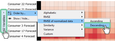
Helpful at this point is also to order the variables: By default, they are ordered in a way that forecasts with similar error patterns over the weeks end up next to each other – i.e., by similarity. This allows for identifying groups of similar forecasts regarding errors. Depending on your use-case, it may make sense to re-order the forecasts, e.g., by the magnitude of the overall RMSE (or other error metric) – to see the most significant errors first.
To sort the forecasts, click on the label of the Y axis and choose the desired sorting criterion (e.g. the RMSE).
In our plot of the RMSE at the beginning of this section, the heatmap reveals a seasonal pattern with higher errors at the beginning and end of the year. Also the error of the first two consumer forecasts is smallest (light red) throughout the year with very small variations of the error over the weeks. The last consumer on the other hand is difficult to predict with high errors (dark red) throughout the year. Apart from those two extremes it can be seen that the prediction of consumer 7 and consumer 20 have a dark red spot (high error) only in week 14, but are performing mostly fine otherwise.
You can also change the horizontal subdivision of the heatmap, as to show cyclic patterns instead of linear trends. This is achieved by clicking the x-axis label (Timestamp [Year/Week] in our example), and then selecting another category. For example, subdividing by "Hour" would allow you to compare typical daily error patterns.
Once you have obtained an overview of error patterns in the Deviation Overview, you may want to focus on the errors of one particular forecast. To do this, you can use the Bar Chart in the panel Drill Down as seen in the figure below.
Select "Consumer 7" with a click on its name in the "Deviation Overview" on top-left.
Open the panel "Drill Down" in the top-right of the screen, and click on the tab "Bar Chart".

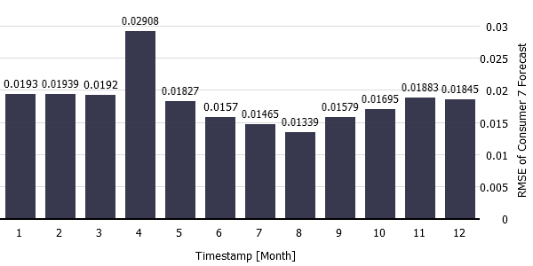
The figure below shows you the RMSE for consumer 7 forecast of each month in the length of the bar. Again, you see that July and August have the smallest errors, with April having the largest error. You can also select to color the bars in "Options" and "Configure View" to display a second dimension.
Another helpful visualization to look at the long term performance is to look at the line plot of the error.
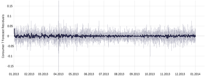
Click on the tab "Error as Time Series" to see the residuals.

As there is strong variance in values it is helpful to show the trend using moving averages.
Add a moving average by clicking on the diagram title "Error as Time Series", select "Trend overlays" and check "Show moving average" – as shown in the image below. Use "Adjust transparency" to make the moving average stand out by making the original time series more transparent.

It can be seen that the amplitude and variance of error is larger at the beginning and at the end of the year with one spike at the very beginning of April as seen in the figure below.
Great! You have successfully obtained an overview of problematic forecasts, and drilled-down on summaries of a specific forecast. In the next chapter, we look even closer and inspect the raw, single values of problematic periods.
How to analyze problematic periods in detail
As seen before there are periods where the error is higher than usual. Let’s look at problematic periods in more detail. This can be done by selecting these periods, putting them in Focus. In the "Deviation Overview" heatmap, use the left mouse button to select cells (by clicking or dragging) showing large forecast errors.
Click on the square of week 14 of consumer 7 forecast in the "Deviation Overview" to set the focus on that exceptional week. As the panels are linked with the focus you will see how your line plot will start to zoom into this period of interest.
In case the focus period is only highlighted and not zoomed into, you need to click on the "Prediciton vs Reference" diagram title and select "Automatic zooming".
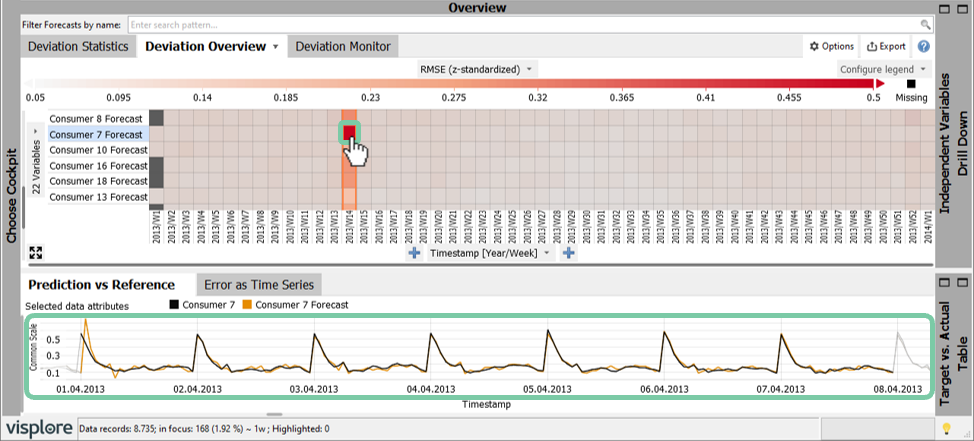
In the figure above you quickly see that the forecast is off by a large degree on the 1st of April 2013 but matches fine on other days.
Note: Use the mouse wheel in the "Prediction vs Reference" line plot to scroll, in order to inspect periods before and after. You can even zoom by holding CTRL while using the mouse wheel.
At this point, you can set a filter on your data to only analyze this one selected week in more detail. This allows you to ignore the remaining time periods for the time being. You can set a filter twofold: The easiest method is to apply your focus as a filter by using the button on the left side of the figure below. Alternatively you can use the top filter menu and click on "new" and using "Data Filter" on the timestamp.
Set a filter from your selected data in one of these two ways:

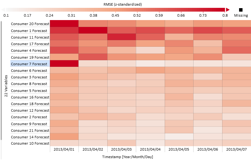
Now that your data is limited to one week of interest, you can change the subdivision of "Deviation Overview" to a smaller unit such as "[Year/Month/Day]" or even "[Year/Month/Day/Hour]". Without a filter, this level of detail would be overwhelming.
Refine the degree of detail of the Deviation Monitor by clicking the label of the x-axis, then selecting "Timestamp [Year/Month/Day]"
In addition to all the aggregated views shown so far, Visplore lets you drill down to raw, single values.
Open the "Table" view in the bottom-right of the screen.

Select the peak error with the left mouse button in the "Prediction vs. Reference" plot by dragging a rectangle, and see how the records in the table update.
This shows the individual values of all time series, with the currently selected forecast time series and corresponding actual values in the beginning. Important: This table only shows the data records in focus, i.e., those that were selected in other diagrams.

We want to know if that day was a holiday: Click "Shown: 5 of 51 data attributes" to adjust in a dialog, which data attributes are shown in the table. For instance, use the filter to find your desired attribute quickly (like "holiday"), and use the green arrows to move this attribute to the beginning of the shown table.

This way, we discover that the first of April, with its big error, was actually a holiday that year.
Another helpful view to assess the mismatch in detail is the "Target vs. Actual" view.
Open the "Target vs. Actual" view by expanding its gray representation.
It is a scatterplot where values in focus are highlighted (see below). With a perfect forecast all values would be on the diagonal line.

Summing up: We used the filter and focus to analyze problematic periods in detail. The largest error with the forecast of consumer 7 is on the 1st of April. This day is a holiday and the forecast peak seems to be shifted by one hour, perhaps due to changing of summer / winter time. Such insights can be used to improve the model performance.
Congratulations! You have successfully drilled down on an example of a significant forecast deviation! The next section describes how you can proceed with identifying systematic deviations, which helps you to improve the models.
How to identify systematic deviations of forecasts
In case of consumer 7, we found a significant forecast error on a holiday (see previous section). Let’s check if this is the case also for other consumers.
In "Deviation Overview" change the segmentation from year to the category "Holiday" by clicking the label on the x-axis, and selecting "Holiday".
Order by RMSE of normalized data descending to have the highest errors on top.
Also, ensure the "Focus" and the "Filter" are reset to include all data again. Do this by pressing the "X" in the respective orange controls 
 for Filter and Focus (if any are set).
With this segmentation of consumer forecasts to holiday it is visible below that the holiday forecast error is pronounced to different degrees for each consumer. The forecast error is generally higher on holidays as expected, but three forecasts are higher to a large degree (consumers 7, 20 and 4).
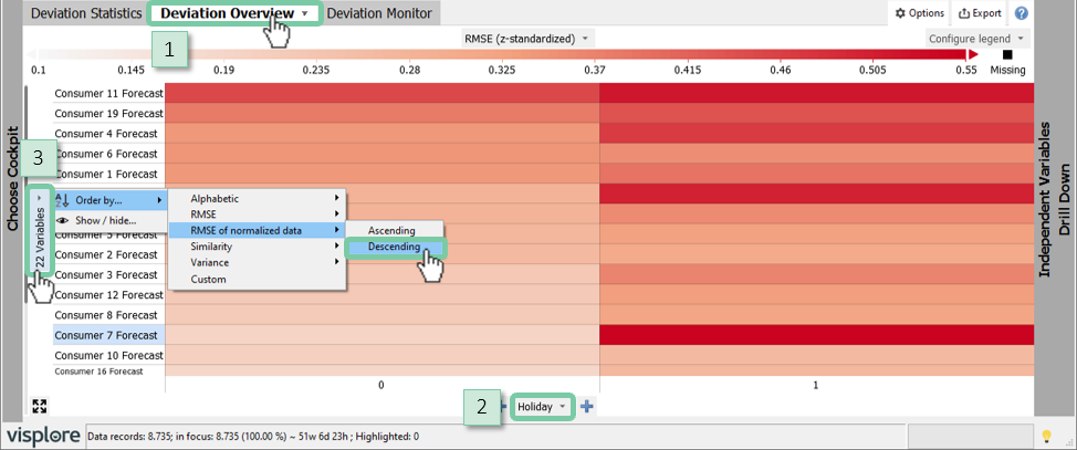
With consumer 7, we also saw a larger forecast error during night time. Let’s check if this is the case for other consumers as well.
For this change the segmentation from "Holiday" to "Timestamp [Hour]" (click on x-axis label).
It can be seen in the figure below that the forecast of consumer 20 has similar characteristics but is less pronounced than consumer 7. Most remaining consumers are characterized by larger forecasting errors during the day (where generally there is also a higher absolute consumption and more variance).
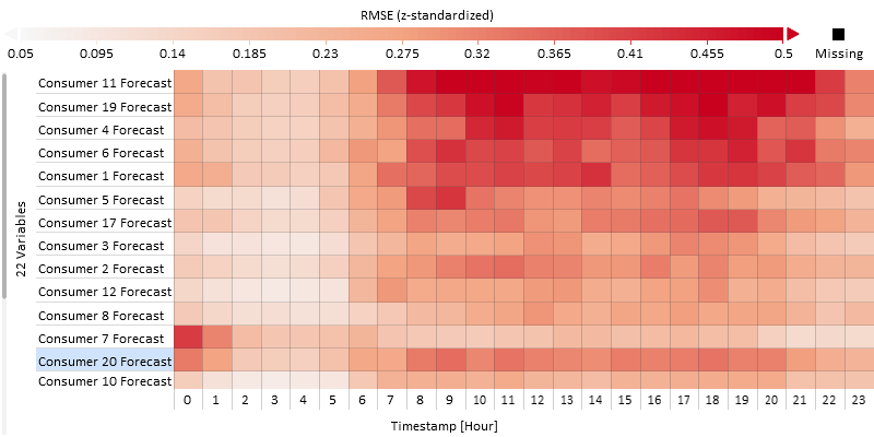
Until now we have inspected the RMSE of the forecast. To indicate whether the model is over- or underestimating use the error metric "Bias".
In the controls for "Color" in the top center, switch to "Bias" instead of RMSE.

By changing the error metric you will notice that the color legend automatically changes from a white-red to a blue-white-red palette to differentiate forecast underestimation (blue), no bias (white) and overestimation (red). Also, it is helpful now to adjust the ordering of the forecasts to bring those with the largest differences to the top.
Change the segmentation of the "Deviation Overview" back to "Timestamp [Year/Week]" instead of "Timestamp [Hour]" (click x-axis label).
Click the label "variables" of the y-axis, then "Order By" / "Variance" / "Bias of normalized data".
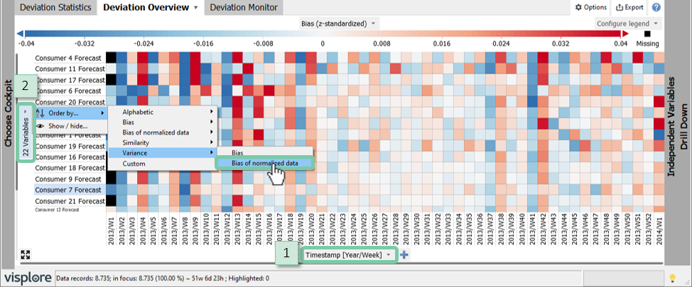
It can be seen in the figure below that there is a systematic underestimation across all consumers in some weeks (e.g. week 8) but also systematic overestimations across all consumers (e.g. week 13). The bias, like the RMSE, is generally smallest in summer time.
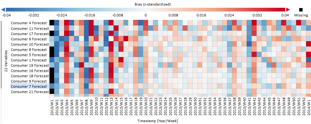
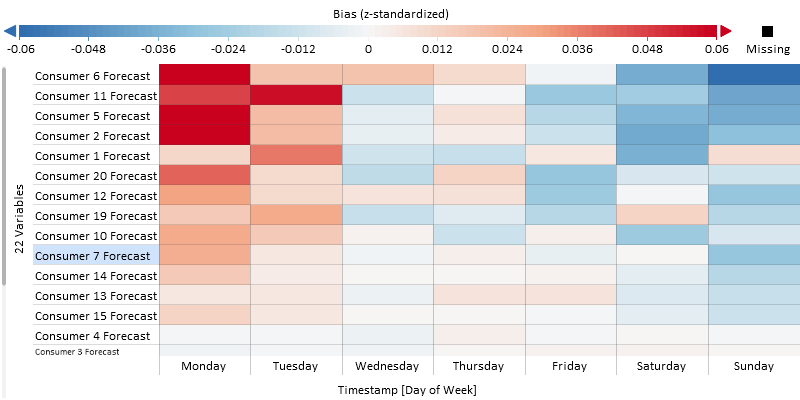
In addition to this seasonal trend, there is often a strong pattern across the days of the week (beginning of week, weekend) for energy consumption. Let’s validate this:
Change the segmentation from "Timestamp [Year/Week]" to "Timestamp [Day of Week] on the x-axis of the Deviation Overview.
In the figure below you can see a relatively strong systematic error for about five consumer forecasts: it overestimates the beginning of the week (red) and underestimates the end of the week (blue). This information can be very helpful in improving the models – apparently day of week effects have not been sufficiently covered by the model! However, we also see that some other consumer forecasts are much less affected by the day of the week.
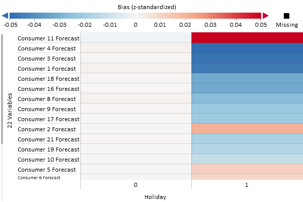
Finally, let’s look at the bias of holidays by using a holiday segmentation.
Change the segmentation of the x-axis from day of week to category "Holiday".
In the figure below you see that the bias is still close to zero if there is no holiday. However, there is a relatively strong underestimation of the consumer 4, and others to a lower degree, if there is a holiday. Only the forecast of consumer 11 shows a relatively strong overestimation on holidays.
The picking of segmentations such as day of week or holiday above was from experience. If however these patterns are not as clear or there are too many potential variables to explain the error (independent variable), then it is helpful to work with the "Independent Variables" panel.
Expand the pane "Independent Variables" to explain the error in relation to other variables.
Change the "Color" error metric from "Bias" to "RMSE" on top of the screen.
Make sure there are no data subsets selected for "Focus" and "Filter", by clearing them (click "X" in the orange bubbles "Focus" and "Filter", if any).
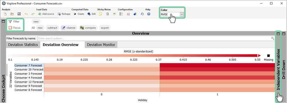
You will see a powerful visualization that explains the forecast error in relation to another variables ("1D Errors" on the left) or in relation to two variables ("2D Errors" on the right).
Looking at the "1D Errors" in the figure below you can see the darkest red (highest RMSE error) at the beginning of the day (in "Timestamp [Hour]") and at the beginning of the week (in "Timestamp [Day of Week]"). Also it is quickly visible, that holidays have a very different error as we already discovered.
Click the line "Holiday" in the 1D Errors view. This enlarges the color coded display of RMSE for holidays vs non-holidays.
The month, week, and year do not show a distinguished error.
The list in 1D errors includes all variables that were marked as "Independent Variables" when starting the cockpit, plus a few Date/Time periods added automatically by Visplore. If you are missing some of your variables, you can click  to reassign these "Roles", and select additional "Independent Variables". For example, system states, operating temperatures, wind directions, manufacturing lines, etc.
The 1D errors view is ordered such that Independent Variables with the most distinct error patterns are ranked to the top. These are potentially more relevant for improving the models, than variables where the error shows no pattern at all.
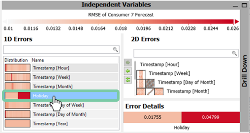
The "2D Errors" diagram works in a similar fashion; at a glance you can see where there are colorful differences of two variables that explain the error.
Change the error metric back to bias
Select a box in the "2D Errors" for an "Error Detail"
In our example, you will notice in the top box of the "2D Errors" that there are different colors for the "Timestamp [Hour]" and "Timestamp [Day of Week]". A click on this box enlarges the view in the "Error Details" as seen in the figure below.
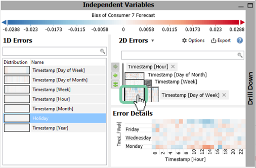
Again, we see an underestimation at the end of the week (blue) and overestimation on the beginning of the week - but this time also with an hourly distribution. The overestimation on Mondays is mainly during daytime hours of 8 to 15 o’clock and otherwise there is a slight underestimation.

The heatmap is generally a very powerful visualization to quickly spot anomalies and grasp differences with a high density of information. The "Independent Variables" pane helps to explain the forecast errors through other variables such as holidays or weather data.
Congratulations! You’ve mastered the inspection of systematic errors that may help you improve the forecast models. Also, you discovered how Visplore guides you towards Independent Variables that may have particularly strong systematic errors.
How to perform regular inspection of anomalies and drifts in forecast quality
Once you are happy with your forecasting models (i.e. analyzed and optimized), you can save a configuration of the Deviation Monitor for regular inspection. This enables tracking the model performance over time, and may help you to notice drifts in forecast quality on your latest data.
First, this section introduces a diagram designed for monitoring recent model performance with respect to a reference period, then we demonstrate you can save the cockpit for regular inspection later.
In the overview section in the top-left of the cockpit, open the tab "Deviation Monitor". Select the RMSE as error metric (if not already selected).
The "Deviation Monitor" tab shows the relative change of RMSE of a recent "validation period" in comparison to a historic "reference period" for each forecast as seen in the figure below. As this list can be long, you may want to sort it by the magnitude of the error change.
Sort by the largest change by clicking on "Validation" as shown in the image below.
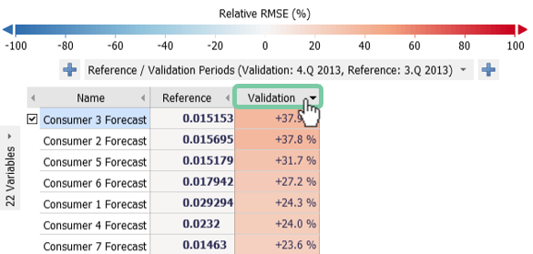
It can be seen that in the last quarter (4th quarter of 2013) the error of all consumer forecasts has increased by between 23.6% to 37.8% compared to the quarter before (3rd quarter 2013). This is mainly due to the fact that the error is generally lower in the summer time than at the beginning or end of the year.
The built-in category called "Reference / Validation Periods" can be used like any other categorical variable. It can be configured according to your needs:
Click the label "Reference / Validation Periods (Validation Period: ….) below the coloring legend.
There are several ways to define the reference period: (1) a duration before the validation period (2) the whole dataset except for the validation period, or (3) a fixed interval. You will see a preview of what your selections will resolve to on the right hand as highlighted in the figure below (i.e. the most recent quarter with the quarter before).
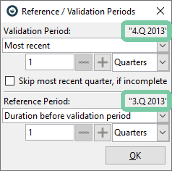
The validation period can also be set to a fixed interval. However, using the "Most Recent" (e.g. quarter or month) option is the most useful for saving the cockpit for regular inspection – as it will always refer to the most recent interval for new data.
The "Deviation Monitor" diagram can also be subdivided by further categories like the other overviews discussed before. For example, to learn how certain models performed per day of week, compared to the same weekdays of previous month, do the following: Adjust the "Reference / Validation Periods" to month and previous month (see dialog explanation before)
In the "Deviation Monitor", add a subdivision by Timestamp [Day of Week], by clicking the plus symbol in the left of the axis label "Reference / Validation (…)"
Optionally, you can reduce the visible days of week by clicking on "Timestamp [Day of Week]" and "Show / hide …" (e.g. the image below only shows Monday, Wednesday, and Sunday).
It can be seen that the error on Sundays remains mostly the same but on Wednesdays there is a large change, especially for the forecast of consumer 3 and 5.
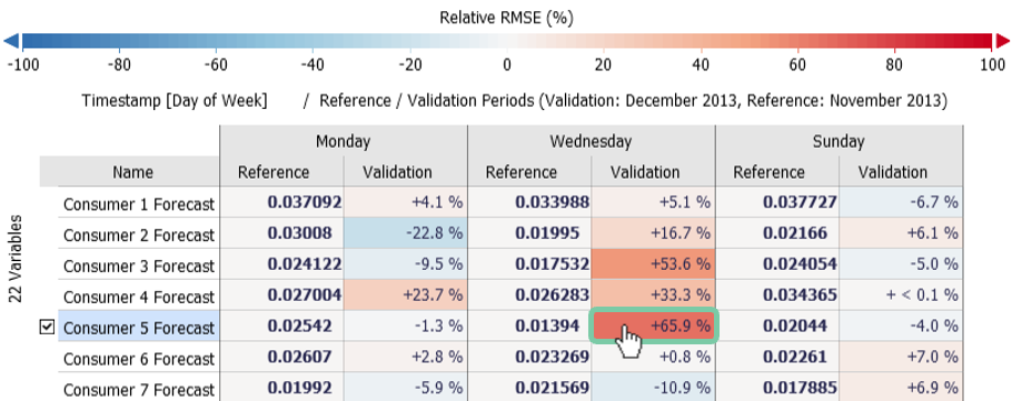
Let’s inspect that big change of consumer 5 in detail:
Click the name of the forecast, "Consumer 5 forecast" to select it for visualization in the other views.
Click on the red box with the value +65.9% to set Wednesdays of the previous month as Focus, making the time series view below zoom to that period.
If it does not zoom you need to enable "Automatic zooming" in the "Prediction vs Reference" action menu.
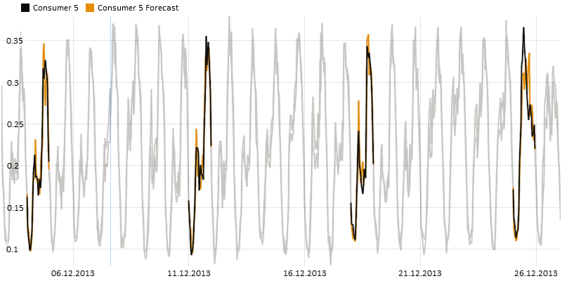
It seems that the large change mainly happened due to a holiday around Christmas (rightmost day selected in image above).
Advanced: Open the tab "Deviation Statistics" and select "Reference / Validation Periods" as subdivision.
Advanced: Use the "Deviation Statistics" menu "Absolute / relative results" and change to percent.
Saving the configuration as .visplore file for regular inspection
Now we are ready to save the current cockpit configuration as a ".visplore" file.
Click the disk icon in the top menu. In the dialog that follows, make sure the "Keep link to data source" is checked. "Embed data" is not necessary for applying the template later to new data.
Read more details on the save session options.
When loading the file later, either with a double click on the ".visplore" file, or by loading it from Visplore with the load icon, you will be prompted to choose what data to use as shown below. If you stored the configuration from an operational source like a database, choose "Load with data from original source" and update it to current times. If you had worked with CSV files, choose "Load with new data import" to load a new file (column names must match). Note how the reference and validation periods are dynamically adjusted to the new data.

When using these features with operational data sources like a database or a OSIsoft PI System, it is possible to configure the data import already in a way to load "most recent" data from these sources. This allows you to streamline loading of a .visplore file without a need for extra interaction. Please refer to the documentation of the respective data connectors, or talk to us about helping you set up the configuration. In particular, we can help you configure "Access masks" for end users, that allow very easy specification of which time periods, assets, operation states, etc.
How to compare multiple model variants
The Deviation Monitor can also be used to compare multiple models with the same reference type (e.g. different model types or parameters, different model providers, etc.). This allows you to pick the best performing model for your application after a thorough evaluation.
This section is demonstrated using a different dataset, that holds 32 model candidates for the same target variable – created by varying model parameters in an external modeling tool.
Follow the instructions of the first part of this tutorial to assign "Forecast" and "Reference" roles to your dataset, and start the "Deviation Overview" cockpit.
After starting the cockpit, let’s focus on a few error metrics to compare the models by.
Click the label "Statistics" in the upper area of the "Deviation Statistics", and select only RMSE, MAPE and Max |Error|.
Also, reduce the number of decimal places shown to three by clicking on the diagram title "Deviation Statistics", then "Cell labels", and adjust the number of post-comma digits.
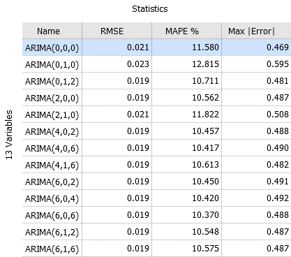
As the summer and winter months have a significant influence on the energy consumption, we want to break down error metrics for these time periods individually. We will use a categorical variable called "Season" (with "Summer" and "Winter" as categories labeling the respective months).
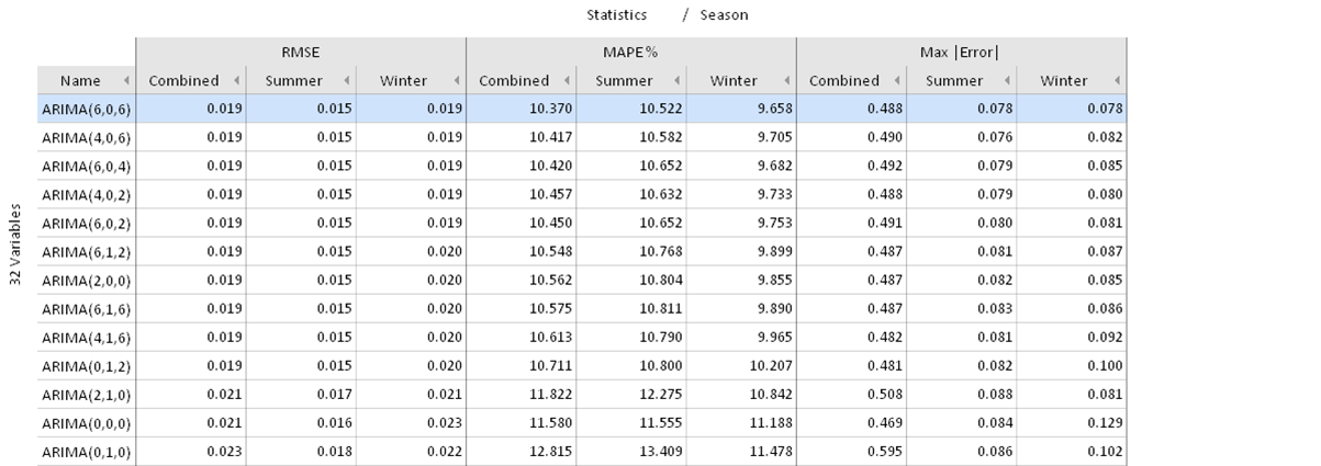
Click on the plus button on the right side of "Statistics" to add a subdivision by "Season".
This will show the selected error metrics for Summer, Winter and the rest. It’s possible to hide the "Rest" and to compare just Summer vs. Winter:
Click the name of the categorical subdivision (here "Season") next to the x-axis label "Statistics", then "Show / hide". In the dialog, uncheck "Rest", and instead check "Combined" to enable the statistics as well for the entire dataset for comparison.
Finally, sort by RMSE by clicking the column label on top.
In this case we see that the models with least RMSE are ARIMA(6,0,6), followed by the simpler ARIMA(4,0,2) and ARIMA(2,0,2) models. For all three models in Summer the RMSE is smaller, the MAPE is larger and the maximum absolute error is the same compared to Winter.
Advanced: Compare the model performance by comparing on a relative level rather than absolute values.
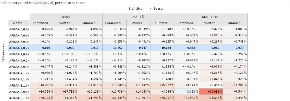
Click the diagram title "Deviation Statistics", then "Absolute / relative results" and change to "percent".
Choose the variable ARIMA(4,0,2) as seen in the figure below. Alternatively, drag and drop the pin control element under "Deviation Statistics" on ARIMA(4,0,2). This will set model ARIMA(4,0,2) as reference for comparing all other models to.

You will now see the relative change of model performance in comparison to ARIMA(4,0,2) as seen in the figure below. You can see that the ARIMA(6,0,6) model has a 1.1% smaller RMSE in Summer and also a more significant lower maximum absolute error of 2.4% in Winter.
You can use the same views from the previous parts of this tutorial also for the special case of comparing model variants for the same target variable. For example, you could inspect the graphical representation of a heat map in "Deviation Overview".
Click on the tab "Deviation Overview" to see the heat map
Order by RMSE descending by clicking on "13 Variables" as seen in the figure below.
Disable the normalization by clicking on the title "RMSE" and choosing "not normalized"
Apart from the three worst-performing models, we see in the figure below a similar performance across all weeks with slight differences how e.g. week 6 is modelled. Remember that you can select a model and time period to see it visualized as a line plot in the "Prediction vs Reference" window in the bottom. Also make use of "Independent Variables" and "Drill Down" panes if you want to explain the model performance of a selected variant in detail.
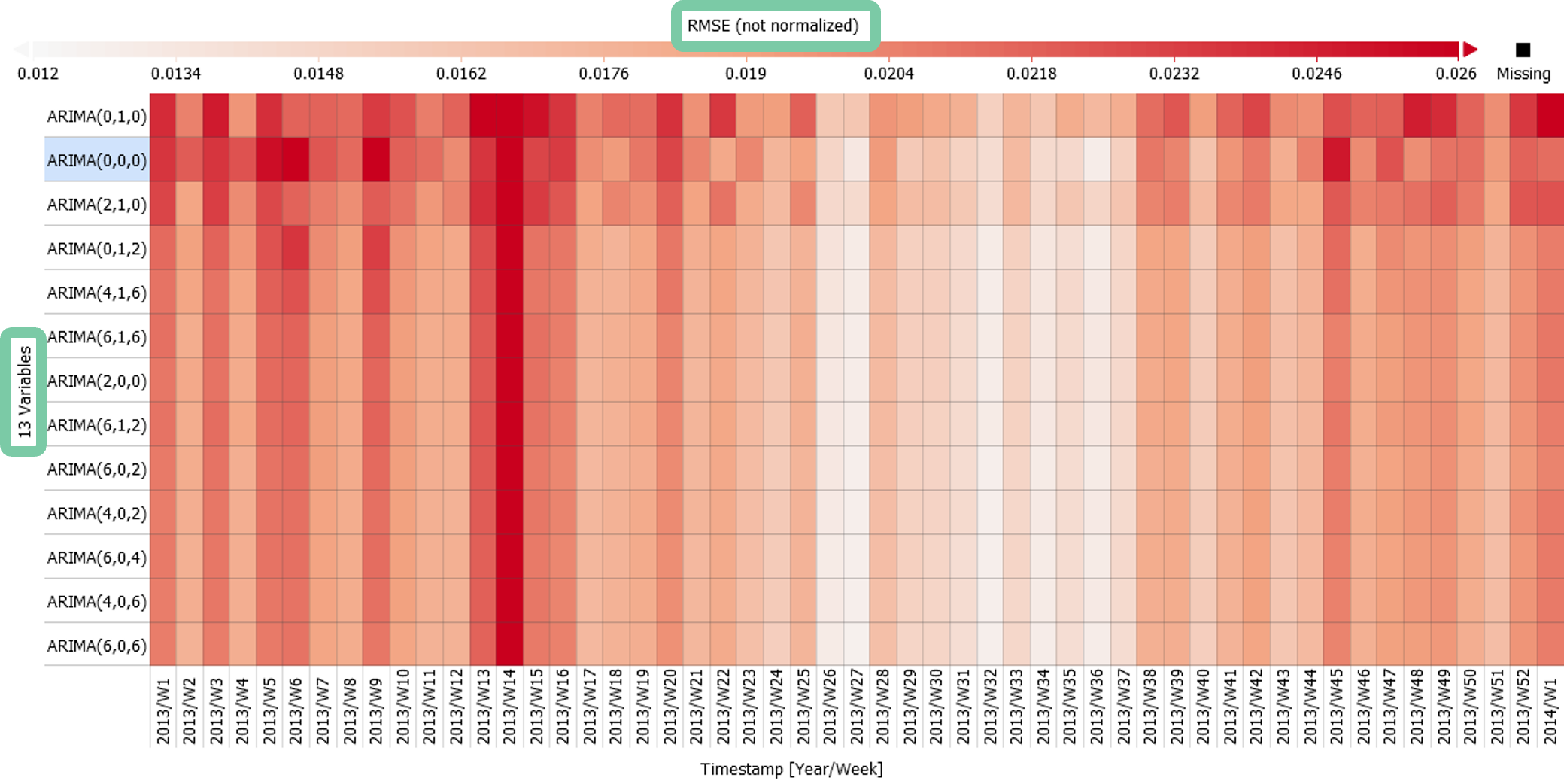
Summarizing this part, we compared the performance of model variations in absolute values and also relative to one model. For deeper insights we distinguished by the season Summer and Winter months, which could be repeated for any other categories. Use this method to select the most suitable model variation for your purpose by analyzing its performance in detail and comparing various error metrics.
Check out the "Forecast Comparison" cockpit as well to compare multiple model variants for the same target variable in detail. For example, that cockpit visualizes which model variant provides the best forecast how often, and lets you break down error metrics nicely for different categories. See the cockpit description of "Forecast Comparison" for details.
How to monitor energy producers
In contrast to the previous examples with energy consumption, this section demonstrates how the same approach can be applied to photovoltaic power generation data as well. Here, the goal is to use an expected value time series to monitor the operation of six PV inverters. In case there is a significant deviation from expected production (= the "forecast") to the measured production, this is an indicator that the PV inverter needs to be checked. The expected values of the six PV inverters are again provided externally.
Open the tab "Deviation Overview", and adjust the x-axis subdivision to see the RMSE error on a daily scale (click the x-axis label, and switch to DateTime [Year/Month/Day]").
Change the normalization from "RMSE (z-standardized)" to "RMSE (minmax normalized)" by clicking on the title of the heat map.

By default the range is calculated to display sensible values and excludes outliers. As a result the extreme values do not stand out without adjustments.
Set a color to highlight large errors. Click on "Configure legend" and "Change colors...". Select the white-red color range and select a color such as magenta on the left box as seen in the figure below.
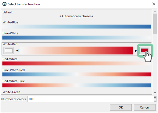
The figure below shows the RMSE error of each PV inverter. As each inverter is of different peak power in this case it is necessary to normalize the data. Here we use a min-max normalization so that each forecast is in the range of 0 to 1. However, the actual values are smaller for each day as seen in the heatmap legend, as these are mean values of the min-max normalized values.
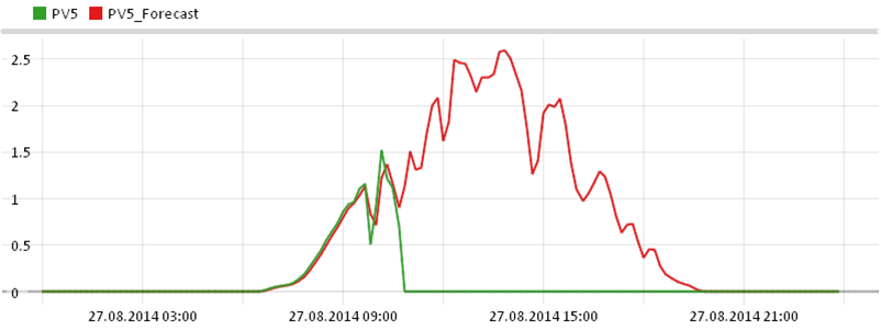
Should there be unexpected behavior of one of the PV inverters it will stand out with a high RMSE and highlighted in magenta. In the figure below this is the 27th of August that can be investigated by putting it into focus by clicking on it. This gives you a visualization of that particular day as seen in the line plot below to investigate further. On this day the power output of inverter PV5 drops to zero starting 10:40 contrary to expectation.

Please refer to section "How to analyze problematic periods in detail" to see how the problem can be further investigated. Also see how Visplore can be configured to perform such analysis on a regular basis (i.e. weekly or monthly) as described in section "How to perform regular inspection of anomalies and drifts in forecast quality".
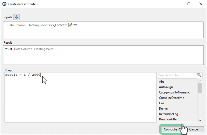
Advanced (custom normalization): If you are interested for a custom normalization that is more relevant to you (e.g. such as bottleneck power of your power plant) you can also do this in Visplore. You can use the integrated formula editor which gives you full flexibility in your calculations. To apply a custom normalization (or perform any other calculation) select the variable of interest, click on "New data attribute" in the very top left and choose "Numeric data attribute". Now you can enter a (simple) script in the form of "result = i / 2000" with 2000 being the bottleneck power and the selected variable available through "i" as seen in the figure below. Now you must validate your script by clicking on "Compute..." and expect to receive a "Computation successful.". Finally click on "OK" and assign a role to your new variable. Please refer to this tutorial on the formula editor for more details.
If you want to adjust the calculated variable you can do this by using the gear symbol in the very top when you select your calculated variable.
In this calculation you are not limited to a fixed value such as 2000 but you can also choose to use a dynamically changing value through a second variable. Please refer to the tutorial of the formula editor for more help on that.
Finally save your calculations as a ".visplore" file to persist your normalizations and calculations across multiple program starts.
Summary and Outlook
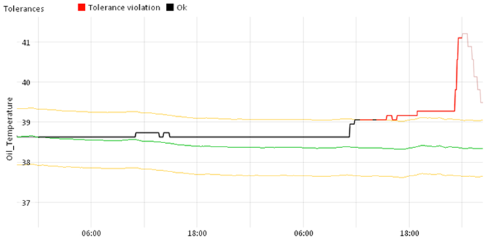
The possibilities do not end with the questions answered in this tutorial and the "Deviation Monitor" cockpit. For example, you can use Visplore to monitor deviations from setpoint curves. Here you configure setpoints and limits that are important to be maintained in your use case (e.g. quality indicators or production targets). These can be fixed values or changing over time as seen in the figure below. Once configured, Visplore allows you to graphically analyze when, and answer how often and why these setpoints and limits are violated.
Also, in all questions it was assumed that the forecasts were created externally. However, it is also possible to rapidly create multivariate regression models in Visplore. The "Multivariate Regression" cockpit assists you to clean your dataset, identify relevant variables, automatically calculate derivations and to build multiple model variants. See an application of this multivariate regression cockpit in the use case of "Condition Based Monitoring of a hydropower turbine".
In this tutorial we looked at various questions and how they can be answered step by step using various example data sets. In a short time we evaluated forecast errors and made discoveries going deeper into the analysis. As such we analyzed long term behavior and systematic errors. We described how forecasts can be inspected on a regular basis and how multiple model variants can be evaluated. Finally, we looked at a practical example on how energy producers can be monitored with an expected value in order to help us operate systems more effectively.
