Comparing events
Many analysis questions involve the comparison of certain events. An example is comparing ramp-up procedures or other operating conditions in a power plant. Another example is analyzing process anomalies and explaining under what conditions they occur.
Visplore supports defining the event conditions interactively and visualizes the compared data subsets in various ways (statistics, colored histograms, and much more). A comparison of all events to the immediate time before (or after) the events is also possible. This supports root-cause analysis and a quick identification of sensors that behaved suspiciously already before the events happened.
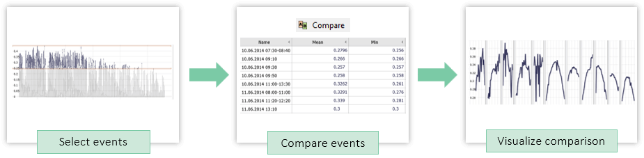
In this tutorial, you learn how to compare explicitly selected events.
Note: This section describes how to compare all events where a variable has a certain condition like “Power > 40kW”. If you want to describe how you can use a selection of 2 or more intervals on a time axis to compare please refer to the part on Comparing time periods.
Preparation (to follow this lesson using demo data)
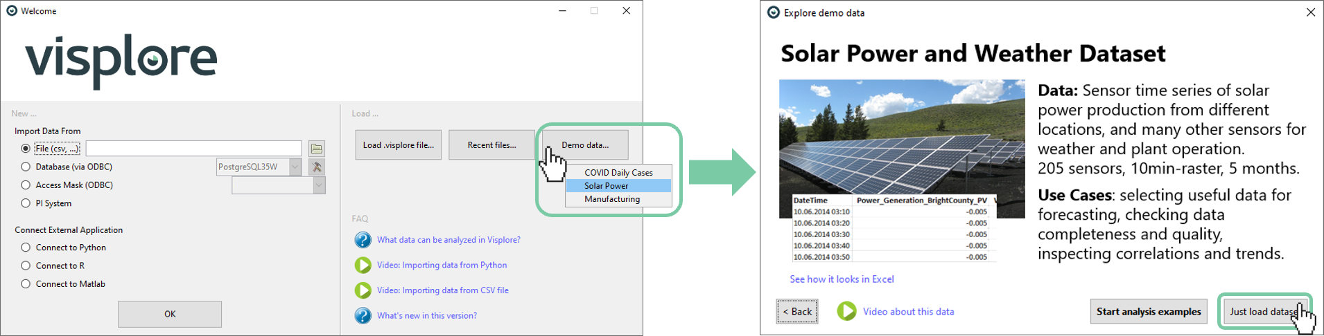
For the tutorial, load the solar power demo dataset from the welcome dialog, as shown below.
Confirm that you are in the Trends and Distributions cockpit. It will say so in the Visplore window title.
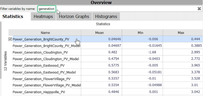
Choose the 'Power_Generation_BrightCounty_PV' time series. You can find it by entering 'generation' in the filter above.
Defining events for analysis
The first section is about defining events. In this example, we are interested in periods with high production. This is done by selecting a value range and creating a comparison for each of the resulting events.
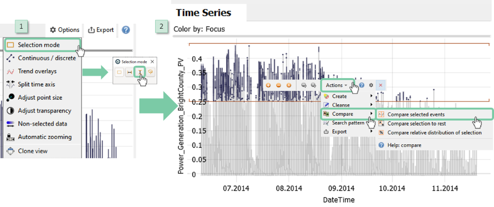
Click "Options", then "Selection mode" and choose the vertical selection. This way, we are selecting only along the value axis, and not along the time axis.
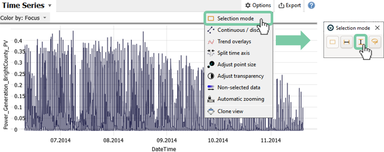
Select a value range from the time series by dragging a vertical interval with the left mouse button.
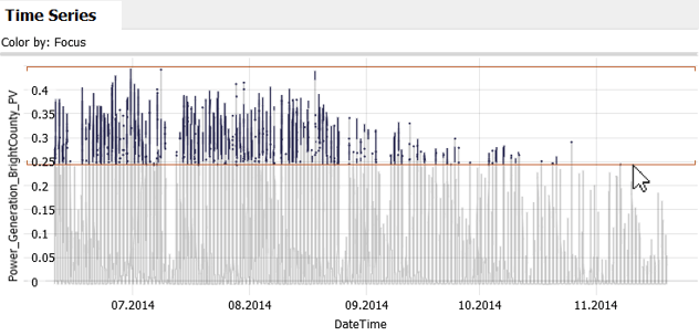
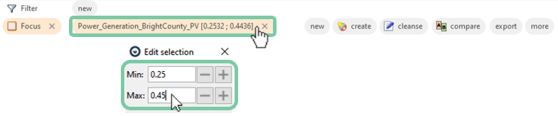
Note: You can fine-tune the exact values by clicking the orange bubble next to "Focus" as shown in the picture below. When entering numeric values that way, confirm them with the 'return' (Enter) key to take effect.
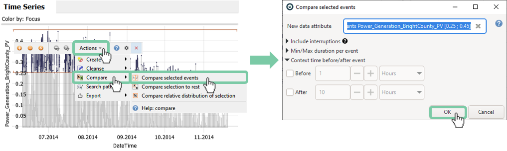
Start the comparison by a click on "Actions" in the small toolbar popup next to the interval selection in the "Time Series" plot (see image below). Then select the action "Compare", and "Compare selected events". In the options dialog that appears, just click "OK" for now.
As a result, all visualizations are filtered to show only the compared events.
In the timeline, the events are shown next to each other, and gaps in between are collapsed. Note that some events are short and only contain a single data point (zoom in to see this more clearly). Later, we will show how you can rid of very short events in the comparison.
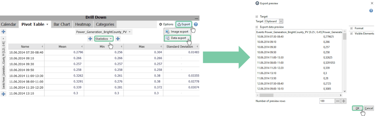
You will also notice that the bar chart on the top right corner was replaced with a pivot table (see image below). This shows the time and duration of each event together with some key metrics such as the mean value. At this point, you might be interested to adjust the statistics and exporting your findings.
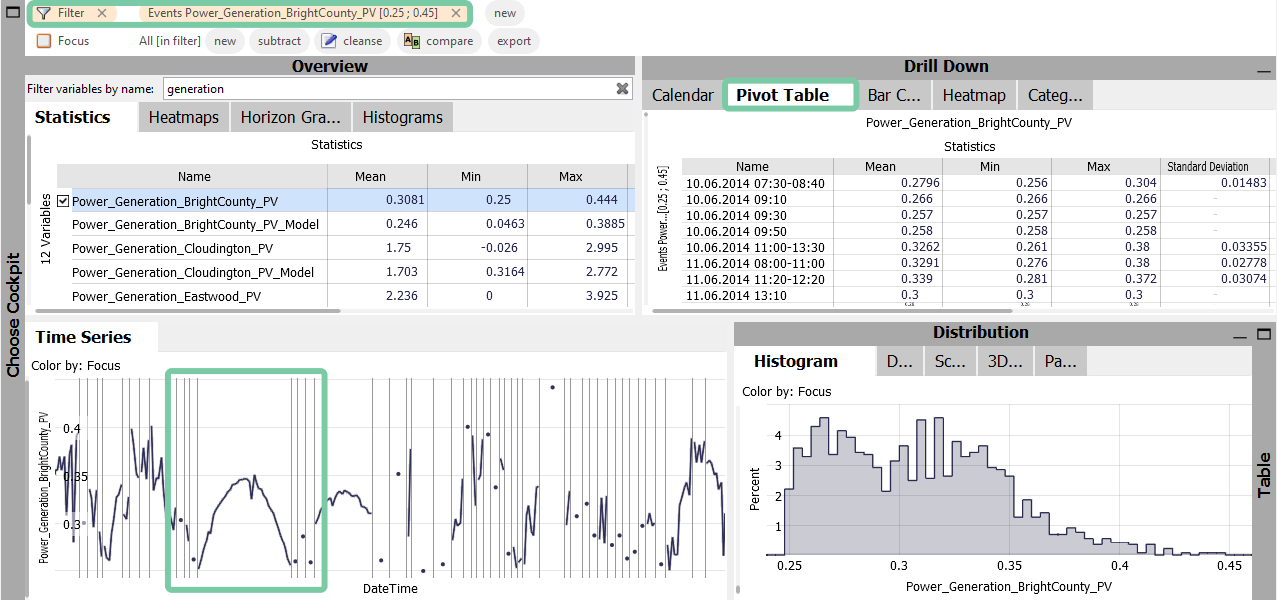
Adjust the statistics by clicking "Statistics" as shown below.
Export this pivot table by clicking on "Export" and "Data Export". You can choose to export to a file or clipboard and adjust the format options.
Set a minimal duration for considered events
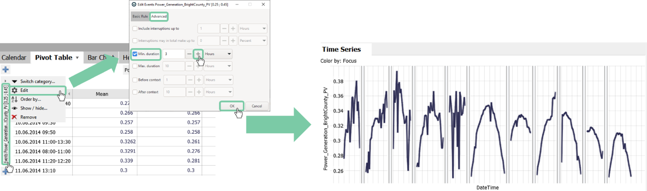
As we saw, we have events with longer periods and events that are single points only. To filter out these very short events you can apply a minimal duration of 3 hours to exclude them from the analysis. If you do not apply this in the dialog in the beginning you can also change the setting afterwards as seen below. This change applies to the event definition as a whole and not only to the pivot table.
Click the event title on the left side, then click "Edit". In the "Advanced" tab, tick "Min. duration" and choose the desired minimum duration. Then click "OK".
Note: You can also define events through conditions (see chapter on Defining conditions for details). This allows for more complex selections in the formula editor. After defining a condition, you can click its orange bubble representation in the "Conditions" bar, then select "compare..." and "Compare selected events".
Plotting all events as overlaid time series
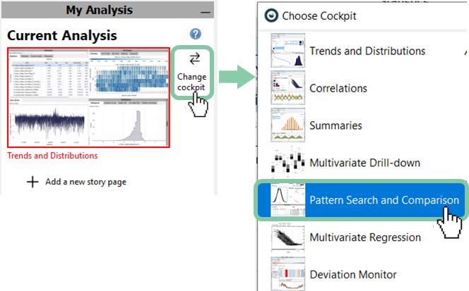
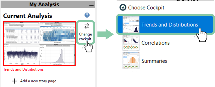
In the following, you will see how the previously selected events can be overlaid in one combined plot. For exmaple, to identify the "typical" shape of events, or outliers. For this, switch to the "Pattern Search and Comparison cockpit".
If it is not shown already, click on the gray vertical "My Analysis" bar on the left edge of Visplore and then on "Change cockpit". In the pop-up window choose "Pattern Search and Comparison" by double clicking. Click "OK" in the appearing "Role Assignment" dialog.
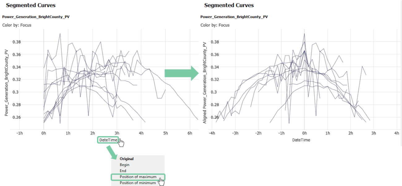
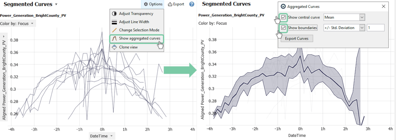
In the "Segmented curves" view, you see each event on a common x-axis indicating the duration in hours. In this case, it is helpful to align them all by their maximum value. This will align the maximum value of all events on the zero time.
Click on "DateTime", then click on "Position of Maximum" of the "Segmented Curves" view.
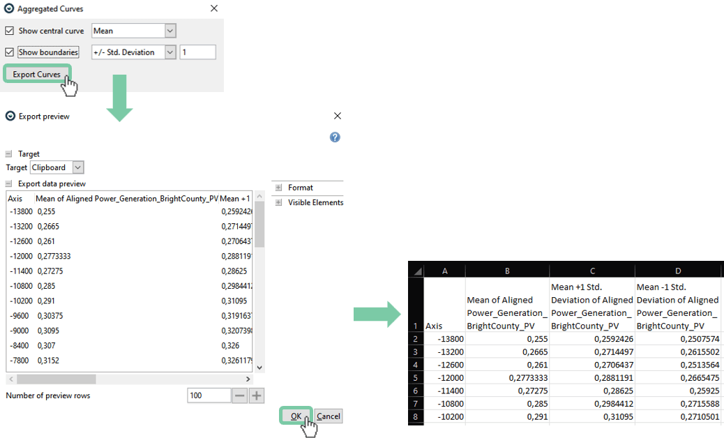
To visualize an average event, use the "Show aggregated curves" feature. It allows you to calculate and export the mean curve. Additionally, you can add boundaries defined by the standard deviation.
Click "Options", then "Show aggregated curves". Tick "Show central curve" and "Show boundaries".
Optionally you can export the curves by clicking "Options", then "Show aggregated curves" and the button "Export Curves".
Comparing events to the periods before/after
For root-cause analyses of anomalies or other events, a common approach is to compare sensor values during the events to the values before the events. The idea is to identify sensors with suspicious patterns that occur before many of the events. This kind of analysis is answered by including a context time in the comparison of events.
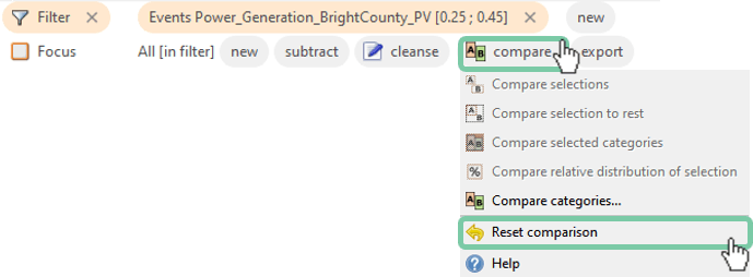
Click on "Choose Cockpit", and switch back to the cockpit "Trends and Distributions" by double-clicking.
Confirm that you don't have a comparison active. If you followed the previous section, reset the comparison as follows: Click on "compare" in the menu bar, then click "Reset comparison".
Again, let's say we are interested in high production events, but this time with 2 hours of context before and after each event:
1. Click "Options", then "Selection mode", and choose the vertical selection.
2. Select a value range from the time series by dragging a vertical interval with the left mouse button. Then click "Actions", "Compare" and "Compare selected events".
Tick the "Before" and "After" context and enter two hours in the appearing options window. Confirm with "OK".
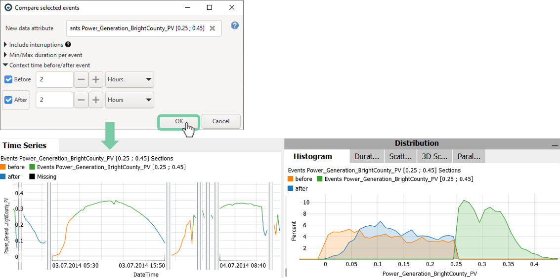
The histogram now shows distributions for the event in green, distributions before the event in orange, and distributions after the event in blue. Also, the time series plot now has differently colored segments. Depending on your setup and previous usage of Visplore, these colors may be different.
With this categorization of the time before, during, and after the events, we can investigate which other variables had significantly different values for these three categories.
Open the "Histograms" tab in the top left corner. Also remove the variable filter above the "Histograms" tab to see all variables.
Click on "Generated_Current_Harmonic_Distortion_Bright County_PV" to select the variable for a larger view and more details.
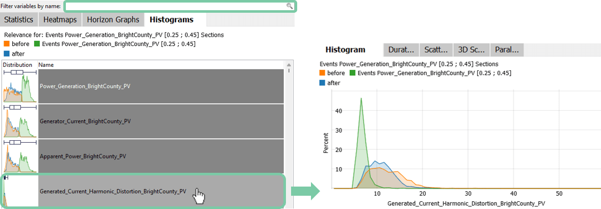
The "Histograms" view shows a list of all variables, sorted by how different their value distributions are for the three temporal categories. Sensors where the values were significantly different before/during/after the events are ranked at the top - guiding the user towards sensors that may explain why the events happened. Sensors, where the values were the same all the time, are ranked lower.
In this example, you see that the power generation, the generator current, and the apparent power of BrightCounty all have similar distributions for the event and its context, which is expected. The fourth variable is also significantly different but shows a different distribution than the ones before. After selecting the fourth variable, it can be seen in its histogram, that the events of highest power generation show the lowest harmonics as seen in the color green (use the right mouse button to draw a range to zoom into to make this clearer). This insight can be confirmed due to the technical characteristics of the inverters.
Use this feature of comparing value distributions with sorted relevance to generate other insights and detect hidden root causes of problematic events.
Note: When doing an event comparison, you get a new categorical data attribute in Visplore that refers to the individual events, and can be used like other categorical dimensions. For example, you can subdivide a Heatmap or bar chart per event. The name for the categorical attribute can be defined when creating the comparison. When defining a temporal context, the before/during/after categories are additionally available as a categorical attribute.
Note: If you are using temporal contexts before and/or after events, these periods will also be part of the timings written in the pivot table (meaning, the before and/or after times are included in the durations).
Great! You have mastered the workflow for comparing events.
>> Continue with Next lesson: Comparing catagories
License Statement for the Photovoltaic and Weather dataset used for Screenshots:
"Contains public sector information licensed under the Open Government Licence v3.0."
Source of Dataset (in its original form): https://data.london.gov.uk/dataset/photovoltaic--pv--solar-panel-energy-generation-data
License: UK Open Government Licence OGL 3: http://www.nationalarchives.gov.uk/doc/open-government-licence/version/3/
Dataset was modified (e.g. columns renamed) for easier communication of Visplore USPs.