Visualizing multiple numeric variables
Very often, you need to visualize multiple variables. For example, you may need to study correlations between sensors or compare distributions of multiple measuring points.
This chapter explains some basic ways to visualize multiple variables in Visplore. Later chapters will address multivariate topics such as correlation analysis.

Selecting variables
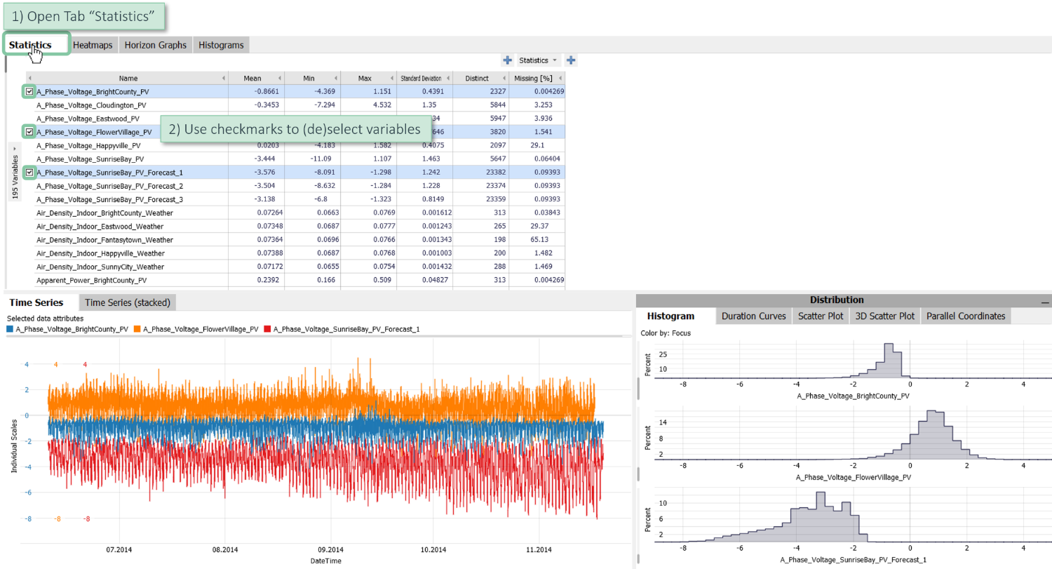
Most Visplore cockpits comprise multiple plots of the data. In order to coordinate these plots, variables are selected in a central place and (by default) affect all plots. In the cockpit "Trends and Distributions", this place is located in the upper left and shows the table titled "Statistics" by default.
Add and remove variable time series
To select a variable, check the respective checkmark and deselect/uncheck it in the same way.
Replace variable selection with direct click on new variable
Click on the name of another variable to switch to this variable and at the same time get rid of the current selection of variables.

Use CTRL and Shift Key for multiple selection
Hold the CTRL key and simultaneously select multiple variables by clicking on their names.

Hold the Shift key and simultaneously select multiple variables lying next to or below each other.

Plots of multiple time series
Change between one and multiple plots
Let's have a look at two temperature variables. By default, you can see that they are discriminated by color
Click on "Time Series (stacked)" to switch between a plot depicting both time series simultaneously and a view where they are shown in seperate plots.

Change Y-Scale of a time series
Click on the left-sided label "Individual Scales" to adjust the scaling of the time series in various ways.
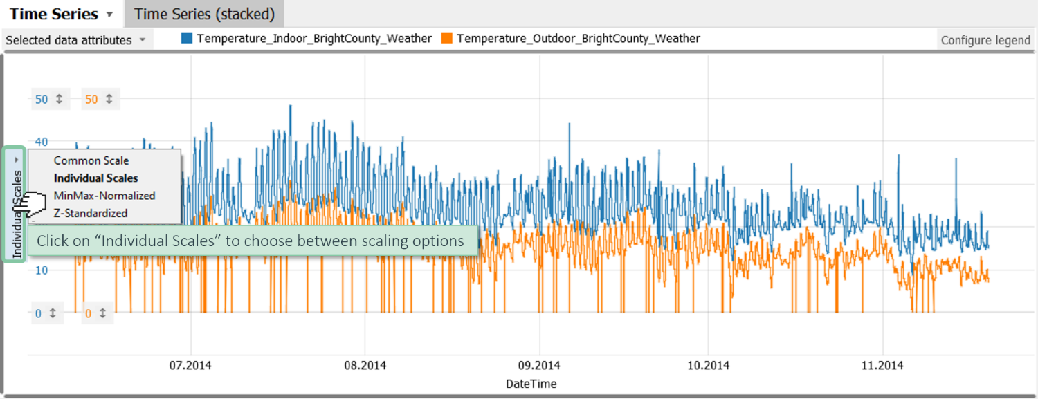
The first scaling option "common scaling" uses the same scale for each variable. Additionally, you can also use "MinMax-Normalized" scales, where each variable is mapped from the minimum 0 to the maximum 1. As a final option, you can also make the variables match by choosing z-standardization. In this case, the mean value of each variable is mapped as 0 and one standard deviation plus-minus.
To change each scale individually, click at the number (50 in this case), adjust from 0 to 40 degree celsius and see how the plot updates.
Click the small arrow next to the number to open the scaling widget and align the two curves precisely, for example.

2D Scatter plot
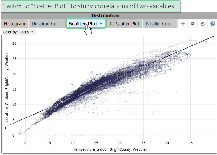
Scatter plots are the standard visualization method for studying correlations and clusters for two variables. The points correspond to the imported data samples. For continuous time series, this may - depending on the data source - be seconds, minutes, 15 minutes, hours, and so on. The temporal order is not shown in scatter plots by default.
As a quick recap of common interactions that work the same way as for time series plots:
- Zooming: zoom in by dragging a rectangle with the right mouse, zoom-out by clicking the button at the bottom left. Alternatively, use the scaling sliders alongside the axes or the mouse wheel while having the control key pressed.
- Switching colors.
- Adjust-point size and transparency in the view menu.
The line that is drawn by default shows a linear regression of the variable mapped to the Y axis by the variable mapped to the X axis.
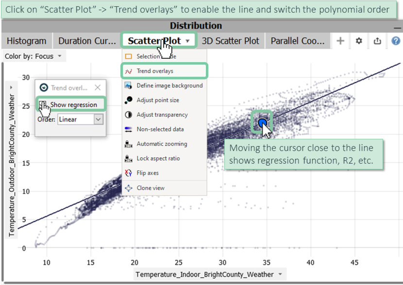
Move the mouse close to the regression line to see the regression function, the root-mean-squared-error and the R² metric in the toolip.
Click on the "Scatter Plot" tab and choose "Trend overlays" to enable the line and switch the order of the fitted polynomial, for example.
Please note: Most further options of the view menu are relevant in the context of data selection. This topic is covered later.
3D Scatter plot
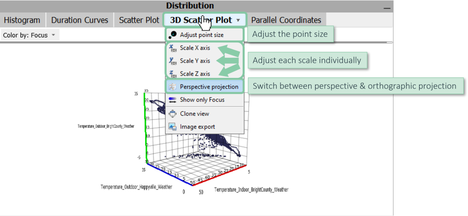
In certain cases, it can be helpful to inspect the distribution of three variables as a 3D scatter plot.
In order to define the axes a 3D scatter plot, select three variables. If you select more than three variables, the first three selected variables will be shown. To interact with the view, use the mouse as described below.

Note: You can use color to show an additional data attribute as discussed for other views.
Further options of the 3D scatter plot are located in the view menu and include:
- Adjusting the scaling of each axis separately.
- Switching between perspective and orthographic projection.
- Adjusting the point size.
Parallel Coordinates
Parallel coordinates are a visualization technique to display multiple variables. Each variable is represented by a vertical axis. By default, each axes is scaled linearly and shows the minimum of the respective variable at the bottom, and the maximum at the top. Each data sample is drawn as a line strip that intersects all axes at the positions corresponding to its values.
In case you know radar charts: Parallel Coordinates are closely related to radar charts, but the axes are aligned next to each other rather than meeting at the same center point.
Parallel Coordinates work best if the number of data samples is rather small (e.g., up to a few hundreds) or if the data has multiple distinctive clusters. In this case, the intensity of the color reflects the density of the data. For larger data sets, parallel coordinates can be helpful in combination with data selection (as described later), because it shows the distribution of selected data relative to the other data. Furthermore, a common use case is the define selections and filters on multiple variables.
Define the axes of the parallel coordinates chart by selecting multiple variables in the "Statistics" window of the cockpit (see upper left side).
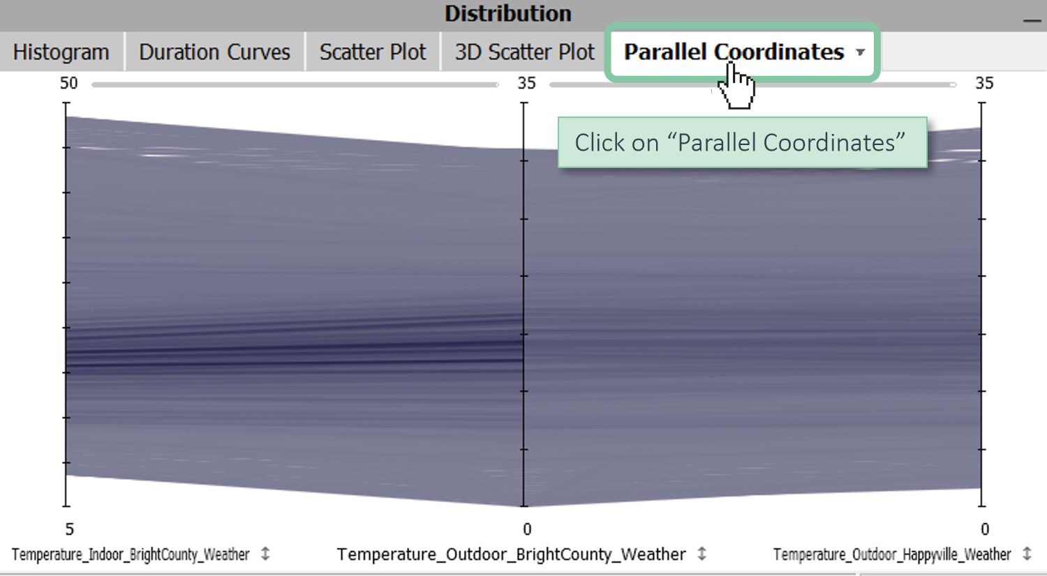
Interactions with axes include:
- Rescaling.
- Changing the order via drag and drop.
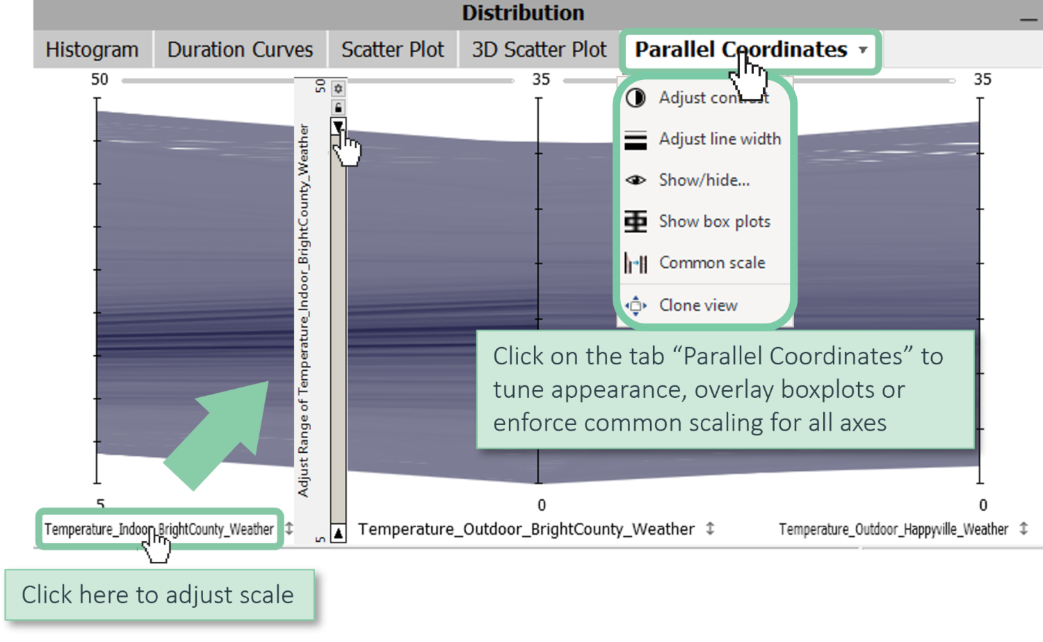
In the view menu, you find options to tune the appearance, overlay box plots and to enforce a common scaling for all axes.
Charts aggregating multiple variables
Multi-Variable Bars
Switch to the "Summaries" cockpit in order to show aggregated charts of multiple variables.
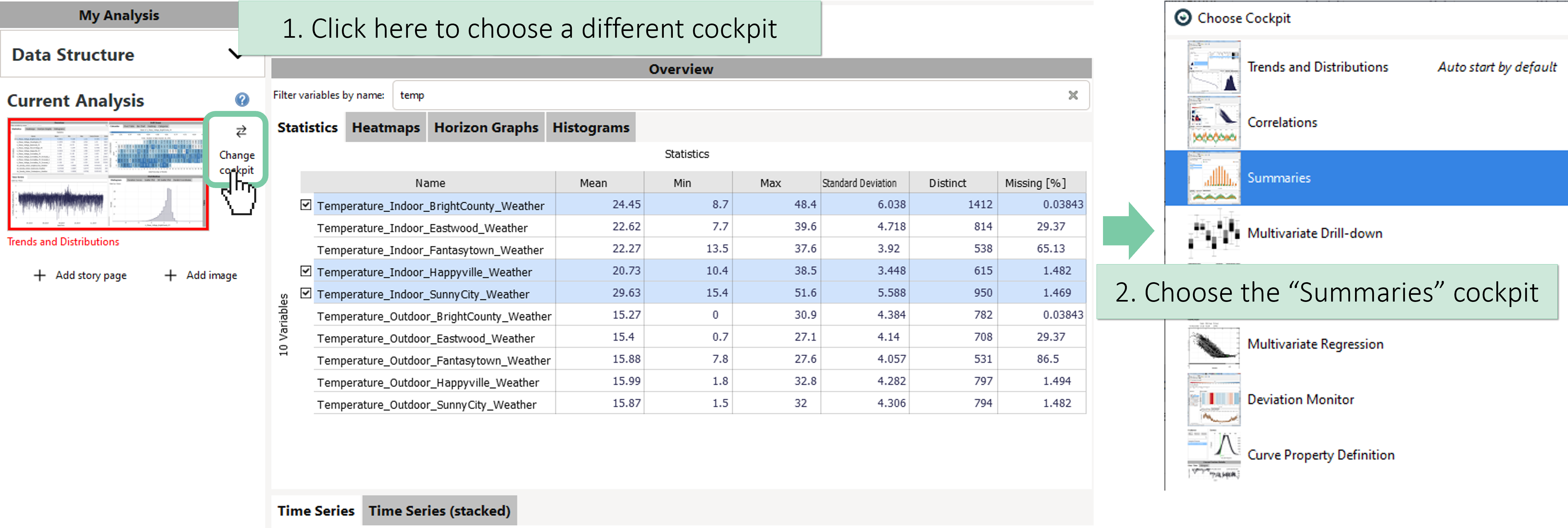
Here, you can see that we have three temperatures selected which are shown as three distinctive colors:
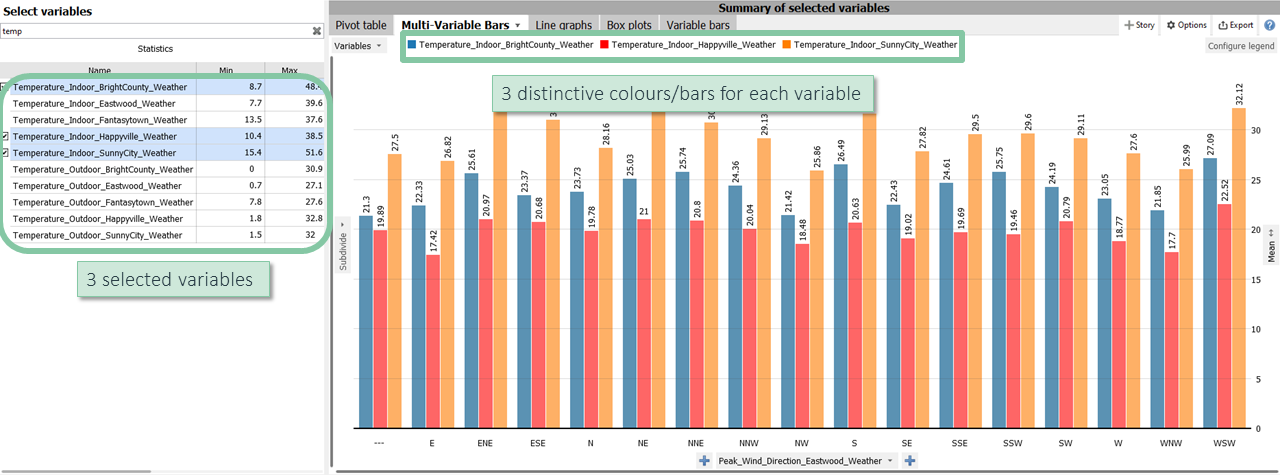
Click on the small arrow next to "Peak_Wind_Direction_BrightCounty_Weather" and switch to "DateTime [Year/Month]".

Here, you can see the respective temperatures seperated by each month of the year.
Line graphs
Click on the tab "Line graphs" which is located next to the tab "Multi-Variable Bars" at the top of the "Summary of selected variables" view.
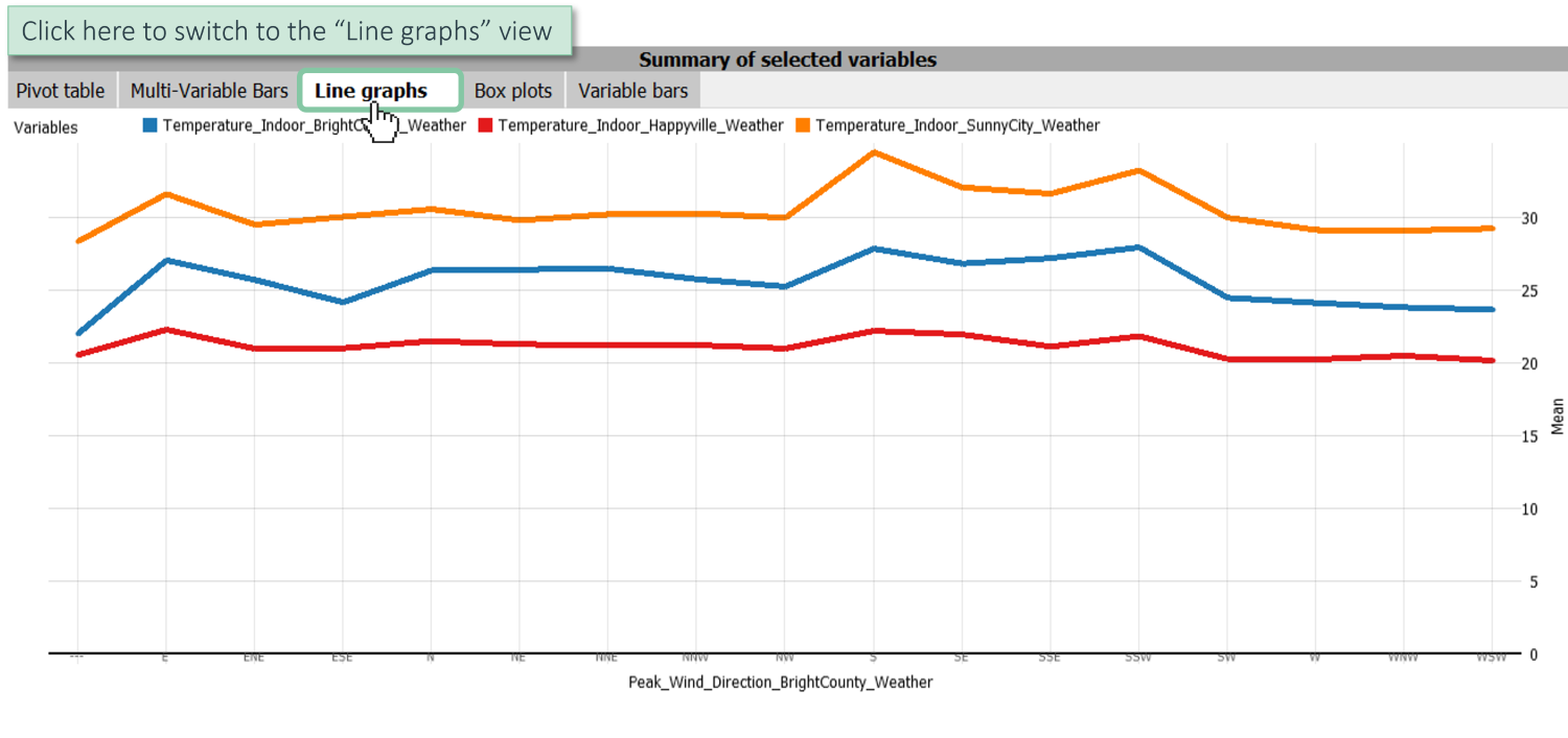
Here, you can see the average temperature of each of the three temperature variables for each wind direction.
Click on the tab "Peak_Wind_Direction_BrightCounty_Weather" and change category to "DateTime [Hour]".

Here, you can see the average temperature curve per day for the three temperature variables.
Box plots
Click on the tab "Box plots" which is located next to the tab "Line graphs" at the top of the "Summary of selected variables" view.
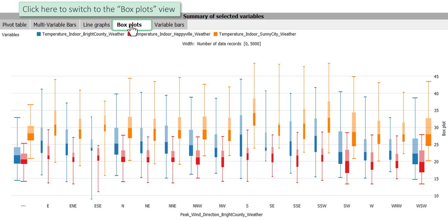
Here, you can see for each of the three temperature variables the boxplots showing you the median (between the dark and the light area), the region where 50 % of the data is (lower and upper end of the box) as well as the interval where 95 % of the data is (lower and upper line). Basically, this is just a simplified visualization of a normal distribution or of a unimodal distribution, respectively.
Click on the tab "Peak_Wind_Direction_BrightCounty_Weather" and choose "Remove".

Now, you can see a more simplified version of the boxplot view without any separation by wind directions. In the "Statistics" window, you can also add other variables that would be displayed as additional box plots. Moreover, you can change categories, e.g. switching to "DateTime [Year/Month]" like in the other views as explained in the previous chapters "Bars" or "Line graphs".
Sum up multiple variables
One other feature that is often helpful is also to sum up multiple variables.
Select multiple power generation variables in the "Statistics" window, switch over to the "Multi-Variable Bars" view and ensure that the axis label is set to "DateTime [Year/Month]". Click on the axis label "Mean", choose "Configure" and switch to "Sum".
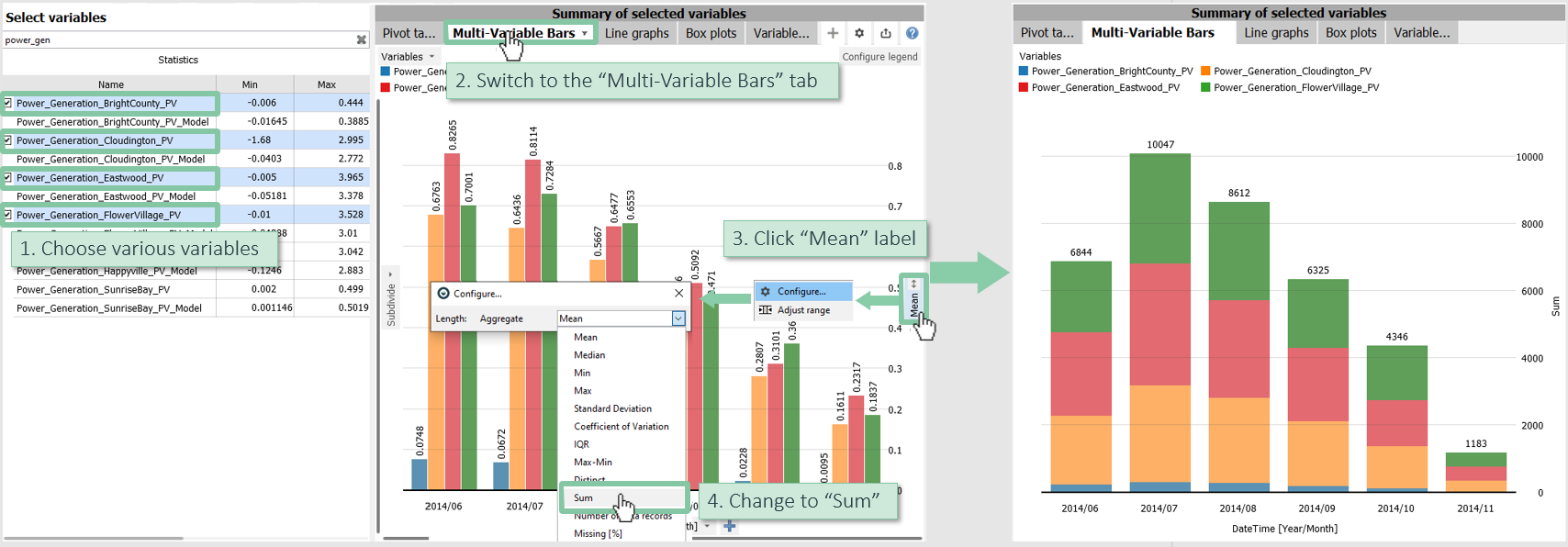
Now, this plot has been automatically turned into a stacked bar chart and on top you see the sum of the four selected variables seperately for each month
>> Continue with Next lesson: Analyzing correlations
License Statement for the Photovoltaic and Weather dataset used for Screenshots:
"Contains public sector information licensed under the Open Government Licence v3.0."
Source of Dataset (in its original form): https://data.london.gov.uk/dataset/photovoltaic--pv--solar-panel-energy-generation-data
License: UK Open Government Licence OGL 3: http://www.nationalarchives.gov.uk/doc/open-government-licence/version/3/
Dataset was modified (e.g. columns renamed) for easier communication of Visplore USPs.
