Lesson 3: Overviews of many time series
Preparation
If not the case yet, load the demo dataset and start the 'Trends and Distributions' Cockpit, as described in the beginning of lesson 01.
In the previous lessons, we used the "Statistics" overview to look at many time series. There are several other, more graphical overviews. For example, looking at the temporal distribution of missing values, or trends in the data. For this, see the overview "Heatmaps".
Heatmaps - an aggregated temporal or categorical overview
Please clear the time series name filter in the field "Filter variables by name" to see all time series again. Also, clear the "Focus" if you have any (e.g. DELETE key or x-symbol near "Focus") to see all records in full intensity again. Finally, close the "Drill-Down" view in the upper right if it is open, by clicking the dark gray header line labeled "Drill-Down".
Then, click the second overview tab "Heatmaps".
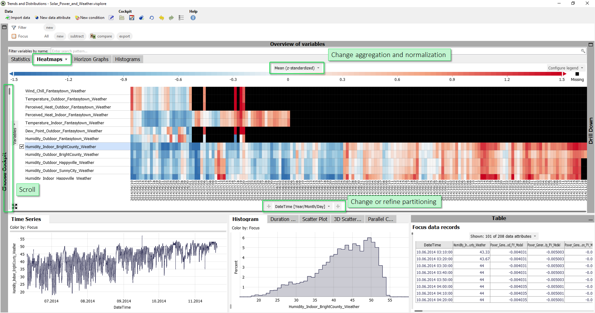
In this view, each row is a time series. Each column corresponds to one day (initial aggregation level may be different for other datasets). The color indicates whether the mean (=average) value of a day is above the mean value of the entire time series (red), similar to the overall average (white) or below the overall average (blue). In other words: in blue periods the time series is low on average, in red periods it is high on average. Black cells indicate days without valid values (100% missing values).
The list of time series is automatically ordered such that strongly correlating time series are
next to each other. This reveals, for example, that certain days are high/low in several
time series at the same time, hinting at a possible correlation.
Scroll the scrollbar left of the view up and down a bit. Then, try filtering the time series list by typing "Temp" in the field "Filter variables by name".
Now, we only look at temperature time series with roughly the same value range. It may make sense to view them in their original scaling.
Click the label of the color legend "Mean (z-standardized)", then choose "not normalized", to switch from the normalized color scale to the original one in degrees celsius.

This reveals that the temperature time series have two distinct value ranges: Indoor temperatures averaging above 30 degrees(intense red), and outdoor temperatures, which are less intensely red, averaging around 20 degrees.
Like in the "Statistics" overview, you can select one or multiple time series in the "Heatmaps" to inspect them in other views.
|
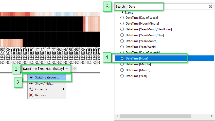
Moreoever, the partitioning of the x-axis can be changed. For example, average day patterns may be interesting for the temperature time series. Click the lower label of x-axis "DateTime [Year/Month/Day], then "Switch category". From the list of data attributes, select "DateTime [Hour]" to partition the axis by the 24 hours of the day. (You may need to scroll down a bit to find "DateTime [Hour]", or use the text filter to search for "hour" in the dialog.). |
|
Note: a shortcut for switching the category, is pressing the small downwards arrow icon right next to the axis label. This opens the same dialog as pressing the name of the axis label, then "Switch category", but needs one click less.

Now switch the normalization for the color legend back on, by clicking the color legend label, then selecting "Normalization / z-standardized".
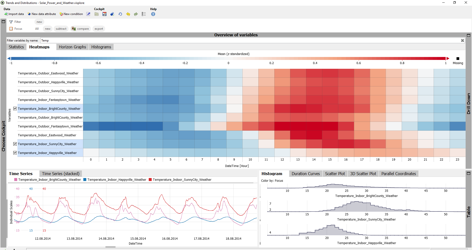
Apparently, almost all temperature sensors have a distinct daily pattern, but not all of them have their maximum at the same time.
Select a few time series and compare details in the "Time Series" view. You may need to zoom in (drag rectangle with right mouse button):
|
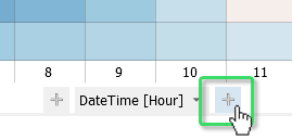
You can also subdivide the axis by multiple data attributes. Hours may be too coarse, for example. Move the cursor to the lower area of the view, then click the "plus" symbol that appears on the right side of the x-axis label "DateTime [Hour]". Then, select "DateTime [Minute]" from the list. Then, the x-axis is partitioned more finely, but still cyclic. |
|
Remove one of the two "partitioners" of the axis, by clicking their axis label, then "Remove". The other one, please switch to "DateTime [Year/Month/Day/Hour]".
This may take some time, as the whole time range is now subdivided linearly, down to hours of every day.
You just learned several very important control elements for aggregated visualizations in Visplore. Identical elements and workflows can be found in the "Drill-Down" views in the upper right part of Visplore, once opened. In particular, the views "Bar Chart", "Heatmap", and "Categories". Try these out as well, and experiment with the partitioning a bit, to get an idea of the pivot table/aggregation functionalites of Visplore.
Horizon graphs - a non-aggregated overview of many time series
This view provides a chronological overview of many time series that preserves extreme values and time series patterns better than aggregated views. Also, relationships and effects that appear with a certain delay in other time series become evident as well. This makes the view particularly useful for root-cause-analysis and explaining errors in continuous processes.
To understand the overall idea of the view quickly, open it on some familiar part of the data. Filter the list of time series by typing "Temp" in the field "Filter variables by name". Then, use the left mouse button to select a time interval in the "Time Series" view. Note how the Horizon graphs automatically zoom in, to show the selected records close-up. Zoom in to the selected part in the "Time Series" view, so you can relate the familiar "Time Series" view to the "Horizon graph":
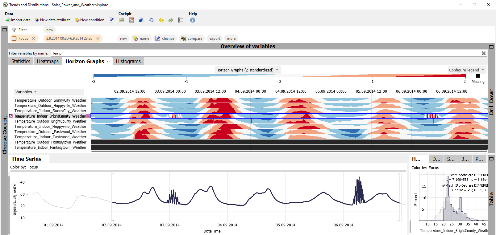
Now let's interpret the visualization:
- Similar to the "Heatmaps" view, red color means high values (above average), blue means low values (below average), white is average. Black means missing values.
- The value of the time series (y-axis) is colored step-wise in intervals. The intervals are drawn stacked on top of each other. This allows to encode everything from extremely low to extremely high on a very small space - which is ideal for an overview.
Order the list of time series by similarity, by pressing the "Variables" button on the left, then "Order by / similarity". As a result, time series with similar patterns are arranged next to each other. This reveals groups of similar time series.

The most important interactions with the view are:
- Click the name of a time series to display it in other views. Use the checkmarks for multi-selection
- Zoom in by dragging an area with the right mouse button. Scroll sideways using the control element at the lower edge of the view. Zoom out with the button in the lower left corner of the view.
- Change the color scale by pressing "Configure legend" in the top-right corner.
- Switch the normalization of the time series off when you have similarly scaled time series, by clicking the color legend label "Horizon graphs (z-standardized"), then "Normalization / no normalization".
- Rearrange the order of the time series manually by Drag-and-Drop of the small squares between the name of a time series and the visualization upwards or downwards.
- Select a time period in the visualization by dragging a rectangle with the left mouse button.
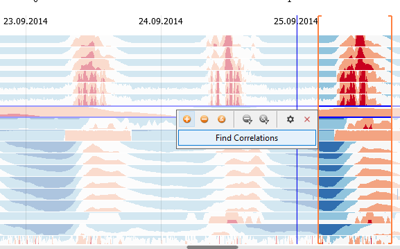
- Finding correlations with a specific pattern of one time series: Select a time period of one time series by dragging a line with the left mouse button in the visualization of one time series (important to stay within the one row and not touch others with the line). Then, press "Find Correlations" that appears next to the orange selection rectangle. This orders all time series by their correlation to the selected pattern in the selected time period. This is particularly useful for finding possible explanations:
Histograms - an overview of (differences in) value distributions
Another helpful overview can be found in the "Histograms" tab. Here, the distributions of the time series are shown using small histograms.
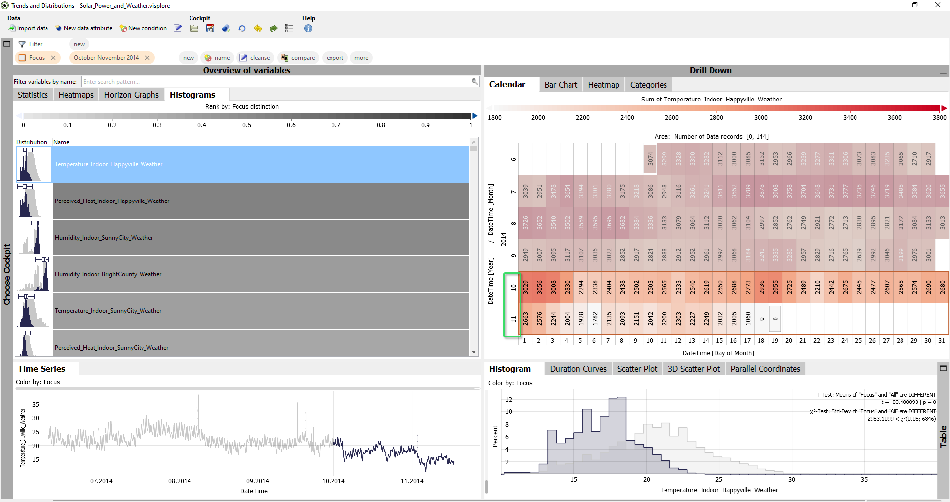
Most importantly, when a focus is defined, the list of time series is automatically ordered by how much the distribution of the focus differs from the rest of the data. This is useful for finding possible reasons for certain patterns that you select.
Remove the text filter of time series names, and select the months October and November. For example, by using the calendar: drag a line with the left mouse button that spans the month labels 10 and 11 on the calendar's y-axis.
As a result, the "Histograms" of those time series are ranked top, that have extraordinary value distributions in October and November. Here, these are certain temperature and humidity time series:
Note that you can also compare more than two categories or time periods by colors in the histograms. Click the label "Rank by: Focus distinction" in the color legend, and select a categorical attribute. For example, "DateTime [Month]. Then, each category is shown in a different color. And those variables are ranked to the top, where the categories have highly different distributions.
Well done! You have mastered the basic overview features, to get the big picture of many time series in 1 minute! :)
>> Continue with Lesson 4: Data filtering
License Statement for the Photovoltaic and Weather dataset used for Screenshots:
"Contains public sector information licensed under the Open Government Licence v3.0."
Source of Dataset (in its original form): https://data.london.gov.uk/dataset/photovoltaic--pv--solar-panel-energy-generation-data
License: UK Open Government Licence OGL 3: http://www.nationalarchives.gov.uk/doc/open-government-licence/version/3/
Dataset was modified (e.g. columns renamed) for easier communication of Visplore USPs.
