Lesson 2: Select and view data subsets
Preparation
If not the case yet, load the 'Solar Power' demo dataset and start the 'Trends and Distributions' Cockpit, as described in the beginning of the first step by step guide.
Selecting time periods in the calendar
A central feature of Visplore is the ability to focus the analysis on a specific subset of the data at any time. This can be a certain period of time, a category (e.g. all weekends), a cluster, or certain outlier values. To keep the specification of this Focus as intuitive as possible, and to use insights from the visualization in doing so, data can be marked directly in the views - using interactions known from drawing programs.
In the previous example, the calendar showed significant differences in daily sums.
Click on July 3rd with the left mouse button.
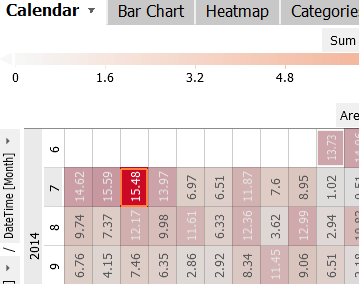 |
This day is now marked by an orange rectangle, while all other days are grayed out, to distinguish the focus from the rest. More importantly, the other views have changed as well (see image below):
|
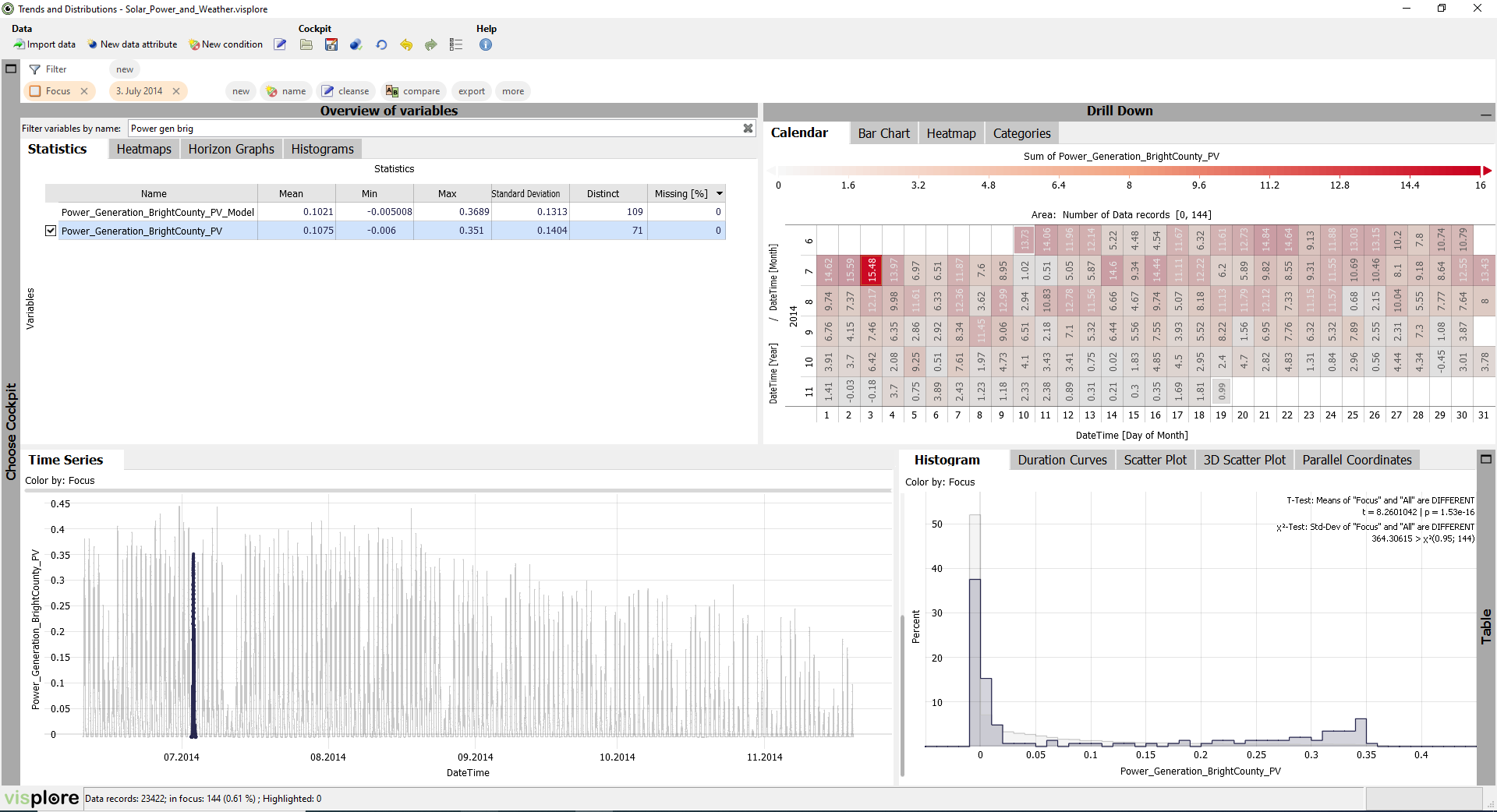
Important: the focus always refers to a subset of entire data records (= whole rows of the imported dataset), regardless of which variable was used to define it.
This means, that selecting a different time series in the "Statistics" overview doesn't have an effect on the focus - the selected records will still be highlighted.
As discussed in the last section, you can zoom in on areas of interest, e.g., by dragging a rectangle with the right mouse button. Doing this shows that July 3rd had no extreme maximum, but an continously high production. You can also make the Time Series view zoom in automatically when defining a new focus:
Click the title "Time Series" of the view, and select the option "Automatic zooming".
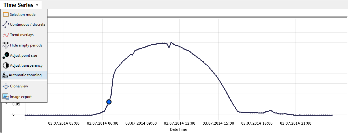
With this, the "Time Series" view will always automatically zoom whenever a new focus is defined.
Click the label "7" in the calendar on the left of the matrix row representing July. This selects the whole of July, zooming accordingly:

View records in focus as table
You can always see the raw data values in Visplore on demand.
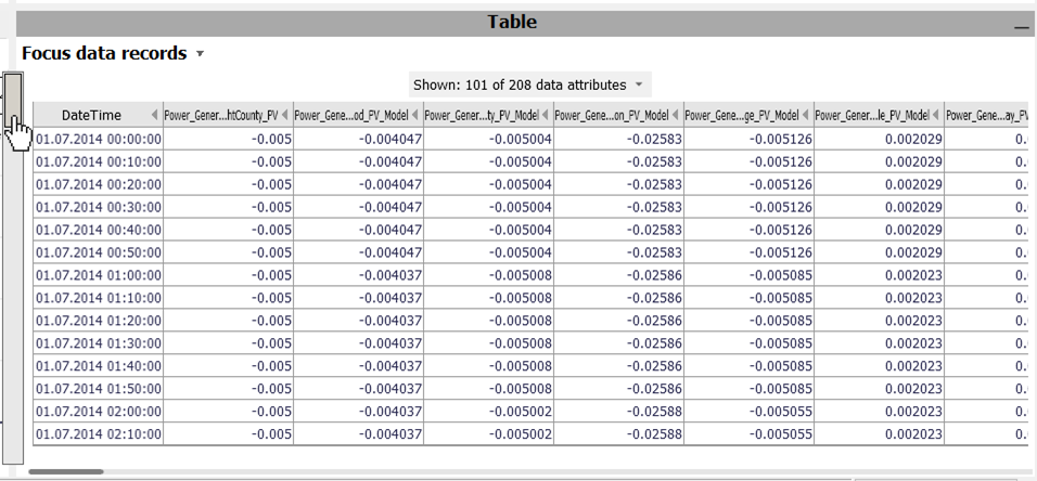
Click the vertical gray bar "Table" at the lower right border of Visplore.
This opens a data table view, showing the data records that are currently in focus. Specifically, when you have not specified a focus, all rows are in focus, and thus shown in the table. Use the scrollbars to navigate in the table, or use the mouse wheel for vertical scrolling.
Clear Selection
In the upper area of Visplore, the current selection of data records (i.e., the focus) is described in a textual form. The area is referred to as "Focus bar". Among many other actions, you can clear the selection (if it is not already empty):
Click the small "x" in the orange "Focus" blob in the top left. Alternatively, you can press the DELETE key on the keyboard ("Entf" on German keyboards).

Once cleared, all records are in focus again and shown in fully intensity, like when you started the cockpit in the beginning.
Selecting and Changing Intervals
You can also select data in other views.
Click with the left mouse button in the middle of the "Histogram" view, and drag an interval towards the right.
This selects all records, where the value of the displayed time series belongs to the drawn interval (here: "Power_Generation_BrightCounty_PV"). You can adjust the interval at any time:
Try dragging the left orange border, then the right one, changing the size of the interval. Then, drag the space between the interval borders to the left or right to move it.
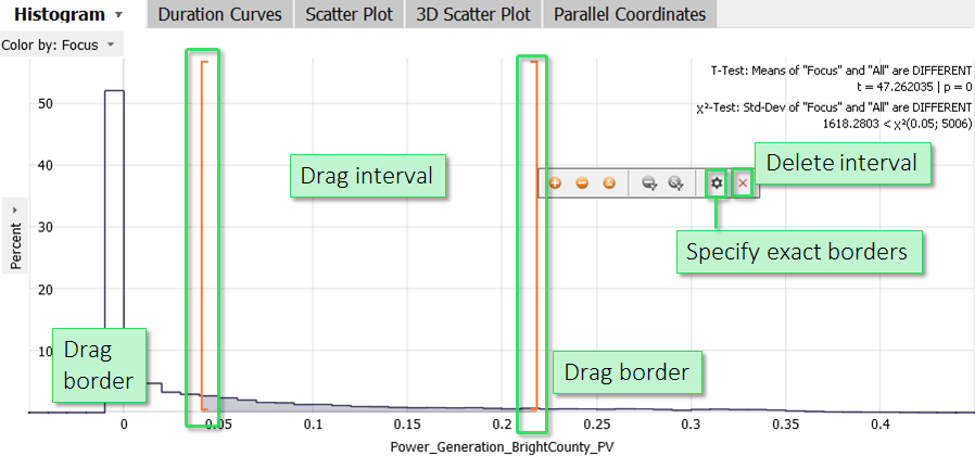
Often, you need precise borders. Click the gearwheel icon next to the orange interval. (If you don't find these icons, hover the mouse over the interval first).
This allows typing the interval border values by hand. Alternatively, you find this dialog by clicking the orange description of the interval in the focus bar.
Free selection of records in the Time Series view
Similar to the interval, you can select records in the "Time Series" view.
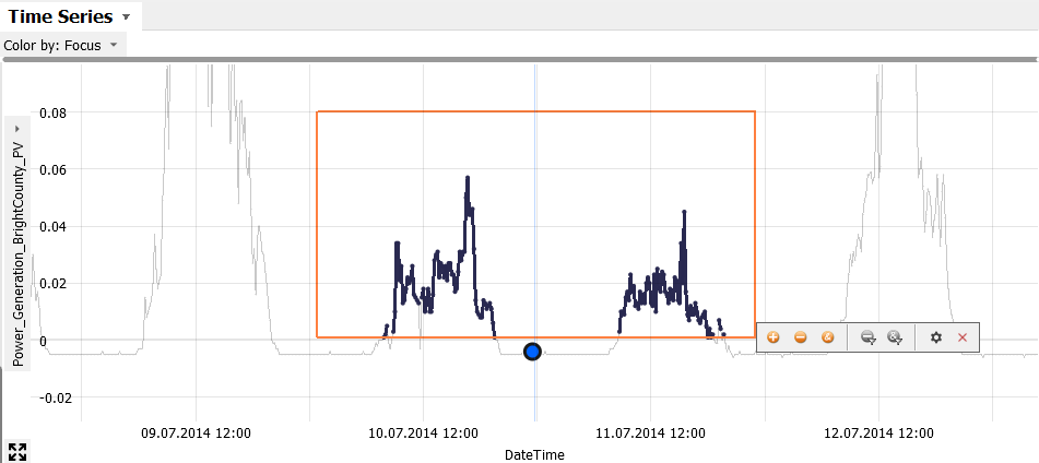
Clear the Focus (e.g. by pressing the DELETE key), then drag a rectangle with the left mouse button in the "Time Series" view, e.g., around some spikes.
The handling is analogous to intervals in the "Histogram".
Move the rectangle, and drag its borders. Then press the gearwheel icon to type its border values manually. Here, need to specify whether you change the border values regarding the time (x-axis) or value (y-axis) part of the rectangle. For example, try to select those times between July 10 - 12, that have significantly lower power generation than the rest, but are above zero:
Sometimes you don't want to use a 2D rectangle to select, but only select along one dimension. For these, various other selection tools exist.
Click the view title "Time Series", then "Selection mode". Then, click on the horizontal interval icon (second from left):
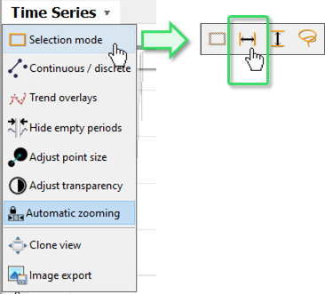
Now the selection only affects the time axis. In the same manner, the third from left selection mode only selects in the vertical value dimension.
Comparing two time series
Up to now, only one time series was considered at a time. Often, you need to compare multiple time series to relate patterns or events like structual breaks.
Let's consider temperature time series. Type "Temp indoor" in the "Filter variables by name" field of the Overviews. Then, select "Temperature_Indoor_Happyville_Weather".
Now click on the checkbox next to the time series "Temperature_Indoor_SunnyCity_Weather".
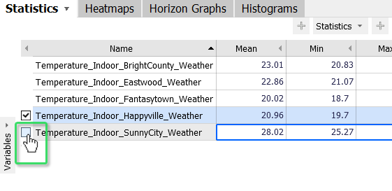
Now both time series are selected. Instead of the checkboxes, you can also hold the CTRL key while clicking the name of the second time series. Or, you can also drag a vertical line across two time series names to select two at once.
After selecting a second time series, Visplore should look like this (you may need to clear the focus, if you still have any):
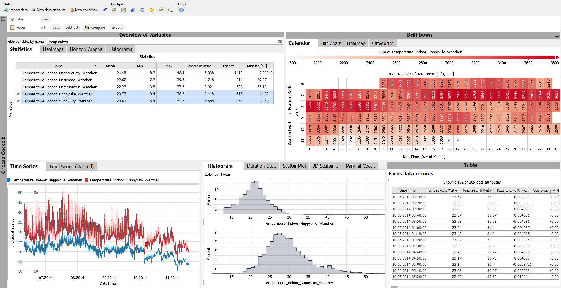
Time Series view with multiple time series
Both selected time series are distinguished in the "Time Series" view by different colors. The coloring is arbitrary at first.
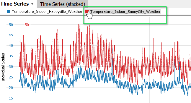
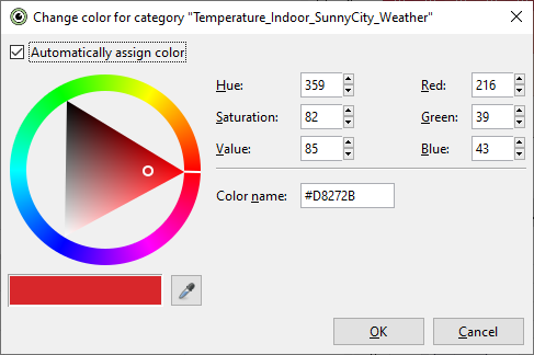
Click on the colored square next to one of the time series names to change its color in a dialog:
|
|
Depending on the value ranges of the two time series, the scales shown in color on the left are aligned like in this example, or not. To enforce a common scale, or normalize the time series, click on "Individual Scales" to find options for these. When you use individual scales, clicking one of the colored range borders allows you to adjust the scaling using the familiar control element.
As an alternative to the superimposed "Time Series", it is also possible to display the time series below each other in the diagram "Time Series (stacked)".
Switch to the tab "Time Series (stacked)".
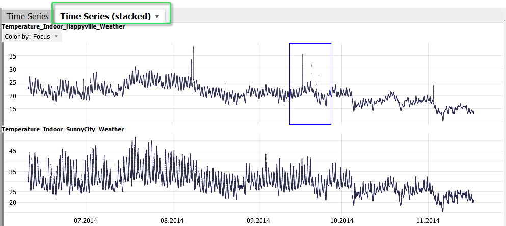
Here, patterns in the individual time series can be seen more clearly, such as spikes or gaps. The time axes of the plots are linked.
Zoom in on of the spikes by dragging a rectangle with the right mouse button in one of the plots (see image above).
The timeaxis of the second plot zooms in accordingly. The vertical axes can be adjusted individually.
2D Scatterplot
Another common visualization of two time series is the "Scatter Plot".
Show the "Scatter Plot" diagram by clicking the corresponding tab in the group:
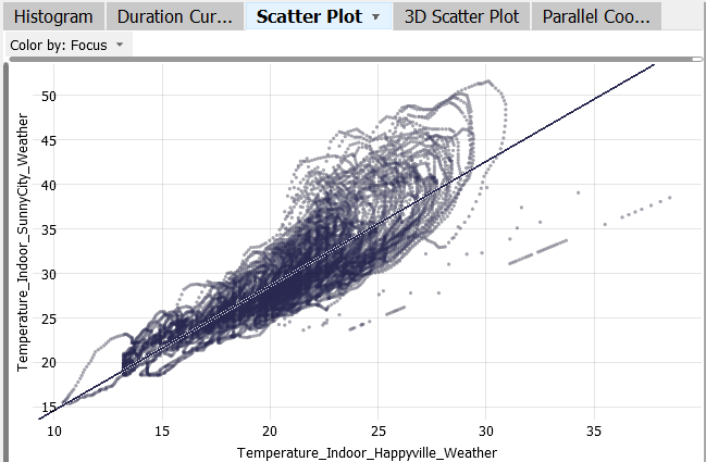
This diagram plots the values of the two time series against each other. Each point is a data record. The temporal order is not shown, but correlations and correlating subsets can thus be seen much more effectively than in the "Time Series" view. Like all views, the "Scatter Plot" is linked with the other visualizations:
Move the mouse pointer across days in the calendar.
The data of the corresponding days is highlighted in the "Scatter Plot" (as well as in other views like the "Time Series"). This way, a relationship between a time period and a value distribution can be seen very rapidly.
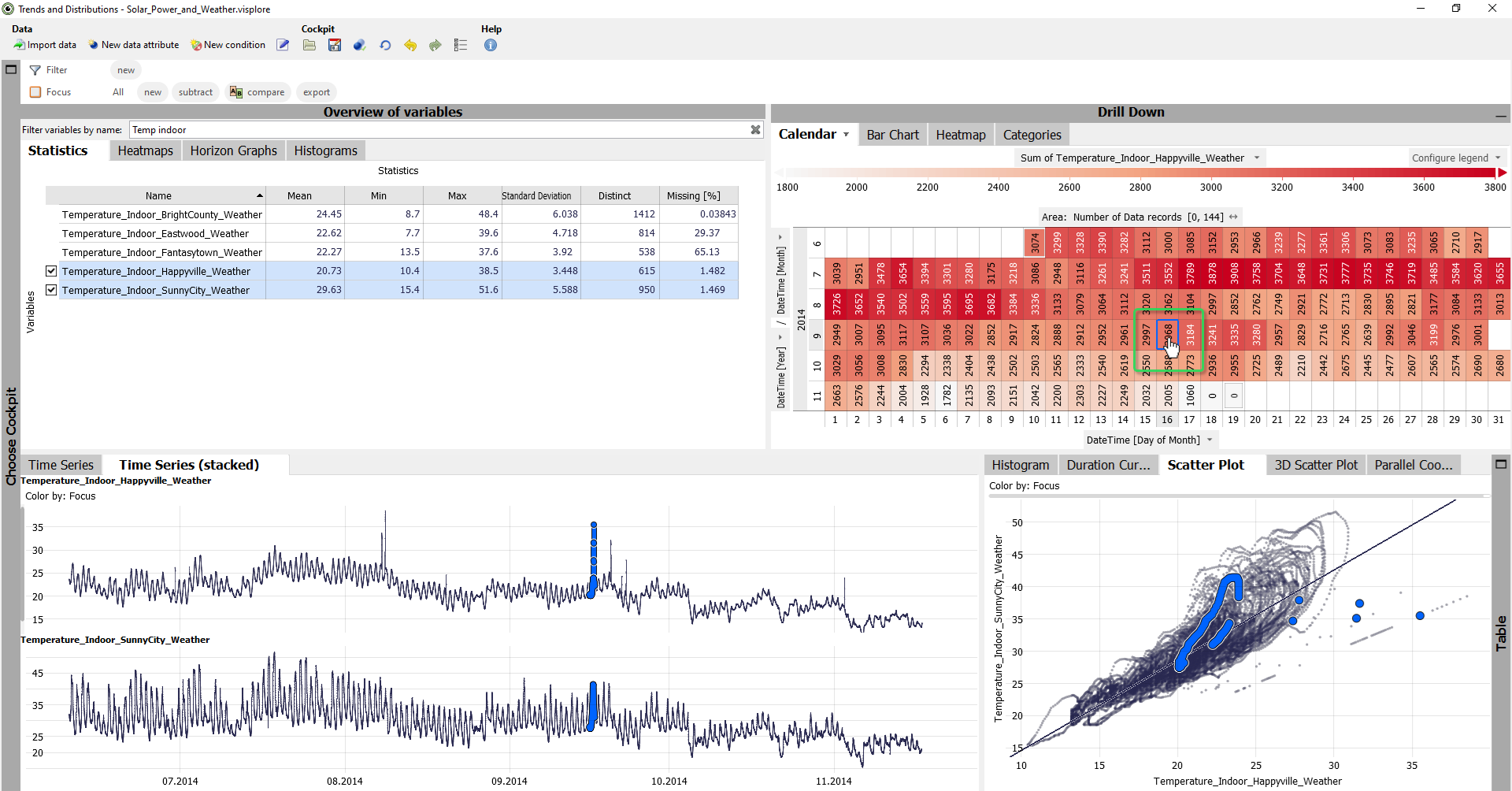
The "Scatter Plot" also shows a linear regression line between the two variables, indicating a possible linear relationship.
Hover the mouse pointer over the regression line, to see the equation of the regression line in a yellow tooltip window.
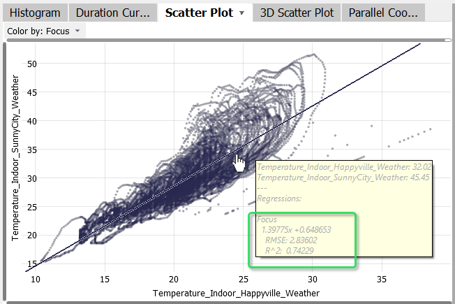
In the view menu (click the view title "Scatter Plot"), you can configure the visualization like flipping the axes, or changing the degree of the regression polynomial to see nonlinear relations.
Visualize a quadratic regression polynomial (see image).
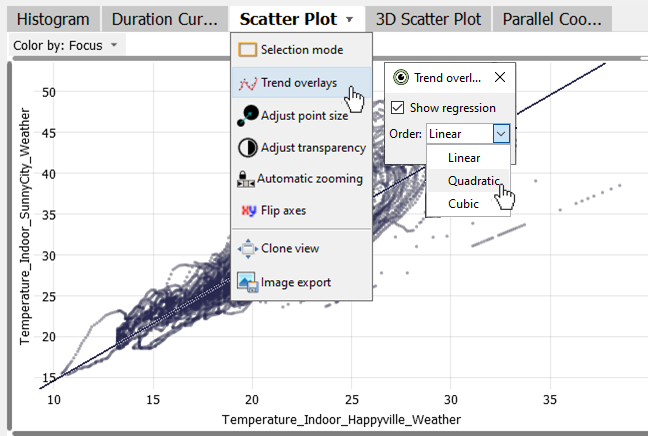
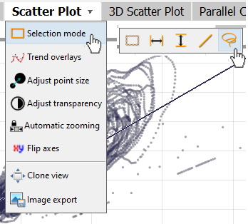
Several points in the "Scatter Plot" seem to lie exactly on one line. To examine this effect, you can select data records in this view as well, for example, using a selection rectangle similar to the "Time Series" view. However, for pattern of a shape like this, a free-form selection is more handy.
|
Click the view title "Scatter Plot", then "Selection mode". From the options, choose the one shaped like a lasso (see image). With the Lasso tool, drag a shape with the left mouse button that contains the points in the line pattern (see image below). |
|

Maybe you need one or two attempts at first to get the shape right. Remember that you can use the UNDO function, or clear the selection (DELETE key) to start over.
Once the line patterns are selected, the other views provide interesting information on these records. It is 52 records (see statusbar at the bottom). Their temporal distribution is evident from the calendar, as well as from the "Time Series (stacked)" views. The points seem to correspond to the spikes from the "Temperature_Indoor_Happyville_Weather" time series. The table in the lower right shows that the value for the two time series seems to be identical at these 52 points. This is confirmed by the statistics for the two time series in the overview (top left). Apparently, this seems to be a data artifact.
This rapid interplay of visualizations is a key feature of Visplore. Discover a pattern, select it, and immediately get answers by investigating it in other views.
Well done! You have mastered the basics of data selection in Visplore! :)
>> Continue with Lesson 3: Overviews of many time series
License Statement for the Photovoltaic and Weather dataset used for Screenshots:
"Contains public sector information licensed under the Open Government Licence v3.0."
Source of Dataset (in its original form): https://data.london.gov.uk/dataset/photovoltaic--pv--solar-panel-energy-generation-data
License: UK Open Government Licence OGL 3: http://www.nationalarchives.gov.uk/doc/open-government-licence/version/3/
Dataset was modified (e.g. columns renamed) for easier communication of Visplore USPs.
