Categorical data and pivot tables
Frequently, data does not only contain quantitative (measurement) values, but also names, designations, and IDs. For example, information about the grade produced, the material used, the asset, defect types, or the respective order number can be relevant in production data. Such data attributes are called categorical. They are typically used for reports, such as an evaluation per order number. It is also often valuable to consider status information (for example, "machine on/off") and time units such as calendar days, weekdays, calendar months, etc., as classes or categories.
Visplore supports the handling of categorical data attributes in many ways. This chapter first explains how to use this information for coloring. It then describes how to build pivot tables, bar charts, and heat maps based on categorical data, which can be used for reports and overview graphs to identify relevant sections of the data for detailed analysis quickly.
This step by step guide assumes you have loaded the 'Solar Power' demo dataset, and started the 'Trends and Distributions' Cockpit, as described in the beginning of the first step by step guide.
Showing categories by color
Visplore uses auto-coloring to highlight the most relevant aspects of the selected data. Selecting something in any view usually triggers related highlights in all connected views. A simple selection highlights the selected part in color while greying out the rest of the data. If you select between 2 and 20 categories or assets at once, they will be colored individually to make it easy to distinguish between the selected assets. Selecting more than 20 different assets defaults back to just one single color for highlighting as it is perceptually too difficult to distinguish between more than 20 different hues.
You can also select the preferred coloring mode from a range of existing options and change the assigned colors to your liking.
Changing the color
In Visplore, most chart types for quantitative data support showing categorical data attributes by color. For the solar power example data, the (discretized) wind directions are an example of categorical data.
In the "Time Series" plot, click on the grey area in the upper left corner called "Color by: Focus". In the menu, choose "Categorical..." and select one of the wind directions, for example, "Wind_Direction_BrightCounty_Weather".
Hint: when you have a very long list of categorical attributes (> 15 options), typing parts of the name on your keyboard filters the list accordingly.
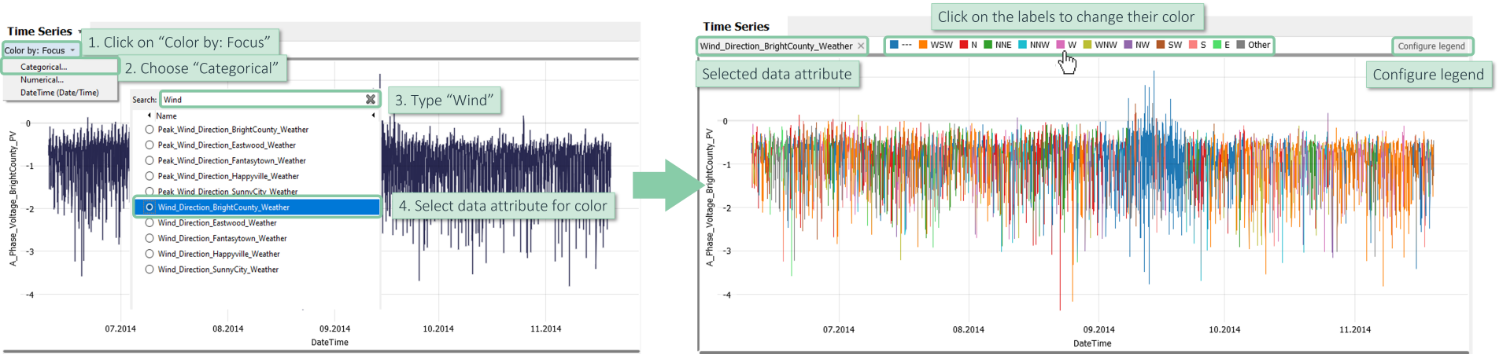
The resulting chart shows when specific wind directions have been dominant. Discriminating categories by color only makes sense for approximately up to 10 categories due to the limitations of human perception. Therefore, some smaller categories are summarized as "Other" in the legend.
Further possibilities (see image above):
- Clicking on a label in the color legend allows for color changes.
- Clicking on "configure legend" in the top right corner of the color legend allows for selecting which categories are discriminated by color and setting their drawing order.
- The "x" next to the name of the categorical data attribute resets the color.
Please note:
- The same possibilities are available in several other charts, for example, histograms and scatter plots.
- You can also assign quantitative data attributes to color.
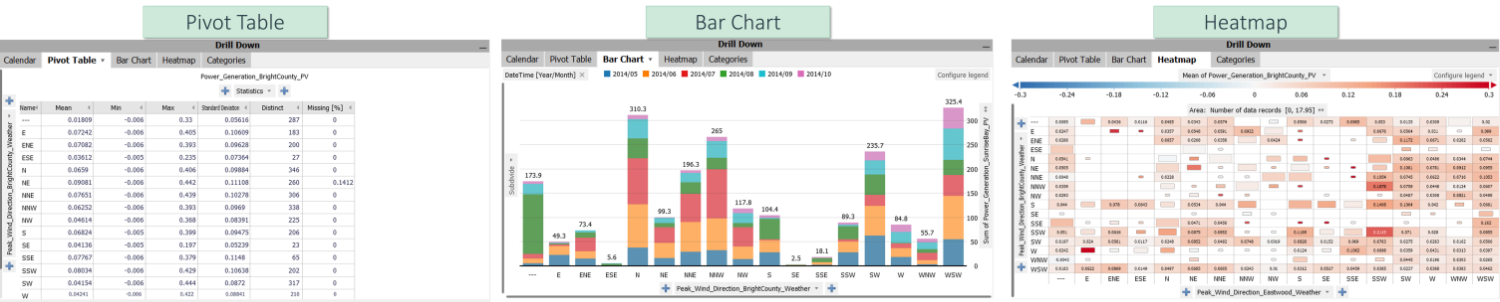
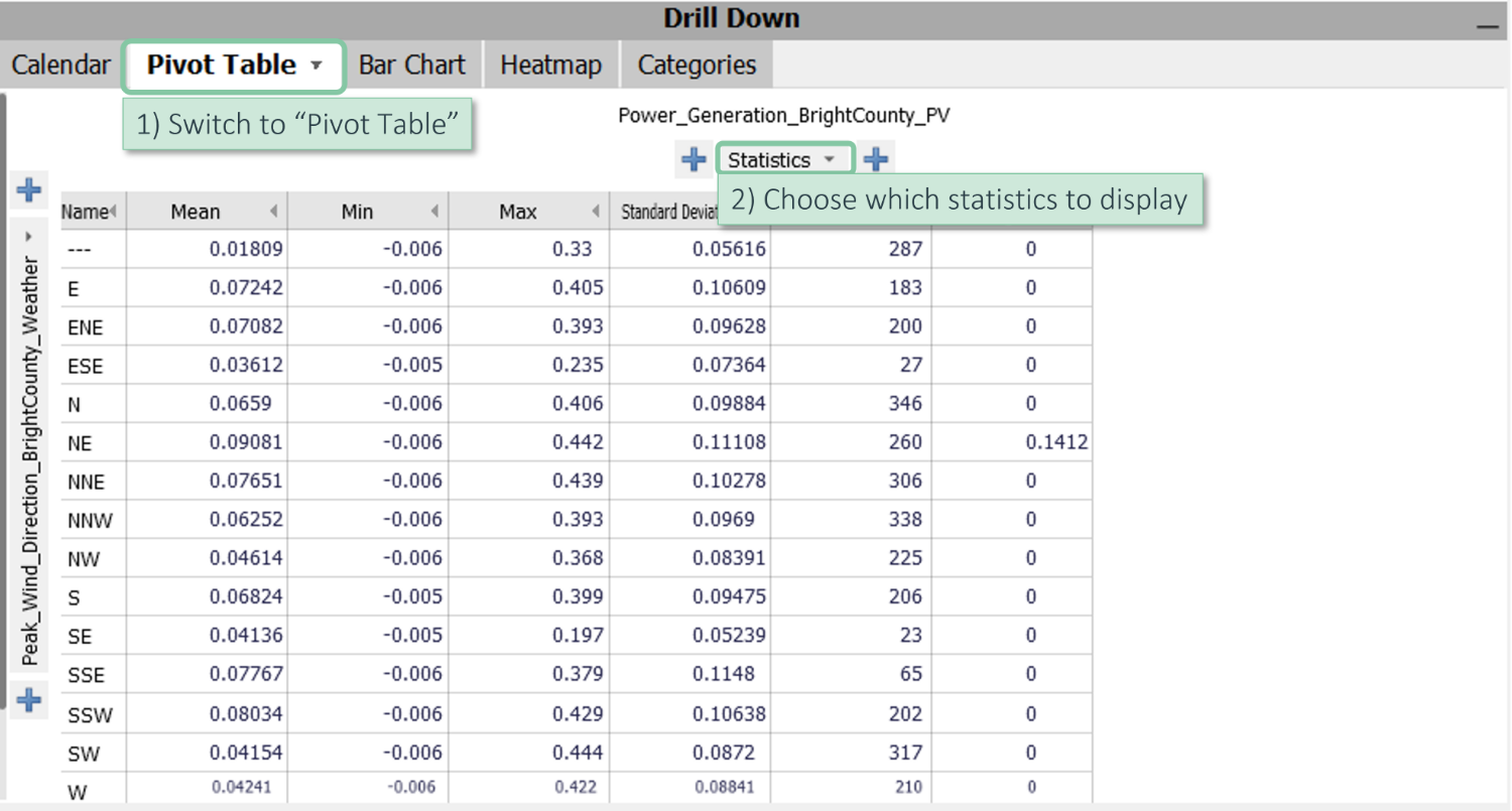
Configuring a pivot table
Visplore allows you to build powerful pivot tables for reporting and data preparation with a few clicks. Assume you must report the minimum, maximum, and average power generation per calendar month.
Open the "Drill down" area, which may initially be collapsed as a dark gray vertical bar, and switch to the second tab, "Pivot Table".
You may see a table summarizing wind directions. The statistics refer to the selected time series.
Let's select the numerical variable "Power_Generation_BrightCounty_PV" in the overview on the left-hand side of Visplore to use this variable in the Pivot Table.
Now let's configure the Pivot Table.
Click on the grey area "Statistics" to choose, which statistics should be displayed, and select the minimum, maximum, and mean for our example.
The rows of the pivot table can be configured on the left-hand side. Clicking on the vertically printed name (not on the small arrow on top!) opens a menu where you can:
|
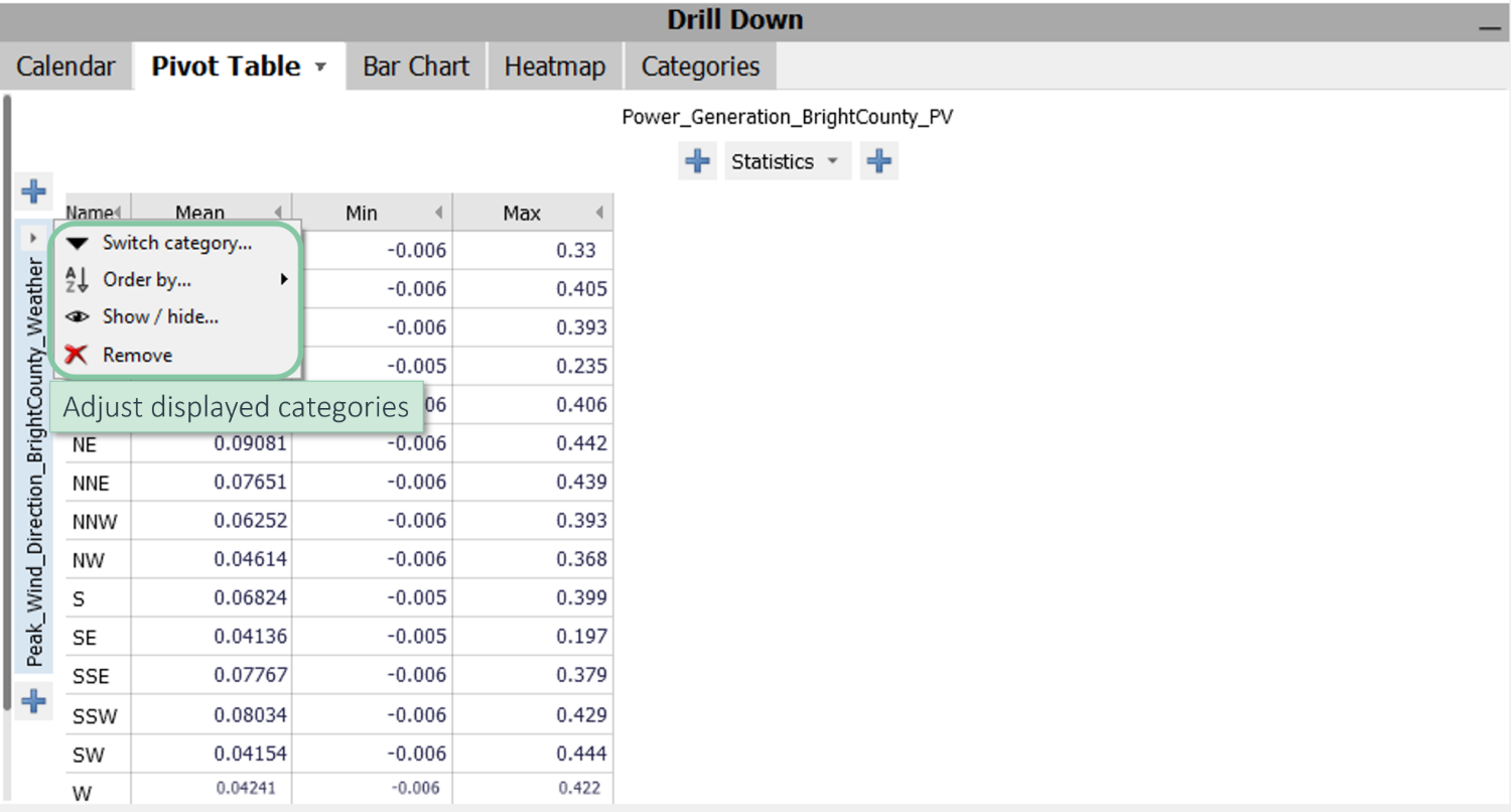 |
Click on "Switch category..." and select "DateTime [Year/Month]"
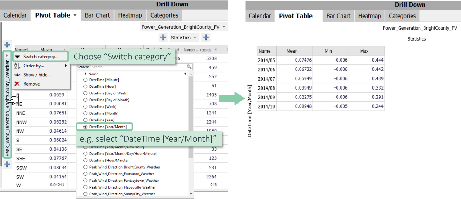
Now you see the calendar months as rows instead of the wind directions.
Please note: The list in "Switch category" contains all categorical data attributes (different wind direction variables in this example) plus several categories that are automatically extracted from the time stamp (called "DateTime" in this example). "Year/Month" is one of these options that defines one category for each month separately per year. "Month" would give the months without the year, combining all Januarys, all Februarys, etc. The same applies, for example, to "Year/Month/Day/Hour" vs. "Hour".
Attention: Numerical data attributes are initially not shown in this list. If you want to categorize by distinct numerical values, use the last entry of the list ("Add category..."). This will open a dialog where you can declare a numerical data attribute to also be available as categorical.
Sub-dividing axes (X / Y): You can further subdivide the axes as often as you want.
For example, if you are interested in the statistics of each day of the week for each month, click the plus sign at the top and select “DateTime [Day of Week]”. After subdividing, you can also concatenate categories by hovering over the slash in the middle between the two axes and clicking on the appearing symbol.
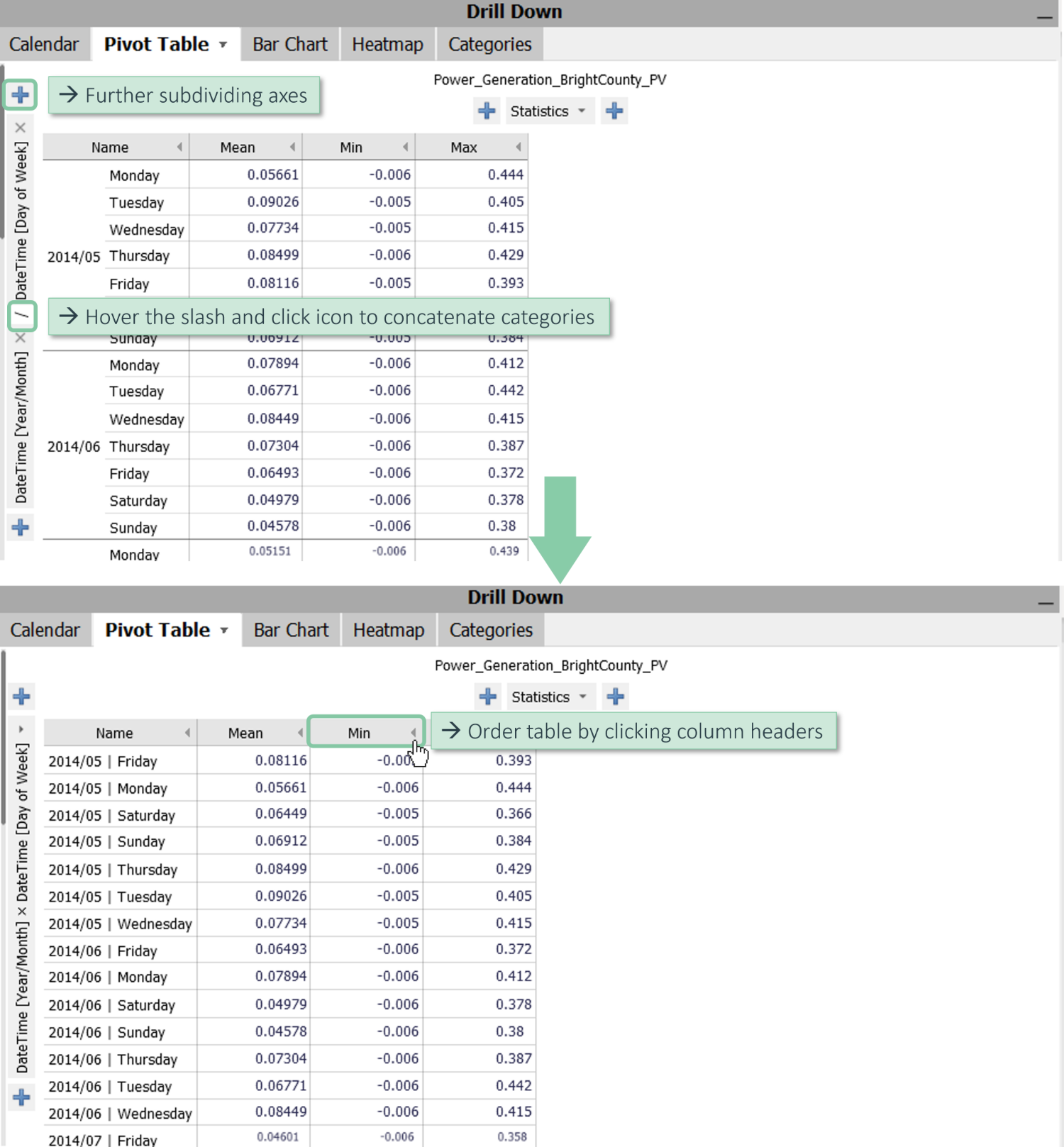
Now the statistics are computed individually for each day of the week of each month. You can split the x-axis in the same way.
The resulting table can be ordered by clicking on the arrows next to “mean”, “min”, or “max”.
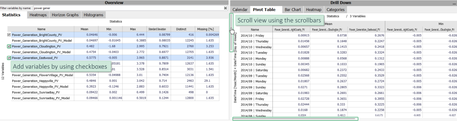
You can add further numerical variables to the pivot table by checking their “Overview Statistics” boxes. For scrolling the diagrams, use the vertical and horizontal scrollbars.
If you want to adjust the cell values, click "Pivot Table", which opens a menu for configuring the entire pivot table. Choose the first option, “Cell labels”, where you can set the decimal places.
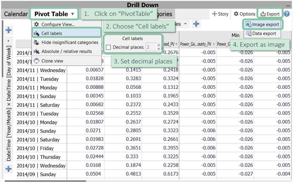
Finally, you can export this pivot table as data or an image. You find these options after clicking the diagram titled "Pivot Table".
Configuring a bar chart
Bar Charts can be configured based on categorical data as flexibly as Pivot Tables.
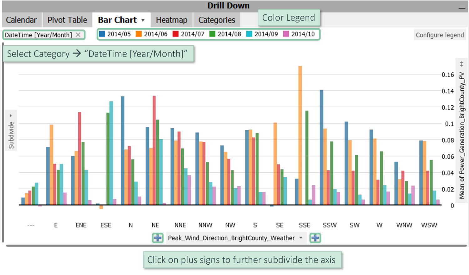
In the "Drill Down" panel, click the third tab, “Bar Chart”.
In our example, the initial bar chart shows the distribution of wind directions, represented by the data attribute “Peak_Wind_Direction_BrightCounty_Weather”.
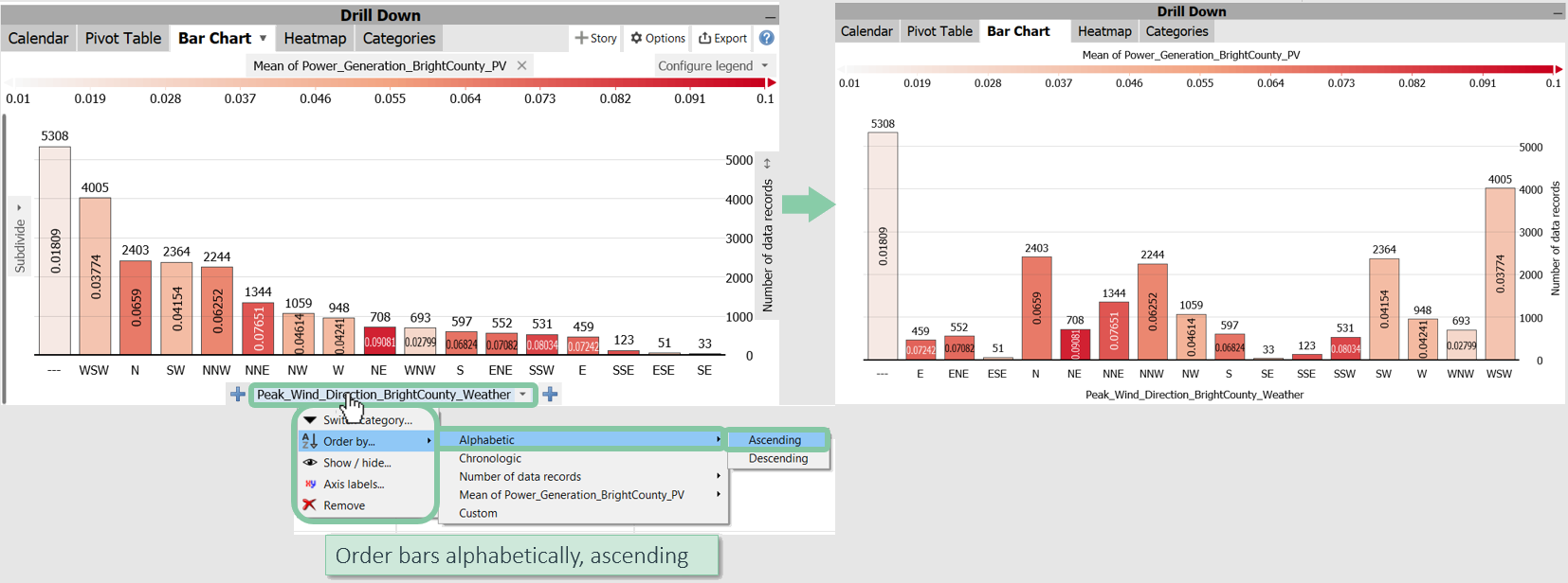
By clicking the axis label “Peak_Wind_Direction_BrightCounty_Weather”, you could switch to another categorical attribute, show/hide categories, and re-order bars.
For example, sort the bars alphabetically / ascending.
Axial-Subdivision: Use the + (plus) buttons to the left and right of the x-axis label to subdivide the bar categories further.
Click the plus button and choose “DateTime [Year/Month]”.
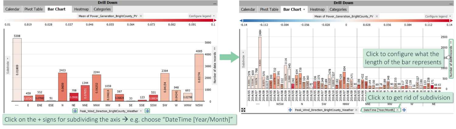
You can see that each wind direction is subdivided by calendar month.
Click the small "x" next to an axis label part to remove the subdivision. Or, subdivide the plot further by clicking the plus signs.
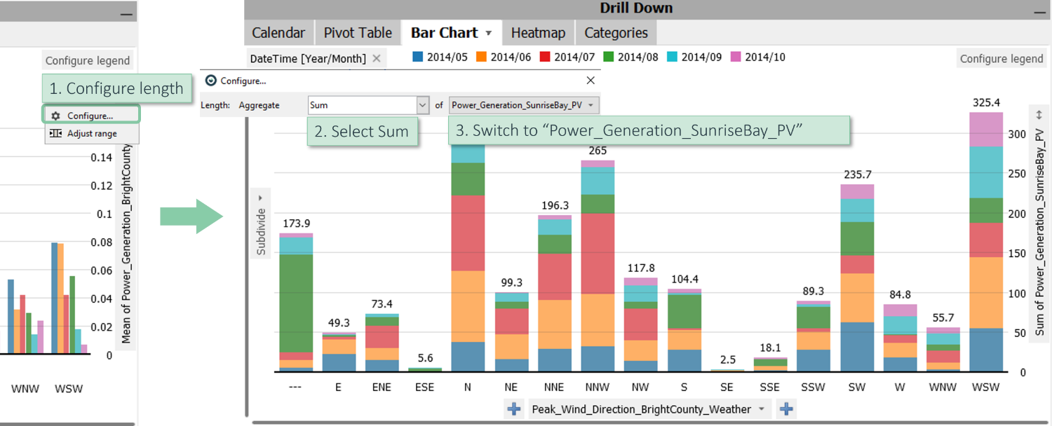
Bar Length: The length of the bar is written on the right-hand side of the view: “number of data records”.
Click on this label to configure the length of the bars (see image above, right).
Bar color: Currently, the mean of the selected data attribute “Power_Generation_BrightCountry_PV” is shown as the color of each bar:
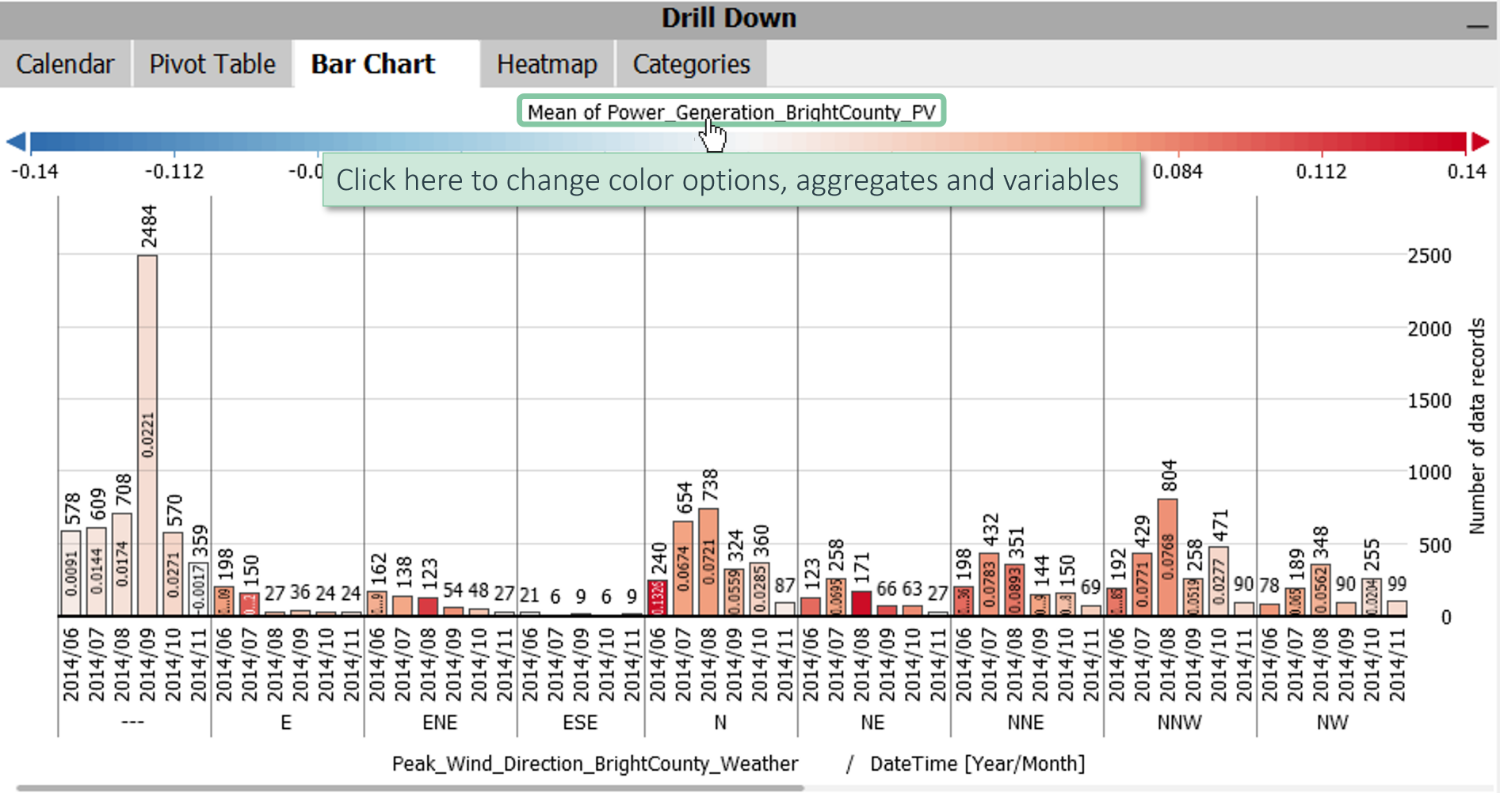
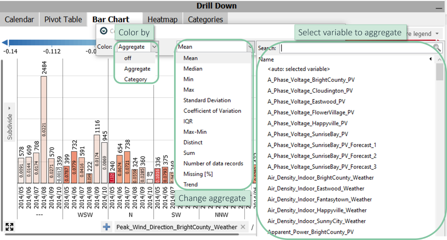
Click the label of the color legend to change the color options, the used aggregate (e.g., Mean), and the represented numeric variable:
Color by categories: The color can also come from a specific category and not necessarily from a quantitative variable.
Click on the color dropdown menu (the left one in the image above) and select "Category" instead of "Aggregate". Select “DateTime [Year/Month]” as the category:
Also, in this case, you can use the plus sign to subdivide the axis further, for example, producing a separate bar for each month.
Stacked Bars: Instead of displaying the differently-colored bars next to each other, they can also be stacked. This can make sense for displaying counts and sums.
Click on the vertical axis label on the right side of the diagram (here: “Mean of Power_Generation_BrightCounty_PV”)
Change the used variable to “Power_Generation_SunriseBay_PV”, the power generated in Sunrise Bay.
Then, switch the aggregate to "Sum" instead of "Mean" to get stacked bars showing individual months separated by color.
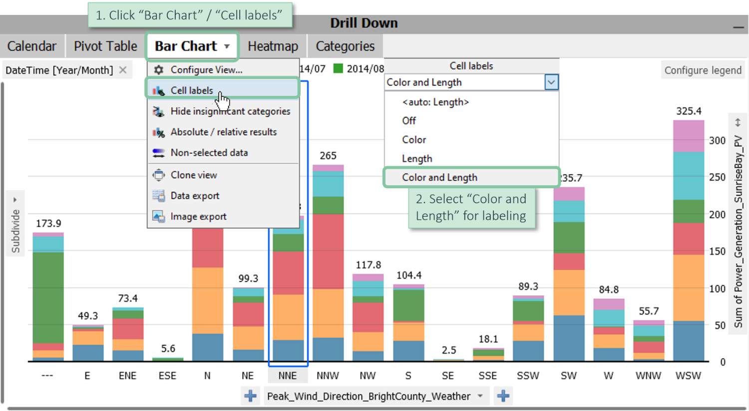
Adjust Labels: You can also adjust the labels in this view.
Click on the “Bar Chart” tab, choose “Cell labels,” and select "Color and Length" for labeling.
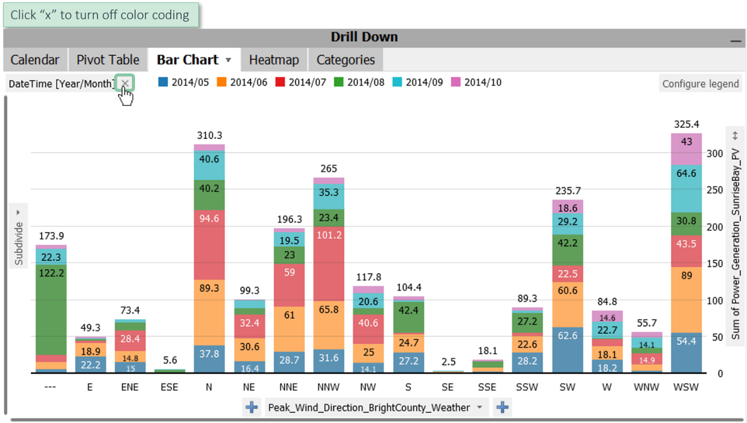
Deactivate colors. For all bar charts, the coloring is optional and can be turned off:
Click on the "x"-icon in the color legend to remove the coloring. To turn it back on, click on the “Bar Chart” diagram, and choose the first option, “Configure view,” in the menu. There, turn the coloring on again.
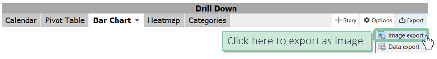
Export as Image: You can also export the view as an image.
Click on the tab “Export” and choose “Image export”.
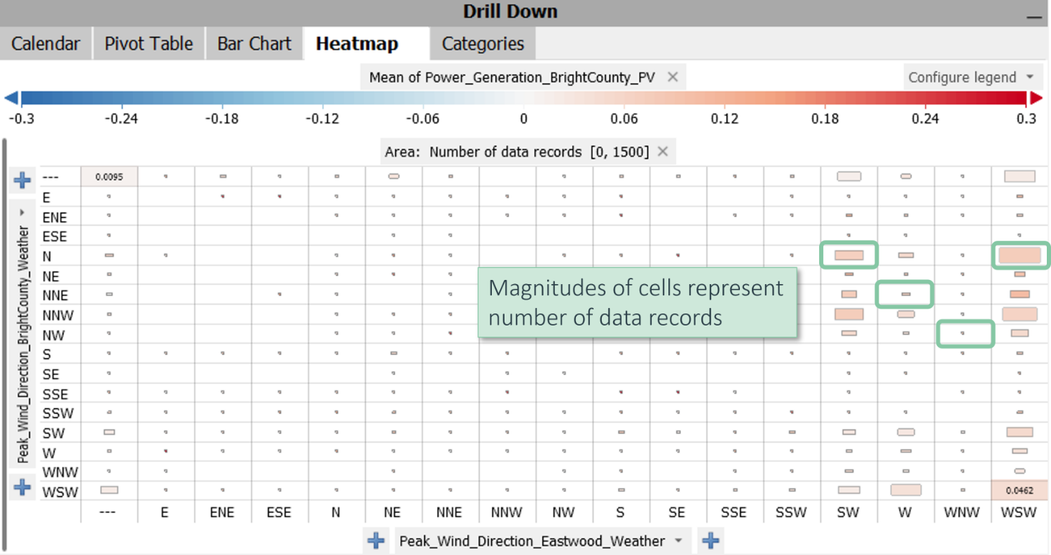
Configuring a heatmap
Heatmaps are a great way of visualizing two or more categorical variables in combination.
In this example, you can see the combination of all possible peak wind directions from “Eastwood” (columns) and the respective peak wind directions from “Bright County” (rows).
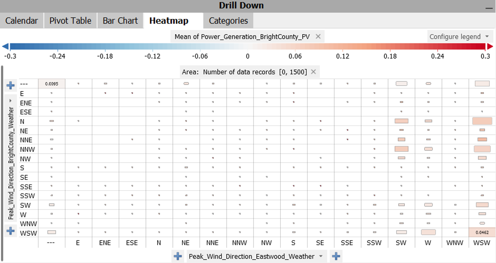
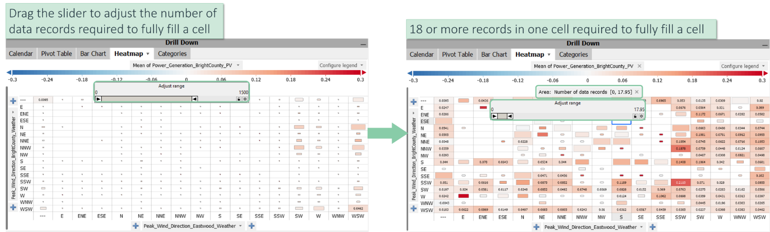
Cell-Size: By default, the magnitudes of the different cells represent the number of data records that fall into each of these cells. Some are empty (which do not occur in that data), and some are very small because there is only a minimal number of data records in the respective cell.
Adjust Size: You can adjust the number of data records that need to be in a cell to be filled.
Click on the top “Area: Number of data records [0, 1500]” and choose “Adjust range”.
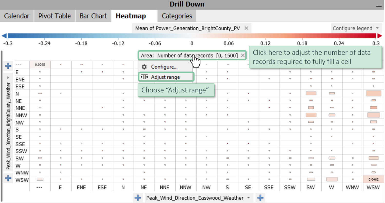
Drag the range slider to the left (here, approximately until 18. So there are 18 or more data records in one cell to fill it).
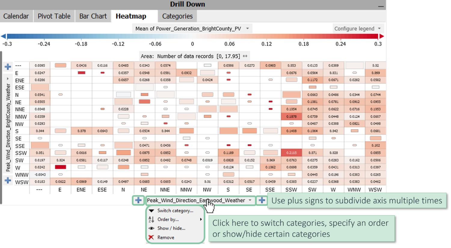
Configure Axes: The handling of the axes is very similar to the pivot tables and bar chart views.
Click on “Peak_Wind_Direction_Eastwood_Weather” and switch the category, specify an order of the categories, or hide some of them.
In the same way, you can subdivide the axis multiple times by clicking on the plus signs.
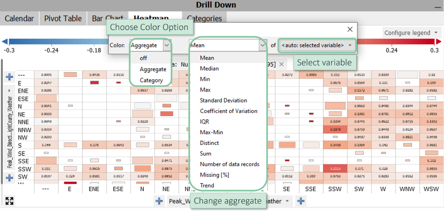
Adjust Color: Like in the bar chart view, you can change the color options, the respective aggregate, and the selected variable.
Click on the tab “Mean of Power_Generation_BrightCounty_PV” to change these color options.
Color by Category: The color can also come from a specific category and not necessarily from a quantitative variable.
Click the color dropdown menu and indicate that the color should come from a specific category, such as “DateTime [Year/Month]".
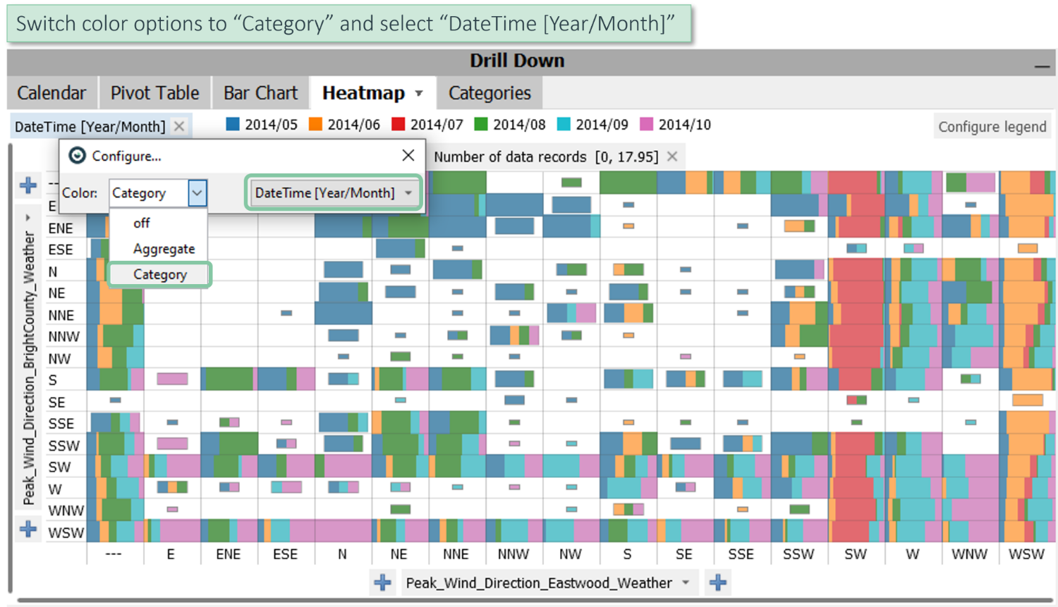
In this view, different colors are used for each month. Here, you can see that some combinations of wind directions occur more frequently in some of the months than in others.
When to use heatmaps?
- Exploring when two or more categories occur in combinations.
- Looking at cycles of time.
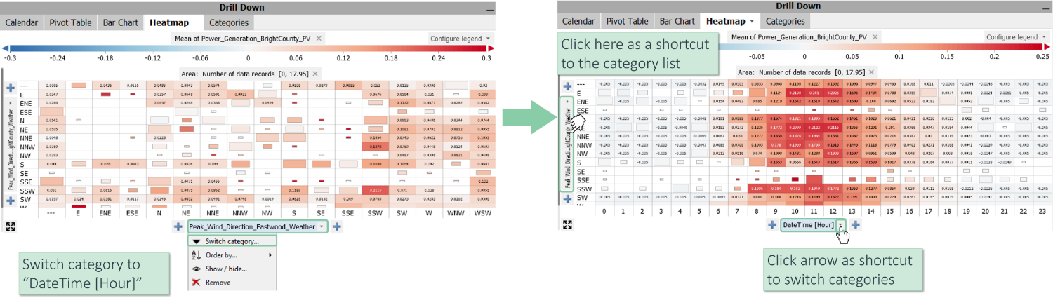
For example, click on the tab “Peak_Wind_Direction_Eastwood_Weather” and switch the category to “DateTime [Hour]”.
Now, click on “Peak_Wind_Direction_BrightCounty_Weather” to switch the y-axis to the "DateTime[Month]", for example.
Note: as a shortcut, you can switch to a different category by clicking on the small arrow, which will get you directly to the list for switching to another category.
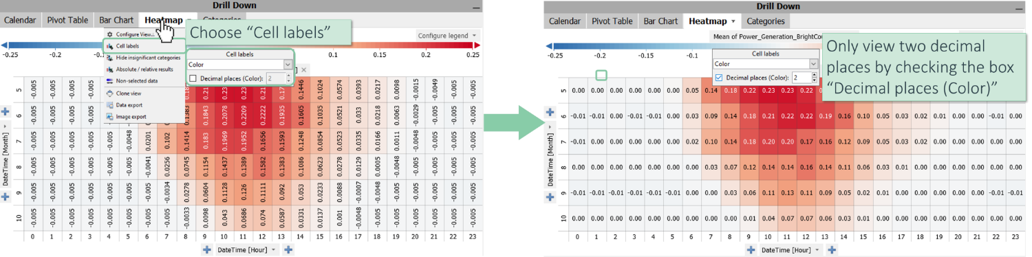
The resulting image shows comparatively more energy production at noon and during the summer months (see below).
Adjust Labels: You can also configure the labels in this view.
For example, if you only want to have two decimal places, click on the “Heatmap” tab, choose “Cell labels,” and check the box "Decimal places (Color)".
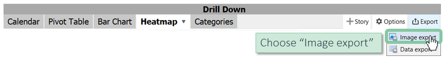
Export as Image: You can also export the view as an image.
Click the tab "Export" and choose "Image export".
>> Continue with Next lesson: Export images and data
License Statement for the Photovoltaic and Weather dataset used for Screenshots:
"Contains public sector information licensed under the Open Government Licence v3.0."
Source of Dataset (in its original form): https://data.london.gov.uk/dataset/photovoltaic--pv--solar-panel-energy-generation-data
License: UK Open Government Licence OGL 3: http://www.nationalarchives.gov.uk/doc/open-government-licence/version/3/
Dataset was modified (e.g. columns renamed) for easier communication of Visplore USPs.