Creating regular reports in Visplore Professional – USE CASE TUTORIAL
Often you have to do the same reports, analyses, or charts for different customers, projects, or quartal on fresh but otherwise equally structured data. Save much time with Visplore compared to doing it with other tools over and over again.
ProPlease note that you require Visplore Professional to apply your report to new data.
Preparation (to follow this lesson using demo data)
For the tutorial, load the solar power demo dataset from the welcome dialog, as shown below.

Switch the current cockpit to "Summaries".

Adding visualizations as new pages
In the following, we create a report with visualizations that we want to update with current data regularly.
Total Production
Create a stacked bar chart with the total production.
Filter the "Select variables" with the filter "power gen not model" and select all remaining variables using a selection box.
1: Click "Multi-Variable Bars" in the "Summary of selected variables" panel. 2: Change the x-axis to "DateTime [Year/Week]". 3: Configure the view to show the "Sum" aggregate. 4: Finally, create a story page called "Power Generation".
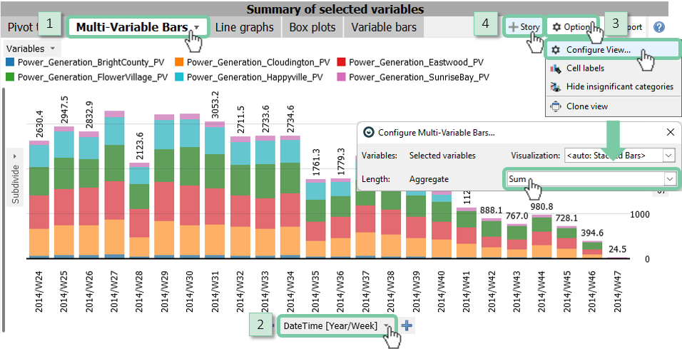
Optionally limit the decimal places to one digit in "Options" -> "Cell labels"
Note: Refer to Categorical data and pivot tables for a complete reference of working with categories, pivot tables, bar charts, and heatmaps.
Average Production
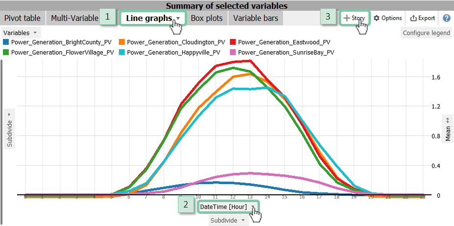
Configure a line chart to show the average production of all power producers.
1: Click "Line Graph" in the "Summary of selected variables" panel. 2: Change the x-axis to "DateTime [Hour]". 3: Finally, create a story page called "Typical Production".
Threshold Exceedances
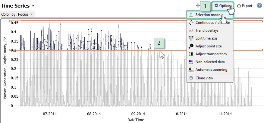
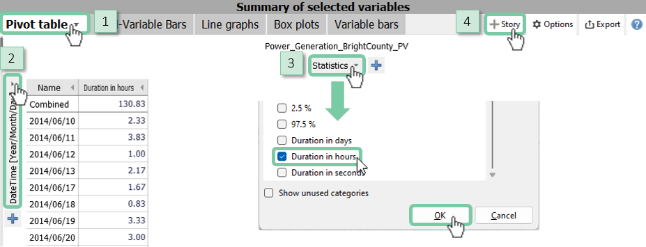
Analyze when and for how long a certain threshold is exceeded. Sort the pivot as required to have the days ordered on top with the longest threshold exceedances.
Select the variable "Power_Generation_BrightCounty_PV" only.
1: Change the selection mode to "vertical 1D interval brushing mode". 2: Select values in the range of 0.3 and 0.45.
1: Click on "Pivot table" in the "Summary of selected variables" panel. 2: Change the y-axis to "DateTime [Year/Month/Day]". 3: Change the statistics to show "Duration in hours" only. 4: Finally, create a story page called "Peak Production".
1: Name the story page "Peak Production". 2: Open "More options". 3: Input a detailed description of what you see in this story page. 4: Add the "Time Series" as a visible element. 5: Confirm by clicking "OK".
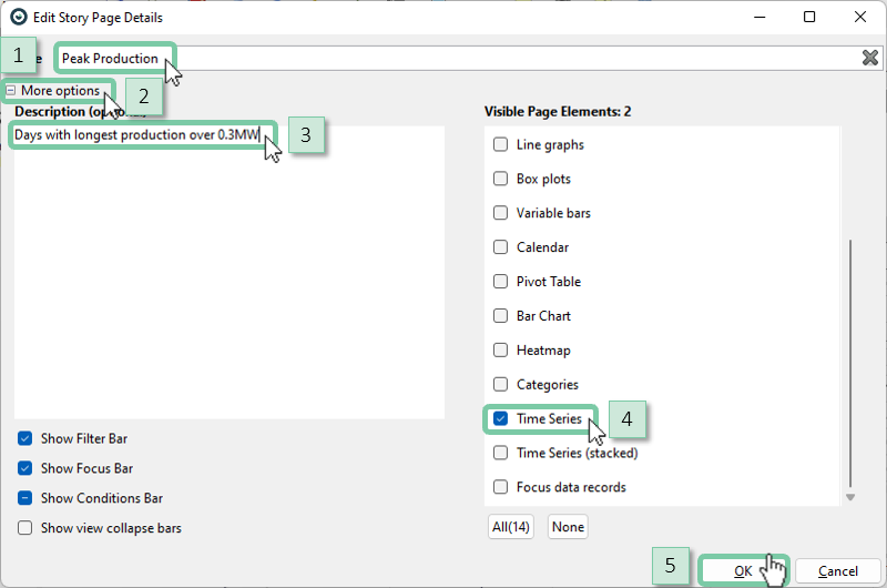
Note: You can add elements from any cockpit, such as daily curves from the "Pattern Search and Comparison" cockpit.
Saving as PDF
All pages can be rendered into a PDF document, for archiving purposes or quick sharing.
Open the story options and select "Export Story".
Add a company logo to personalize the report by ticking the "Enable custom header logo" option.

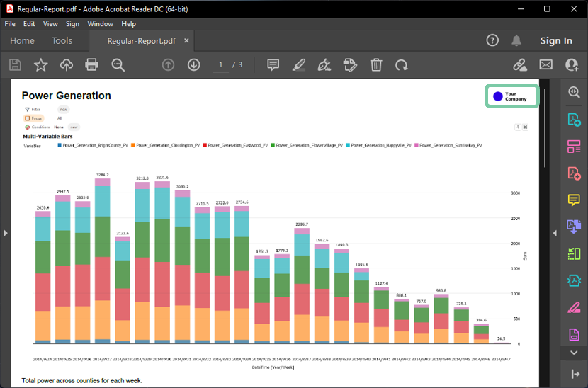
Your company logo appears in the top right corner (highlighted below) on every page of the report.
Saving as a template for later
Apply your story as a template to new data to create an updated report.
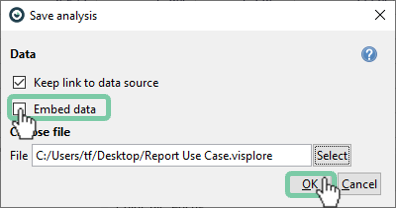
Save your story as a Visplore session without embedding the data (meaning, the checkbox should *not* be checked).
Close Visplore and start a new Visplore. Load your new data (for demonstration purposes, load the Solar Power Demo Data again, see above).
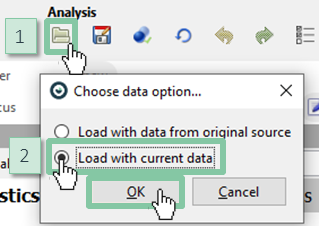
Now apply your story as a template to the freshly loaded data. 1: Click "Load analysis". 2: Select the option to "Load with current data".
Note: At this point, you can again export the story as an updated PDF report.
Note: You can automate the process of loading data, applying it to a story template, and generating a PDF report using the Python API.
In this tutorial, we looked at building a report that can be applied to new data repeatedly using the story feature. Use this feature to save time for repetitive tasks!
