Getting your data in shape
This guide aims to introduce the means of shaping data sources within Visplore.
1. Basics
Let’s start with some vocabulary that is widely used within Visplore and in any context regarding data shaping.
1.a. What does "long" and "wide" mean?
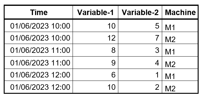
Data could be stored in a table in two main ways: long format and wide format. Each of these formats have its advantages when it comes to data analysis in Visplore. In a table with the long format, each row represents a data record or an observation. See below for an example. Notice that each row is a measurement for a single machine at a specific point in time.
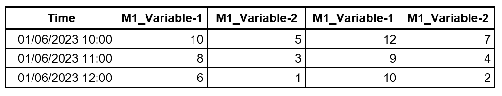
In a wide table format, each row is not a single observation but an aggregation of records. See below the same data transformed from long format to wide format using the ‘Machine’ column as a key. Notice that each row includes measurements from multiple machines this time and timestamps are not repeated.
1.b. What is a regular raster?
Regular raster is the fixed-duration temporal resolution that all imported data sources are shaped to. Let’s assume that we have multiple data sources such as- a sensor that automatically takes a reading every minute
- a quality measurement taken every 30 minutes
- a log of events which naturally have irregular time intervals
To analyze these three sources with different temporal resolutions, they need to be harmonized using a regular raster.
2. Filtering at data import
The first step of shaping the data starts as soon as while importing it into Visplore. There are import filters for each suitable data source.
2.a. CSV and Parquet:
For CSV and Parquet data sources, below window appears following the data import window.
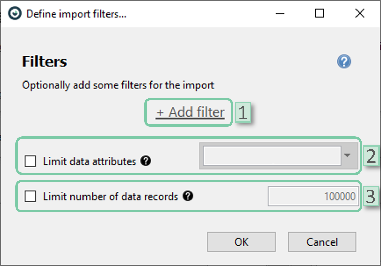
- Add filter: Select filters to be added. Date/time attributes or categorical attributes could be selected.
- Limit data attributes: Limit data attributes to be included in the imported data.
- Limit number of data records: Limit the maximum number of data records to be included in the imported data. It could be helpful for big datasets.
2.b. ODBC:
The import filter for databases via ODBC provides more options in terms of import filtering.
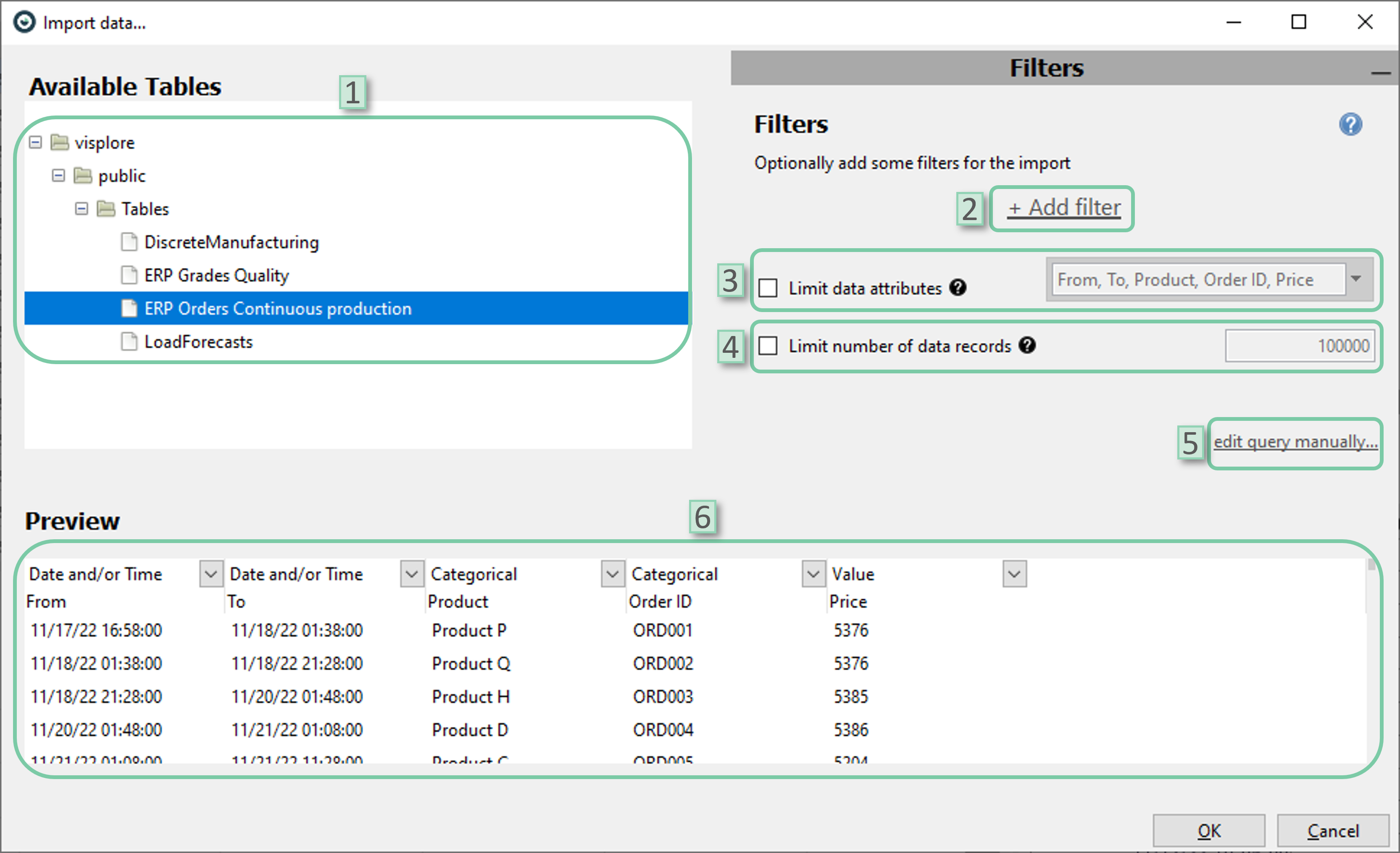
- Select table: Select the tables to be imported from the database
- Add filter: Select filters to be added. Date/time attributes or categorical attributes could be selected.
- Limit data attributes: Limit data attributes to be included in the imported data.
- Limit number of data records: Limit the maximum number of data records to be included in the imported data. It could be helpful for big datasets.
- Edit query manually: If desired, user can edit the query manually using SQL
- Preview: The preview window could be used to get an idea of the shaped source. This also works for manual queries.
2.c. InfluxDB:
The import dialog for Influx database also offers data shaping options during import.
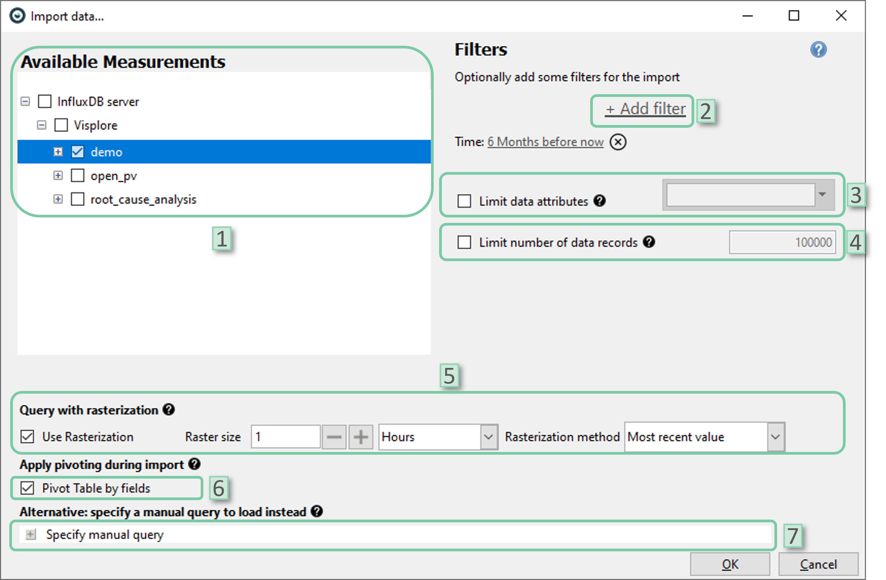
- Select measurement: Select the measurements to be imported from the database
- Add filter: Select filters to be added. Date/time attributes or categorical attributes could be selected. By default, time filter is set to ‘6 Months before now’. You can change the time-span by clicking onto it or remove the filter completely by clicking the ‘X’ icon next to it
- Limit data attributes: Limit data attributes to be included in the imported data.
- Limit number of data records: Limit the maximum number of data records to be included in the imported data. It could be helpful for big datasets.
- Query with rasterization: If desired, data can be rasterized even before importing it into Visplore. User can select the raster size (temporal resolution) and rasterization method. Note that, the rasterization methods ‘mean’ and ‘sum’ are only applicable if the dataset only holds numerical data attributes as these methods are not defined for categorical data attributes.
- Pivot table by fields: This setting is ON by default and advised to be left as it is Pivoting collects unique values stored vertically (column-wise) and aligns them horizontally (row-wise) into logical sets. This allows the data to be formatted in a tabular way that most users are used to. If this setting is unchecked, the selected fields must all be of type FLOAT.
- Specify manual query: User can apply custom import settings via a flux code. This automatically disregards any other import setting provided via user interface.
3. Rasterization
3.a. What is a "raster", and why is this important?
A raster is the regular structure being applied to a time-dependent data for rasterization. A raster is particularly important when merging multiple data sources in a wide format as it is very likely that the temporal resolution (or the sampling frequency) of the data records among different sources wouldn’t match. Thus, a temporal alignment is needed. This could be achieved by applying a common raster to all data sources.
3.b. How to define a raster
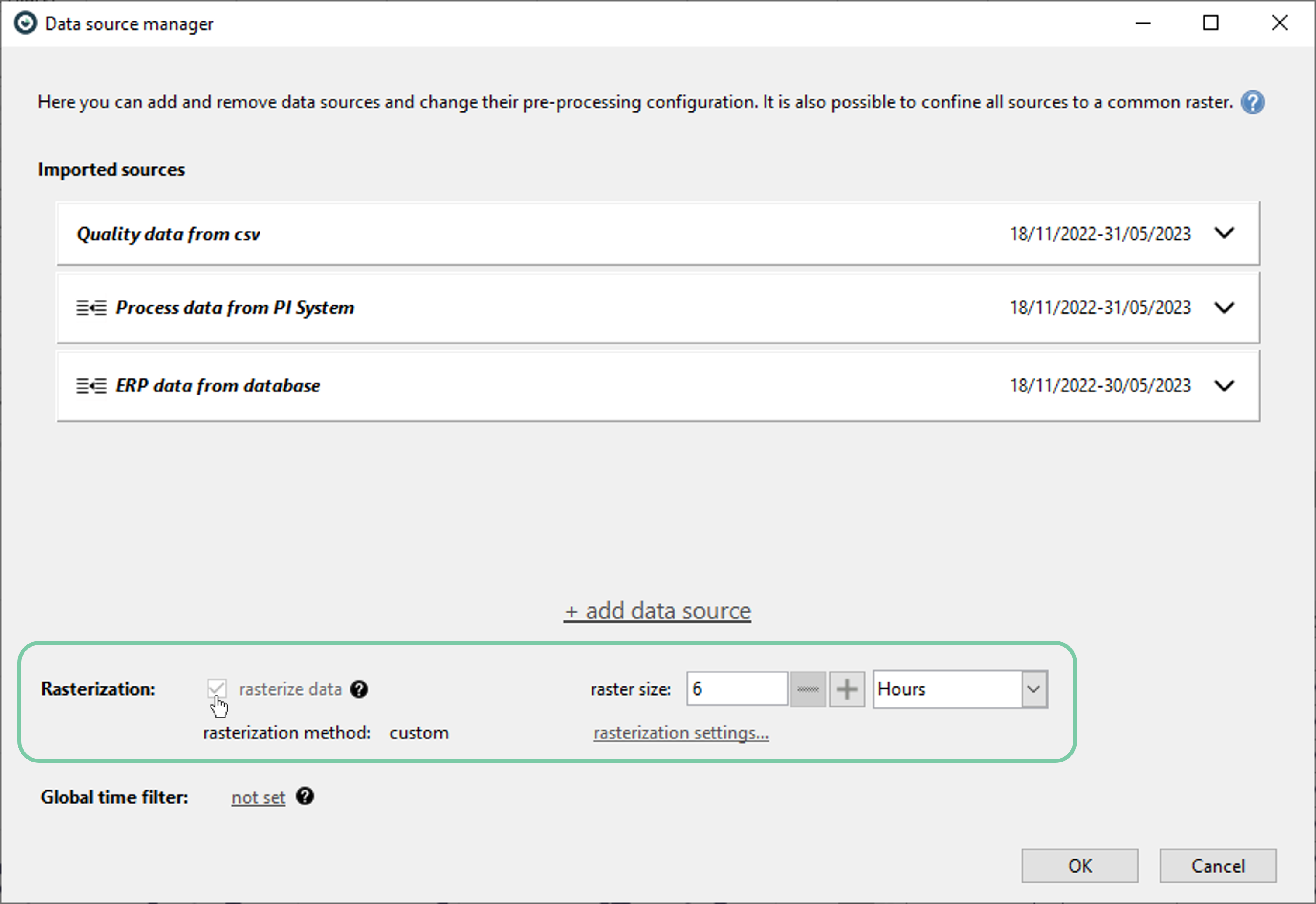
A raster could be defined in the ‘Data Source Manager’ by clicking the checkbox named ‘rasterize data’ and selecting a raster size afterwards.
3.c. Different time interpretations
Here, the user can assign a temporal interpretation for each data source. This impacts the rasterization options as well as how rasterization is performed. Visplore automatically assigns the best fitting time interpretation to each imported data, however, user can overwrite this by clicking ‘Time interpretation’ selection as shown below.
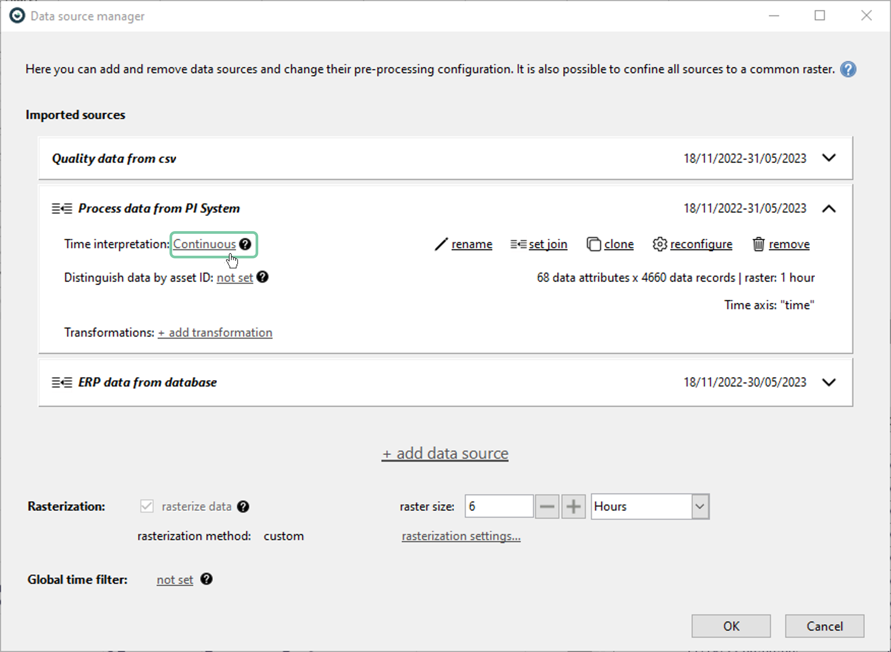
Time interpretation selection window will pop up as below. Here, user can change to the desired interpretation.
Continuous data is a constant stream of measurements and the most common time series format. Visplore treats the input data as one continuous measurement, even if irregular gaps exist between the measurements. Discrete events are measurements that happen at one specific point in time, are not connected to one another, and should not be linked in a time series view. An example is quality measurements that get recorded whenever they are taken and are only valid at that point in time. These measurements (events) will be shown as points in the time series view. Events with duration are limited time measurements, not limited to a singular point in time, but to a specific time span. Visplore treats all values within the duration of an event as connected but does not connect one event to the next.
These options to define time spans exist:
- Until next event assumes the value of a measurement at a particular time is valid until the subsequent measurement (event)
- Fixed duration provides a user-settable time duration, and the duration of each event will be exactly the set amount of time
- From column applies if the duration of an event is given in a column of the data set, both the column and the time unit are user settable
- Start/end times use two time columns from the data set: the begin (from) time and the end (to) time of the event
3.d. Some frequent rasterization methods per time interpretation
After setting raster size and time interpretations, the next thing is usually to determine the rasterization methods. Setting the correct rasterization method for the purpose is critical. For example, Let's say a dataset of daily temperature readings is reshaped to a monthly raster. Then, depending on the rasterization method set, the values you get may or may not be useful for the purpose. For example, if the aim is to get the coldest temperature record for each month, ‘minimum’ method can be used. On the other hand, using ‘sum’ as the preferred rasterization method on such a data wouldn’t generate much value to the user.
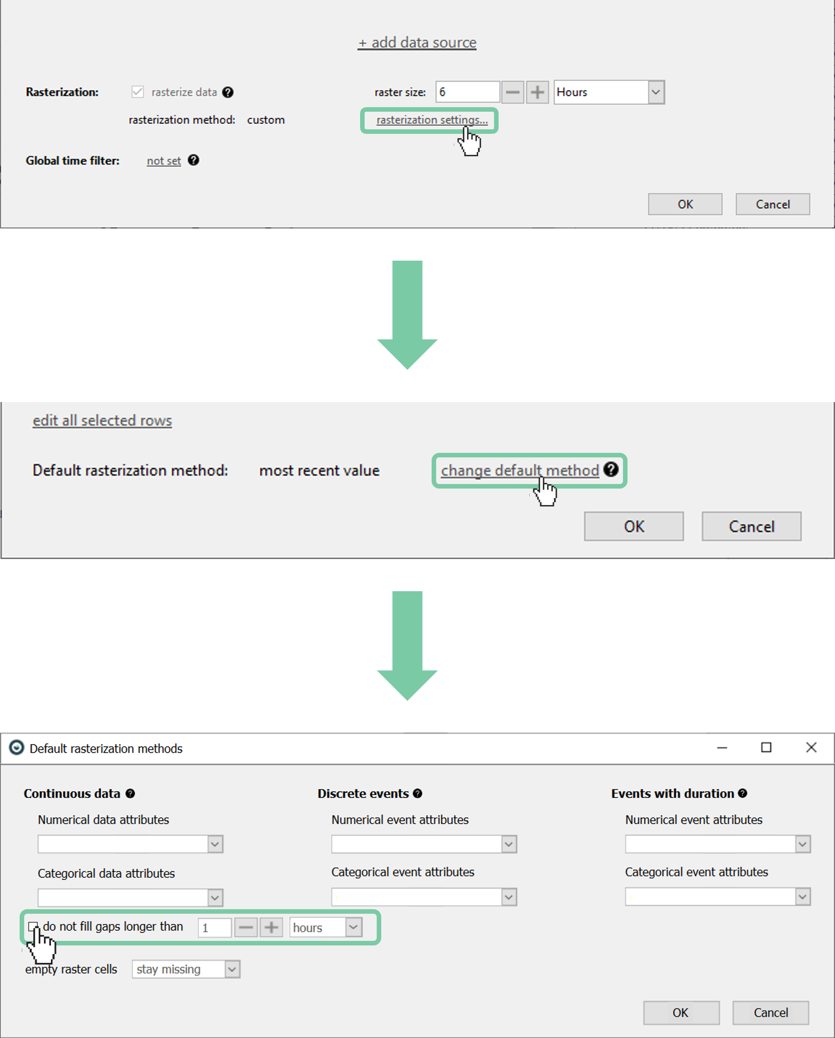
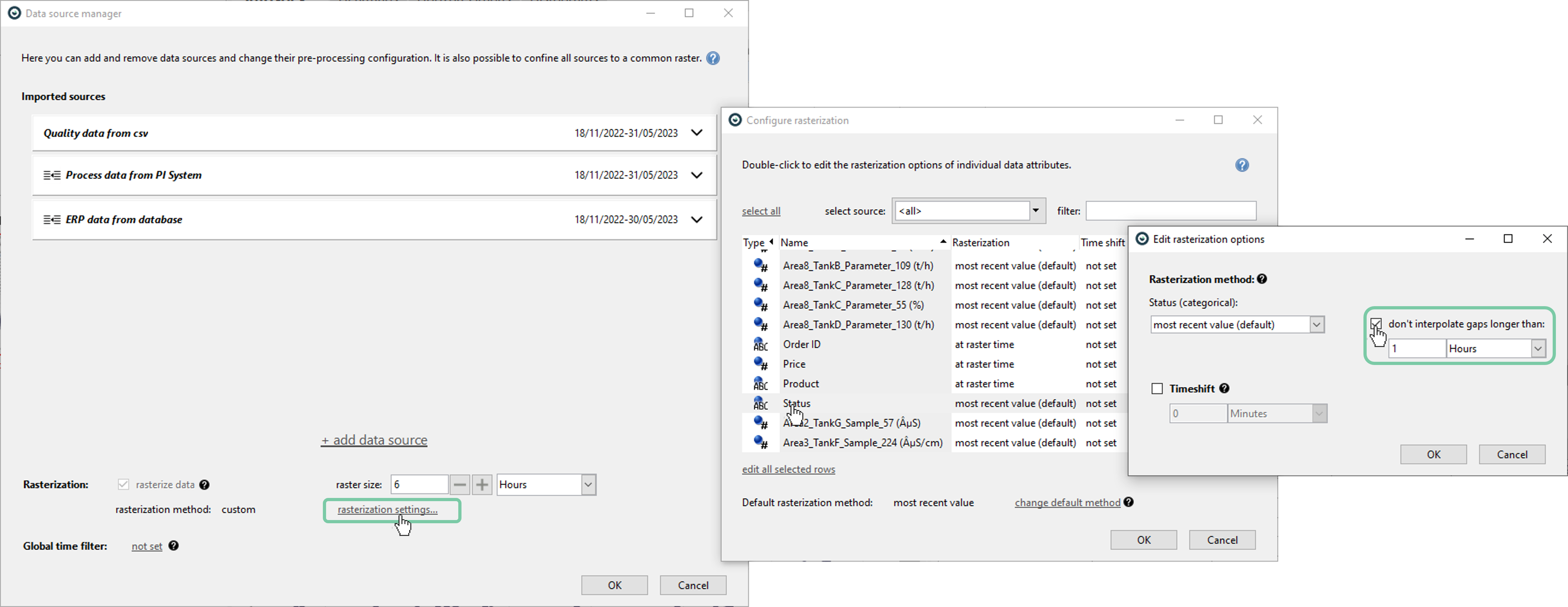
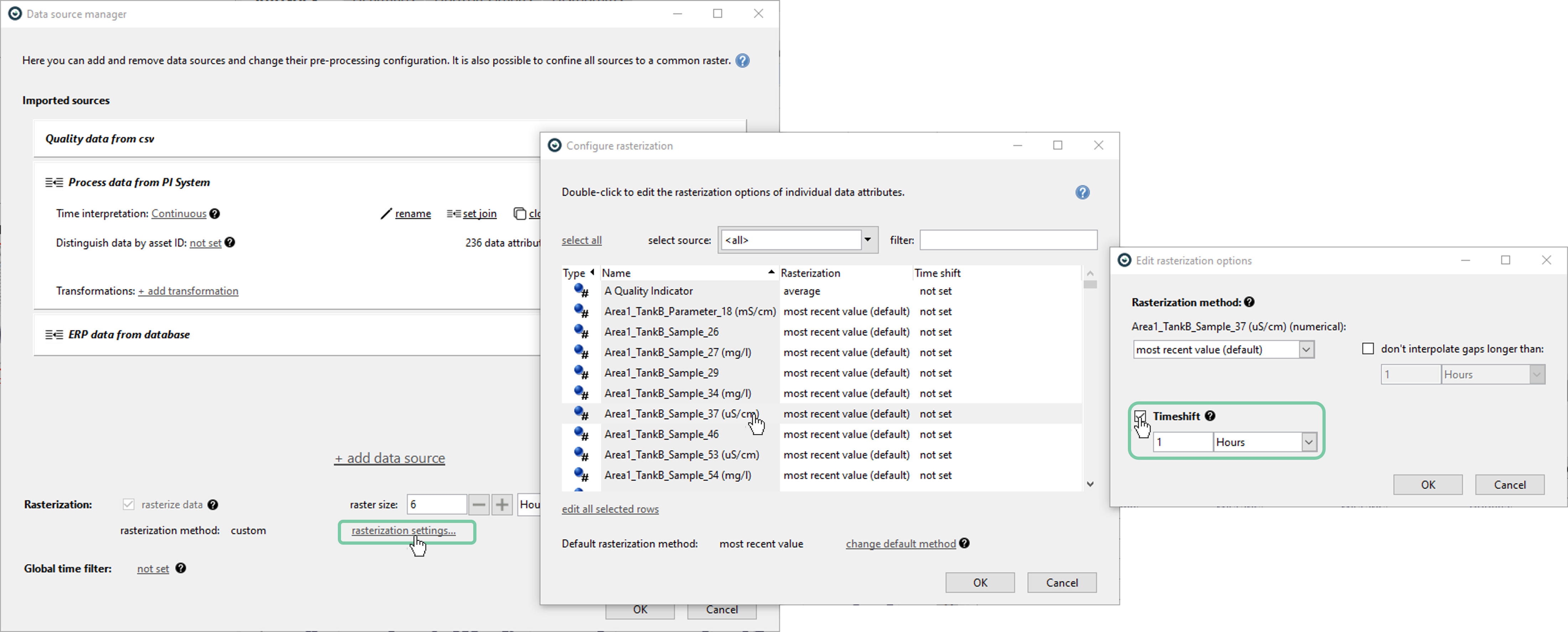
Appropriate methods can be assigned by clicking the ‘rasterization settings’ as shown below
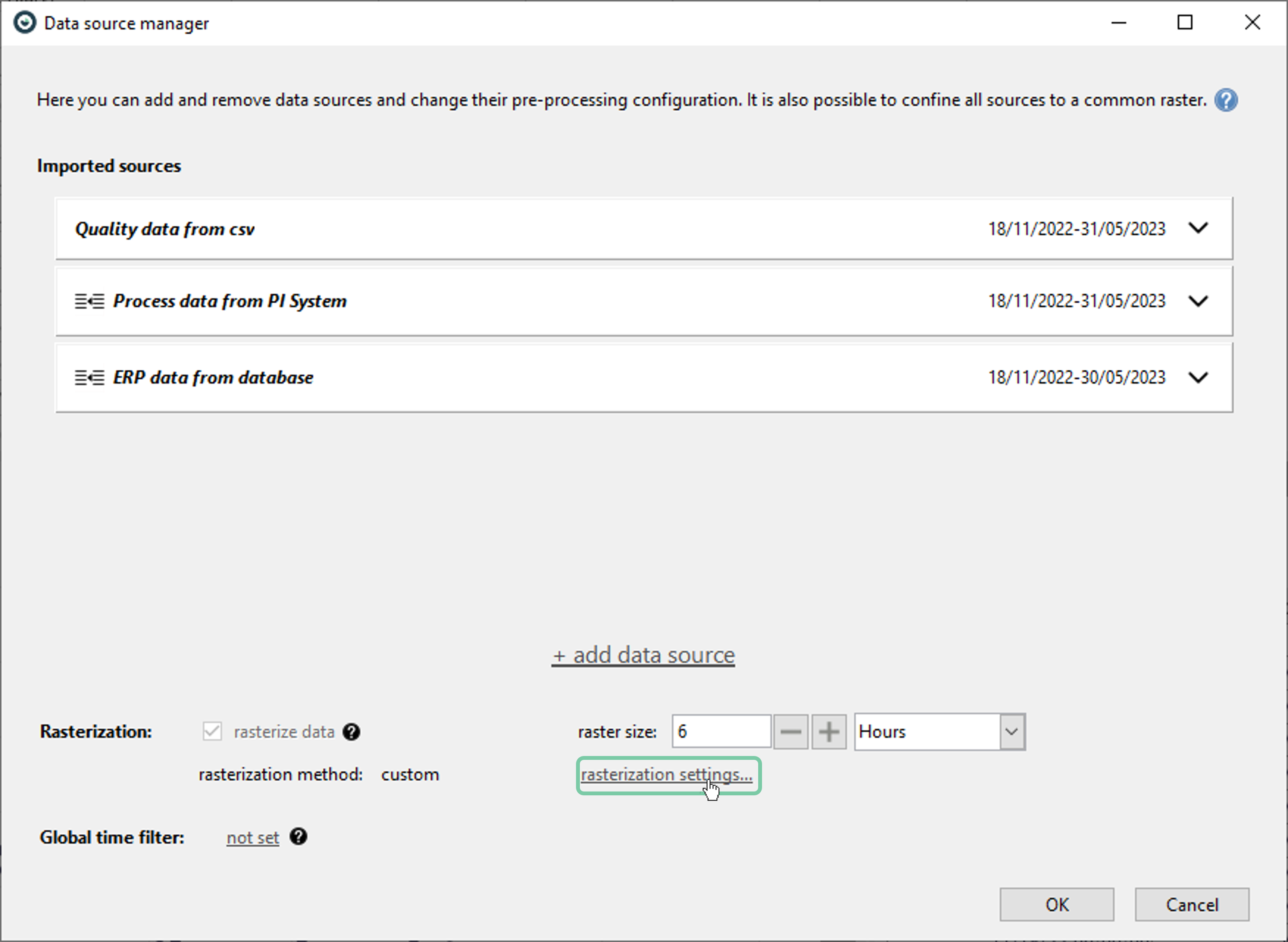
The available rasterization methods depend on the time interpretation of the data source and data type of the attribute. Please refer to the [Configure rasterization] (link: https://visplore.com/documentation/v2023a/dialogs/rasterizationoptions.html) page for detailed information regarding the available methods.
3.e. Ignoring gaps
Sometimes, it might be desirable not to interpolate long periods of missing data so that it is visually distinguishable. In that case, user can check the ‘don’t interpolate gaps longer than:’ box and specify the duration.
This can be done at once for all data attributes that uses an interpolation method as shown.
Alternatively, this can be set per attribute as shown below.
3.f. Changing an existing raster
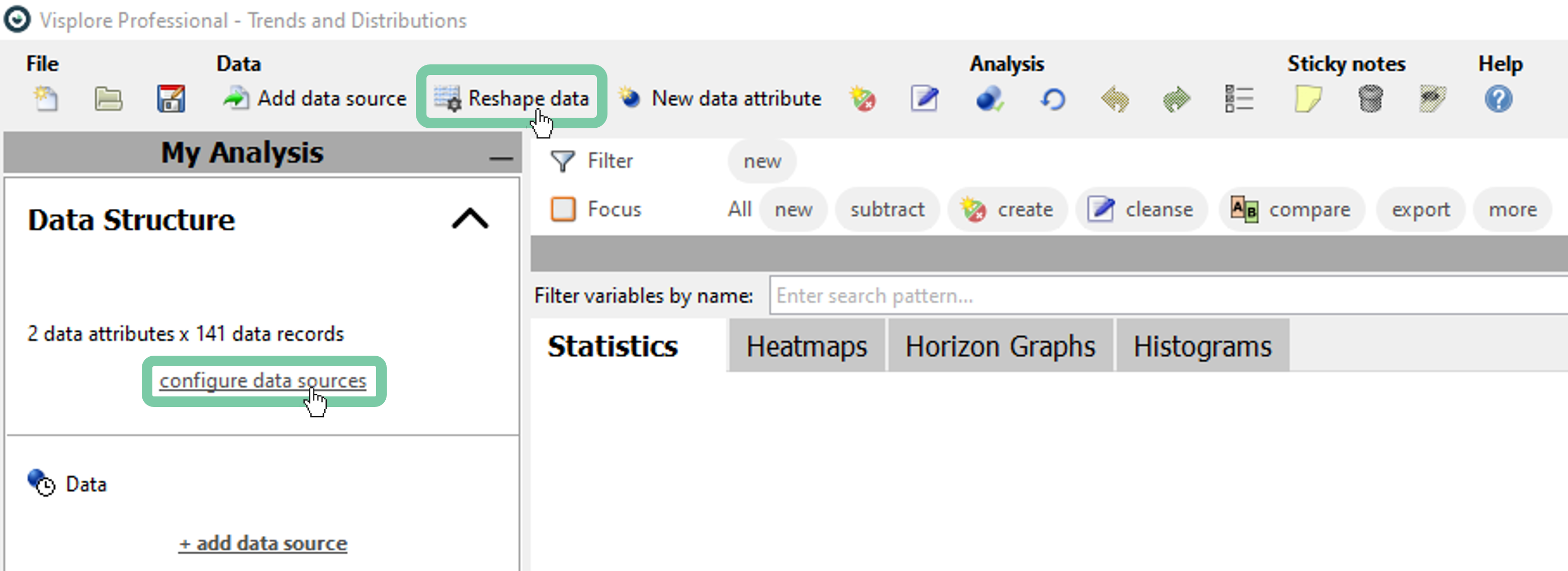
It is possible to change the raster size or disable the rasterization (provided that the data structure doesn’t enforce it) at any time by clicking ‘Reshape data’ or ‘Configure data sources’.
4. Defining Time-shifts
4.a. Why time-shifts?
Sometimes there might be a need to introduce time shift to desired attributes. Although there are many reasons to do that, below are the most common ones:
Time-dependent relationship: In some cases, relation between attributes might be time-dependent. Introducing time shift to attributes to create a purposeful lag or lead, might help capture the relationship between attributes. A great example for this might be the pulp&paper industry where the changes made at the beginning of the line are measured towards the end of the manufacturing line. Thus, the data from sensors located at the later stages of the manufacturing should be aligned accordingly.
Seasonal adjustments: Some datasets might exhibit seasonal patterns or other cyclic patterns. In such cases, it is common to apply time shifts in a way that would account for cyclic effects.
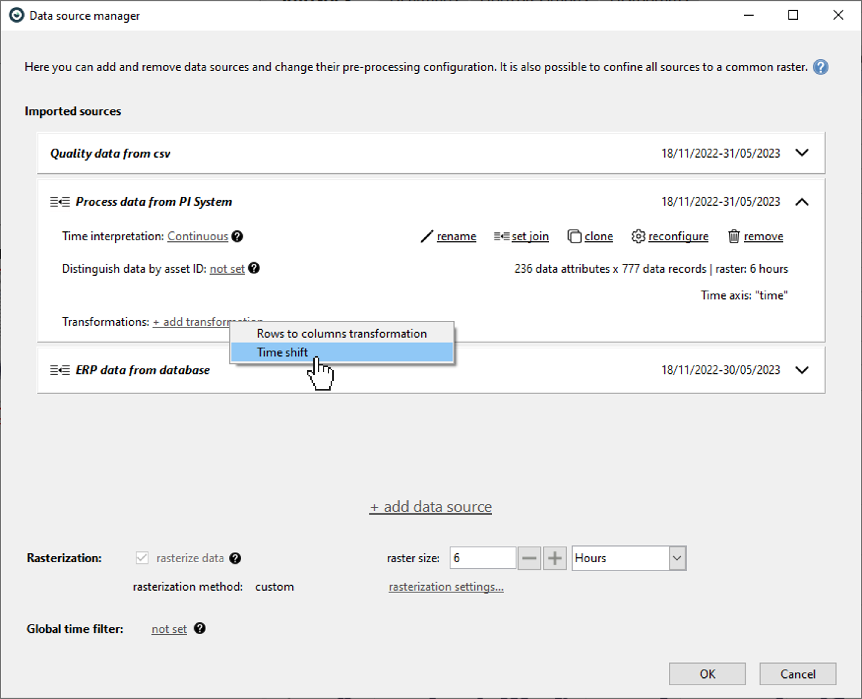
4.b. Defining constant time shifts per data attribute
In Visplore, it is possible to define constant time-shift per data source (affecting all attributes of that data source) or per data attribute.
Below is how to define a constant time-shift for every attribute of a data source.
Alternatively, below is how to define a constant time-shift per attribute.
5. Rows to columns transformation
5.a. Motivation: a typical example
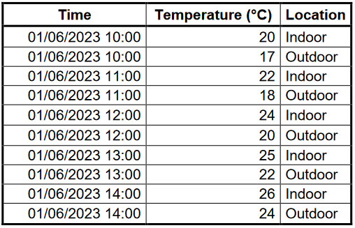
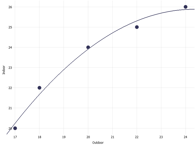
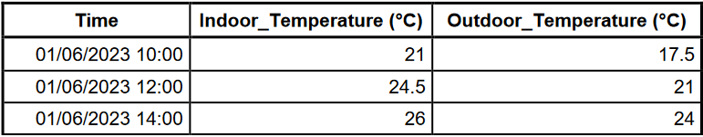
In some cases, the structure of the stored data is not helpful for the analysis in mind. Let’s examine the table below which illustrates a section from a dataset that holds indoor and outdoor temperatures at a specific location. This data is in a long format as each row is an observation.
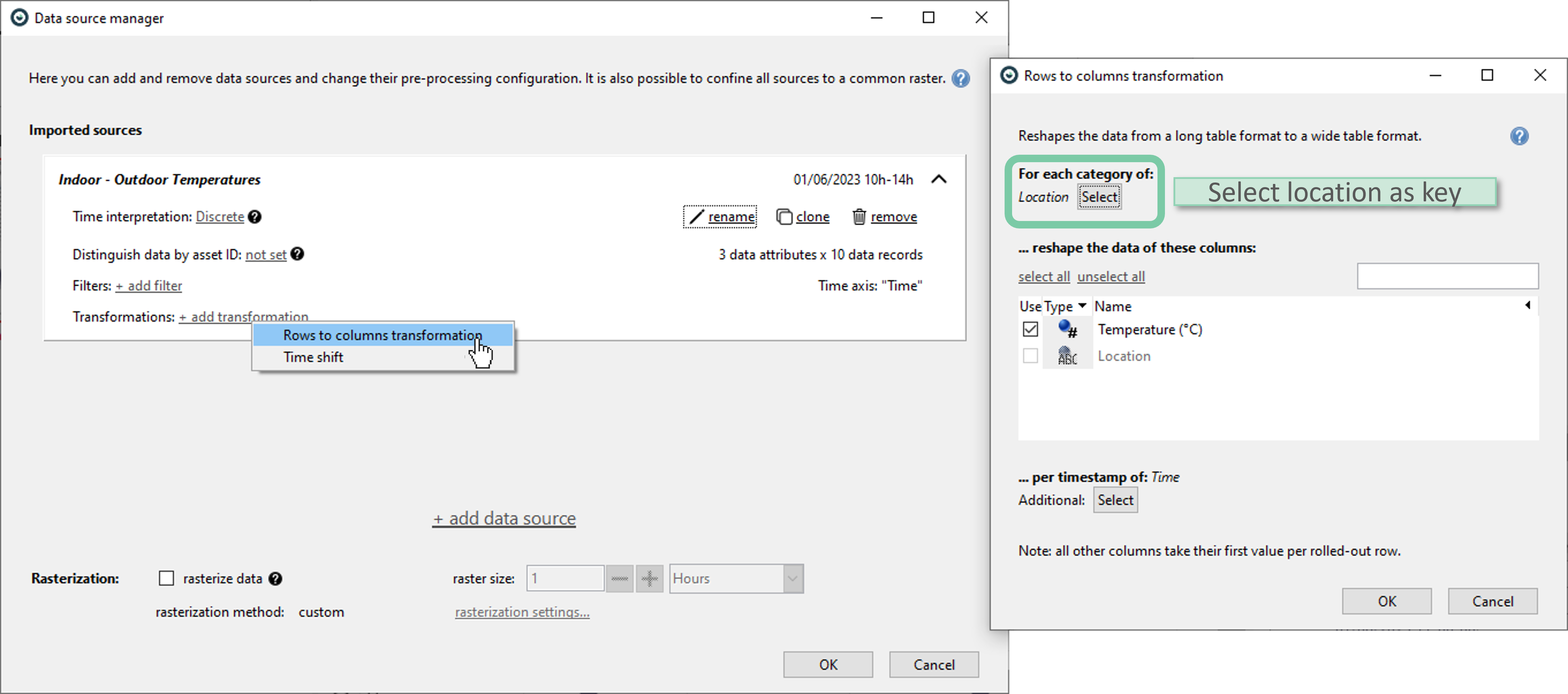
Now, imagine that one wants to examine if there is a correlation between indoor and outdoor temperatures for that location. For such purposes, a long format is not much helpful. One would prefer a wide format where each temperature sensor (indoor and outdoor) has its own attribute column. This way, whether a correlation exists between these two columns can be examined using scatter plots and trend graphs.
Using the data source manager, it is easy to perform rows to columns transformation as shown below. In this case, the column that is to be used for distinction is ‘Location’. It is selected as the key in transformation options.
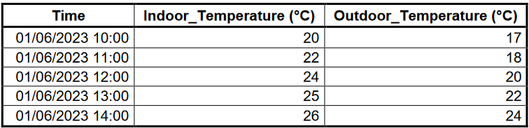
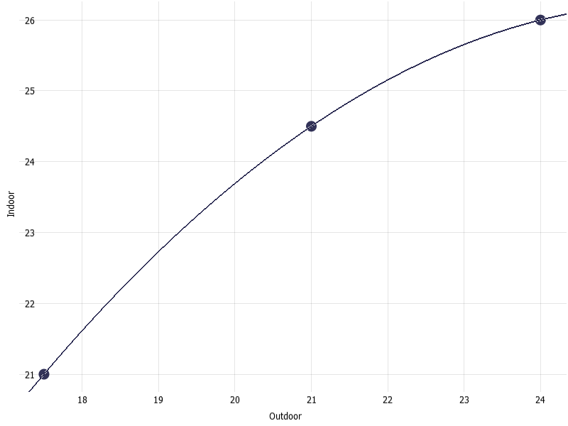
Upon clicking ‘OK’, one should notice that the data table is now transformed into a wide format as shown below.
Using this table in a wide format, now it is possible to examine the scatter plot of indoor temperature versus outdoor temperature and overlay a regression line as these are now two distinct data attributes. Below is the scatter plot and a quadratic regression line overlayed on top.
5.b. Reshaping the data with or without rasterization
It is also possible to reshape rasterized data. For example, below is the same temperature data rasterized to 2 hours and using average as the rasterization method.
Please refer to the Rows to Columns transformation page for detailed information regarding the available methods.