Comparing categories
The "Comparing categories" feature allows you to compare assets concerning production quality and process metrics (e.g. how KPIs differ across plants, machines, and shifts). Furthermore, you can compare KPIs across different process states, operation modes, or time categories. In addition to this, you can find out which variables explain the difference between categories.

In this tutorial, you learn how to compare explicitly selected categories.
Preparation (to follow this lesson using demo data)
For the tutorial, load the manufacturing demo dataset from the welcome dialog, as shown below. Note: in Visplore Professional, you need to click "Demo Data", and then "Manufacturing".

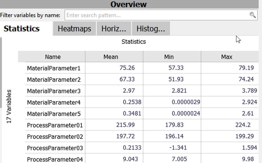
In the image below, we see the manufacturing data. The data set comprises 80500 data points of approx. four days. Each data point in the times series view corresponds to one produced item and for each item, we have several measured quantities. Five parameters describe the material (MaterialParameter) and ten parameters were measured during the production process (ProcessParameter).

Selecting categories to compare
At first, we choose the categories which we would like to compare. For this example, we compare two different machines.
Click "Compare" in the menu bar, then click "Compare categories". Select "Machine", click ok and then choose "M2" and "M5". Click "OK".

Select the variable "ProcessParameter03" in the "Statistics" table.
The image below shows the result of this comparison. The times series shows the two chosen machines (M2 and M5) in different colors. In the distribution section, the histogram compares the value distributions of both machines. As you can see, the distribution of ProcessParameter03 is higher for M5.

Adding additional filters
In the next step, you add an additional filter to analyze only comparable product types, as you only want to compare the same product type across machines.
Click "+" right above "Machines" on the left side of the "Drill Down" section, then tick "ProductType".
The result of this selection is shown in the image below, visualizing the selected machines subdivided by their produced product types. It can be seen in the "Pivot Table" that both machines produced product type "334A". Finally, clicking (or hovering) the product type "334A" highlights periods in the "Time Series" view, to see when this product type occured.

Click on the product type "334A" to put it in focus. Click "more" in the menu bar, then click "Filter: Keep only selected data" to remove anything that is not in your focus. Alternatively, use the action menu that appears when you click on a category.

Comparing categories over time
In the Timeline view, it can be helpful to show the periods of the compared machines right next to each other, without temporal gaps inbetween. Also, moving average of the production paremeter helps to identify trends over time.
Hide empty periods: Click "Options" in the Time Series view, then click "Split time axis". Click "Hide empty periods" and move the bar to the right (towards "Hide many"). In the Timeline graph further down on this page, you see how long time gaps are now collapsed. Now close the dialog.

Moving average: Click "Options" in the Time Series view, then click "Trend overlays". Click "Show moving average" and select 1 hour. The resulting graph shows, for each point in time, the average of ProcessParameter03 from all items that fall within the 1 hour around that time point (see Timeline graph below). Now close the dialog.

As shown in the image below, all views are configured to compare these two assets of one product type. Again, the statistics are shown side by side for the selected machines. The times series and the histogram discriminate the machines by color. However, now you see that some larger gaps are collapsed, and there is a moving average configured. You can see that the ProcessParameter03 of M5 is more steady than the one of M2.

Comparing categories in other views
Furthermore, you can observe your comparison in other views (histogram, heatmap, and more).
The "Histograms" view shows which variables differ the most for the two selected machines. The variables are sorted by how different their value distributions are for the two machines. As a result, you can see that "The Lot ID" distribution is most different, followed by "ProcessParameter05".

The heatmap compares for each machine the normalized mean values (from blue to red) for each process parameter.

Note: You can also compare more than two categories.
Note: You can adjust the desired categories in retrospect by clicking on them in the filter (see Comparing time periods).
Great! You have mastered the workflow for comparing categories.
License Statement for the Photovoltaic and Weather dataset used for Screenshots:
"Contains public sector information licensed under the Open Government Licence v3.0."
Source of Dataset (in its original form): https://data.london.gov.uk/dataset/photovoltaic--pv--solar-panel-energy-generation-data
License: UK Open Government Licence OGL 3: http://www.nationalarchives.gov.uk/doc/open-government-licence/version/3/
Dataset was modified (e.g. columns renamed) for easier communication of Visplore USPs.
